RSS Feed
  1. Transmedia Field Guide!

    November 28, 2012 by arichard@uoregon.edu

    AAD 550 Art In Society

    11/27/12

    I finished my Transmedia Field Guide. It’s called Best Show Ever: The Audience Experience of Live Music In Eugene Venues and Beyond. It can be found here! I had a blast making this site. It was a lot of work, but I loved every minute of it.

    Here is the description of this assignment.

    Part B: Field Guide based on provided template. Posted to your student learning portfolio with hotlinks and embedded media. This will be the “final project” for our course, and will need to exhibit the rigor of editing and construction associated with such things. The provided template breaks the field guide into sections (required), and you will populate these sections with examples, analysis, and references to outside sources as appropriate. Due November 28.

    TEMPLATE:

    Section 1: Introduction to art world/practice = a brief overview that provides key terms, definitions, and historical context

    Section 2: Setting = a description of the participants, community, and/or context for the subject introduced in Section 1

    Section 3: Transmediations = a narrated tour through a mininum of 7 (seven) transmedia resources that you used to map your subject

    Section 4: Analysis = a critical discussion of the art world/practice under investigation that draws on course materials/texts, themes and issues from course discussions, and any relevant outside sources


  2. Transmedia Field Guide Slide

    November 28, 2012 by arichard@uoregon.edu

    AAD 550 Art In Society

    11/27/12

    This is Part C of my Transmedia Field Guide. This PowerPoint slide is a brief summation of my entire Transmedia Field Guide, which is a WordPress site devoted to the investigation of the audience’s experience at a live concert, in Eugene, OR and beyond.

    Assignment Description:

    Part C: One (1) powerpoint/presentation slide along with 5 minute presentation to class.. This slide should consist of an image representing your field guide’s subject matter and no more than three bulleted text bits. We will post these together as a gallery on the course site after the presentations. Due by November 26.


  3. PowerPoint Topic and Flow Chart

    November 13, 2012 by arichard@uoregon.edu

    Assignment Description: Students will use Microsoft  Word SmartArt Graphics option too create a flow chart of their Powerpoint presentation. The purpose is to introduce and work with Information Architecture and create a hierarchy of flow of content to be contained in the Powerpoint presentation. It is recommended that the Powerpoint presentation topic be the Prototype shell of the students’ Winter term professional ePortfolio website they will produce. Students have the option to choose a different presentation topic. Examples and specifications of both are shown. The Powerpoint piece is one of three presented at Finals.

    Reflection: I am going to do my PPT on my Transmedia Field Guide for Art In Society. The Field Guide will be a WordPress blog that looks at Eugene’s music venues and the ways a venue can encourage or hinder a participatory and/or meaningful concert-going experience. The flow chart below shows eleven sections of information which will be the eleven pages of my Field Guide, and will also be slides in my final PPT presentation. It’s a bit odd to have drop-downs for only one page, but it suits my purpose and should be easily navigable.

    Flow Chart PDF


  4. Event Poster

    November 8, 2012 by arichard@uoregon.edu

    Assignment Description:

    Students are introduced to poster history, and the utility and design of posters in the arts, politics, social agenda, and other genres. Students will create an event poster for their midterm. One of the primary challenges in Event Poster design is working with applying content in a larger space/format. The expectation is to work with a common poster design size of 11×17. Issues of working with images, artwork, typography, and other design elements will be addressed. Use the Diigo and blog resources to look at samples, case studies to attend to these design considerations.

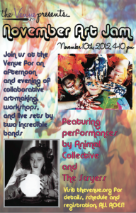
    I had a couple bothersome issues in making my poster, so it’s not perfectly, exactly as I wanted it. But it’s pretty close. I free transformed the background watercolor-looking picture to make it cover the whole 11″ x 17″ page, but initially the colors were so bright and inconsistent that it was really difficult to read all the type. So, I lightened up the background using the good old transparency option, which went a long way towards making it more readable. I also experimented with the placement of the text and pictures quite a bit, and I think I managed to create a fairly good balance of info and great, bold colors and images. The one thing that did end up eluding me was how to add the logo in without a white box. I couldn’t figure it out, so for now, I’ve just used the name “the Venue” in the correct typeface, and will add the brush later when I get some help.

    Event Poster


  5. Collateral Drafts

    November 6, 2012 by arichard@uoregon.edu

    Assignment Description:

    Students will apply their logo in common collateral materials that will be included in their Graphic Standards assignment. Along with lecture, handouts and resource links describing and modeling organization graphic standards are provided. Past cohort examples are made available for reference to clarify both collateral material development, specifications and production, as well as specific criteria for producing the graphic standards assignment.

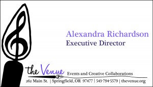
    I found that it was difficult to pick one theme and stick with it, because one large, graphic element does not necessarily translate to all three pieces of envelope, letterhead, and business card. So, I chose to use the brush tip from my logo for the card, and the 15% transparent treble clef for the other two pieces. I think there are still enough repeating elements to make the pieces look like they belong together…at least that’s my hope! The most difficult thing was creating the brush stroke line between the byline “Events and Creative Collaborations” and the address and other info. The stroke isn’t identical between the three, but I kind of like that. Here are the jpgs, with PDF links as well.

    Business Card:

    Business Card PDF

    Letterhead:

    Letterhead PDF

    Envelope:

    Envelope PDF


  6. Display Ad

    November 1, 2012 by arichard@uoregon.edu

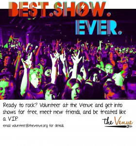
    Here is a call for volunteers for Springfield’s new community music and art center, the Venue!

    Note: the first image is the original, how I intended it to look. The second was a mistake–I tried to save from a .tif into a .jpg, and something about doing that altered the color. While it was an accident, I kinda like it. Which do you like best?


  7. Logo Design

    October 30, 2012 by arichard@uoregon.edu

    Assignment Description – Students create an original logo representing an organization or agency. This can be for a real or fictitious organization, and include a makeover of the organization brand. This piece will be used to create collateral materials which become the basis for the Graphics Standards assignment.

    Here is my logo for the Venue,  my fictitious music and art venue for Cultural Administration. I like the purple,  and the little treble clef in the paintbrush. I also spent a good deal of time picking the font, Halo Handletter. I wanted it to look like the brush that underlines the name wrote the name. The way that I created the brush was making it in Photoshop, importing the image into Illustrator as a .bmp, then live tracing it to turn it into vector art.

    the Venue Logo PDF


  8. Photoplay!

    October 22, 2012 by arichard@uoregon.edu

    Assignment Description – As a means to introduce basic image manipulation and artwork creation using a bitmap program, students will makeover an image provided to them.

    Here is my Photoshop Photoplay assignment for Advanced Info Design and Presentation. I learned a lot about how to merge two landscapes. My favorite part is the horse walking through the pool on the bottom of the page. I used transparency to create this effect. Other tools I used: clone stamp, blur effect, and color adjuster.


  9. Logo/Branding Awareness

    October 16, 2012 by arichard@uoregon.edu

    Two of the companies I picked for logo/branding analysis (Rose City Rollers and Feel the Music!) are smaller organizations that have nonprofit status. Feel the Music! requires professional look, as it is an organization that works primarily with children and relies on philanthropic donation and grant money to sustain its programming. While Rose City Rollers, Portland’s roller derby league, is also a nonprofit, it relies mostly on member dues, ticket sales, and advertising partnerships for its support. Therefore, they are more able to showcase their slightly wild, rock and rock attitude in their branding. I chose also to look at Billboard magazine, which is a huge company. Although rooted in the artistic (musical) realm, Billboard is definitively corporate. Their logo represents their gravitas in the music business while maintaining a sense of fun.

    #1 Feel the Music!

    The actual name of this organization based in NYC has an exclamation point, and I am curious as to why they didn’t include it in the logo. I have always heard that exclamation points feel to the reader like shouting and are to be avoided. If the exclamation point in the organization’s title is meant to convey excitement and inclusion, I feel like both of those sentiments are more or less expressed in this logo. The way the stems on the letters “f,” “l,” and “c” extend to the circle evokes musical notes on a staff. The manner in which the eye must follow around the twists and turns in the words “feel” and “music” creates a playfulness that engages the reader. Another reason this logo succeeds: the extension of letters to meet the circle creates a shape, almost turning the logo into a symbol rather than merely a name in a circle. If the same font had been used but the letters didn’t meet the edge of the circle, this logo would not be very captivating. I am also interested in the choice of using a font that is reminiscent of neon tubing in a sign, or the pathways of a Pac-man game. I don’t think either of these references was intentional, but it creates a great maze-like feel of continuity. The choice of using the one color is wise, I think, as there is enough going on in the image without adding the complication of multiple colors. This logo is just about perfect for all applications- web or print. Even if the resolution is low, it’s still going to look great, and would be fine in black and white.

    #2 Rose City Rollers

    I absolutely love this logo. It’s more complex than most logos though, so I could see the amount of detail and number of elements working against it in smaller printed pieces, like business cards or a letterhead.  This version would also not work well in black and white, as the rose would look like a blob. That said, it works great on the web and on merchandise. I have a t-shirt with this logo, and it always invites questions from strangers. What I appreciate about it are the strategic pops of red, the idea of motion in the fists and the wheel in “Rollers,” and the juxtaposition of cursive script and tattoo-style font. Black and red are colors that, when used together, often connote political radicalism. While Rose City Rollers is not politically affiliated, the use of the arresting color combination was wise for a tough, nonconformist sport. Also, in some of the league’s promotional material, the red is echoed (repetition!) in blood splatters. The use of a roller skate wheel for the “o” in “Rollers,” as well as the swoosh of wind behind the wheel is ingenious. It’s an efficient use of space, reminding me of the arrow in the FedEx logo. Of course, in FedEx’s logo the arrow was more or less subliminal and here the wheel figures prominently. I like the contradiction of cursive script with tattoo font because it alludes to a sort of subversive cheekiness, which is a pretty prevalent theme in the world of roller derby.

    #3 Billboard

    This is an established company, founded in 1894. They publish a trade magazine and two websites—one for the consumer/music fan, and a “B2B” site for music business professionals. All three outlets use the above logo primarily, but the company uses another logo (below) for Twitter, Google +, Facebook, and other social-media outlets. I don’t know if this is common practice, but I think it’s really smart for a company to brand itself differently for social media usage. I’m not going to discuss the below logo here, but just wanted to include it for comparison’s sake.

    The primary logo with the full name of the company is very simple, the main defining feature being the filled-in body of the letters “b,” “o,” “a,” and “d.” I think it’s interesting that the designer did not choose to fill in the first letter of the word with a color as well. I imagine that was actually tried before this version was settled on. Perhaps if the first letter was filled in, it would look too cutesy. As it is, it is verging on cutesy, but I think escapes that due to the graphic, thick, sans serif font. The kerning of the characters is worth noting, too. I don’t know how or to what extent the character spacing was manipulated, but it seems significant that the “b,” “o,” and “a” are touching, and none of the rest of the letters are. This is also where the color is concentrated in the logo. This increases the readability of the word, which might otherwise jolt the eye too much, with the tall “i” and “l”s. I think the choice to use primary colors all in a row is a good one, but to decrease the risk of calling to mind a children’s toy (maybe that’s why I think this logo verges on cutesy), the unexpected lime green is used in the outlier “d.” Overall, this is the most sophisticated and bold of the three logos.


  10. Transmedia Field Guide Part A

    October 15, 2012 by arichard@uoregon.edu

    AAD 450/550 Art in Society, Professor Fenn

    10/14/12


    Vocal Ornamentation in Contemporary Music

    How did modern use of vocal runs in r and b and pop music evolve from classical usage? What are some of the other vocal flourishes that singers use on a regular basis? How do vocal techniques vary across these genres: classical, r and b, gospel, rock, commercial pop, and experimental or indie rock? In my field guide, I plan on identifying different techniques that singers use to make a vocal line sound more interesting, display their vocal prowess, or express whatever emotion they are trying to convey more accurately. I will also explore the history of vocal ornamentation. I will look to examples of vocal ornamentation largely in contemporary American music. To narrow down the artist choices, I will use the Billboard charts (http://www.billboard.com/charts/billboard-200#/charts), investigating the singing styles and ornament usage of approximately five artists from each genre that are currently charting, using them as case studies.

    Vocal ornamentation is an individual skill, and generally hinges on the ability or talent of one person performing (as opposed to a group). However, vocalists, like all musicians, borrow from and are inspired by one another. We can see vocal techniques as at art world because of the tremendous influence vocalists have on one another. Even though soloists do not, by nature, sing together, the style in which each sings is inevitably informed by his or her peers and musical icons. The same could be said for any artist. A network is built between singers because of their shared sources of musical inspiration and education. It goes without saying (though I will say it anyway), that this is true now more than ever with the advent of the Internet, as access to videos and songs is virtually unlimited.

    I will focus heavily on the use of melisma in my field guide, which Wikipedia defines as “. . . the singing of a single syllable of text while moving between several different notes in succession” (http://en.wikipedia.org/wiki/Melisma). Melisma is often referred to as a vocal run. Runs are difficult to master, and can be a form of showboating among both experienced classical and r and b vocalists. The below video is long, but brilliantly isolates and compares some of the more complicated vocal ornamentations that Beyonce and Christina Aguilera have performed live.

    [youtube]http://www.youtube.com/watch?v=IeYJEjSbPfQ[/youtube]

    In classical music, runs are rarely, if ever, improvised, but are written into the music by the composer. Here is a good example of the classical foundation of the current usage of melisma. It is “I Attempt From Love’s Sickness” by Henry Purcell, performed by Nancy Argenta

    [youtube]http://www.youtube.com/watch?v=pPf-NLuCSOc&feature=share&list=PL72709501B126A453 [/youtube]

    The pop singer Regina Spektor uses melisma in the chorus of 2010’s radio hit, “Fidelity.” Spektor has made vocal experimentation a centerpiece of her musical style. She often uses a rhythmic vocal delivery similar to rap, vocally echoes instrumental parts, and plays with the texture of hard consonant sounds, among other tricks. I will look at more examples of her work in my field guide. Watch “Fidelity” below.

    [youtube]http://www.youtube.com/watch?v=wigqKfLWjvM&feature=youtu.be[/youtube]

    The musician M.I.A. appeared in the dance/indie music scene in 2005, surprising listeners with track two of her album first album Arular, “Pull Up the People.” She uses an upward vocal slide that sounds a bit like a yelp or a call.

    [youtube]http://www.youtube.com/watch?v=ySm46x00oQ0&feature=youtu.be[/youtube]

    I have noticed the same technique applied by a multitude of singers since M.I.A. became prolific, from Canadian art rock band Braids, to a hint in pop country music star Taylor Swift’s new single, “We Are Never Getting Back Together.” In Swift’s song, the vocal flip lands somewhere between M.I.A.’s yelp and an intentional vocal break that jumps up in pitch, used commonly in pop and country music.

    [youtube]http://www.youtube.com/watch?v=gcMn_Eu-XTE&feature=youtu.be[/youtube]

    These examples are culled from the knowledge I already have of vocal features and ornamentation. In doing research for this project, I hope to discover patterns like the “vocal flip” in genres I don’t normally listen to, such as punk rock. I also want to investigate the way that music production software has influenced the skills a singer can display. Auto-tune, for example, has dramatically changed the sound of pop music in just a few years. Auto-tune often alters the sound of a vocalist’s voice to the extent that it’s sometimes hard to believe the origin of the vocal track was a real human being singing.  The hip-hop musician T-Pain is the most popular example of this, as he was the first musician to gain widespread notoriety for using auto-tune as a main feature of a song. Listen to “Can’t Believe It” here.

    [youtube]http://www.youtube.com/watch?v=kWBE0sQC5L8&feature=youtu.be[/youtube]

    I plan on interviewing one or two voice teachers about their methods of teaching techniques like runs (is it even possible to teach a run? I’m not sure). I also would like to record an audio guide to the most commonly used ornamentations, possibly using my own voice to demonstrate. Finally, I’d like to make a downloadable playlist of some of the best examples of singers using ornamentation. I hope to lead a reader to a better understanding of why singers make the stylistic choices they do, and demonstrate how a well-placed vocal ornament can add the power or beauty of a song.


Skip to toolbar