RSS Feed

‘infodesign’ Category

  1. Showcase ePortfolio

    March 19, 2013 by arichard@uoregon.edu

    AAD 585 Multimedia in Arts Administration

    Assignment Description: Students will create and make live their Prototype Professional Showcase ePortfolio websites for presentation to the class.

    Here it is! The moment of truth is upon us: my Showcase ePortfolio.

    I learned a ton in this (CSS) website creation process, but there are a couple of things I definitely would have done differently. For example, I would have chosen some sort of central theme for my website, and made the design consistent page-to-page with that theme. Instead, I just designed the header and thought having a neat, almost-transparent image in the background of all the content would be suitable, and while I like the design I created, it makes the text a little difficult to read. The site looks sort of old-fashioned, but I think it’s cute, functional, and easy-to-use. I plan on adding a few features later down the road,  such as my AAD “Student Spotlight” video interview which will be completed soon. I like how my Resume page turned out. I initially had a bunch of text pulled straight from my resume, and I realized I might as well put a jpg that links to a pdf of the actual document instead. I also like the Professional Associations page, as all the jpgs link out to the organization’s websites. I would probably tweak some of the other pages–I’m not sold on “Work Samples” or “Research,” which look a little unwieldy. But overall, since this was a very steep learning curve for me, I am proud at what I accomplished in about five weeks’ time. If I choose to learn more about web design in the future, I have a solid foundation.


  2. Showcase ePortfolio Timeline

    March 4, 2013 by arichard@uoregon.edu

    Multimedia In Arts Administration

    Showcase ePortfolio Timeline

    Assignment description: Students create a timeline, a chronology of events to complete their websites. The timeline is an outline of calendar dates detailing activities with specific tasks necessary to complete the website.

    Timeline: Showcase ePortfolio Design


  3. Web 2.0 App Abstract: Musicovery

    February 28, 2013 by arichard@uoregon.edu

    AAD 585 Multimedia In Arts Administration

    Web 2.0 App Abstract Assignment

    Assignment Description:

    Students pick a Web 2.0 app that they use, and/or one they are interested in knowing more about, to write a brief abstract about its features, application, and value. This will be presented like a product review, approximately a page in length, and submitted as a PDF. These will be shared on my instructional blog. Web 2.0 apps include Diigo, Skype, Prezi, Evernote, Flickr, hulu, digg, weebly, Linkedin, and many more.

    Musicovery Web 2.0 App Abstract


  4. Showcase ePortfolio Template and Narrative

    February 21, 2013 by arichard@uoregon.edu

    AAD 585 Multimedia In Arts Administration

    Showcase ePortfolio Web Template and Narrative Assignment


    PDF: Showcase ePortfolio Template and Narrative


  5. Arts Organization Website Case Study

    February 19, 2013 by arichard@uoregon.edu

    AAD 585 Multimedia In Arts Administration

    Arts Org. Website Case Study Assignment

    Assignment Description: Students will pick an arts organization (their internship site makes for an interesting choice) and critique the organization website. The case study will include a brief backgrounder of the organization, an overall assessment – addressing design, UI (user interface), navigation, functionality, and content, and prescription for improvement.

    PDF of Portland Institute for Contemporary Art website case study: Website Case Study


  6. 20 Years in Record Time

    February 7, 2013 by arichard@uoregon.edu

    AAD 585 Multimedia In Arts Administration

    Biopic Assignment

    Assignment Description: Students create a 2-4 minute video biopic or one based on a passion that represents who they are, an interest, etc… but the intent is to create a piece that demonstrates their knowledge of how to use video as a viable communication tool in their Arts Management area study; that it can be included as a work sample on their Showcase ePortfolio. Use of video and still images, and audio trackediting is encouraged, as are other content features and editing unique to this presentation medium. This will be exported in a Quicktime or MP4 video format at the Vimeo recommended export standards. Videos will be made accessible via Vimeo or another video sharing network.

    [vimeo]http://vimeo.com/59129530[/vimeo]

    This video, which I titled “20 Years in Record Time,” chronicles the last two decades of my life in photographs and music albums. I picked a photo that spoke to a major theme in that year for my personal development, and accompanied it with an audio clip from my favorite album of the year. This was incredibly challenging. Not only was choosing the pictures difficult (and I had to scan hard copies in of most), but cutting the soundtrack of each year to a mere 11 seconds was sort of painful. Music and people are the two biggest influences on my personal development, and I felt strange having to leave out some key individuals and albums due to the constraints of the project. But,it was still a deeply satisfying experience. This video is not, of course, exhaustive. It is a snapshot. I made the video with iMovie, and imported photos that I processed in Photoshop, as well as mp3s from iTunes. The sound editing was actually my favorite part. I considered adding captions to the photo or a voiceover describing them, but decided that since I couldn’t string them together into some cohesive narrative, the descriptions would be forgettable and therefore, inessential. I think the video does manage to reflect where I’ve come from and who I am now–and how music has shaped and supported me throughout the years.


  7. Personal Learning Environment

    February 7, 2013 by arichard@uoregon.edu

    AAD 585 Multimedia In Arts Administration

    PLE and Narrative Assignment


    PLE  Assignment Description– Students create a graphic representation of their Personal Learning Environment – examples on my blog from past cohorts, and links to PLE sites. A written and/or recorded narrative must accompany the PLE (depending on the media type used for presentation).

    PLE

    I chose to represent my personal learning environment (PLE) as a village because I feel as though I am immersed in a community that offers new avenues for learning at every turn. I have a lot of fun entering different spaces—both actual and metaphorical—to acquire the information I need.

    • The University represents the University of Oregon. This is a new element to my PLE. While I learn much in the buildings and classrooms I frequent, my cohort and professors are responsible for inspiring me every day, and challenge me to work harder.
    • The Theatre/Music Hall symbolizes WOW Hall, where I am currently engaged in a practicum, as well as all the music venues in Portland and Eugene where I have rehearsed, performed, or seen live music. I learn from the performers I watch, and I learn something about myself every time I sing publicly.
    • The Radio Station is the media hub. Since moving to Eugene, U of O’s radio station, KWVA has become a fixture in my life. I also learn of music and news stories through NPR, and discover many favorite new bands through KEXP, U of W’s radio station. I included television and Netflix under this category, as well. This is part of how I stay connected to local, national, and international entertainment and current events.
    • The Library symbolizes all the learning that I engage in through the written word—either online, or through books and periodicals. Reading has taken center stage since I began this program, and I expect it to occupy an even greater space as I begin to engage in research. The library, metaphorically, is the place where I feel most comfortable in this village, besides Home.
    • Home is my friends and family, as well as the base from which I operate. This is where I feel safe to hash out ideas, to learn about myself, and glean wisdom from those close to me. This is my chosen social community, and also includes public places where I can observe people. Facebook is part of home, a site that helps me stay current on the affairs of those who are important to me.
    • The Apothecary is where I go to get well, at least, that’s the goal. I have spent much time in doctor’s offices since I was a baby. I learn from healthcare professionals, clinics, and pharmacies, and teach myself about medical issues using medical websites.
    • The Spiritual Center is where I find solace and guidance. I learn about my religion from books, websites, and tools such as astrology and tarot. I learn by practicing at home, and out in nature. I sometimes attend churches, as well.
    • The Music Store helps me learn about new music, along with the Radio Station. In the past, I’ve worked in a record store and wrote for a music blog, and I gather “Best Of” lists every December to make a spreadsheet with the critics’ top albums of the year. I learn both by checking out others’ music recommendations and exploring new music in physical stores and in iTunes.


  8. VideoPlay Assignment

    January 25, 2013 by arichard@uoregon.edu

    AAD 585 Multimedia In Arts Administration

    January 24th, 2012

    30-60 second VideoPlay Assignment


    Here is the link for my VideoPlay assignment. I’ve made the video private because it contains music from a video recording I took of a live performance by musician Reggie Watts. I didn’t get permission from Reggie, and I don’t know if he would want the audio available to anyone on the internet (actually, I don’t think he would mind, but just to be safe…). The password is NYC.

    VideoPlay

    The performance session from which I took the music was during a conference I recently attended: the Association of Performing Arts Presenters in New York City. Reggie (whom I have seen before in Portland) is an excellent performer, and he excels at improvisation and freestyling. The song I chose to excerpt featured a large chunk of improvising about New York. I thought it was fitting, so I used it to accompany images of some of my best moments on the trip. Separating the audio from the video was the most time-consuming and difficult part of the process of making this video. For some reason, iMovie (the program I used to make the video) wouldn’t let me detach the audio from the video. I eventually figured out that I could import the video into GarageBand and separate the audio in that program. I’m familiar with GarageBand already, so manipulating the audio after it was detached was a cinch. I used the image processor function in Photoshop to make all my images uniform in size and resolution, and it was there that I added the wood frame look. Finally, I spent a decent amount of the time adding different headings to each photo. It’s not necessarily a “clean” look, because I used four different heading styles, but I just couldn’t help myself! Next time I use iMovie, I would like to experiment with the voiceover function, and try different kinds of transitions. For this assignment, I kept it pretty basic. I had a lot of fun making this video.


  9. Showcase ePortfolio Webmap and Narrative

    January 22, 2013 by arichard@uoregon.edu

    AAD 585 Multimedia Design and Presentation, Winter 2013

    Assignments #1a and 1b: Showcase ePortfolio Project Narrative and Webmap

    Alexandra Richardson


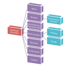
    For my Showcase ePortfolio, I plan on including these headings and subheadings: 1) About; 2) Resume; 2a) Performance Resume; 3) Internship; 4) Work Samples; 4a) Writing; 4b) Design; 5) Research; 6) Professional; and 7) Contact. Thus, I will have seven main headings/pages and a total of three sub-pages. I personally do not like navigating many subheadings, so I wanted to include as much information as possible on the front end of the site. The main headings will be laid out vertically on the left side of the page. Vertical heading layouts are less common, but I think easier to use. I want my site to be bold and warm at the same time. I want it to convey strength and style, and communicate my achievements clearly to a casual reader.

    1) The About page will be a basic bio with some info about my outside-of-school interests, plus an explanation of the site and a “thank you for visiting.”

    2) The Resume section will have all the resume text on the parent page, as well as including a link to a PDF version. There will be one sub-page- a separate page for a performance resume. This page will be laid out the same as the main resume page (all info there with a PDF link). I may also include photos or videos to creative work I have done.

    3) The Internship section will have all info on the one page, describing what I did Summer 2013. Additionally, I will house information about my current (and future, if applicable) practicum.

    4) Work Samples- This basic explanatory page will contain two sub-pages: Writing and Design. Under Writing, I will include PDFs to papers, as well as a link to my Transmedia Field Guide. Design will contain samples from Advanced Info Design class, and possibly this class.

    5) Research will contain a brief explanation of my terminal research and maybe a paragraph discussing future areas of inquiry.

    6) The Professional page will have a list of the organizations to which I belong, a list of professional conferences I have attended, and any other applicable info not elsewhere on the site.

    7) Contact: straightforward. Will have my contact info, as well as links to my coursework ePortfolio, LinkedIn profile, and Tumblr blog (which I am in the process of developing).

    Showcase ePortfolio Webmap PDF


  10. Graphic Standards Final Project

    December 4, 2012 by arichard@uoregon.edu

    Assignment Description: The Graphic Standards represents a culmination of students’ logo design, collateral pieces and other presentation specification around their organizations brand. Specifications and examples of past cohort standards are provided. The standards are presented at Finals.

    Info Design Graphic Standards Final PDF

    I enjoyed using InDesign to create graphic standards for one of two Advanced Information Design and Presentation final projects (the other can be found here). I like the degree of precision InDesign accommodates. After setting the purple bars as design elements on the master pages of the document, as well as page numbers (with the help of Prof. Eric Schiff), I was off and running. The most time-consuming part of the creation of this project was making the measures for the collateral pieces. It was also a bit difficult to make sure the text boxes for each page were placed consistently between all the pages. I set my margins pretty far in for all the pages, so I didn’t have a lot of space to work with, but I did so intentionally because I thought it looked a little more modern and less like a Word document with some images thrown in. I had to scale down the collateral, logo images, and display ad in order to fit the text and each image comfortably on the same page, so I hope I didn’t make those images (and the measurements) too small to see. I think it turned out well, and I am pleased that I was able to create something that looked so (relative to, say, my event poster) formal and professional.


Skip to toolbar