Consumer Spending Has Plenty of Support

Now that the economy looks to have escaped the clutches of a manufacturing-induced recession, the attention of market bears has turned to that bulwark of spending activity, the American consumer. Not a week passes without a story that households are skating on thin ice and that a consumer-induced recession should be the new focus. In reality though, household spending both stands on a stronger foundation and is more resilient than commonly believed. It’s not the threat to the economy you are looking for.

In a recent Bloomberg article, Lakshman Achuthan and Anirvan Banerji argue that consumer spending power is less than meets the eye. Market participants should approach such fears warily. Consider the opposing view that the consumer is just fine.

First, while nominal wage growth has disappointed, this in part reflects low inflation. Real earning power, in contrast, has been on a tear since 2014:

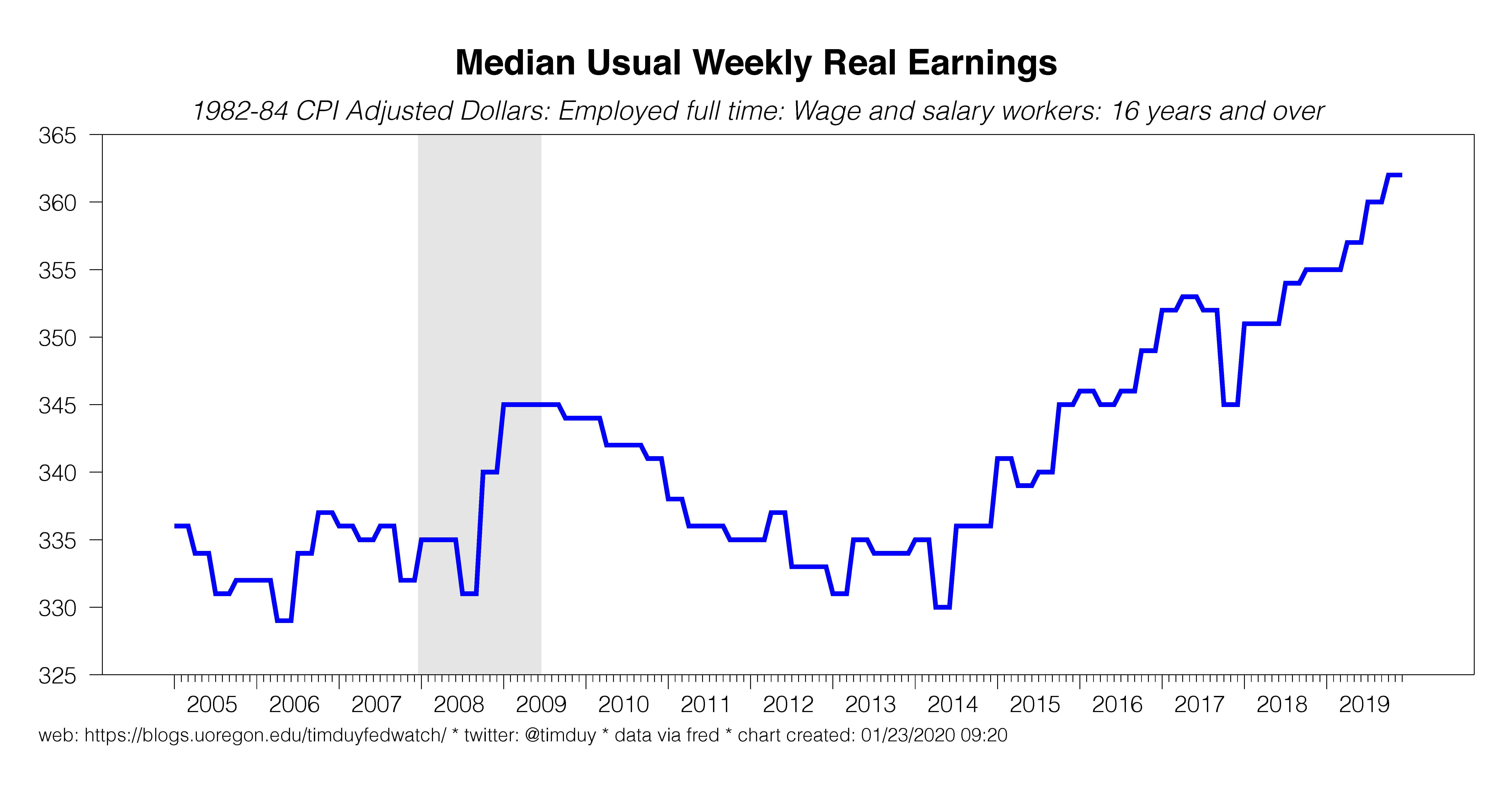
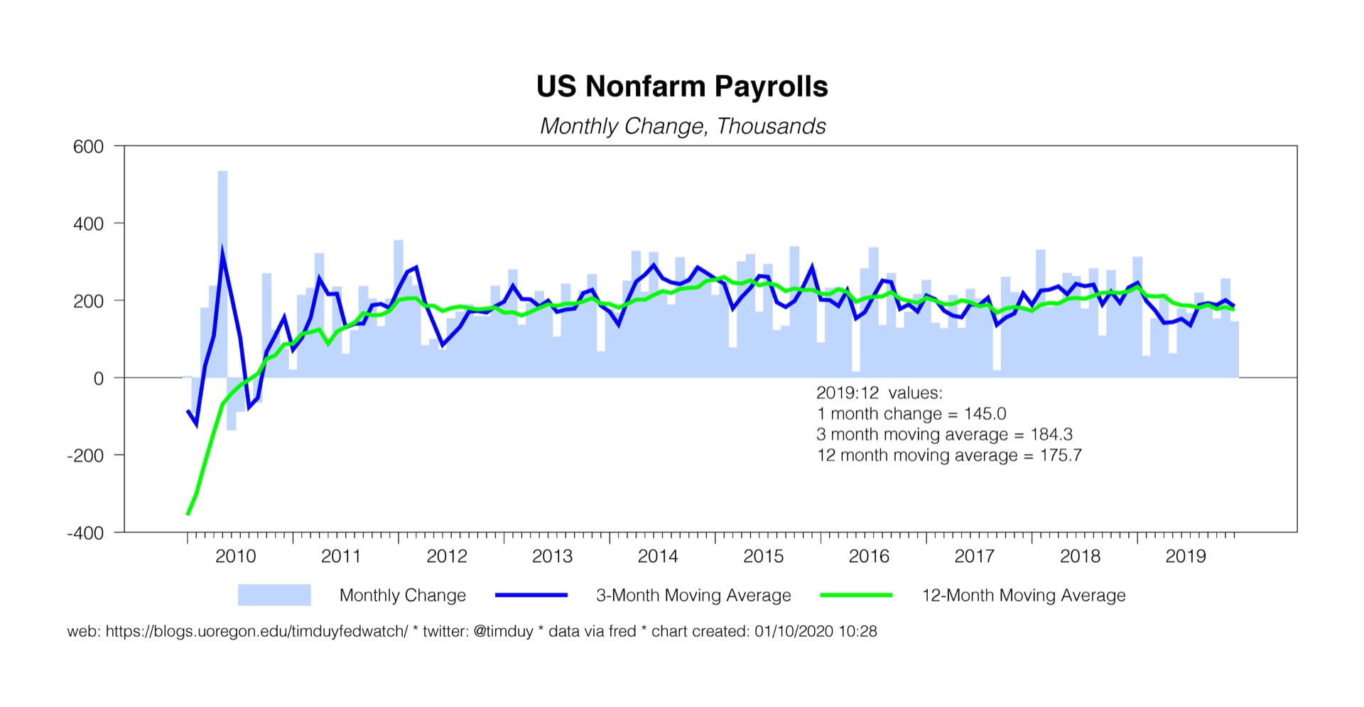
This, combined with solid job growth and low unemployment both supports the solid consumer confidence numbers we see and provides the basis for spending growth.

Second, remember that retail sales a.) only tell part of the consumer spending story and b.) unless you strip out gasoline sales, energy prices can hide underlining trends. Real person consumption expenditures provides a more comprehensive story of household spending:

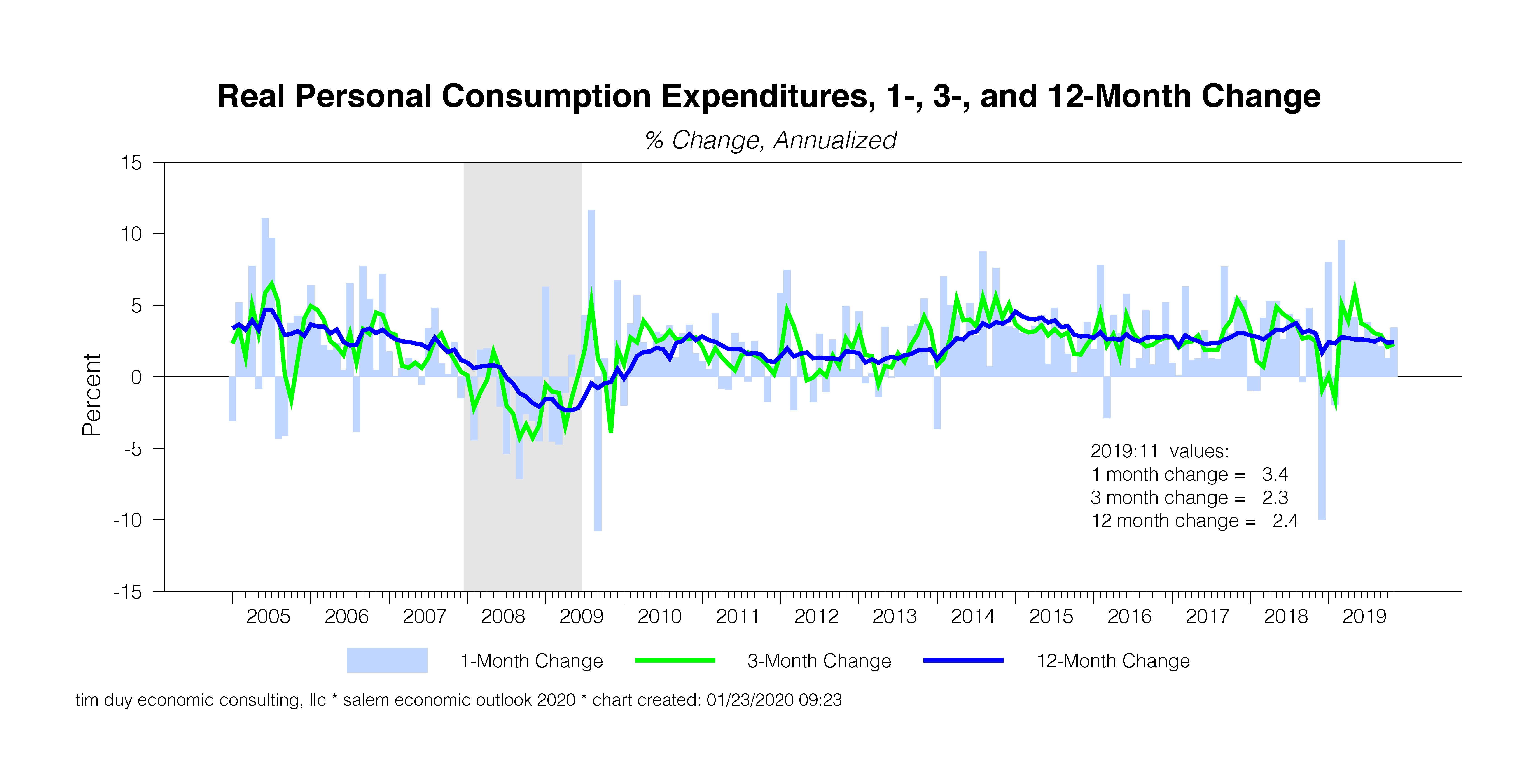
With the exception of some gyrations around in 2018, consumption growth has been stuck in the 2% to 3% range since 2016. For all the angst, the underlying pattern of spending has held fairly constant and arguably even a bit high relative to expectations that overall activity settles in close to 2% growth this year.

Third, if households were starved for income to support spending, we would expect the saving rate to be in decline. In fact, the opposite is that case:

The saving rate rebounded after the recession and has maintained an upward trend ever since.

Fourth, while consumers are often described as struggling under the burden of debt, household financial obligations dropped precipitously after the recession and remain near series lows:

Finally, any talk of consumer spending and recession can’t be separated from the housing rebound experienced this past year:

To be sure, warm weather boosted the December starts numbers, but by that time the reversal of the 2018 downdraft had already occurred. Moreover, homebuilder confidence numbers also confirm the strength of the rebound in the housing market. The housing rebound strikes at the core of the weak consumer story. Panicked consumers on weak financial footing are not going to be driving housing activity higher.

Quite frankly, the rebound in housing should have ended recession talk altogether. While a weak housing market does not always signal a recession (for example, see 1995), recessions are always preceded by housing downturns. Typically, housing starts peak around two years prior to the onset of recession. That means that if housing starts are still climbing, the likelihood of a recession in the upcoming two years is fairly small.

The reality of the situation is many ignore the fundamental strength and resilience of the U.S. economy and hence overestimate the probability of recession. Household are particularly resilient as once spending patterns are set they become very sticky. People don’t change their spending patterns absent a big shock to their income. The big negative shock is generally job loss, which means that a recession is likely to be what causes consumer spending to tank, not vice-versa.

Once you recognize that resilience, you realize why recessions are both rare events and hard if not virtually impossible to predict with any certainty. It takes a large shock to throw the economy into recession. A small shock to an increasingly small sector like manufacturing just lacks to the punch to make it happen.

Bottom Line: I know that it is easy to be seduced by the bearish warnings of market prognosticators. We seem to be hard-wired to be cautious, always worried that we are about to become prey. It is important to keep those fears in check. Years ago I quipped “As long as people have babies, capital depreciates, technology evolves, and tastes and preferences change, there is a powerful underlying (and under-appreciated) impetus for growth that is almost certain to reveal itself in any reasonably well-managed economy.” That lesson is too often forgotten.

Employment Report Keeps Fed On Track

If you were looking for something exciting out of this labor report, you were disappointed. Mostly it is is a continuation of recent trends that will encourage the Fed to retain their basic optimism while providing them no reason to change course. Probably most important for policy was the weak nominal wage growth. Absent an explosion in wage growth, it is hard to describe the labor market as overheated. At the same time, note that low inflation means that the labor market is generating real wage gains.

Nonfarm payrolls grew a notch below expectations at 145k:

Although previous months were revised downward slightly, the average monthly gains in the final quarter of the year were a solid 184k. Still, there is a modest downtrend in the annual pace of job growth that will be more evident after annual revisions. The unemployment rate held at 3.5% while wage growth softened:

Obviously, the Fed is watching wage growth for signs the economy is overheating. And here is Federal Reserve Chair Jerome Powell from December:

“The labor market is strong, I don’t know that it’s tight because you’re not seeing wage increases,” Powell said in response to a question from Yahoo Finance on Dec. 11. “Ultimately if it’s tight, that should be reflected in higher wage increases.”

Faster wage growth does not necessarily mean inflation will accelerate, but it it difficult to expect any sustained acceleration of inflation absent faster wage growth. In other words, it is tough to get too bent out of shape about some inflationary threat with nominal wage growth crawling along around 3%. And minimal inflation worries will leave the Fed on hold; there is simply to reason to think that they need to reverse last year’s rate cuts anytime soon.

All that said, I think it is important to push back on this idea:

The weak spot – and ongoing concern – was wage growth, up just 2.9 percent over the past year. Experts say wages would have to grow between 3.5 to 4 percent in order for workers to really feel an impact.

Accounting for low inflation, the tighter labor market is now generating real wages on par or better than the pre-Great Recession boom:

I point this out to suggest that we should beware of excessive pessimism. Tighter labor markets appear to be having the intended effect of improving real wage growth, which in turn helps support consumer confidence and spending growth. Yes, I know, everything is terrible and you can never say anything good about the economy. That attitude though would have led one to sit out a multi-year equity rally as some surely have.

Bottom Line: The employment report will keep the Fed on hold. As always avoid excessive pessimism.

Markets Looking For Another Solid Employment Report

Keeping the Fed on the sidelines means having enough positive data to keep their forecast near one consistent with trend growth but not enough positive data to make them think they need to reverse last year’s rate cuts. It’s hard to see the latter situation happening anytime soon with Federal Reserve Chairman Powell looking for either actual, significant inflation or a real risk of significant inflation before raising rates. Instead, incoming data looks to be closer to trend growth; the employment report is expected to conform with that outlook.

Last week, the ISM manufacturing index disappointed, stubbornly refusing to match the more optimistic PMI story. Manufacturing, however, is only a part – an increasingly smaller part – of the economy. A manufacturing recession no longer guarantees an economy-wide downturn, a lesson learned in 2015-16. As far as recessions are concerned, we should be on the lookout for economy-wide shocks that pull down the services sector along with manufacturing. So far though the services sector remains resislient as seen in this week’s ISM services report:

This kind of divergence is what we saw in 2015-2016; note the contrast with 2007-2009 when both measures move in virtual lockstep deep below 50. That’s what we would expect with an economy wide shock and aren’t seeing now.

I have been on this soapbox before, but I will get on it again: If the manufacturing cycle is less tied with the overall cycle than it has been in the past, a lot of analysis is going to be upended. We need to be very careful when telling economy-wide stories with the manufacturing data.

As far as the Fed is concerned, the softness in manufacturing and associate economic risks were enough to justify last year’s rate cuts. The resiliency of the rest of the economy prevents any further cuts. Friday’s employment report is expected to confirm that resiliency. Wall Street expects a Goldilocks report with nonfarm payrolls growing by 164k, unemployment holding steady at 3.5%, and wages up 3.1% over the past year. Those are numbers that the Fed will see as consistent with solid but not spectacular trend-like growth with no reason to believe the economy is overheating or will soon overheat.

Today’s ADP number surprised on the upside with a 202k gain in private employment and thus provides for the possibility of an upside surprise Friday. My payrolls estimate for the report is a tad higher than Wall Street at 188k:

Anything in that zone would be consistent with the Fed’s basic story. What about outside that zone? Realistically, the data is sufficiently noisy that no single data point would change the overall story. We should instead be looking for patterns of data that threaten to send unemployment higher to justify a rate cut. So a single weak report would likely not do that in any meaningful way; two or three consecutive weak reports would be more interesting.

Bottom Line: Fed on hold until the tenor of the data meaningfully shifts. 

The Dual Y-Axis Chart: Just Say No

I propose a finance-wide New Year’s resolution: Stop using dual y-axis charts. This won’t happen as the practice is a staple in the industry and one I admit to regretfully dabbling in myself. But it is time to stop or, at a minimum, start challenging the charts more aggressively.

For instance, recently a version of this chart crossed my Twitter feed:

It was captioned “Fundamentals.” The implication being that the rise in equites over the past year is disconnected from any economic fundamentals. This seems particularly evident in the last few months with the ISM number continuing to disappoint even as equities pushed to record highs.

These kinds of charts are at best naive and at worst deliberately misleading. If a financial advisor/analyst/newsletter writer puts such a chart in front of you, I recommend asking them to convert it to a scatter plot:

That alone should lead you to question the strength of any relationship, but the chart’s author could point out that there exists an obvious positive relationship. How tight is that relationship? Ask for a simple regression line:

Sure enough, there is an upward sloping relationship, but do you really want to base your investment decisions on an R-squared of 0.18? I wouldn’t.

Next, look for any outliers that may influence the results. A little eyeball econometrics will draw you to the points in the lower left-hand quadrant.  These are dates associated with recessions. That stock prices and the ISM data both tank during recessions should be a no-brainer. But we aren’t in recession. So what happens if we pull out the recession observations?

If we aren’t in recession, any relationship basically disappears. Are you going to make an investment decision on a relationship with an R-squared of 0.01? Because yes, that it exactly what the purveyor of the original chart is asking you to do.

Let’s step back a second and give the chart’s author the benefit of the doubt and keep the recession observations. Now ask the author to show the regression results in a bit more detail:

Now you say “sure, the coefficient on the ISM term is significant even if there is a lot of noise, but that residual plot and Durbin-Watson statistic sure look like a problem.” Right, that’s the autocorrelation in the data that the chart’s author isn’t accounting for. Let’s do that now with the quick fix of adding a lagged dependent variable to the regression equation. The results:

Now the ISM variable has no explanatory power. The explanatory power is eaten up by the lagged dependent variable. In this case, if equities are up 1% this month (in y-o-y terms), they will be up 0.94% next month.

That conclusion amounts one of the oldest rules: “The trend is your friend.” Of course, it’s not always your friend, but don’t assume that it won’t be on the basis of the dual y-axis chart. You should be asking for more. A lot more.

Finally, if the chart’s author won’t follow through with this kind of analysis (which they might not for obvious reasons), feel free to poke around and look for other times when the fundamentals and whatever don’t match up. Like this:

Now that is interesting – equities rising in 1995 even as ISM falls to cycle lows. Now some interesting questions emerge. Suppose you reasonably say that proves the point – equities took off on a rampage now commonly considered a bubble. Well then you still have two problems. First, the economy did rebound. Second, the equity rally lasted five years. So should you pull out now when you could have a five year rally ahead of you?

Alternatively, you can argue that maybe the economy in 2020 is rebounding like in the mid-90s and the Fed will pull off a soft-landing just like then. That could be the signal the stock market is sending. Is it a bubble? Well, I covered that last week. My quick answer is that the current rally is really overstated on a year-over-year basis because of the base effect from stocks tanking at the end of 2018. Also, in my opinion, the path of equities bears no resemblance to that of the late 1990s. 

Bottom Line: Just say “no” to the dual y-axis graph. Or at least push back on that chart hard, very hard. They are dangerous in the wrong hands.

Are Stocks Overvalued?

This past week I had an uncharacteristically snarky response to the latest entry in the “it’s all about QE” genre of market analysis:

Yes, my frustration with this line of reasoning – the supposed one-to-one linkage between the balance sheet and equities prices – got the better of me. My tweet prompted this response from Grant Thornton Chief Economist Diane Swonk:

I get  this; I see it as a deeper question than the QE-equity link. The analogy to the late 1990s is relevant given the similarities between Fed policy now and then. Is the rebound in stocks this year foreshadowing something ominous? Has the Fed set the stage for the next bubble? Below is how I think about these questions.

To start off, and in answer to the question that is the title of this post, I can’t tell you whether stocks are overvalued or not. I don’t really know, but it is not obvious to me that we should assume stocks are overvalued. The answer to that question assumes a known “true” model of valuation. But there appear to be many models and I agree with Ed Yardeni here – the answer depends upon your particular valuation model. Many of the models I see floating around suggest stocks are overvalued (but that is perhaps Twitter bias), but I tend toward Yardeni’s intuition that the appropriate model should recognize the impact of lower inflation and interest rates.

Yardeni’s preferred model said (as of November) that stocks were somewhat undervalued. That seems reasonable to me, but as I said before, I don’t know the “true” model. I think instead of a different question: “Is the path of equities substantially different from my expectations of that path during an economic expansion?” That depends of course on how I set my expectations. I tend to look at longer-term trends during the post-1984 period (the Great Moderation). Something like this:

Here I included a trend line derived from the beginnings of two rate hike cycles. From a qualitative perspective, the exact dating isn’t particularly important. You can eyeball the trend from 1987 to 1995 and extrapolate it out, or use the trend between roughly the beginning of the Great Moderation to the Great Recession.

I see two dominant features in this chart. The first is a clear acceleration in equity prices in the late 1990’s. I see nothing similar in today’s environment. This doesn’t surprise me as I think fears of financial excess are overplayed, effectively a case of fighting the last war. I also think the Japanese experiences is relevant here. Despite decades of ultra-low interest rates, nothing like the asset bubbles of the late 1980’s has reoccurred.

So, no, I don’t think the Fed has either created a bubble or necessarily set the stage for another bubble. To me, the dynamics don’t yet fit. Still, the operative word is “yet.” If stocks gain another 20% this year (unlikely in my opinion), I will obviously reassess this position.

The second feature I see is a level shift down in the value of equities after the Great Recession. I don’t think this will be corrected via some trend-reverting behavior of the series (it is not stationary around a trend). I think a better explanation is that there was a break in the trend for some fundamental reason such as secular stagnation. This suggests to me that a less optimistic view of the world has already been priced into equities. This I find interesting. I think the dominant view is the the trend path of equities should be flatter (?). To what extent has that view incorporated the possibility that a downward shift in the level of equities has already occurred?

Taking an alternative view, I also look at the path of equities after the Fed begins a rate hike cycle:

This view better highlights the 1987 run-up in equities though that ended more quickly than that of the late-1990s. As for the current cycle, the path of equities is pretty much exactly where I would expect in a continued expansion.

Zooming in on the more recent history does still tell a story:

To me, the obvious time that equities exceeded my expectations was late 2017/early 2018 (around day 600 here). Stocks subsequently reverted and then proceeded roughly in line with my expectations (maybe a little pricey) before sliding below my expectations late 2018. In my view, the behavior of equities this year is not an unexplainable deviation from fundamentals but an expected recovery from excessive pessimism. Is there excessive optimism now? Nothing dramatic relative to my expectations given the ongoing expansion.  That doesn’t rule out a correction, but absent a recession I would tend to view it only as noise around the trend.

(I do acknowledge the criticism that any similarity between my expectations and actual outcomes is attributable to dumb luck).

How does QE or, more generally, monetary policy fit into this story? To the extent that the Fed sets policy in a way designed to kill your recession call, it will support a general uptrend in equity prices over time because the economy remains in expansion. If the Fed commits a policy error or is unable to respond to a negative shock with sufficient speed and the economy tumbles into recession, I would expect equities to follow the economy down. With regards to the most recent months, I think the equity moves have more to do with a reduced risk of recession than repo-related balance sheet changes. 

Bottom Line: I don’t think you need to fall back on “it’s all QE” to explain the behavior of equities this past year or this cycle. It appears to me that the general path of equities is what should have been anticipated given continued expansion. To the extent the Fed is involved, it is because policy moves have sustained the economic expansion. It seems best to view the Fed as endogenous to the system not some conspiratorial exogenous factor.