
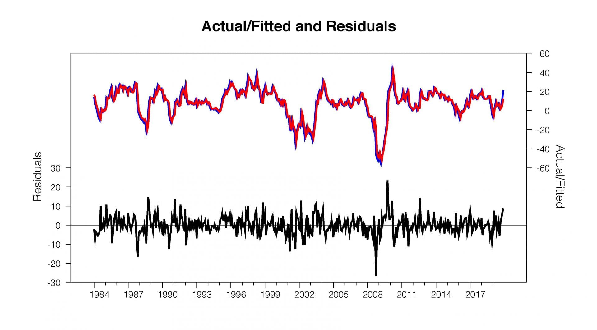
I propose a finance-wide New Year’s resolution: Stop using dual y-axis charts. This won’t happen as the practice is a staple in the industry and one I admit to regretfully dabbling in myself. But it is time to stop or, at a minimum, start challenging the charts more aggressively.
For instance, recently a version of this chart crossed my Twitter feed:
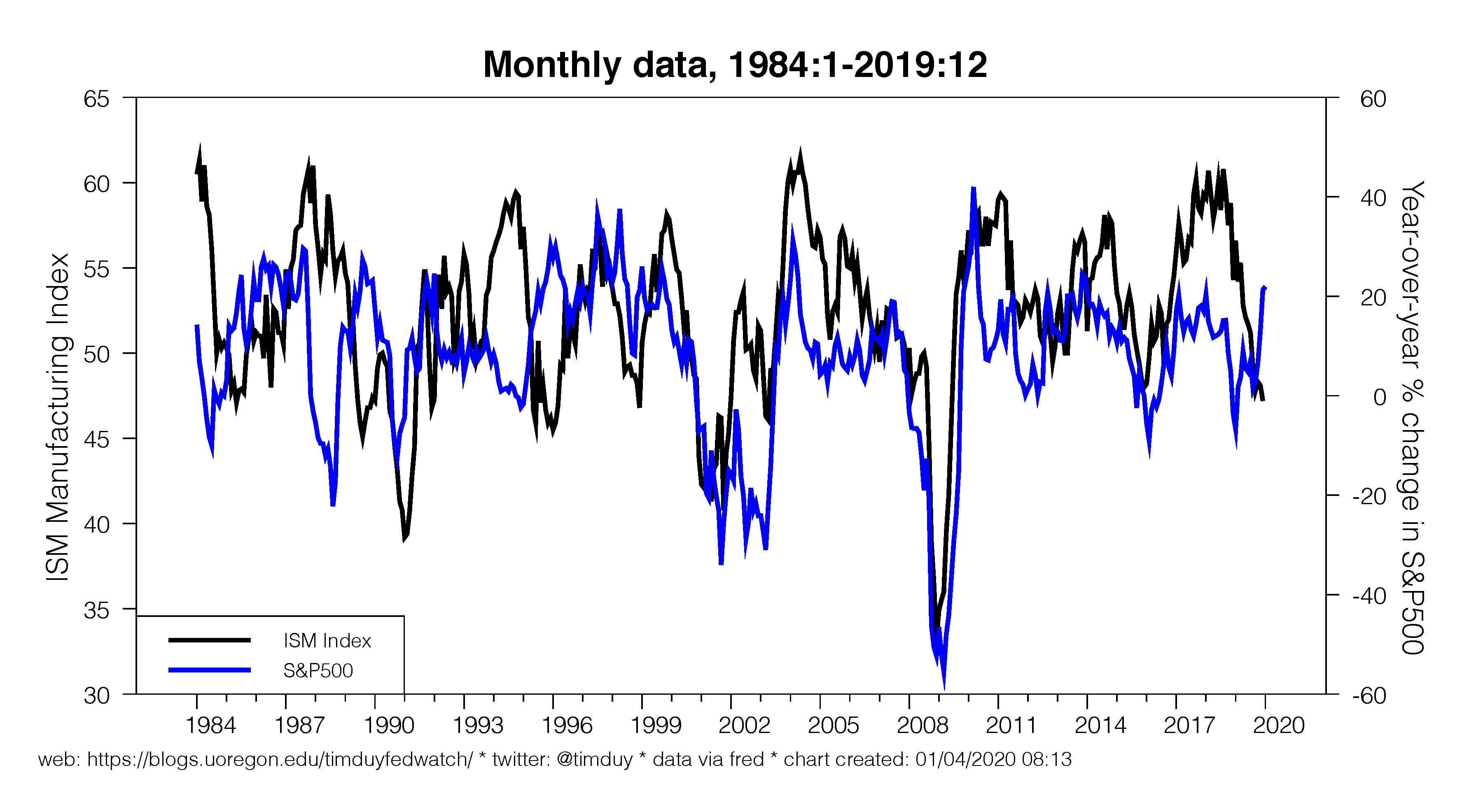
It was captioned “Fundamentals.” The implication being that the rise in equites over the past year is disconnected from any economic fundamentals. This seems particularly evident in the last few months with the ISM number continuing to disappoint even as equities pushed to record highs.
These kinds of charts are at best naive and at worst deliberately misleading. If a financial advisor/analyst/newsletter writer puts such a chart in front of you, I recommend asking them to convert it to a scatter plot:
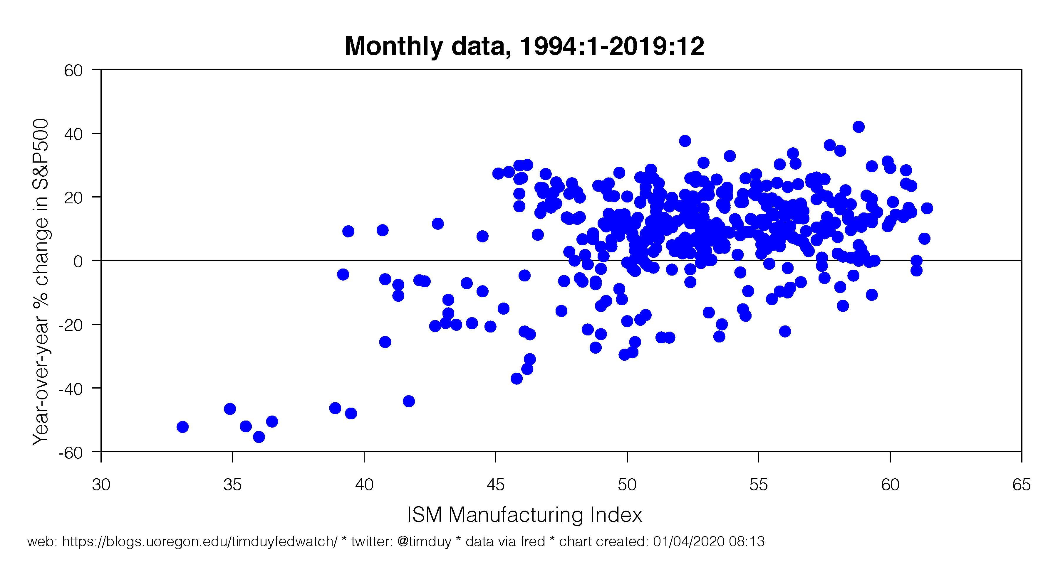
That alone should lead you to question the strength of any relationship, but the chart’s author could point out that there exists an obvious positive relationship. How tight is that relationship? Ask for a simple regression line:
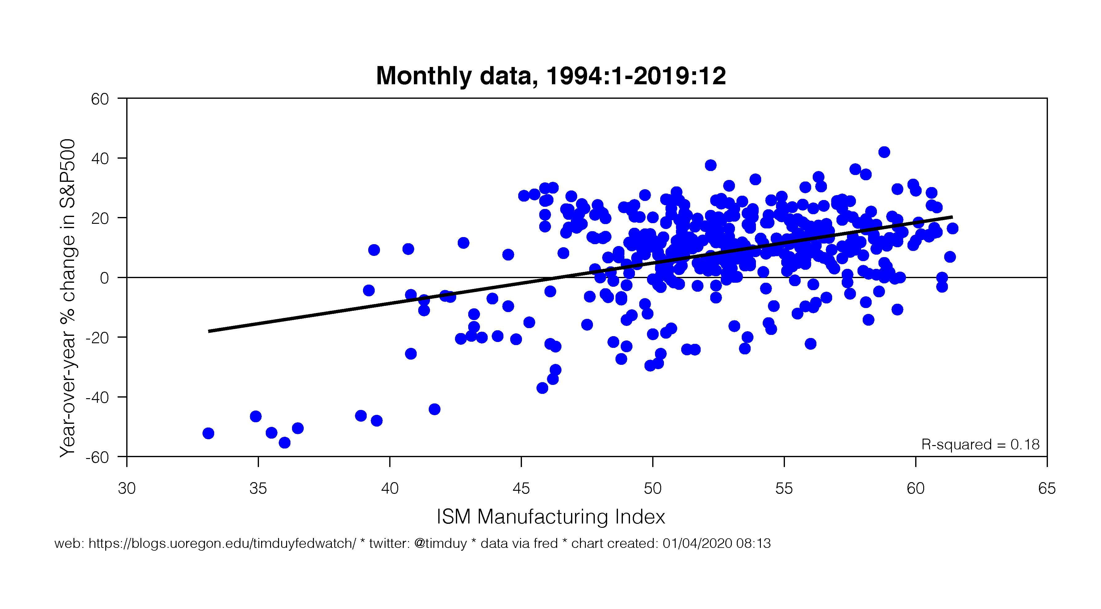 Sure enough, there is an upward sloping relationship, but do you really want to base your investment decisions on an R-squared of 0.18? I wouldn’t.
Next, look for any outliers that may influence the results. A little eyeball econometrics will draw you to the points in the lower left-hand quadrant. These are dates associated with recessions. That stock prices and the ISM data both tank during recessions should be a no-brainer. But we aren’t in recession. So what happens if we pull out the recession observations?
If we aren’t in recession, any relationship basically disappears. Are you going to make an investment decision on a relationship with an R-squared of 0.01? Because yes, that it exactly what the purveyor of the original chart is asking you to do.
Let’s step back a second and give the chart’s author the benefit of the doubt and keep the recession observations. Now ask the author to show the regression results in a bit more detail:

Now you say “sure, the coefficient on the ISM term is significant even if there is a lot of noise, but that residual plot and Durbin-Watson statistic sure look like a problem.” Right, that’s the autocorrelation in the data that the chart’s author isn’t accounting for. Let’s do that now with the quick fix of adding a lagged dependent variable to the regression equation. The results:

Now the ISM variable has no explanatory power. The explanatory power is eaten up by the lagged dependent variable. In this case, if equities are up 1% this month (in y-o-y terms), they will be up 0.94% next month.
That conclusion amounts one of the oldest rules: “The trend is your friend.” Of course, it’s not always your friend, but don’t assume that it won’t be on the basis of the dual y-axis chart. You should be asking for more. A lot more.
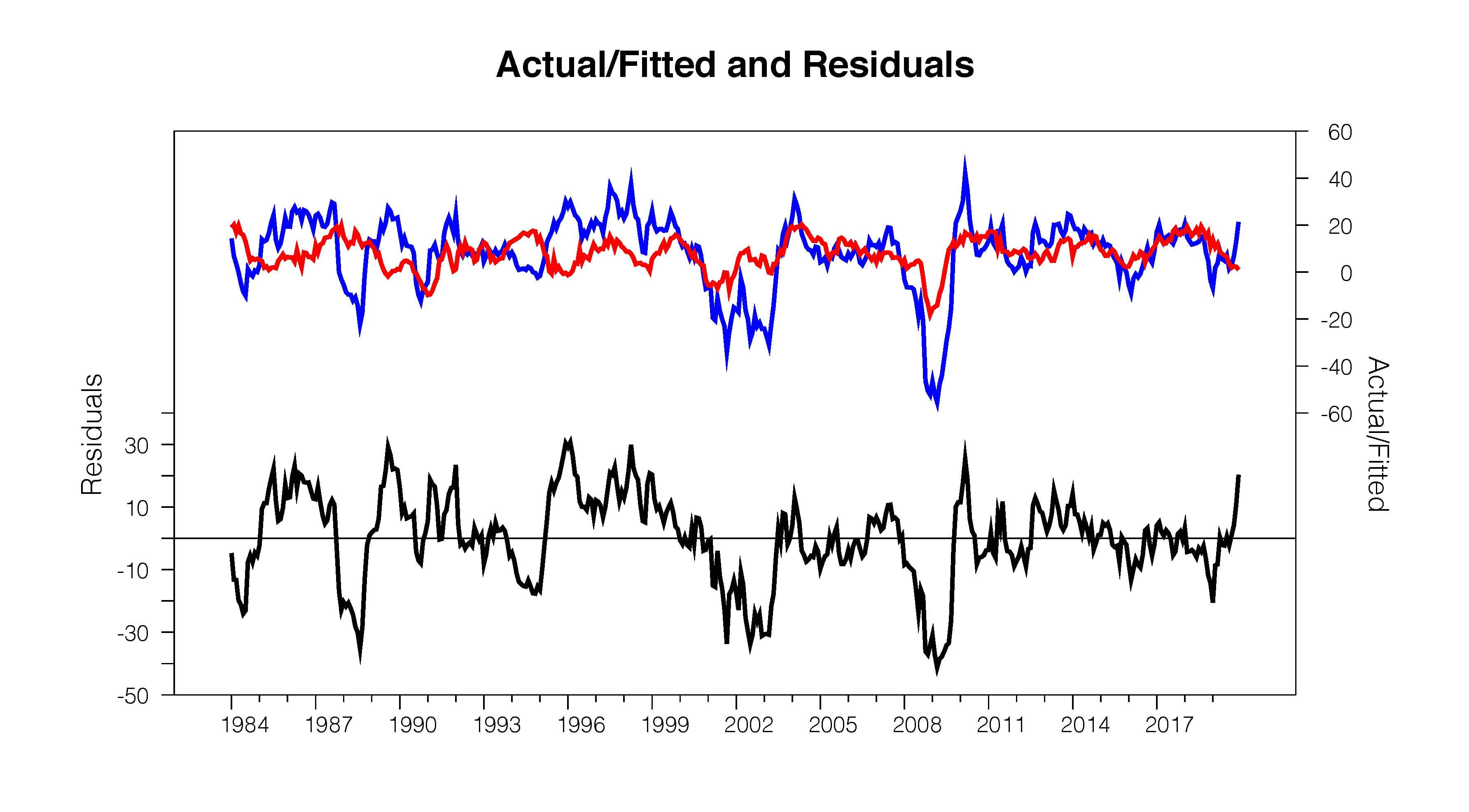
Finally, if the chart’s author won’t follow through with this kind of analysis (which they might not for obvious reasons), feel free to poke around and look for other times when the fundamentals and whatever don’t match up. Like this:

Now that is interesting – equities rising in 1995 even as ISM falls to cycle lows. Now some interesting questions emerge. Suppose you reasonably say that proves the point – equities took off on a rampage now commonly considered a bubble. Well then you still have two problems. First, the economy did rebound. Second, the equity rally lasted five years. So should you pull out now when you could have a five year rally ahead of you?
Alternatively, you can argue that maybe the economy in 2020 is rebounding like in the mid-90s and the Fed will pull off a soft-landing just like then. That could be the signal the stock market is sending. Is it a bubble? Well, I covered that last week. My quick answer is that the current rally is really overstated on a year-over-year basis because of the base effect from stocks tanking at the end of 2018. Also, in my opinion, the path of equities bears no resemblance to that of the late 1990s.
Bottom Line: Just say “no” to the dual y-axis graph. Or at least push back on that chart hard, very hard. They are dangerous in the wrong hands.