RSS Feed

November, 2012

  1. Transmedia Field Guide!

    November 28, 2012 by arichard@uoregon.edu

    AAD 550 Art In Society

    11/27/12

    I finished my Transmedia Field Guide. It’s called Best Show Ever: The Audience Experience of Live Music In Eugene Venues and Beyond. It can be found here! I had a blast making this site. It was a lot of work, but I loved every minute of it.

    Here is the description of this assignment.

    Part B: Field Guide based on provided template. Posted to your student learning portfolio with hotlinks and embedded media. This will be the “final project” for our course, and will need to exhibit the rigor of editing and construction associated with such things. The provided template breaks the field guide into sections (required), and you will populate these sections with examples, analysis, and references to outside sources as appropriate. Due November 28.

    TEMPLATE:

    Section 1: Introduction to art world/practice = a brief overview that provides key terms, definitions, and historical context

    Section 2: Setting = a description of the participants, community, and/or context for the subject introduced in Section 1

    Section 3: Transmediations = a narrated tour through a mininum of 7 (seven) transmedia resources that you used to map your subject

    Section 4: Analysis = a critical discussion of the art world/practice under investigation that draws on course materials/texts, themes and issues from course discussions, and any relevant outside sources


  2. Transmedia Field Guide Slide

    November 28, 2012 by arichard@uoregon.edu

    AAD 550 Art In Society

    11/27/12

    This is Part C of my Transmedia Field Guide. This PowerPoint slide is a brief summation of my entire Transmedia Field Guide, which is a WordPress site devoted to the investigation of the audience’s experience at a live concert, in Eugene, OR and beyond.

    Assignment Description:

    Part C: One (1) powerpoint/presentation slide along with 5 minute presentation to class.. This slide should consist of an image representing your field guide’s subject matter and no more than three bulleted text bits. We will post these together as a gallery on the course site after the presentations. Due by November 26.


  3. PowerPoint Topic and Flow Chart

    November 13, 2012 by arichard@uoregon.edu

    Assignment Description: Students will use Microsoft  Word SmartArt Graphics option too create a flow chart of their Powerpoint presentation. The purpose is to introduce and work with Information Architecture and create a hierarchy of flow of content to be contained in the Powerpoint presentation. It is recommended that the Powerpoint presentation topic be the Prototype shell of the students’ Winter term professional ePortfolio website they will produce. Students have the option to choose a different presentation topic. Examples and specifications of both are shown. The Powerpoint piece is one of three presented at Finals.

    Reflection: I am going to do my PPT on my Transmedia Field Guide for Art In Society. The Field Guide will be a WordPress blog that looks at Eugene’s music venues and the ways a venue can encourage or hinder a participatory and/or meaningful concert-going experience. The flow chart below shows eleven sections of information which will be the eleven pages of my Field Guide, and will also be slides in my final PPT presentation. It’s a bit odd to have drop-downs for only one page, but it suits my purpose and should be easily navigable.

    Flow Chart PDF


  4. Event Poster

    November 8, 2012 by arichard@uoregon.edu

    Assignment Description:

    Students are introduced to poster history, and the utility and design of posters in the arts, politics, social agenda, and other genres. Students will create an event poster for their midterm. One of the primary challenges in Event Poster design is working with applying content in a larger space/format. The expectation is to work with a common poster design size of 11×17. Issues of working with images, artwork, typography, and other design elements will be addressed. Use the Diigo and blog resources to look at samples, case studies to attend to these design considerations.

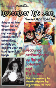
    I had a couple bothersome issues in making my poster, so it’s not perfectly, exactly as I wanted it. But it’s pretty close. I free transformed the background watercolor-looking picture to make it cover the whole 11″ x 17″ page, but initially the colors were so bright and inconsistent that it was really difficult to read all the type. So, I lightened up the background using the good old transparency option, which went a long way towards making it more readable. I also experimented with the placement of the text and pictures quite a bit, and I think I managed to create a fairly good balance of info and great, bold colors and images. The one thing that did end up eluding me was how to add the logo in without a white box. I couldn’t figure it out, so for now, I’ve just used the name “the Venue” in the correct typeface, and will add the brush later when I get some help.

    Event Poster


  5. Collateral Drafts

    November 6, 2012 by arichard@uoregon.edu

    Assignment Description:

    Students will apply their logo in common collateral materials that will be included in their Graphic Standards assignment. Along with lecture, handouts and resource links describing and modeling organization graphic standards are provided. Past cohort examples are made available for reference to clarify both collateral material development, specifications and production, as well as specific criteria for producing the graphic standards assignment.

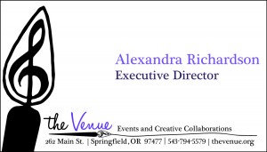
    I found that it was difficult to pick one theme and stick with it, because one large, graphic element does not necessarily translate to all three pieces of envelope, letterhead, and business card. So, I chose to use the brush tip from my logo for the card, and the 15% transparent treble clef for the other two pieces. I think there are still enough repeating elements to make the pieces look like they belong together…at least that’s my hope! The most difficult thing was creating the brush stroke line between the byline “Events and Creative Collaborations” and the address and other info. The stroke isn’t identical between the three, but I kind of like that. Here are the jpgs, with PDF links as well.

    Business Card:

    Business Card PDF

    Letterhead:

    Letterhead PDF

    Envelope:

    Envelope PDF


  6. Display Ad

    November 1, 2012 by arichard@uoregon.edu

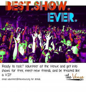
    Here is a call for volunteers for Springfield’s new community music and art center, the Venue!

    Note: the first image is the original, how I intended it to look. The second was a mistake–I tried to save from a .tif into a .jpg, and something about doing that altered the color. While it was an accident, I kinda like it. Which do you like best?


Skip to toolbar