ArtCity Case Study & SWOC Analysis

final-pdf-merge-page-022ARTCITY

A Case Study and SWOC Analysis

Victoria Lee | Arts Marketing, Media, and Communications | Fall 2016

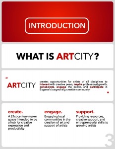
ArtCity is an art-driven and artist-serving startup in Eugene, Oregon. The organization seeks to generate “opportunities for artists of all disciplines to interact with creative peers, inspire professional growth, collaborate, engage the public, and participate in Eugene’s burgeoning creative community.” (ArtCity, 2016). The project was initiated in early 2016 by founder and local artist, Charly Swing. The organization is currently in its initial development phases. Some of what follows is based on expectations as large facets of the company (participant base, location, service) have yet to be fully developed. Expectations are grounded in assessing the current state of ArtCity and Swing’s vision its future.

ECONOMIC SCAN

Economic factors affecting an organization are numerous and form complex webs of interrelations. Here, these are broken down into several broad, primary categories. The economic scan considers income (earned, contributed, and government); present financial state, as there is no past to consider; and the general economic climate for arts organizations.

ArtCity currently has no significant source of income as the organization mostly exists within a state of ideation. Early-stage event programming consisting of “Drink & Draws” have been hosted, which encompass the entirety of earned income sources. Funds are raised by participant donation. Donations are also accepted through an online portal. Contributed, or in-kind, income makes up the largest portion of ArtCity’s resources. For example, space and art supplies for the Drink & Draw events were donated to the organization while marketing and branding development is being obtained through University of Oregon graduate student input. At this time, there is no source of government funding.

Following from the general overview of income sources, ArtCity does not have a notable present financial state. As far is what is apparent, costs and revenue exist essentially only nominally. There is no location, professional staff, marketing strategy, or programming to constitute expenditure and, similarly, no products or services to generate funds.

The general economic landscape for arts remains characterized by underfunding. The federal government has developed a notorious reputation for allocating only a small portion of non-defense spending to arts agencies, the groups that would likely fund a project like ArtCity. A 2016 study from Americans for the Arts reports that federal funding has fallen $19.5 million dollars to $148 million ($0.46 per capita) in the past six years. State funding has similarly decreased by $101.2 million over a 15 year period. In contrast, funding to local arts agencies has shown a consecutive five years of increase, rising $57.1 million in just the past year. This could mean both good and bad news for ArtCity. As a small startup, initial support is likely to come from the community and local arts agencies. However, as an organization with a vision for national expansion, the focus on only local agencies may prove problematic down the line.


DEMOGRAPHIC SCAN

The demographics of the greater Eugene area play a large role in defining ArtCity’s context. According to the United States Census Bureau (2015), Lane County is home to approximately 363,000 people, roughly half of which are female. The largest racial demographic is, by far, Caucasian (89.8%). 91.1% of the population has a high school degree with 28.2% having a bachelor’s or higher. The per capita income is quite low at only $24,720 with 18.4% of the population living in poverty.

Income might perhaps be the greatest demographic influence. For a membership fee ArtCity offers space and services that may be seen as essential. The organization targets artists who need help in reaching professional status. As such, this target audience is not likely to have a large disposable income as they aren’t in developed careers. Because Lane County already has such a low per capita income and artists, outside of architects, are often among the lowest paid in the U.S. workforce, ArtCity might struggle in reaching their demographic.

In a 2015 National Endowment for the Arts (2015) study, Oregon saw a higher level of arts participation in all fields considered the national average (see Table 1). Perhaps most significantly, Oregon had the third highest rate of adults actively engaged in creating artworks, only falling short to neighboring states, Washington and Idaho. This suggests that there may be a suitable economic base for ArtCity given its physical context.

Because the organization is new, there is no information regarding user demographics. Swing seeks to fill a gap in resources between those offered in art school and a lack thereof as artists enter the professional world. If intent matches actual function, participants are likely to be of 25+ age. According to the NEA (Vartanian, 2011), artists are most likely to be domestic and caucasian, which matches the composition of Lane County.

TABLE 1: A​rts Participation in Oregon

Type of Art Engagement

Oregon Rate of Participation (%)

National Average Rate of Participation (%)

Attend Visual, Performing Arts, or Movie Events

73.3

66.2

Attend Live Music, Theater, or Dance Performances

36.3

31.6

Attend Art Exhibits

27.2

18.7

Go to Movies

64.6

58.4

2

Visit Buildings, Neighborhoods, Parks, or other Sites for Historic/Design Value

36.6

27.4

Read Literature

59.5

43.1

Personally Perform or Create Artworks

59.9

45.1

State by State Estimates of Art Participation Rates (2012-2015) – arts.gov

CULTURAL SCAN

The general culture of the Board is collaborative. Because the organization is so new, the group of starting employees often wear many hats. They work on the basis of joint partnership and support throughout the organization, coming together to develop new programming and strategies.

The culture of the surrounding area is generally seen as arts-forward. Eugene is home to a thriving university community and many galleries, theaters, concert halls, independent artists, etc. As such, they are at the heart of a society that already has the framework in place to lend a participatory aspect to ArtCity. The organization also addresses a widespread cultural need of support for artists. In a time of decreasing funding and resources, ArtCity taps into a cultural landscape that is lacking in support. In this sense, they have the potential to be quite culturally relevant.

As a potential cultural detriment, arts participation in the U.S. does not occupy a significant portion of the nation’s time. In 2013, arts only contributed $40 million1 of the $2.5 trillion entertainment and leisure market. Arts are losing user-time to digital interfaces and consumer activities including electronics, television, social media, and video streaming (RKMA, 2016). ArtCity does not yet seem to be doing much to integrate the trend toward the digital. Their projected program base is largely analog involving the traditional arts and workshops. While Eugene may have a higher ratio of traditional artists than some other small cities, a company that is not tech-forward is in opposition to large-scale cultural trends.

The nonprofit arts sector contributes a greater sum but this is not considered part of the cultural context as ArtCity is a for-profit initiative.


SWOC ANALYSIS

Strengths

Weaknesses

Opportunities

Challenges

Cultural Products

– Developing a community of creativity, collaboration, and culture

– Addressing a need for shared workspace and professional development

– May not be applicable to all audiences
– Under- developed programming

– Lack of community engagement -Merging an artisan culture with “fine art”

– Creating a new artistic identity in Eugene
– Providing mentorship and development for new artist

– Making products accessible to a broad base of the community – Making products relevant in an area with other access to the arts

Pricing

– The only program thus far has been donation based (accessible to everyone)

– Memberships could be cost prohibitive

– Engaging in partnerships (in-kind contributions) to keep costs low

-Low cost of living compared to most artistic communities

– Identifying competitive pricing
– Generating a profit with something that may be seen as unessential

Place (Access)2

– If location is downtown, there will be a need.

– Expense
– If location is not downtown or easily reached by public transit

– Common meeting ground for collaboration and critique
– Meeting place between San Francisco and Seattle

– Eugene is a somewhat isolated area
– Smaller population than most artistic hubs

Promotional Efforts

– Engaging in partnerships to increase publicity

– Highly underdeveloped web presence
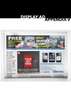
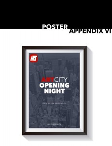
– Ineffective branding and promotional materials

– Collaboration with graphic/web designers

– Creating the desired aesthetic/percep tion of ArtCity through visuals

 No place or location exists for ArtCity. This section is based on a hypothetical situation.


REFERENCES

ArtCity. (2016). About us. Retrieved from ​http://www.artcityeugene.com.​

National Endowment for the Arts. (2015). [Map book: state by state estimates of art participation rates (2012-2015)]. ​Survey of Public Participation in the Arts. Retrieved from https://www.arts.gov/sites/default/files/map-book-sept-rev3-sept2016.pdf.

RKMA. (2016). The U.S. leisure market. ​Leisure business market research handbook. Retrieved from ​http://www.rkma.com/2015leisuresample.pdf.​

United States Census Bureau. (2015). Quick facts: Lane County, Oregon. Retrieved from http://www.census.gov/quickfacts/table/PST045215/41039

Vartanian, H. (2011). What does the U.S. arts community look like? The NEA sheds some light. Hyperallergic. Retrieved from ​http://hyperallergic.com/39376/nea-study-of-artist-wages/.​

5

Lexicon 6

SOCIAL PROPRIOCEPTION

Social Proprioception is our awareness of ourselves or our positions in relation to a larger social context. (I think). With a greater emergence and use of social media technologies we see a blurring of the lines between our personal and public lives. As a society, we have perhaps never been quite so aware of our social position and the lives of others. We are hyperaware of the lives and positions of everyone around us.

FEEDBACK LOOP

In a feedback loop, a system is used circularly. Either a part of or the entire output in a chain is then used to reenter the input stage, which then creates small changes that ripple throughout to output where the process begins again. In this situation you have a constant stream of feedback and reiteration.

DISSONANCE

Dissonance refers to the state of things not matching, a lack of cohesion, or incongruous notes. On a social level, technology creates dissonance in our identities. Who we are an who we project ourselves to be often do not aline. This creates a dissonance in our understanding of both ourselves and who our friends, aquantances, and contemporaries are.

COMPRESSION

Within the context of technology, compression make sme think of two things: the compression of data and the compression of our lives. In the former, processing power allows massive amounts of data to be compressed into tiny bits of very accessible information completely changing the way we think about and engage with the world. In teh compression of our lives, technology and social media is, in some sense, a limiting form of expression. Complex emotions are compressed into 140 characters.

GRAPHIC STANDARDS

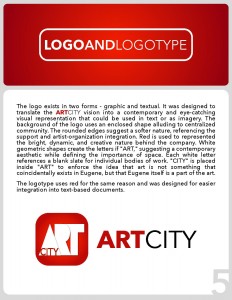
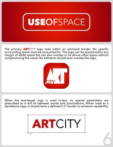
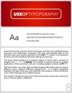
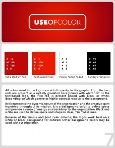
Graphic standards are the rules surrounding a brand’s logo and graphic presence. It includes standards for how the logo is to be used, colors, fonts, required margins, types of acceptable applications, etc. These are used to allow for consistency and cohesion throughout the entire brand regardless to whom is doing the application.

Lexicon 5

STRATEGIC PLANNING

Creating a developed and well-thought out method to achieve a goal. This involves understanding the nature of the objectives, the various contexts affecting it, and variables, trajectories, or obstacles likely to be seen. In the realm of marketing this might mean having a long term vision for a brand or social impression of a company and developing a method to achieve it.

CUSTOMER RELATIONSHIP MANAGEMENT

By managing customers’ relationships to the organization, the company can better understand customers’ motivations, needs, dislikes, and uses. By having a better understanding of the customer, the organization can target more specific programs or marketing while gaining a better understanding of their context as a business. Empathizing with customers whether through qualitative or quantitative data allows for benefits of the relationship to be maximized.

SOCIAL IMPACT/CONSEQUENCE

New technologies often irrevocably change the social landscape. The ways in which we communicate, think, and understand the world and ourselves goes through a number of iterations as new forms of media are developed. Understanding the social implications is a grey area because we are in the heart of rapid change.

NARCISSISM

It is sometimes thought that the widespread emergence of social media technologies lead to a narcissistic generation; one determined to share all aspects of their lives with the mindset that there will always be an audience that cares

Lexicon 3

SIGNATURE

A signature is a printing template of sorts that can come in a number of iterations from four page print jobs to 32 page prints. Signatures allow printing on both sides of the same sheet, to be folded in pamphlets, brochures, or booklets. This is a useful tool for planning ahead and maximizing budget as it allows for multiple pages to be printed with one ink set up and paper stock.

HICKEY PICKER

Hickeys are pieces of detritus stuck to the printing template. This could be bits of fiber, paper, dust, etc. that would compromise the quality of a print job. A hickey picker is a tool used to remove hickeys. A hickey picker roller is another tool to maximize efficiency in removing hickeys.

DPI

DPI stands for dots per inch. This is a term that refers to resolution in print as PPI (pixels per inch) refers to on-screen resolution. DPI specifies the number of ink dots a printer is capable of placing within a one square-inch space. A higher DPI will result in a higher quality, more clearly defined project.

BLEED

Bleed refers to a document that has been printed with no white space in the margins. The digital format of the graphic extends beyond the margins. When printed, a larger sheet of paper is used, and the edges are trimmed down. These allows for seamless printing to the very edges of a page.

ArtCity Narrative

ART CITY EUGENE

1. HISTORY

ArtCity is a new artist-driven makers’ space start-up based on Eugene, Oregon. The organization was founded in 2016 by Charly Swing and is still in the development stages. Swing has been a professionally practicing artists since the completion of her studies at the New York Academy of Art in Manhattan. Upon graduation, she realized a gap of resources in the community. Going from the full and unmatched resources of a university to being on her own inspired her to develop a space dedicated to supporting the efforts of local artists. The space is intended to be a dynamic platform for creatives to focus on professional development, collaboration, and the continuation of their craft.

2. THE PRODUCT

While ArtCity may offer merchandize or sell its members works, the product is primarily a service. According to the founder, identified serviceable goals are, “to establish a dynamic studio community in Eugene that offers professional growth for creatives, help artists establish sustainable and thriving careers, and stimulate a cultural vibrancy that encourages local economic growth.” The company seeks to be a multidisciplinary hub for creatives on the West Coast. Services will include workshops (both creative and professionally orientated), classes, and events like paint and sips open to the community.

3. COMPANY CULTURE

The organization is still it its start-up phase which is seen in its culture. With a small staff and no brick-and-mortar location the culture is one of focus, energy, and hard work. Employees wear many hats and are expected to take on tasks outside of their experience and comfort zone, such as developing a website or social media platform.

4. TARGETED AUDIENCE

ArtCity is intended to target any and all creatives. While based in Eugene, the organization does not wish to only cater to a local audience. Their sights are set on being a well-known cultural hub along the western border.

5. TAGLINE

There currently is no tagline for ArtCity. Core values include culture, economy, and community while the mission proclaims, “ArtCity creates opportunities for artists of all disciplines to interact with creative peers, inspire professional growth, collaborate, engage the public, and participate in Eugene’s burgeoning creative community.”

Lexicon 4

DISTRIBUTED COGNITION AND COLLABORATIVE INTELLIGENCE

Learning is not isolated to an individual. Our knowledge is a collective process that is ingrained across individuals, tools, media, and other resources. In this sense, the mind is an extension of the individual and knowledge exists relative to its surroundings. The collaborative nature of intelligence suggests that intellect is multiplied by the presence of others. When intelligence is distributed across a group in a collaborative format agents come together to augment the ideas of the individual.

INFORMAL LEARNING

This suggests the implicit education we are obtaining at all times outside of traditional structures like schools, lectures, textbooks, museums, etc. Informal learning is an impromptu experience that can be stimulated by any number of factors such as learning social cues by being operating within society, interpreting body language, and processing consequences of different actions.

WHITE SPACE

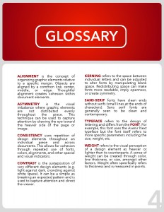
White space is characterized by the lack of graphic presence in a particular part of a project. This can be a powerful tool in creating contrast. What is present on the page immediately draws attention by nature of is stark opposition to the white space.

FOCAL POINT

Focal points are the main area of interest in an image. They are where the eye is immediately drawn. In the image above, the focal point would be the car as it captures attention first. Focal points can be created through centering, color contrast, white space, and other techniques.

Lexicon 2

C.R.A.P.

Contrast. Repetition. Alignment. Proximity. These are the primary four essential principles at the heart of the graphic design toolbox.

Contrast allows certain aspects to stand out because of their sheer difference to the rest of the composition. Contrast can, but does not have to, imply color.  It also entail contrasting white space in a realm of busy design or using bold font in a paragraph of a lighter weight. Differences naturally catch the eye and capture attention. This is a great way to direct perception or highlight something of particular importance.

Repetition is used by having the same elements (color, alignment, font) show up multiple times. This is a tool to introduce cohesion and unification to a composition. It can tie an individual piece together, define a relationship between multiple pieces, and, on a larger scale, created synonymity within a brand.

Alignment refers to actual layout on the page. By keeping certain elements in line with each other a certain harmony rises from a clean look. Without proper alignment, a page will look amateurish and haphazardly thrown together.

Proximity uses spatial relationships to convey a message. Elements that are grouped together will implicitly tell the viewer that these topics belong to the same category. It allows captions and subtitles to make sense and apply to the correct heading. Proximity can also serve aesthetic purposes by using space to evoke emotional reactions like chaos or calm.

VECTOR

In the design world, vector is a type of image. Instead of using the individual pixels of a raster graphic, vector works with paths. An image is created of points held in a particular shape through a mathematical ratios. Shape is retained by relationships, but by lined up pixels. This allows an image’s size to be manipulated without compromising crisp quality. The ratios stay the same regardless to enlargement, so lines will always be clean and never pixelated.

RASTERIZE

To rasterize an image is to convert it from a vector format into it’s individual components. This compromises quality but is a useful tool for specific manipulations like using an eraser tool. Rasterizing allows for individual brushstrokes with is useful in manipulating images in Photoshop (or similar programs) or for creating digital paintings.

OPACITY

Opacity is the level of transparency of an object. The more transparent an image is, the more the background will be able to show through. Transparency can be a great way to overlay text on image. Using an opaque color background provides contrast for the text to stand out while not entirely compromising the image.

Lexicon 1

Type/Typography as Design

Typography is a type of art related specifically to creating and arranging letter forms. As an aspect of design, typography has significant implications on human perception. For example, bold or heavy-weighted typefaces can suggest power or strength while ones employing light cursive might suggest delicacy. Types are composed of a number of different traits (size, leading, kerning, etc.) that affect the various anatomy of letters. I think typography is particularly important as it is the form of presentation in all written communication; often the first thing someone will see when engaging with a company. It is a method for both creating an appealing aesthetic and for implicitly communicating a message about the image or brand with which the company is trying to present itself.

Typography can be traced back to ancient Greece with the first use of a letterpress of sorts. Known as the phiastos disk, characters were carved into a metal tool used to recreate and imprint them on other materials. These can be considered the first typefaces in that they were a set style that could be reproduced.

Balance

In this context, balance, to me, balance is about understanding the median between often opposing demands. There should be a balance between complicated/crowded graphics and too simplistic, between taking advantage of trends and being novel, between the company’s wishes and your own, or between the literal and the interpretive. Balance can also mean visual balance within the frame. Are images centered? Is there more going on in one particular side of the image?

Intangibles

Intangibles represents intangible design mediums like creating user or visitor experiences. In the realm of arts management this is exceedingly important as a significant portion of the industry involves visitors engaging with a brick and mortar space, such as theatres, museums, classrooms, or hospitals. By taking a human-centered and empathy-based approach to design solutions we are able to create spaces that better answer users’ implicit needs. User experience is about enhancing the ease, accessibility and positivity of a person’s interaction with a service or product. This could take the form of designing educational models, using acoustics or lighting to make a space more inviting, or even by manipulating customer service to better suit user needs.

Flexibility

Flexibility could be related to the role of the design or marketing team. There might be conflicts between the vision of the designer and various constraints like the client’s wishes, budget, or time-frame. It is important to remain flexible in projects to adapt to these various as they rise. Often design involves prototyping and first drafts rarely make it to the final cut. Designers should be flexible in their attachment to various designs and understand that they will likely need to be changed or adapted to fit within different frameworks.