Lexicon 2

C.R.A.P.

Contrast. Repetition. Alignment. Proximity. These are the primary four essential principles at the heart of the graphic design toolbox.

Contrast allows certain aspects to stand out because of their sheer difference to the rest of the composition. Contrast can, but does not have to, imply color.  It also entail contrasting white space in a realm of busy design or using bold font in a paragraph of a lighter weight. Differences naturally catch the eye and capture attention. This is a great way to direct perception or highlight something of particular importance.

Repetition is used by having the same elements (color, alignment, font) show up multiple times. This is a tool to introduce cohesion and unification to a composition. It can tie an individual piece together, define a relationship between multiple pieces, and, on a larger scale, created synonymity within a brand.

Alignment refers to actual layout on the page. By keeping certain elements in line with each other a certain harmony rises from a clean look. Without proper alignment, a page will look amateurish and haphazardly thrown together.

Proximity uses spatial relationships to convey a message. Elements that are grouped together will implicitly tell the viewer that these topics belong to the same category. It allows captions and subtitles to make sense and apply to the correct heading. Proximity can also serve aesthetic purposes by using space to evoke emotional reactions like chaos or calm.

VECTOR

In the design world, vector is a type of image. Instead of using the individual pixels of a raster graphic, vector works with paths. An image is created of points held in a particular shape through a mathematical ratios. Shape is retained by relationships, but by lined up pixels. This allows an image’s size to be manipulated without compromising crisp quality. The ratios stay the same regardless to enlargement, so lines will always be clean and never pixelated.

RASTERIZE

To rasterize an image is to convert it from a vector format into it’s individual components. This compromises quality but is a useful tool for specific manipulations like using an eraser tool. Rasterizing allows for individual brushstrokes with is useful in manipulating images in Photoshop (or similar programs) or for creating digital paintings.

OPACITY

Opacity is the level of transparency of an object. The more transparent an image is, the more the background will be able to show through. Transparency can be a great way to overlay text on image. Using an opaque color background provides contrast for the text to stand out while not entirely compromising the image.

Lexicon 1

Type/Typography as Design

Typography is a type of art related specifically to creating and arranging letter forms. As an aspect of design, typography has significant implications on human perception. For example, bold or heavy-weighted typefaces can suggest power or strength while ones employing light cursive might suggest delicacy. Types are composed of a number of different traits (size, leading, kerning, etc.) that affect the various anatomy of letters. I think typography is particularly important as it is the form of presentation in all written communication; often the first thing someone will see when engaging with a company. It is a method for both creating an appealing aesthetic and for implicitly communicating a message about the image or brand with which the company is trying to present itself.

Typography can be traced back to ancient Greece with the first use of a letterpress of sorts. Known as the phiastos disk, characters were carved into a metal tool used to recreate and imprint them on other materials. These can be considered the first typefaces in that they were a set style that could be reproduced.

Balance

In this context, balance, to me, balance is about understanding the median between often opposing demands. There should be a balance between complicated/crowded graphics and too simplistic, between taking advantage of trends and being novel, between the company’s wishes and your own, or between the literal and the interpretive. Balance can also mean visual balance within the frame. Are images centered? Is there more going on in one particular side of the image?

Intangibles

Intangibles represents intangible design mediums like creating user or visitor experiences. In the realm of arts management this is exceedingly important as a significant portion of the industry involves visitors engaging with a brick and mortar space, such as theatres, museums, classrooms, or hospitals. By taking a human-centered and empathy-based approach to design solutions we are able to create spaces that better answer users’ implicit needs. User experience is about enhancing the ease, accessibility and positivity of a person’s interaction with a service or product. This could take the form of designing educational models, using acoustics or lighting to make a space more inviting, or even by manipulating customer service to better suit user needs.

Flexibility

Flexibility could be related to the role of the design or marketing team. There might be conflicts between the vision of the designer and various constraints like the client’s wishes, budget, or time-frame. It is important to remain flexible in projects to adapt to these various as they rise. Often design involves prototyping and first drafts rarely make it to the final cut. Designers should be flexible in their attachment to various designs and understand that they will likely need to be changed or adapted to fit within different frameworks.

Learning Objectives

Objectives and Goals for AAD 616:

  • Understanding the nuances of visual branding in terms of how small components like color, line weight, shape, texture, font, etc. affect perception
    • The relation of graphic design principles to human psychology (cognition and perception)
  • Understanding how marketing for arts organizations differs from strategies in other industries
  • Gaining a better fluency with vector-based graphics (e.g. removing backgrounds/portion of layer when you can’t simply erase by pixel)
    • Better understanding when to use raster vs. vector software. Is it common to convert files and use both types of programs on a single project? Is quality lost when exporting back and forth to different file types? Are raster-based graphics ever used in marketing since images will often get blown up to larger sizes?
  • Gaining literacy in the most common/effective/accepted types of marketing strategies and their inherent flaws
  • Understanding the moral/ethical responsibilities arts organizations have in disseminating massive amounts of knowledge via marketing or communications materials

Brand Awareness

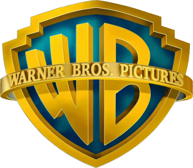
Warner Bros. Pictures

From Dirty Harry to Harry Potter and Free Willy to Willy Wonka, Warner Bros. has been one of the biggest players in the entertainment industry since its inception in 1923. Over the last 93 years, the company has undergone a number of changes in staff, ownership, and production. They’ve expanded from a small film company to a multibillion dollar icon under the Time Warner Center umbrella. Growing up, the WB logo was one of the most easily recognizable symbols branding the movies and cartoons I knew and loved. I chose this logo simply for the nostalgia it represents to me, even though it is still very much a prominent company.

The logo has undergone many variations over the years perhaps, most notably, in Saul Bass’s 1972 iteration. The most obvious consistency over time is the use of a shield branded with the Warner Bros. acronym, “WB.” The imagery of a crested shield suggests power and quality, alluding to the projected strength of their productions. The choice of a bold typeface further promotes strength. The letters tend to fill the full shield, forcing them to be larger toward the middle of the frame. The suggests growth and expansion while the choice of gold again alludes to quality and a name you can trust.

Although there are repeated shapes and colors, I think the logos greatest strength is its fluidity. As a brand persists through time it will be witness to changes in cultural and social norms. Warner Brothers allowed the logo to adapt and while still maintaining the memorable framework of the large branded initials. They incorporated their logo into the films themselves by giving individual filmmakers the freedom to stylize the logo to suit their project.


DC Comics

DC Comics is another subsidiary of the Time Warner Center empire. I love the brand, I’m behind the product but in this case, I kind of hate the logo. DC has also undergone a number of branding changes during the 82 years since its start. While each iteration varies slightly, the general theme is a bold-fonted sans serif “DC” centered within the boundaries of a circle with no background.

The first logos relied heavily on product-association feature their pride and joy, Superman. he most notable alteration, in 1970, features a the caped crusader mid-flight against a black background. Generally, color schemes can tell a lot about the type of message a company is trying to confer. In this case the fluctuation between red, blue, or both seems to be representative of their iconic hero’s signature colors. I like this technique as a way to associate the perhaps less known DC name with the near universal brand of Superhero. Circles generally suggest softness and familiarity. They are considered to be “feminine” compared to their more pointy geometric cousins and are thought to evoke comfort. The light and undersaturated blue creates a similar ambience. This all seems like an odd choice for a battle-filled comic book. Compared the the stark, bold, and sharped edged logo of their major competitor, Marvel, the DC logo in its pale blue circle seems to have already given up. The general blocky-ness of the typeface (in particular, in its most recent form) confuses me. I cannot fathom why they chose 2016’s font.

I appreciate the clever design of 2012’s logo. The D and C are combined into one shape with the former being peeled over the latter, like the pages of a comic book but again, the color choice doesn’t seem synonymous with the brand. 2005’s logo choice makes new use of the circle. My guess is that they were attempting to turn it into something evocative of Captain America’s shield being slung through the air. However, the color and gentle curvature in the typeface makes me think of a laundry detergent company.
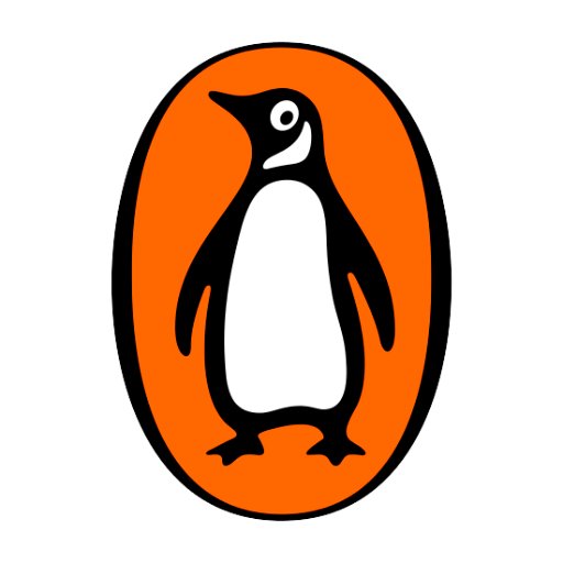
Penguin Books

The British publishing house, established in 1935, is home to one of my favorite logos and many of my favorite books. I think the logo itself is quite effective in branding the company while their application of the logo in marketing and publishing is extremely consistent and highly identifiable.

The logo makes use of simplicity that was rare in the publishing houses of the time that often portrayed elaborate illustrates and marketing. The clearly illustrated penguin itself was an effective logo, easily standing out amongst the competition. The color orange, in marketing, is thought to evoke a sense of curiosity and adventure while also generating excitement. This is another great technique to draw a gazing eye toward your brand on a shelf cluttered with hundreds of other publications. The gentle curves of the outline suggest calm and order, in line with the ambience sought after while reading. Additionally, the shape of the border (an oval with slightly thicker sides) seems to be a capital letter “O” similar to the enlarged O’s beginning the Once upon a time’s of fairy tales.

One of the biggest challenges in marketing books is getting your product to stand out in on a shelf or in a bookstore. Penguin created a systematic and consistent identity using color. All book spines followed the same guidelines and were color-coded to ease the user experience (orange for general fiction, green for crime, etc.)

Readers browsing a shelf could easily identify the publishing house and filter for the types of books they were looking for. The consistency of the three-striped covers makes them easily identifiable.

I have no particular reason to prefer this publishing house to others, yet when browsing a bookstore their spines always catch my eye, dotting the selves with their orange stripes. I find their strategy to be very effective and, aesthetically, I appreciate the simplicity.

New Student Survey Questions

University of Oregon


1. Where did you move from to attend the UO? And, briefly describe how you landed on the UO AAD program. Any interesting, funny, anecdotal stories/details are welcome.

  • I was born and raised in New York but moved to Eugene from Miami, where I spent the past year. I found interest in AAD/Museum Studies by accident, abandoned the idea on purpose, and fell back into it again by chance. The arts (and their management) have been a part of my life in some capacity for quite a bit of time, built in so seamlessly I perhaps didn’t even notice for a while. Some of my family and family friends are heavily involved in the creative sector, both as artists and administrators/managers. I grew up partaking in my own involvement in creation, mostly through digital and analog drawing with a little bit of photo and video work thrown in for good measure. In the past several years I’ve had the opportunity to co-curate an exhibit at the University of Vermont’s Fleming Museum and ended up falling into work on some community development projects as well as scoring a few freelance graphic design gigs. Studying design, I became interested in the ability to manipulate perception and narrate stories through spatial formats, like buildings, exhibit spaces, etc. I knew I was super interest in museum work but decided not to shut doors in other opportunities and kind of forgot about it for a while. Through all this I studied economics, philosophy, and chemistry on both pre-med and pre-law tracks. I have complicated relationship with commitment. Eventually, interests in space and design led me to my acceptance into UO’s Master of Architecture program, which I backed out of literally at the last minute. Like, on the day of orientation (sorry, M.Arch. administrators). I realized the program wasn’t quite the right fit and by some modicum of luck, AAD welcomed me to the program with little notice. And now, here I am. Committed. Although, I think this is a commitment I’m excited about.

2. Area of concentration in AAD?

  • I guess I got a little ahead of myself with my last answer. Museum Studies, in case you missed it.

3. Describe your knowledge and use of technology systems.

  • I’m not entirely sure what “technology systems” specifically refers to. I have no sense of direction and use GPS for everything. Does that count? I’ve done a bit of web-editing for Florida Atlantic University’s Graduate College website (basic stuff, no coding involved). I also have some experience with graphic design/art as well slightly less experience photo/video editing and audio recording.

4. What software do you commonly use? Briefly describe purpose/application for software on your list.

  • Adobe Illustrator – I use this for just about every presentation/poster/project I’ve ever had to make. I also do a little bit of graphic design and enjoy digital art as a hobby. My knowledge of the software gets me by but is probably pretty rudimentary compared to all of the features Adobe offers.
  • Adobe Photoshop – I’ve taken a couple photography classes that were focused around the use of Photoshop, but I mostly use this as a tool for digital art with a Wacom tablet.
  • SketchBook – I use this a lot for digital art when I don’t need vector based graphics or all of the features in Photoshop.
  • I’ll use the Apple or Microsoft suites (PowerPoint, pages, etc.) for quick slides or posters.
  • SketchUp, 123D Make, 123D Design – Pretty limited knowledge here but I’ve used these in a design class for prototyping and creating 3D-printable models.
  • iMovie – I use this pretty frequently, mostly for personal projects for fun. I’ve also used it for some promotional materials for university orgs. I’ve run and worked with.

5. Do you have any graphic design or media production/management experience? Have you taken any graphic design or media production courses?

  • I’ve taken a design course and a couple photoshop-based photography courses. These have all been at an introductory level and most of what I’ve learned has been through online tutorials or kind of clicking on things and hoping for the best. The majority of experience comes from a level of personal interest without any formal knowledge backing it but I truly love graphic design and have been noodling around with it (as well as video, photo, and audio software) for a few years.

6. Know anything about typography?

  • Typography (and color) is everything. Well, not everything, but it’s a lot. I’m familiar with some basics and definitely have an appreciation for the ability of typography’s subtleties to completely alter messaging and perception. Font, size, leading kerning. I had a professor who beat it into us that these are things we really needed give focus to. Turns out, once you start paying attention to typeface it’s kind of impossible to stop. Cool stuff.

7. Do you use Web (2.0) apps? Name those that you use or are familiar with.

  • I had to google a list of these to see what that meant. Apparently, Google itself has a host of them that I use (Google Calendar, Gmail, and Google Docs/Google Drive). Maybe I use more? I’m not very clear on what differentiates a website from a web app.

8. Do you use Social Media (Facebook, Twitter, Instagram, Snapchat, Vine, Yelp, etc.)? Name those that you engage in.

  • Instagram gives me life.

9. Tell me something unique about yourself.

  • That’s tough. There are a lot of people in the world. I’m not sure that I possess any exclusive characteristics. Instead, I’ll offer a fun fact: I love superhero movies, specifically for the villains. Joker is my favorite and I will shamelessly purchase merchandize that features the character.

10. Anything else?

  • I once tried to find my iPhone using by the flashlight app on my iPhone.