1. San Francisco 49ers
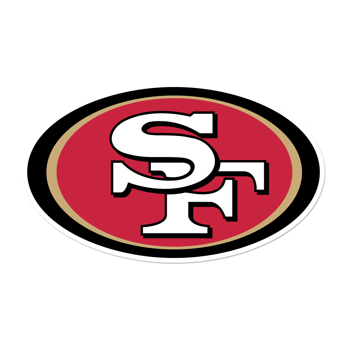
The San Francisco 49ers. A storied NFL Franchise (despite what current results indicate) that represents dynastic legacy. I’ve been a huge sports fan since I can remember but one constant in my house was always the 49ers. When thinking of brands that stood out to me this was one of the first logos that popped into my head so naturally I took the idea and ran with it. The San Francisco 49ers have been around since 1946. Despite that length of time, the team has only really gone through four different logos in their history. The original design, presented to ownership in 1946, was a mustached gold miner shooting pistols. This was a callback to the mining industry in California (i.e. Gold Rush) as well as reference to the term that gave the team their name “Miner 49er. ” The team held this logo for over 20 years until they updated it in 1968. Since 1968 the team has used the iconic “SF” as their logo. Originally, the lettering was placed in a red oval with black outline, since that time, the logo has gone under two re-brands adding a gold trimming between the red and black in 1996 and again changing the hue of the red to a brighter shade in 2009. Even taking into account my own bias as a fan, this is truly an iconic brand. Most people with even a basic understanding of sports will recognize the “SF” logo. It is a testament to how something so simple can be effective with the right application. Though the team has a number of alternative and text logos, the “SF” logo is the real representation of their brand. The coloring here is particularly interesting to think about. The red in the logo could symbolize the passion and energy with which the team plays and the gold could symbolize optimism and the excellence.

2. Oregon Contemporary Theatre
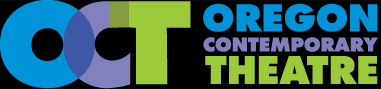
Oregon Contemporary Theatre has been a staple in Eugene’s art scene for more than 20 years and an organization that I myself believe in and strongly support. They have, however, not always gone by that nomer. Founded in 1992 by Randy Lord and Chris Leebrick, the company was initially named the Lord Leebrick Theatre Company. In 2003 they hired a new Artistic Director, Craig Willis, and a re-branding began to occur. In 2009, the company bought their new space in downtown Eugene (formerly located in the Whit) and by 2013 with their new opening they officially became Oregon Contemporary Theatre. The name change came about as the result of a new marketing plan that occurred during the renovation of the space and re-branding. Originally slated to remain as Lord Leebrick Theatre Company, it took some time before a new name was settled upon. Ultimately, it was determined that the previous name did not invoke the right feeling in constituents and was less inviting to the community. So the company re-branded as Oregon Contemporary Theatre and is currently Eugene’s only professional theatre with recognition regionally and nationally. Their brand is simple in nature making use of bold type and color schemes. “Oregon Contemporary Theatre” is a bit of a mouthful so they company aptly chose an acronym as the main focal point in their logo. “OCT” is an acronym recognized around Eugene and is accessible to the larger community and one could argue that by having an acronym they stay in touch with the 20-30 demographic (a large portion of Eugene’s population). Their color scheme of purple, blue and green is certainly chosen with purpose. The blue conveys feelings of dependability, trust, and strength. The green gives feelings of growth and prosperity. The purple is generally a color giving off feelings of creativity, imagination and wisdom. When you think about their mission,”Oregon Contemporary Theatre creates bold entertainment, challenges expectation, inspires curiosity, encourages dialogue and supports positive change,” one can see how these colors and their perceived meanings really plays into the brand as a whole and creates a cohesive message. Lastly, the bold typeface stands out and really pops at viewers making the logo very hard to miss on print, digital, and signage mediums. Overall, I like OCT’s logo for its simplicity, utility and representation.
3. Star Wars
![]() One might be hard pressed to find a brand more widely recognized in pop-culture than that of the Star Wars brand. Though the current iteration of the logo has been around since 1976, the brand went through a series of evolutions before it reached the iconic logo you see to the left.
One might be hard pressed to find a brand more widely recognized in pop-culture than that of the Star Wars brand. Though the current iteration of the logo has been around since 1976, the brand went through a series of evolutions before it reached the iconic logo you see to the left.
A man by the name of Ralph McQuarrie was approached by George Lucas to design a brand before the film even began its filming. What he came up with can only described as atypical when it comes to sci-fi in the late 70’s early 80’s.  Nothing too special, generic at best but serviceable. In this early iteration we can already see the yellow coloration of the font coming into play and a blocky Helvetica style font; something distinctly “futuristic.” Ultimately, Lucas decided to drop “the” from the brand and re-brand it simply “Star Wars.”

To the right you will see some early poster design featuring the new design. As we know, Star Wars is famous for its opening credit crawl. To achieve the effect of draw distance, the logo needed to be made with a vanishing point to make it appear as though the text was moving away…perhaps somewhere far, far away?
Around 1976-1977, Lucas tasked his Artistic Director, Suzie Rice, with creating a logo that looked “very fascist.” An interesting request but makes sense when you consider the films subject matter. Ms. Rice research Nazi Germany and the typography they used in their propaganda to come up with a modified version of the Helvetica font, which, after hearing the words fascist and Helvetica uttered in the same sentence does give off a fascist appearance. The logo was nearly complete. 
Lucas added the ‘s’ connection because he felt like it didn’t read properly without and it was decided that the ‘w’ looked far too much like an upside down ‘m’ to be used in the pan shot during the credits crawl. So another artist in employ, Joe Johnston, redesigned the logo with a an improved ‘W’ and a widened font. Johnstons design ended up being the final edit and leaves us with the now iconic symbol we see throughout pop-culture today. The careful research and implementation of typography really does complete the vision of creating something that appears futuristic but visually looks very imposing, or, “fascist” as Lucas described. This is clearly illustrates the amount of work it can take to arrive at a final branding which in this case took several years to achieve. The results cannot be denied as the brand is truly iconic in pop-culture. 
Resources:
- Miller, B. (n.d.). San Francisco 49ers Logo History. Retrieved October 06, 2016, from http://sportsteamhistory.com/san-francisco-49ers-logo-history
- Staff, B. 4. (n.d.). Take the 49ers with You. Retrieved October 06, 2016, from http://www.49ers.com/
- Wibrew, T. (n.d.) About OCT. Retrieved October 06, 2016, from http://www.octheatre.org/about-oct
- Starr, B. (2013, August 16). The storied evolution of the Star Wars logo. Retrieved October 6, 2016, from Visual News, https://www.visualnews.com/2013/08/16/the-storied-evolution-of-the-star-wars-logo/