Coach
![]()
The Coach logo has a few variations, but always contain most if not all of the same elements. The horse-and-carriage, or stage coach, is the main design element which is usually placed on top of the word “Coach”. This can also include the date in which the company was established (1941) or New York. This was designed in 1962 by Bonnie Cashin. The horse-and-carriage design represents the elite and luxury, as this form of transportation was usually used by those with money and royals. Coach is known as producers of affordable, luxury handbags – yet they have started to produce many other type of products: scarves, clothing, shoes, wallets, sunglasses. The variations of this logo is useful as the entire thing probably won’t fit on the side of sunglasses, but the unique font used in the brand name works great. Coach also uses different logos depending on if there merchandise is being sold through a factory store. These items usually do not show the horse-and-carriage design. This is one of my favorite logos because it really does represent quality and luxury – I enjoy buying products with this specific logo on it for that reason. I also like that the main logo is black – it’s clean and refined. I’ve notice that they add color to their factory items and it’s usually in red. Just a fun fact from my shopping adventures!
Paramount Pictures
![]()
![]()
“The mountain of dreams” was first born in 1914 from a doodle by the founder and president of Paramount, W.W. Hodkinson. This kind of goes back to our discussion of how many of the most prominent logos, and brands, emerged by accident. Many believe the mountain was based off of Hodkinson’s memory of a mountain in Utah known as Ben Lomond. Later it’s compared to other mountains as the shape of the peak slightly changed.

The stars that are encircling the mountain represent the 22 stars that were currently working for them. These stars have ranged in quantity throughout the years, but the general display of the brand and logo has basically been the same. Pretty much always displaying a picture of a mountain with stars, other than a brief time in which the logo was drawn out and displayed almost entirely in blue (displayed above). I thought it was interesting that the stars represented the employed stars of Paramount Pictures. I had no idea that it would be literal, and I think it’s very clever. I’m assuming that the mountain is representing the regal and impressive nature of the movie business. This is one of the most famous brands out there, and unlike many it’s been virtually unchanged for over a century. I expected it to look quite different and that’s why I was interested in the first place. I became even more interested when I saw the previous brands and there wasn’t much change.
Girl Scouts

The Girl Scouts is one of the oldest organizations developed to empower women and girls. Founded by Juliette Gordon Low in 1912, the focus of the group was inclusiveness, outdoor knowledge, service and self-reliance. The group has obviously evolved through the years and as the country changed so did the organization. Inclusiveness was a main focus through the years and all girls were invited to the organization. The girls can earn badges and different skills are incorporated into the groups.
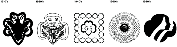
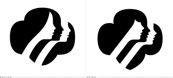
Shown above are some of the first logos, however most recent (almost) branding is the to the far right. This was designed by Saul Bass in 1978 and has been the brand until recently when OCD (Original Champions of Design) slightly changed the outline of the girls. The use of negative space to form the three girls is so cool. I think that it goes hand-in-hand with the Girl Scouts’ goal of inclusiveness as the three girls are one in the same. Below you can see the subtle differences between the original logo and the new one. Basically, the girls are modernized by changing the hairstyles by adding bangs versus a pulled back look. There are also a few other subtle changes which help unify the brand. I also really like the font used, because it’s very simple and appealing to all ages especially younger girls. This logo is definitely universal and flexible as it can be printed on shirts, websites, magazines, and – of course – cookie boxes (yum!).
![]()
Sources:
Coach Logo – Design and History of Coach Logo. (n.d.). Retrieved October 06, 2016, from http://www.famouslogos.us/coach-logo/
Marks, S. (2013, May 06). Go tell it on the mountain: A pictorial history of the Paramount logo. Retrieved October 05, 2016, from http://www.sandiegoreader.com/weblogs/big-screen/2013/may/06/paramount-logo-history/#
Paramount Pictures Logo – Design and History of Paramount Pictures Logo. (n.d.). Retrieved October 05, 2016, from http://www.famouslogos.us/paramount-pictures-logo/
Timeline – Girl Scouts. (n.d.). Retrieved October 06, 2016, from http://www.girlscouts.org/en/about-girl-scouts/our-history/timeline.html