Logo 1: Atlanta Shakespeare Tavern

To begin, I’d like to talk about a logo from my hometown- Atlanta. This is for the Shakespeare Tavern- a unique theatre company residing in the middle of downtown with a facade designed after the original Globe that offers dinner, drinks, and plays by or about Shakespeare. Their logo is actually quite ornate and I would like to break it down into two parts, the caricature and the text.
The caricature of William is very interesting. It’s made to look hand-drawn, adding a historical feel. He is notably wearing an Atlanta Braves baseball cap (that signature A can be recognized a mile away) and holding a pint of beer. The team gear adds a subtle local feel to the design, instantly making the theater more approachable and relevant to the community. The pint of beer emphasized the tavern part of the operation and gets the audience excited for drinks and bar food. While a bit busy, these details really make this a very impressive design.
The organization’s name appears in both its forms (Atlanta Shakespeare Company and the New American Shakespeare Tavern) and in two places (around the caricature and next to it). It blends in perfectly with the picture and uses a simple font. The separate text is actually very interesting. I’ve never quite understood why they elongated the “V”, though I am sure there is a reason for it. The font definitely invokes a Shakespearean feel of old-fashioned books and sword fights. The red/burgundy color is signature to the organization and appears throughout their marketing materials.
Logo 2: New York Public Library
![]()
My next logo is a classic- the New York Public Library. The lion of course invokes the famous stone lions perched outside the building. The evolution of the lion is actually chronicled in a youtube video:
As explained in the video, the new design was intentionally made to be future-forward and to be inclusive of digital scholarship. These goals are accomplished with the simple lines and black and white color scheme. Additionally, the text has been updated as well to a rounder and cleaner font. This is an excellent example of a rebranding that remained true of the organization but updated the message and helped work towards sustainability.
Logo 3: Playbill
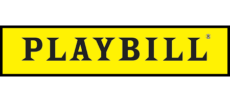
This final logo is iconic- Playbill. On top of every program for every Broadway show and even some tours sits the famous yellow box with these bold, pointed letters. The company has become so recognizable, that often people simply refer to the programs as the playbills. This is a very old logo that has been the same since before I was born. Similar to the Nike swoosh or the Mac apple, it’s timeless and hard to imagine anything different. Recently, they issued limited edition programs with a pride background to celebrate the supreme court decision:

Notice that the colors still remained rather flat and the font is identical. Having such a strong and consistent brand is very impressive, and I felt it was important to include such an example. This design builds its success on the rich history of Broadway and New York theatre, all of which immediately come to mind. The font is clean and unique. Set against the bright yellow background, it stands out and has become instantly recognizable. This font is great for any theatre-related project as a result and has transcended Playbill itself.
This article has a great content, please visit our site: https://www.hughesmedia.us/