LEXICON WEEK 2
1)Type/Typography as Design
Typography as design is the use of text as an element to create a design. This would be the use of different fonts to build the design. This would also be looking at the different elements of fonts: strokes, stems, kernings, ears, terminals, etc., and what effect they have on text and the overall design of an image.

Source:
http://www.designersinsights.com/wp-content/uploads/2012/03/Anatomy-of-Typography.png
2)Balance
Balance is an element of design that creates order within a subset. In marketing and advertisement this would be arranging different elements so that the weight is equal on each side of a design, to on the top and the bottom of a design. Balance can be used to create order, but can also be used to make a point by purposefully leaving elements unbalanced, which draws attention to those specific element.
3)Intangibles
“Intangible” means something that can’t be touches, something that isn’t a physical object. Something that is an example of this in marketing and branding is trade marks and intellectual property. These are ideas and objects that aren’t necessarily physical, but are owned by companies are are very big assets to companies and organizations.
4)Flexibility
Flexibility in relationship to marketing and design relates to designs that are able to be manipulated and changed. In relation to brands and logos, this could be a logo that is able to be changes: either in color scheme, or for different programs, while still being able to be recognized by the public as that logo. SAM is a good example of the idea of flexibility with its logo.
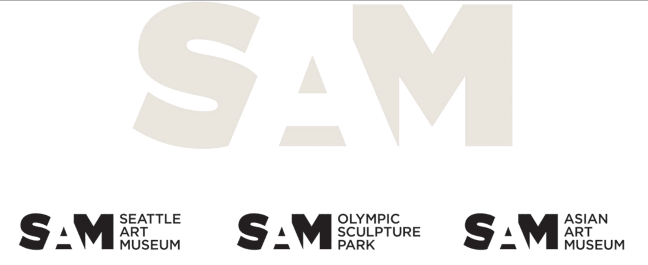
The colors are flexible being able to be in black and white or colored, and text is able to be added. These are flexible yet still effective because they are able to be recognized.
Sources:
http://www.underconsideration.com/brandnew/archives/sam_logo_detail.png
LEXICON WEEK 3
1)C.R.A.P (all words with the exception of Proximity were suggested)
CRAP stands for Contrast, Repetition, Alignment and Proximity. Each of these words are very important as part of the design process.
Contrast is important in design because it allows it to be visible. If a design in’t visible it isn’t going to be effective.
Repetition is an element that create cohesion within a design. This could be the repetition of a font, a character, a color, or an element.
Alignment is the way that different elements in a design are arranged in relationship to each other. Alignment can also create cohesion by the use of straight lines.
Proximity is how close or far apart elements in a design are in relation to each other. Proximity encompasses both alignment and contrast. Elements far apart can create a high contrast. Proximity and relationships also play into alignment.
2)Vector
Vector is a way of designing, such as in Adobe Illustrator that uses mathematical functions to structure elements in relationship to each other. Vector drawing allows designs to be scaled larger or smaller and keep there integrity by keeping those formulas.
3)Rasterize
Rasterizing is taking a vector image and converting it into pixels in order to be displayed on a screen, or to be printed. This is a different format than vector, and is referred to either a pixel image or a bitmap file.
4)Opacity
Opacity is how opaque something is. Transparent is the opposite of opaque. The opacity is a percentage on a scale from transparent to opaque. Opacity can be used to create contrast when things are very opaque, or less contrast when elements of lower opacity are paired next to or overlapping each other.
LEXICON WEEK 4
1)Signature
In books and printing this is a set of eight pages that is folded to create a small booklet of 4 front and back pages. These can be combined to create larger books.
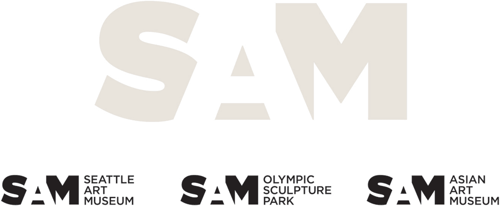
2)Hickey Picker
Hickey picker is a machine that picks up dust and dirt off pages in the printing process to ensure that there are no “hickies” or little flakes of paper left on the paper or printing press from the cutting of paper. If this dust isn’t picked off the ink won’t stick to that part of the paper and leave little dots or hickies.
Source:
http://printing.rotadyne.com/solutions/graphic-arts/rodel-hickey-picker-rollers/
3)DPI
This stands for “Dots per inch”. This refers to the amount of dots of color that is in a image. This is applicable to printing in how many dots will be laid down per inch of a printed product. The more dots, the higher the resolution. These dots will then be larger or smaller, or more saturated based on the color that is going to be printed. Colors are certain percentages of Cyan, Magenta, Yellow and black which are the colors the dots are printed in.
4)Bleed
Bleed is the amount of an image that is off the printed page. Incorporating a bleed into a design ensures that a printed image will stretch all the way to the edge of a page instead of having a white border that goes around it. Bleed is something that needs to be accounted for in the design process to ensure that images can cover the necessary area.
LEXICON WEEK 5
1)Distributed Cognition & Collaborative Intelligence
Distributed Cognition stems from the idea that your workplace affects the work you do, or your environment of learn will in turn effect your learning. This also ties into the idea of technology and how the technological environment that a person is working or learning in will effect the outcomes of their learning. Collaborative intelligence is based off the idea that the social environment that someone is working or learning in will effect the outcome through social problem solving.
2)Informal Learning
Informal learning would be the learning that is done through participation, or through experience versus formal learning which would be a class type setting, or through reading. Informal learning can be used in conjunction with formal learning to enhance it, or as an alternative in some cases.
3)White Space
White Space is a design element, also called negative space in art, which is intentionally left white or black. This can be used in design to balance design, allowing the viewer to breathe or focus on other more important elements. White space can also be used to hid hidden meaning.
4)Focal Point
Focal points are places in a design that the viewers’ eyes are drawn to, or are supposed to be drawn to. Their can be a single focal point, or multiple within a design. If a design is too busy, crowded or complex their may not be a focal point, or it may be hard for the viewer to see.
5)Collateral
Collateral can be items such as letterheads, business cards, envelopes. Collateral can also be things such as apparel, coffee mugs, or other promotional items. Theses items are important because they can be used as promotion of a business with a logo on them, or can help professionalize a business (business cards, etc.).
LEXICON POST 6
1)Strategic Planning
Strategic planning is a goal oriented planning that organizations can do to access there strengths, weaknesses, opportunities, and challenges which the organization may encounter, and how they can use those to achieve those goals. Strategic planning uses both long and short term planning, breaking it down to steps so that organizations can achieve their goals.
2)CRM (Customer Relationship Management)
CMR is how companies manage and keep track of their customers. This can be done through different softwares. The softwares can do things such as track and analyze customer interactions and sales. They can also be things such as email lists, or automatic response messages that help get information to customers after buying products.
3)Medium
Medium, plural: media, is the material or platform that an artist or person is working with. This can range from physical media and more traditional art media such as paint, ceramics, pastel, etc. to digital media. “Social media” is a newer term that is more of a platform versus a material.
4)Social Impact/Consequence
Social impact and consequence refers to how an image, phrase, or idea can effect people. These have impact on the social structure based on the feeling and reaction of the people.
LEXICON WEEK 7
1)Social Proprioception
Social Proprioception is a concept that refers to the ability of large amounts of people to know what each other are doing . This is made possible by social media with many people posting activities that they participate or things that they are doing. It is made relatively easy with social media for people to scroll through and see what people have done that day or week with a simple, even if they haven’t had physical interaction with them in that amount of time or longer.
2)Dissonance
Dissonance is a lack of harmony, disunity, or a tension. This can happen both in terms of communication or effect people socially. This is what happens when two things don’t communicate efficiently or effectively.
3)Feedback Loop
A feedback loop is a constant circle of communication where information feeds off itself.
4)Compression
Compression in design refers to making the file size smaller. This many times reduces quality, but allows it to be more applicable to certain projects.
5)Graphic Standards
A graphic standard is a document that a organization keeps which outlines how their brand should be applied to projects. This is a guideline which allows the organization to maintain a level of consistency with their brand to keep the quality of work. This would apply to any piece or marketing, promotion, or anything else that the brand will be placed on. This outlines elements such as color, spacing, typeface, etc.
LEXICON WEEK POST 8
1) Intellectual Property
Intellectual Property is someone’s ideas, or content that they own. This is used to protect someones thoughts and ideas under copyright law so that people are unable to steal them. They can properly be used with citations, but credit is needed since it is owned by someone. This can apply for other intangible things such as research. It is possible for a bigger entity to own someones ideas, such as a university in which someone is working for and producing the work.
2) Minimalist
Minimalist is a word that describes a person or a design which is very simple, simplified or has minimal design elements. This is a style that can come out of personal preference, or can be used to emphasize specific elements. The simplicity allows focus.
3) Transmedia
Transmedia is a way of telling a single story, message, or transmitting a single message over multiple platforms of media. This can be things such as print, digital and various forms of social media all working together.
4) Affiliation
Affiliation is how an organization, a person, or an object is connected to another organization, person, or object. For example I am affiliated with the University of Oregon by being a current student and an alumni as I graduated my undergrad there.
5) Buckley
Buckley is Hames’ dog… he is a kinda big dog…. big dogs scare me. But he looked nice in Hames’ video… as long as he doesn’t jump on me.
LEXICON POST WEEK 9
1) Kerning
In typography, a kerning is the distance between the letters and how they are adjusted in relationship to each other to make the type more visually pleasing.

image from: http://www.webopedia.com/TERM/K/kerning.html
2) Emphasis
Emphasis is when one image, idea, or piece of information is made to stand out in one way or another over other images, ideas, or information. Graphically this could be achieved through bolded text, color, size or placement.
3) Descender
In typography a descender is the part of the letter that dips below the baseline of the letters. Letters that Have descenders include: q y, p, g, j. They only occur in lower case letters.
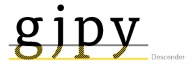
image from: https://www.fontfont.com/staticcontent/images/original/descender_tisa.png?1308293261
4) Visual Impact
Visual impact is how effective an image or design is in conveying a message to a viewer. This message could be a feeling, thought, or factual information. The visual impact of a design has many factors including color, layout.