- BE OREGON Campaign

This is a logo for Nike’s new “BE OREGON” campaign that is being spawned from the larger “Be True”. The campaign focuses on LGBTQ and minority inclusion among athletes at the university, encouraging all students to be their authentic selves.
The logo uses fonts and symbols that the public is already familiar with. The font and Puddles the Duck is used on other athletic wear and university branding. The campaign has modified it by adding the rainbow gradient. I find this appealing because its simplicity appeals to something I am already familiar and comfortable seeing, and shows the legitimacy of the campaign through the university by using university trademarked images, while creating something just different enough to get me interested. The rainbow gradient is appealing design wise, contrasting with the black background, and also connects the movement with the LGBTQ movement that is easily identified by a rainbow flag. This reference to the rainbow flag through the gradient subtly hints at what the campaign is about while still being attractive in a design sense. The rainbow could be overpowering, but is not because of the simplicity of the text and Puddles the Duck line design.
Link to article about the campaign.
http://www.goducks.com/news/2016/9/26/general-ducks-nike-launch-beoregon-initiative.aspx
2) Instagram
A New Look for Instagram from Instagram on Vimeo.
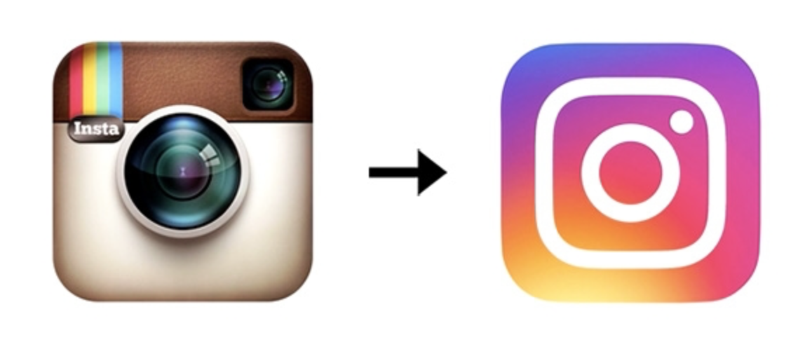
Instagram changed their logo in May of 2016. The video above shows the process of changing the logo. Many people didn’t like the change. Even though I personally prefer the old logo, there are many good design elements and advantages to the new logo. The new logo is simplified, which makes it easier to translate into a grayscale version.


The gradient and white line design also allows for the design to be more consistent across the different apps that the company owns:

The white backgrounds of the other apps are opposite of the white line design and gradient background of the original Instagram app. This allows for the apps to have a coherent theme. This theme and consistency was not possible with the old logo. The simplicity and consistency allows for the company to be recognizable across each app, yet still allows each app to have a distinct symbol to identify it.
Link to sources:
https://www.instagram-brand.com
http://blog.instagram.com/post/144198429587/160511-a-new-look
3) Facebook
New Logo for Facebook done In-house with Eric Olson. http://t.co/7s36a5ulR8 pic.twitter.com/ykoOOwd8co
— Sven Grothe (@svengrothe) July 1, 2015
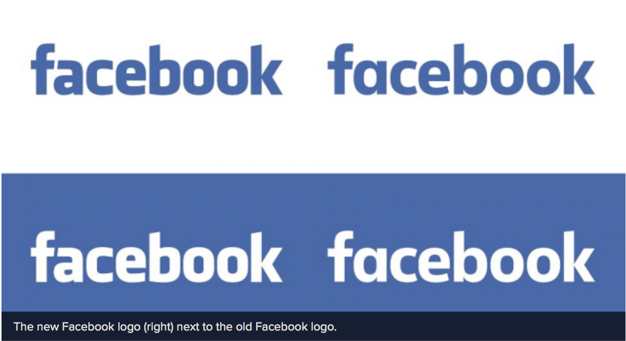
Facebook had two separate logo changes, the most recent being in 2015. The difference is slight, and only changes the font of the word “Facebook”. The change was so subtle that not many people even noticed it. I like the new font better, it is less blocky, with slightly more space between the letters which adds to clarity. Since it isn’t as blocky it also makes the text appear bigger, even though the size is not increased. The GIF above overlays the old and new, only then is the change made more apparent.
Facebook in 2013 had also done another slight logo change of their app logo:

The change takes away the sun spot or defective spot at the bottom of the app. This simplifies the logo, making it only two colors. The change is subtle, but effective. It also allows for the logo to translate to gray scale more effectively if necessary.
Sources:
http://mashable.com/2015/07/01/facebook-logo-change/#E_7JB4b3HqqL
http://www.underconsideration.com/brandnew/archives/facebooks_radically_new_f_logo.php#.V_XrETKZMb0