1) Kerning
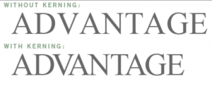
In typography, a kerning is the distance between the letters and how they are adjusted in relationship to each other to make the type more visually pleasing.
image from: http://www.webopedia.com/TERM/K/kerning.html
2) Emphasis
Emphasis is when one image, idea, or piece of information is made to stand out in one way or another over other images, ideas, or information. Graphically this could be achieved through bolded text, color, size or placement.
3) Descender
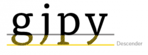
In typography a descender is the part of the letter that dips below the baseline of the letters. Letters that Have descenders include: q y, p, g, j. They only occur in lower case letters.
image from: https://www.fontfont.com/staticcontent/images/original/descender_tisa.png?1308293261
4) Visual Impact
Visual impact is how effective an image or design is in conveying a message to a viewer. This message could be a feeling, thought, or factual information. The visual impact of a design has many factors including color, layout.

