[embeddoc url=”https://blogs.uoregon.edu/briannahobbs/files/2017/03/Learning-Goals-Reflection-28ilv8q.docx” download=”all” viewer=”microsoft”]
Category Archives: aad616_f16
OSLP A&C Marketing Plan
[embeddoc url=”https://blogs.uoregon.edu/briannahobbs/files/2017/03/PRINT-THIS-ONE-tlo8a1.pdf” download=”all” viewer=”google”]
Infographic Example
Lexicon Essay/ Inforgraphic
Media Map
[embeddoc url=”https://blogs.uoregon.edu/briannahobbs/files/2017/01/Media-Map-1pli593.docx” download=”all” viewer=”microsoft”]
Learning Goals
- Develop a comprehensive understanding of marketing theory and framework.
- Be able to discuss marketing theory with employers and apply best practices in specific circumstances.
- Be able to directly apply new marketing knowledge to development in a practical and effective manner.
- Understand how to effectively market on a strict budget.
- To utilized materials presented on the course website more often.
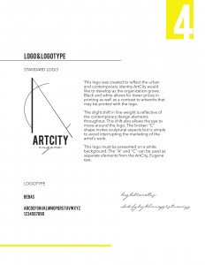
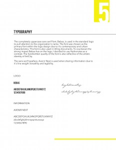
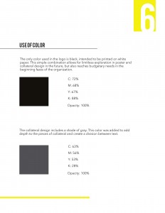
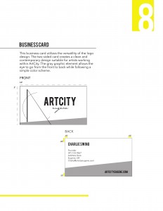
Graphic Standards
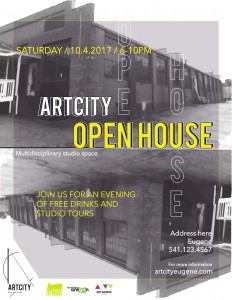
ArtCity Case Study
[embeddoc url=”https://blogs.uoregon.edu/briannahobbs/files/2016/11/ArtCity-SWOT-Analysis-pj6v7y.pdf” download=”all” viewer=”google”]
Questioning Survey
What is your organization or company? Give background history including by whom, when, and why it was founded.
The organization I am focusing on is ArtCity, a new start up that will be based in Eugene. The current developer of this program is Charly Swing. Charly is a recent graduate of the New York Academy of Art. After receiving her MFA in sculpture she found herself searching for a support system within the creative community of Eugene. Without many resources to find this support, she decided to develop her own.
What do they do or make – describe the products and services and what makes them unique.
ArtCity focuses primarily in creating a profession making space for artist who would identify in a “fine art” spectrum. These artists are not commercially known or making to sell their work. They are spending time in this space to explore ideas and theories. This is unique to Eugene because it is not catering to a “making community” that is reflective of the artisan culture that primarily surrounds the area. The products will consist of fine arts works in the 2D and 3D realms, theatre productions, musical productions, and artistic experiences. The space will evolve into a multidisciplinary studio space.
From the Website: “ArtCity developed out of the intention to address and resolve artists’ immediate need to sustain their livelihood in Eugene and work in a salon-style studio community. In this environment artists will work near professional peers, surrounded by inspiring activity, growth, and opportunity.”
Describe the culture of the organization or company. What is the work environment like – the atmosphere? What is the building like – exterior/interior, architecture, fittings and furniture? How do the employees work together? What are the jobs and roles of individuals? How does management treat them?
The organization’s culture will reflect human and artistic sustainability. Charly believes that “creating is a human act.” She would like to focus on content for professional development, developing video to interview artists who are involved, and also a place for review and curation. The culture is surrounding all things art.
Who is the targeted audience? What are their demographics? (Age, gender, income level, where they live, own or rent, etc.)
The target participates are working artists focusing primarily in contemporary art making. This can cater to anyone. As far as an audience there wasn’t a specific demographic mentioned. She did mention locals who are interested in the arts as well as artists. I assume the target audience will be those who can afford to consume the fine art piece, so that may refer to those with a sustainable income.
What is the organization or company mission statement? Tagline? (Can be the same – Nike’s is, “Just Do it!”
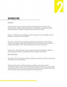
ArtCity creates opportunities for artists of all disciplines to interact with creative peers, inspire professional growth, collaborate, engage the public, and participate in Eugene’s burgeoning creative community.
No tagline was discussed. However, Charly mentions a few words that were reflective of a tagline. These examples include “House of creative energy”, “all things art”, and “Creating is a human act.”
Brand Awareness
Upon deciding what brand to begin this miniature research project with, I knew right away NPR (National Public Radio) was a good start. I’m one of those millennial that got hooked on NPR in my not-so-classy studio space, by my very classy studio friends. It began with a couple podcasts, which we will discuss further in a moment, and eventually grew to become my main news source.
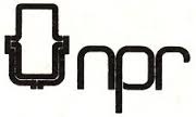
Once I decided to go with NPR, it dawned on me I have no clue what their logo looks like. I gave myself a break considering all the advertising i’ve been exposed to for NPR was on the radio, but was pleased to find a not so bad logo when searching. The simplicity in this logo reflects the style with which the program presents news. The high intensity of the red and blue creates depth with the black square dividing them. However, I am no logo designer, but my background in color theory has made me particularly critical of color. If I had one complaint, it would be the retinal vibration occurring between these colors on a computer screen making it kind of annoying to look at. However, that vibration might also draw me to the logo on a busy page. I’m also curious how this logo would look with capital letters in this font as opposed to lowercase.
A couple other NPR logos from the past include these:
I’m personally thinking they should have a “throwback” logo, and bring the bottom one back. Talk about reflecting simplicity, this is a winner!
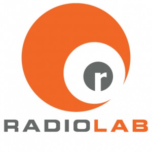
Alright, bringing back the podcast mentioned earlier. The number 2 logo goes to Radiolab, a podcast developed by NPR. This podcast reports on interesting topics such as prairie dog languages, and microscopic fungi in the ground having special relationships with trees. I think this logo represents the characteristics and topics they report on. If I were to see this logo without knowing what this podcast was about, it wouldn’t appear to be too serious. I think this is due to the orange in this logo being an inviting color, especially next to the dark gray. Both colors aren’t too intense like the red and blue you find in the NPR logo. The font along with the repetition in shape, simulating a radio satellite image, is also inviting to the eye.
A very simple design that I really enjoy is from a new, comfortable clothing line know as Lou & Grey. What I enjoy about this logo is the simplicity through color, shape, and font. All choices seem to be reflective of each other, all the way to the soft edges of the gray square. The ampersand adds a bit of flair, reflecting the luxury clothing this company makes.
The example below is a logo from non-profit that I really love. It’s a traveling Airstream gallery that sells very well thought out functional ceramic work. As much as I enjoy this gallery, I don’t necessary like their logo. The first time I saw it, I remember thing how disappointing it was compared to all the beautiful work that comes from this space. I enjoy this font, but next to the hand illustrated trailer, it seems misplaced. Perhaps I would enjoy this logo more if they hand wrote “nomadic gallery” next to the handmade design.
