Upon deciding what brand to begin this miniature research project with, I knew right away NPR (National Public Radio) was a good start. I’m one of those millennial that got hooked on NPR in my not-so-classy studio space, by my very classy studio friends. It began with a couple podcasts, which we will discuss further in a moment, and eventually grew to become my main news source.
![]()
Once I decided to go with NPR, it dawned on me I have no clue what their logo looks like. I gave myself a break considering all the advertising i’ve been exposed to for NPR was on the radio, but was pleased to find a not so bad logo when searching. The simplicity in this logo reflects the style with which the program presents news. The high intensity of the red and blue creates depth with the black square dividing them. However, I am no logo designer, but my background in color theory has made me particularly critical of color. If I had one complaint, it would be the retinal vibration occurring between these colors on a computer screen making it kind of annoying to look at. However, that vibration might also draw me to the logo on a busy page. I’m also curious how this logo would look with capital letters in this font as opposed to lowercase.
A couple other NPR logos from the past include these:

I’m personally thinking they should have a “throwback” logo, and bring the bottom one back. Talk about reflecting simplicity, this is a winner!
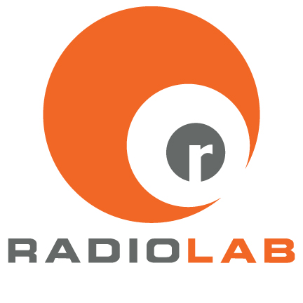
Alright, bringing back the podcast mentioned earlier. The number 2 logo goes to Radiolab, a podcast developed by NPR. This podcast reports on interesting topics such as prairie dog languages, and microscopic fungi in the ground having special relationships with trees. I think this logo represents the characteristics and topics they report on. If I were to see this logo without knowing what this podcast was about, it wouldn’t appear to be too serious. I think this is due to the orange in this logo being an inviting color, especially next to the dark gray. Both colors aren’t too intense like the red and blue you find in the NPR logo. The font along with the repetition in shape, simulating a radio satellite image, is also inviting to the eye.
A very simple design that I really enjoy is from a new, comfortable clothing line know as Lou & Grey. What I enjoy about this logo is the simplicity through color, shape, and font. All choices seem to be reflective of each other, all the way to the soft edges of the gray square. The ampersand adds a bit of flair, reflecting the luxury clothing this company makes.

The example below is a logo from non-profit that I really love. It’s a traveling Airstream gallery that sells very well thought out functional ceramic work. As much as I enjoy this gallery, I don’t necessary like their logo. The first time I saw it, I remember thing how disappointing it was compared to all the beautiful work that comes from this space. I enjoy this font, but next to the hand illustrated trailer, it seems misplaced. Perhaps I would enjoy this logo more if they hand wrote “nomadic gallery” next to the handmade design.
![]()