Week 2
Type/Typography as Design: the arrangement and analysis of type and what the changes in certain elements (line weight, spacing, ect.) conveys to a reader. Understanding these elements in type can change the impact of an overall design.
Balance: the arrangements of elements to create a visual appeal to a viewer throughout the whole product. A traditional approach is using symmetrical compositions, but balance can also be accomplished in asymmetrical compositions as well.
Intangibles: lacking of physical presence, and cannot be touched/ felt. Utilized when referring to design in technology that still give a viewer the experience, without actually being able to handle it.
Flexibility: able to apply to several scenarios without losing the integrity of a design.
Week 3
1. C.R.A.P ( Contrast, Repetion, Alignment, Proximity)
Contrast- this term allows for opposing characteristics to draw a viewers eye. When using contrast in design, you can utilize contrasting colors to allow for a most ascetically pleasing result or as a means to make something more apparent.
Repetition- When addressing repetition, I immediately think about Fibonacci’s spiral. He uses repetition along with scale to develop his famous spiral used today, but it gets the point across. I repeating element can create a pleasing design that develops unity for the viewer to see.
Alignment- is all about understanding spacial relationships. In our readings it is discussed that every element should be placed with intention. Without alignment even the most well planned design may appear as though there is something slightly “off”.
Proximity- this was a new term to me, and not one that is often discussed in a traditional studio space. To my new understanding, proximity is placing alike elements near one another and spacing those unlike each other away so an image appears to be more cohesive? I’m still working on this one..
2. Vector- is all about “math”. This is a term I have heard several times, but never actually understood what it meant. Vector is used in Adobe Illustrator (as opposed to a bit map/ pixels used in Photoshop) to help support the diverse needs in logo design. With a vector program you are able to scale a design much larger or smaller without loosing the quality of an image. This is done using math/geometry equations.
3. Rasterize- this is when you take an image that was developed in a vector program and change it to a bit map. This can make editing a photograph easier.
4. Opacity- the correct means of explaining opacity is the lacking of translucence. I like to think of it as “cloudy or film-like”. Utilizing opacity is very much like understanding color relationships. If you use it correctly it can make a very strong impact on a design. Opacity along with color can give depth to a very simple design.
5. Unification- (Unity) helps the elements in a design function together. It helps to organize a visual image. A good example of this that promotes a similar idea is when you are sharing information with people either in a handout or online. When the information is well organized, it is easier to read and understand. Unity provides the same assistance within design.
Week 4
1. Signature- when pages are printed on both sides of a sheet of paper, folded, cut and bound you are creating a signature. Seeing this process done at QSL made me wish I would have known such technology exists when reflecting on my many paper folding activities for my previous school district.
2. Hickey Picker- When hearing about this term I had to laugh a little. What a ridiculous name that makes so much sense. Hickey picker refers to the removal of dust and particles on paper before the printing process to avoid errors. In all seriousness, this would be a really frustrating thing to deal with in a printing company.
3. DPI- Dots per inch is a measure of printing resolution. The higher the DPI the so clear and detailed a print is. The reference I carry is most Pop Art by Roy Lichtenstein, except DPI is a little smaller than his work.
4. Bleed- this is used when you would like no border around a print. In other words, you would like an image to touch the edge of a page. The term makes sense to me, but the process in which to actually produce a bleed is a bit confusing.
Week 5
1. Distributed Cognition & Collaborative Intelligence- Distributed cognition is a theory reflective of cognition not being classified for an individual but a distribution across individuals, artifacts, and tools. Collaborative intelligence is when a human uses distributed cognition to achieve and outcome.
2. Informal Learning- Informal learning is a nontraditional approach. It is an unplanned or impromptu experience in which the learner has complete control over the learning process.
3. White Space- White space is used when discussing negative space. This is the space that is not being utilized. When using white space in design you need to be conscious of how much white space is left in a final design. Too much white space can make an image appear off balance, but if used with intention, it can have a strong affect.
4. Focal Point: Focal point is where your eye goes when looking at an image. Understanding how to utilize a focal point can help you get a message across to a viewer effectively.
5. Layers: Layers are used to keep a design organized within a program. Using layers can assist in manipulating a design without changing the items surrounding it.
Week 6
- Strategic Planning- Strategic planning within arts management consists of a set of comprehensive choices that have been prioritized and documented to manage resources available to an organization to assist in meeting goals and objectives.
- CRM (Customer Relationship Management)- CRM discusses the practice, strategirs, and technologies that an organization uses to manage customer interaction and data. In arts organizations this is often used in development and donar relations.
- Medium- Medium is the material used to create a work of art. Outside of the art it can be defined as an agency or means of doing something. In today’s world media can consists of mostly anything.
- Social Impact/Consequence- is the impact an organization will have/has on a community. Social consequences are unintended negative impact the organization may have on a community.
- Narcissism- Excessive interest in oneself, good in small doses.
Week 7
- Social Proprioception- Social proprioception is the awareness of the spatial positioning of a group in order to organize/coordinate themselves. In other words, it is an understanding of of ourselves or our group in a greater social context.
- Dissonance- Dissonance, from a cognitive perspective, is a term that refers to a discomfort due to a belief, idea, or value that is contradictory. This occurs when two feelings clash.
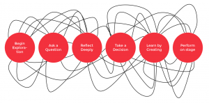
- Feedback Loop- Feedback loop is reflected in a circular model. Part of the output then becomes the input. This is reflective of the artistic process ( a much less organized model than most feedback loops).
- Compression- Compression reduces the number of bits in representing data. It makes a file smaller, but also reduces the quality.
- Nuance- Subtile differences. I think people use this term to define a situation where there is “a lot more than meet the eye”. In response to our current political situation:


Week 8
1. Intellectual Property: Anything you create, including the intangible that one has copyrights to.
2. Minimalist: Approaching a lifestyle, design, ect. in a manner that is reflective of the basic needs or components in order to get the information across.
3. Transmedia: a technique of telling a single story or experience across multiple platforms and formats using current digital technologies
4. Buckley: