
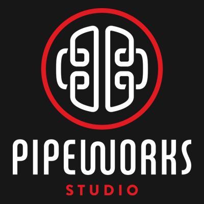
 The first brand I’ll highlight is a local one: “Pipeworks Studio,” a Eugene-based video game company, located in the heart of downtown. They’ve existed since 1999, producing independent video games and going on to help form the largest independent game developer in the world in 2005 (according to their website). The logo is posted on the side of their office building, in very large scale, and I’ve walked by it many times and was attracted to it. Only in posting it here, for this assignment, did I notice the birds-eye-viewof a brain hidden within what appears to be a tangled knot of pipes. Besides the fact that it’s clever, I’ve found I’m drawn to branding which includes a prominent image to accompany the words. While I have an appreciation for typography which holds it’s own, there’s something very memorable about a symbol. I feel this accurately illustrates Paul Rand’s idea of logos as being “escutcheons” (even though I still can’t pronounce it). It’s bold, distinctive, and gives a sense of the business, just as a coat of arms gives a sense of a family. In addition, the font of the words resemble the pipes, creatinga nice tie-in and balance for the overall image.
The second brand I wish to discuss is for “Salt & Straw” ice cream. Based in Portland, OR and Los Angeles, CA, they are known for their inventive flavors, and (in Portland) for having customer lines stretching out of the shop and down the block. In looking into the background of their logo, I found that it had actually been created by a contracted graphic design company called “Shipwreck Graphic Design” (here’s the link to their website: http://shipwreckdesign.com/work/ to see more of their designs).

I love the simplicity of the logo, the look of the typography, and the color scheme. The red and white colored pattern reminds me of an ice cream parlor from the 50’s. I find it interesting that a simple color combination can evoke a time period. However, what I like most is how adaptable it is. It looks good on everything! They place it on different textures and backgrounds, but it always looks clean and appealing. Or maybe it’s just appealing because they’re selling ice cream…


Thirdly, I want to share my appreciation of the logo for the podcast “Serial.” To start, that title is wonderfully layered and reflects the podcast perfectly. Looking at this example reminded me that the title or name of the brand is just as important as the way in which that title is communicated. The logo depicts a literal series, like frames of film or storyboard. The color scheme reminds me of a film noir, or detective story, which fits with the genre of the podcast, in which a team from This American Life revisits the mysterious, inconclusive case of a high school girls murder.


Another version of the logo shows the letters stacked like a deck of cards, which could also be symbolic of mysterious nature of the narrative. This is another logo that is clever in that it is adaptable. Even just the one letter has a distinct enough design that it can stand alone and still be recognized. This version is another great example of an escutcheon.
Finally, I want to talk about the “Boys & Girls Club” brand.
![]()
Between undergraduate and graduate school, I worked for the Boys & Girls Clubs of the Portland Metropolitan Area. Before I knew details about how the organization operated, I knew their name, knew their mission, and could perfectly picture their logo. While working there, I was introduced to the strict rules regarding the use of this logo, including online, on documents, and on buildings. I think part of the reason for their branding success is how intentionally and meticulously they utilize it. Another reason is their transparent mission. It is important for both the form and the content of the design to be clear, and with this logo, the mission is clearly reflected in the symbol. In addition, it is successful in many of the ways that the “Pipeworks” logo is successful: it’s a somewhat intricate symbol which is aesthetically pleasing on it’s own, but also has a “hidden” picture: in this case, two hands clasped together.