This portion highlights the most significant work completed since the start of this program. As I am in the first year of this program, we are focusing heavily in foundational work complimented with group projects. The information given here is a sample. However, the complete work can be located by clicking the link below the segmented example.
Example 1
While studying Community Cultural Development, our class worked closely with the Sustainable Cities Initiative to develop a cultural asset map for the City of Albany. As a class, we worked together to provide the materials needed for Albany to further explore a cultural inventory for their city. I took a leading role in this project, focusing in family and community services- specifically looking into services for females and mothers. We used several research methods such as case studies, interviews, and data analysis. Once we develop a cohesive foundation based on our research, myself and two other students presented to a panel of citizens from Albany. We also shared recommendation for when they further explore this content.
Below are segments of the presentation given to the panel. This work provides the way in which we assisted the city with tactical plans in approaching a cultural inventory, but also give contexts as to how we further developed an understanding of Albany to create an effective asset map that can be useful in future planning.
Please click the images below to see a larger view.
The full presentation can be found here- Albany Cultural Inventory.
Example 2
Through studying marketing and communications, I have developed a close working relationship with ArtCity- a start-up initiative in Eugene. The writing sample below is a segmented portion of a further look into ArtCity’s strengths and weaknesses.
[embeddoc url=”https://blogs.uoregon.edu/briannahobbs/files/2017/01/Cultural-Scan-ucipg0.pdf” download=”all” viewer=”google”]
The complete analysis can be found here: ArtCity Case Study
Example 3
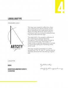
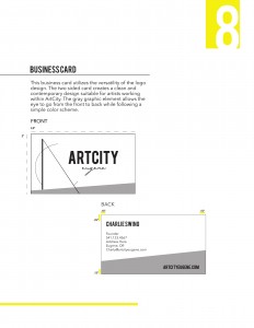
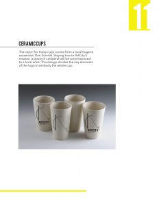
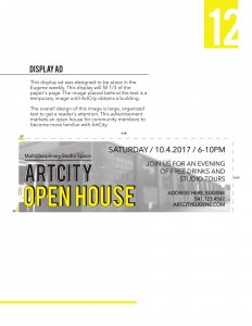
To continue the work completed with ArtCity, I have included a portion of the graphic standards designed for the organization. This work was created with the diverse artists associated with the organization in mind. The contemporary, simplistic approach was intended to hold aesthetic appeal when printed next to an artist’s piece, but not obstruct it.
Please click the images below to see a larger view.
The complete graphic standards can be located here: ArtCity Graphic Standards


