Your axons! They’re all squished! You can hold shift (PC) when scaling in Illustrator to avoid deformation.
While I appreciate the use of a highlight color, the green overwhelms the drawings. As a rule of thumb, your drawings should be legible without any color – the highlight is to only draw the eye to a change or progression in the design.
The line weights below are almost unreadable. They remind me of old video game consoles (I mean this in the BEST way). It looks like you had dashed lines assigned to every line. The front most pieces should be solid, denoting that it is the face of the object, whereas dashed lines show that something is not visible to the viewer but are still imperative to understanding the design as a whole.
Keep it up!


Your axons! They’re all squished! You can hold shift (PC) when scaling in Illustrator to avoid deformation.
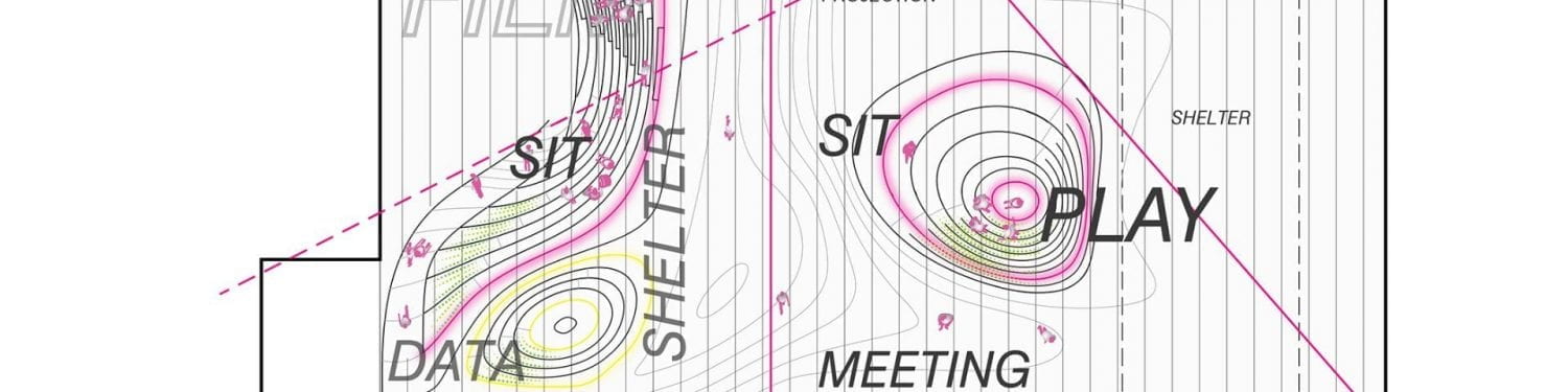
While I appreciate the use of a highlight color, the green overwhelms the drawings. As a rule of thumb, your drawings should be legible without any color – the highlight is to only draw the eye to a change or progression in the design.
The line weights below are almost unreadable. They remind me of old video game consoles (I mean this in the BEST way). It looks like you had dashed lines assigned to every line. The front most pieces should be solid, denoting that it is the face of the object, whereas dashed lines show that something is not visible to the viewer but are still imperative to understanding the design as a whole.
Keep it up!