1. Kerning: The space between letters (typography) in proportional fonts.
2. Emphasis: Where the visual weight is carried, the use of bold, italic, or other mechanisms to make a stronger point than with words alone.
3. Descender: The part of a letter that falls below the baseline.
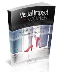
4. Visual Impact: How the audience sees the image. Unless of course you are a woman, in which case it is a workout routine for the feminine physique.
5. Constraint(s): Limitations of the medium, the canvas, the cost, print color, time, etc.