As part of this assignment I used the NTLF logo which was an image generated from their new sign, recently installed. Found below, there were a few considerations when I started revamping their logo. The first is that they were certain that they wanted to use the image of their sign as it is easily recognizable in the community and represents the Friend’s purpose; to maintain the building and grounds.
My first draft, found below, is a simple logo that uses the same imagery but adds an image of the book. While there is a simplistic element that I like about this draft, it doesn’t contain key elements required by the Friends. The Tillamook County Library Logo (seen on the lower right of the sign of the first logo) needs to be incorporated. Secondly it does not contain the word Friends, which is important to distinguish it between the public library system and the private nonprofit.
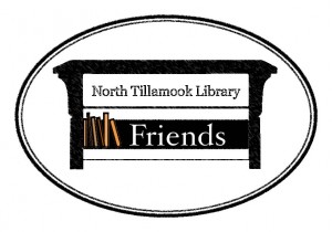
The third and most recent draft incorporates three elements that I felt represented the character of the Friends. The first is that the sign is contained within a circle to ground the sign and give it a contained feeling. The Circle itself is also reminiscent of some of the local historical signage for the three villages without being derivative. The word Friends was added, and the sign was turned into a bookshelf. Finally the sign was treated with a filter to make it look like torn paper, which also makes the sign look a little older, to match the age of the building. Wear and tear on infrastructure occurs at a higher rate on the Oregon Coast.
The final logo will need to include the Tillamook County Logo, and will incorporate elements and suggestions from the communications committee.


