Well, I feel like I’m more organized. I’ve made significant effort to reduce the noise in my output and perhaps it shows in my portfolio. My blog is easy to navigate which lends itself to a minimalist style, although the visual impact is busy. I appreciated the overview of terms used in graphic design as well as the review of the technology available for marketing. I also have a better understanding of the project management tools available and how they are used. I’m happy with the product of the course and feel that it was worth the time and effort required. The direct applicability of the course work to my professional field was also valuable. Thank you! See you in the Winter Term.
AAD 616 Fall 2016
Final Lexicon
1. Kerning – The space between lines.
2. Emphasis – Where and how the point is made.
3. Descender – The part of the letter that goes below the baseline.
4. Visual Impact – The first impression a graphic or image makes on the viewer.
5. Constraint(s) – The limitations on the media such as size, materials used, colors used, etc.
Graphic Standards
ntlf-graphic-standards-cara-mico – link
[embeddoc url=”https://blogs.uoregon.edu/caramico/files/2016/11/NTLF-Graphic-Standards-Cara-Mico-2kubkqe.pdf” download=”all” viewer=”google”]
Lexicon Week 9, We Made It!
1. Kerning: The space between letters (typography) in proportional fonts.
2. Emphasis: Where the visual weight is carried, the use of bold, italic, or other mechanisms to make a stronger point than with words alone.
3. Descender: The part of a letter that falls below the baseline.
4. Visual Impact: How the audience sees the image. Unless of course you are a woman, in which case it is a workout routine for the feminine physique.
5. Constraint(s): Limitations of the medium, the canvas, the cost, print color, time, etc.
Lexicon Week 8
1. Intellectual Property: The category of corporate greed that takes away the rights of artists for the profit. Conversely, the ineffectual area of law that ‘protects’ artists from copyright infringement. See below.
2. Minimalist: <=>
3. Transmedia: Telling a story across multiple platforms so that the audience is engaged in multiple areas of their life.
4. Affiliation: The way in which two or more objects, people, or associations are related to one another.
5. Buckley: The worlds 5th cutest dog that I know of.
Lexicon Week 7
- Social Proprioception: Proprioception is the bodies unconcious ability to know where its limbs are and coordinate movement. Similarly, the social aspect of proprioception is the understanding of where different parts of your community are through status updates and location based apps. The concept is that people are more unconciously aware of their friends and family through social media.
- Dissonance: when two or more objects, sounds, thoughts, or events are used in such a way that is counter-intuitive and not in the way the audience expects. Things that are not in harmony with one another. While this can be used to a strategic advantage, it generally is negative. This image is one example of graphic dissonance from the website http://www.uxmatters.com/mt/archives/2013/02/design-dissonance-when-form-and-function-collide.php
- Feedback Loop: Design work, design presentation, design review, back to design work to incorporate comments.
- Compression: Reduction of an image file-size through the use of algorithms.
- Technology Reticulation: The creation of a mesh or wire-frame using CAD to generate 3D images.

PLE
[embeddoc url=”https://blogs.uoregon.edu/caramico/files/2016/11/Personal-Learning-Environment-1-2gwjkcj.pdf” download=”all” viewer=”google”]
My personal learning environment emphasizes people. I learn through connecting with people either at home, work, or school. I enjoy lectures, radio programs, books on tape. Storytelling is one of my favorite mediums. Outside of oration I enjoy reading. I love the printed word, the combination of lecture and reading works very well for me. Finally I enjoy video which I consider to be another form of person to person connection (TedTalks, etc.). I enjoy work environments that have energy but allow for focused effort. If I can have my way I would learn in the company animals on all occasions 🙂 I enjoy being outside and need to connect with nature regularly to offset the amount of time I spend in front of a computer. I also enjoy meditation and find that I can learn more effectively if I meditate regularly. Although I can multitask, I prefer to have enough time to focus on one project at a time, for a period of an hour or so, then be able to take a break and move on to a different type of project. My learning is fueled by coffee and black tea.
While I prefer tactile, hands-on learning, I’m also a tech junkie. I enjoy photography and use Instagram for storytelling, both in the images I post, and in the images I like. I also enjoy twitter to share news articles I find interesting or socially important. It’s also interesting to be able to have conversations with people you might not otherwise be able to. I’m not a fan of Facebook but for some people, you have to use it :”/ I use Blogger, WordPress, and other media sites (occasionally I use the Tumblr and G+ sites). Snapchat is being overtaken by Facebook/Instagram so while it’s fun, I don’t see a need for it. I also have limited space on my phone which is where I access most of these apps (with the exception of blogging which I do from my laptop or another computer).
In terms of learning styles I prefer to dig deep into a subject and understand all of the intersecting components. For instance I’m not only interested in the biological component of water quality, but also the social, political, and cultural aspects of water quality. I prefer to ask a lot of questions to better understand a subject. I take copious notes since I need them to keep track of my commitments. I also enjoy going back to my notes from previous years and seeing how I felt about things. I also firmly support the theory of spiral based learning. I am still learning about things that I was introduced to over 30 years ago, but I am learning from a different perspective. I also am waiting for the robot takeover when humanity will become irrelevant. It’s coming. (I’m only sort of joking.)
Lexicon – Week 6
- Distributed Cognition: Knowledge is housed in multiple objects and people, you don’t know what you know as an individual, you know what you know as a collective and in context.
- Collaborative Intelligence: People working in concert to solve problems, we’re more than the sum of our parts.
- Informal Learning: All of the learning that takes place outside of a structure classroom environment.
- White Space: The Balance. For emphasis, the space left open.
- Focal Point: The place where the eye is drawn to.
- New Media: Anything post printing press, what is often called social media.
NTLF Collateral

Business Card

Envelope
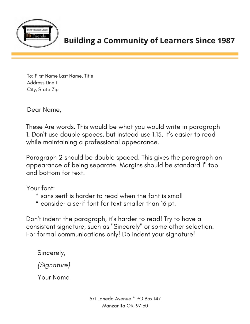
Letterhead
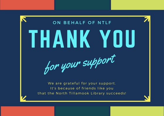


Friends Sign Up Postcard


Brochure
Posters
Logo Draft 1
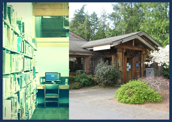
As part of this assignment I used the NTLF logo which was an image generated from their new sign, recently installed. Found below, there were a few considerations when I started revamping their logo. The first is that they were certain that they wanted to use the image of their sign as it is easily recognizable in the community and represents the Friend’s purpose; to maintain the building and grounds.
![]()
My first draft, found below, is a simple logo that uses the same imagery but adds an image of the book. While there is a simplistic element that I like about this draft, it doesn’t contain key elements required by the Friends. The Tillamook County Library Logo (seen on the lower right of the sign of the first logo) needs to be incorporated. Secondly it does not contain the word Friends, which is important to distinguish it between the public library system and the private nonprofit.
![]()
The third and most recent draft incorporates three elements that I felt represented the character of the Friends. The first is that the sign is contained within a circle to ground the sign and give it a contained feeling. The Circle itself is also reminiscent of some of the local historical signage for the three villages without being derivative. The word Friends was added, and the sign was turned into a bookshelf. Finally the sign was treated with a filter to make it look like torn paper, which also makes the sign look a little older, to match the age of the building. Wear and tear on infrastructure occurs at a higher rate on the Oregon Coast.
![]()
The final logo will need to include the Tillamook County Logo, and will incorporate elements and suggestions from the communications committee.