![]()
The Puffs brand was introduced in 1960 by Procter and Gamble. I chose Puffs because I have very bad allergies and love this brand of tissues. This logo is simple yet gets the point across. The letters are soft and fluffy, much like the tissues themselves. I believe that they used this soft, easy on the eyes font to match the comfort style tissues that they produce. The blue color used also represents peacefulness and comfort. The logo around the word is in 3D format. Maybe they did this to represent something thick, sticking out, like a puffer fish. This is a non free logo, so there is no free representation. More recently invented there is a newer puffs, where the words are more swirly fancy letters, and inside a cloud figure. I believe they use the cloud because it represents something soft, which you want for your nose.
![]()
The disney logo is famous world wide, and iconic to people of all ages. I chose this logo because I worked for disney and this their logo is simple but effective. The logo has had numerous changes and alterations over the years. Walt Disney’s signature changed overtime, as did the logo. Even the current one above, is different then Walt’s final signature and didn’t appear till 18 years after his death. I believe the D is so profound, intricate, just like the company. It has a roundness in shape, with a sharp single line through the center. In Walt’s original signature, he had little open circles for his i, here it is similar, but with a little slash through the circle. The s & y are fancy also, but the N & E are more simple upper case rounded, almost sloppy quick hand writing effect. Walt’s signature changed at various stages of his life, and also depending on what tool he was writing with. You can go online and watch in-depth videos of the history of Walt’s signature and how the logo has changed overtime.
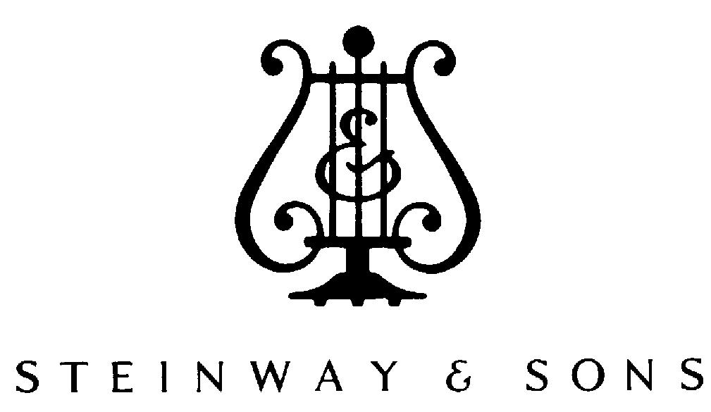
Steinway & Sons is an American and German producer of pianos, establish in 1853 by Heinrich Engelhard Steinweg. This logo is very symmetrical, with the words extending out to the same length on both sides of the lyre. The words are simple yet stately. In all caps, and spaced out. The lyre represents music, and is actually very similar to the lyre used as patches on my navy uniforms. The liar is used as a logo in numerous brands. It represents music, even to a non musician. The bottom of the lyre features three foot pedals, like the steinway piano has. This logo like many companies has changed over the years. If you look closely at the liar (S&S), steinway and sons is weaved in. The eyes may not notice it at 1st, but there is a backward S on the left, and a normal S on the right. Between them is the & sign inside the three vertical lines of the liar.
1 Comment
I couldn’t agree more with your analysis of these iconic logos! It’s fascinating how each design captures the essence of the brand. Speaking of brands, have you ever noticed how the jumping shell logo also manages to convey a sense of energy and movement with its clever design? It’s impressive how logos can tell a story in such a simple yet impactful way.