
The Lancome Rose is the iconic logo used for all Lancome products. The rose is printed as a stand alone logo on all bottles, tubes, makeup bags, brush handles, etc., and is imprinted into makeup products such as blush. The colors it is printed in change according to the product packaging, as Lancome often differentiates its products by color, so the rose will be seen in black, red, pink, gold, silver, blue, white, or purple. It can also be scaled to any size and, because of this, is easily transferable to any media type. The significance of using this logo goes beyond trying to appeal to the romantic, feminine mystique. Lancome actually created its own variety of rose, known as The Lancome Rose, that is used as the scent for its higher end facial products and makeups and grows fields of them in rural France.
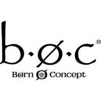
Born Concept is a shoe company that is based in the United Kingdom and was established twenty years ago. In the last decade, it has become an international brand with, what was for me, a confusing logo. When I bought my first pair of Born shoes, I thought the company was called “boc” because these three letters were embossed on the outside of both pairs of shoes. I found the website and learned that the company is called Born Concept, but still did not understand the “o” in the center because it seemed to be irrelevant. I thought that it must have been some sort of initial, and for years, called the company “boc, Born Concept.” A few years ago, I realized it was a matter of bad promotion and the company is just called “Born Concept”. They simply weren’t being clear about the name and logo being two different things. Looking at their website for this assignment, I see that they have completely eliminated the “boc” and have been imprinting the circle with the crown in the middle of it by itself on shoes instead. This is exactly what I wanted them to do! This simple logo communicates everything about the company: it is British (hence, the crown), it has a diagonal line (for lack of a better word) that invisibly dissects it through the middle and speaks of strength, as if it’s a sword. These two things speak of strength and quality, as well as pride in the product.
![]()
I had originally included a different logo as my third choice, but after Tuesday’s class, I decided to change it to the Louvre‘s logo. I disagreed with a classmate that I thought this was a good logo for the museum and have continued to occasionally think about why I like it over the last twenty-four hours. For one who is not familiar with it, the Louvre is France’s flagship museum and is one of the top destinations for many of those who may travel to Paris. In its collection are some of the most important works of art in Western European History. “Venus de Milo,” da Vinci’s “Mona Lisa,” and “The Winged Victory of Samothrace” are probably the most well-known works in the Louvre’s possession, and, as a note, I have seen them in person, on display in this museum. Additionally, I have extensive experience singing chansons of the French classical canon, began learning French when I was nine years old, and have a love of haute couture. As I’ve thought about this logo, more and more elements of French culture and history are evoked in my mind by it and the more I become emotionally engaged with it.
To begin, this logo does much to situate the Louvre within the broader context of French culture. The French are masters of understatement. Some might say they are reserved in how they present themselves through their culture, language, and expression of emotion, but this is the foundation of their sophistication. They say volumes with very little. The simple black and white color scheme is evocative of the importance of the color black in French haute couture history – something France takes great pride in. It was Coco Chanel who invented the little black dress and culturally liberated women in the 1920s. This was one of two monumental moments in women’s cultural liberation through the power of haute couture (the other being the design of the woman’s pant suit and smoking jacket, or Le Smoking, by Yves Saint Laurent in the 1960s). Also, French are often depicted as wearing black and white striped, long sleeved shirts – just think of mimes. Then, there is this cloud curling upward in the background. Is it a cloud as one would see in the sky or is it a cloud of cigarette smoke? The French and their cigarettes were literally hand in hand. All of this leads to mystery and sex appeal – very French. It elevates the Louvre so that it acknowledges that it does not stand in French culture as a beacon by itself or even second best to the Eiffel Tower, but rather it is powerful in sharing its contribution to the society and culture it has in common with all of the other important elements of French History. This, briefly, is why I think this logo is well suited for its task of branding the Louvre.
A logo design that has been highly customized plays an important part in reaching out effectively to the target audience through the apt conveying of the right message of the brand that highlights and upholds the values and vision of the same.
https://artlogo.co/pages/gallery
We just cannot start logo making in pc. First we have to draw on a paper and with the idea we will do it in graphic design software. We must also be aware that the logo must be unique and never done before. There are certain rules and tricks to make logo.
https://www.anargha.com/
Great web site you have here.. It’s hard to find high-quality writing like yours these days. I really appreciate people like you! Take care!!
Karya Bintang Abadi