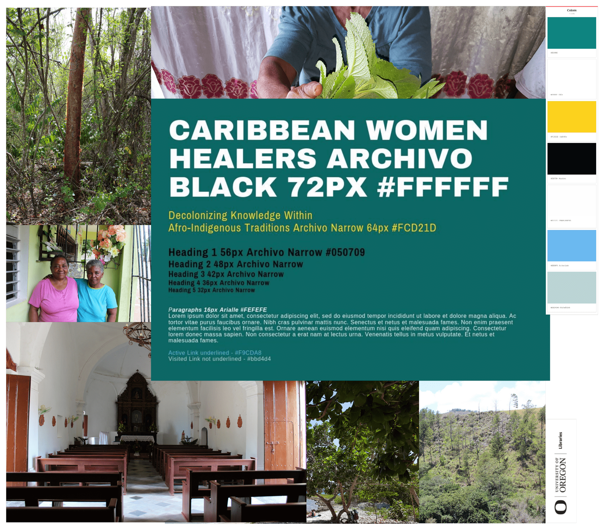
This summer the Caribbean Women Healers team members have been working toward the continuation of content creation, finalizing a style guide, and determining pages for the project’s website. While Ana and Ali have been traveling through the Caribbean and interviewing healers, UO Libraries Digital Scholarship Services has worked with faculty created a mood board/style guide and started work for the DH sites information architecture. For this post, we’ll focus on the work we’ve put together for the mood board/style guide and in the future one talk about information architecture process.
So what is a mood board and style guide? And why do we care about them in the context of this project? A mood board and style guide happen at the beginning of a design process. It helps you to begin organizing your creative ideas to establish the visual feel of your website. We put our mood board and style guide together after reviewing photographs of healers, Caribbean landscapes captured by Ana and Alai, and reflecting on what Ana and Alai shared during our project kick-off meeting about the Caribbean diaspora. Part of these conversations involved identifying what kinds of colors are preferred or not for the project. For example, we asked if specific colors could not be used for cultural reasons, and if there were specific visuals we should reference while designing. After photos highlighting healers, plants, landscapes, interiors, and the beach were select from field research data, our decisions to select the colors and fonts focused on user inclusion.
We used Milanote and Canva to put together the mood board/style guide. Milanote aided us in pulling together all the photos, color swatches, and fonts. Canva was specifically used to pick and combine various Google Fonts after we researched font pairings that would be bold and readable. We also used auditing tools to determine what our color palettes should be so we didn’t exclude people with visual impairments like color-blindness. Accessible Color Palette Builder and Color Safe to make sure we were in compliance with WCAG 2.0 AA guidelines. For fonts, we selected sans-serif fonts because lack of hooks gives more space between letters and makes them more distinguishable for people with dyslexia.
Next step for web design is to begin working on the site’s information architecture. We’ll be using the wireframing tool Lucidchart and a sitemap drafted by Ana and Alai to get us started. For upcoming upcoming project updates, we’ll be highlighting this work, our new Digital Scholarship Specialist Graduate Employee Hanna Lepskaya, and the technology platforms we’ll use for as our site’s content management system and streaming media platform.
— Kate Thornhill