Museum of Arts and Design Logo
![]()
In 2008, the Museum of Arts and Design (MAD) relocated into a brand new building and got a new graphic identity. Prior to 2002, the museum was called the American Craft Museum which was felt to be outdated and didn’t fully represent what the museum encompassed. Designers worked to create new graphics that embody the museum’s mission of showcasing innovative methods used by artists. They created their own typography that could easily be manipulated depending on the use. The acronym MAD is easily distinguishable from the MAD we know from the magazine.
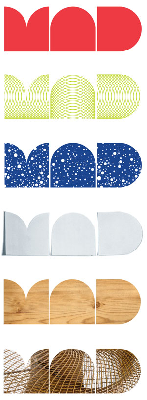
The designers used the shape of the museum’s new building as inspiration. I think it creates a unified message. The museum and their simple logo composed of geometric shapes expresses a contemporary feel and because of the proximity of the type can be read as one circulinear shape until the viewers eyes follow the curves to the spaces in between and discover each individual letter’s form.

Obey Logo

In 1989, Obey the Giant iconography was created by street artist and design student, Shepard Fairey, while he was teaching his friend how to stencil. Since then, it has grown into prolific street art, fine art and the clothing brand, Obey. Since the outcropping of the Obey Giant image in the 90’s, I was fascinated by it and the evolution of the artist’s work. I knew there was something he was trying to convey. This logo reminded me of vintage propaganda posters yet it was distinctly speaking the language of pop culture.
World War II Poster
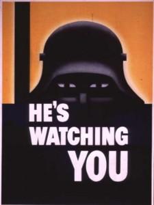
When the viewer sees Shepard’s image of Andre the Giant, there is an instant association with war propaganda posters. Like the propaganda posters, he uses simple, bold graphics and typography. Because of this association, the viewer knows there is a “message in the medium”. The design is effective because there is a perfect balance in design elements: contrast, alignment, repetition, and proximity. The eye loves contrast and is immediately drawn to the deep-set eyes of giant, as the small white shape of the iris contrasts the larger black shapes that make up the eye. The viewer is drawn in further to the shapes of the forehead, nose and mouth and directed to the word OBEY. The use of the color red elicits a feeling of caution and the use of italics has a slightly menacing affect, like a subliminal whisper. In addition, I believe the use of the word “obey” is a play on the punk rock mantra “Question Authority” of the 80’s and 90’s and a clever way the artist is using reverse psychologically and challenging the viewer to think .
Levi Strauss & Co. Logo
The Levi Strauss logo has changed in the last 100 years but has maintained the some of the same elements such as lines and color. Today, the logo has been stripped of many of its symbols of authenticity and durability and has taken shape as a simple form.


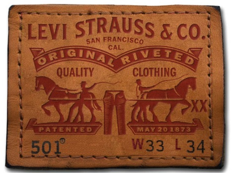

The logo has been distilled down to the same shape as the design on the back pocket of the jeans which has been the brand’s signature since the beginning. The batwing shape and color red have proven to be powerful symbols that have infiltrated the minds of generations and survived rebranding in 2011.
