Category Archives: Uncategorized

Final Reflection

This class was an excellent ending to the Media, Marketing and Communications series. If you would have asked me if I was interested in marketing prior to fall term, I would have said no way. I had the idea of marketing being this dry, business thing that was beyond me. However, what I have discovered is, marketing is a very creative process and an artform in itself. It is the process of analyzing a situation or problem, researching, coming up with a creative solution, designing and crafting a plan.

I feel it is a good idea to have two terms to fully develop the skills necessary to implement a marketing plan. During MMC I, we researched an organization and its context, generated a SWOC and situational analysis, branded and created collateral, and established graphic standards. This deeply informed the process of effectively marketing our chosen organization in MMC II. The experience of working with a real life start up organization, like Eugene Printmakers, definitely reinforced my learning from last term while also allowing me to stretch into new material.

Marketing has so much to do with understanding the audience served and responding to their needs, desires and values. The various marketing strategies we explored and utilized were diverse and could be applied in a range of settings. I think this important in order to facilitate accessibility for all. For example, when an organization understands the demographics of its audience, like age or abilities, they can tailor their marketing strategies to broaden their audience or cultivate knowledge and commitment in already existing members.

I am excited by what I have learned about social marketing and its potential as a tool to reach a diverse audience and get the message out to a lot of people which could lead to growth in an organization. The idea of virtual third spaces becoming a channel for the exchange and sharing of information is fascinating to me. I would like to delve into this more in the future and become fluid using web-based channels.


Lexicon Week 8

Environmental scan- An environmental scan enables organizations understand the internal and external environment in which their organization exists. It helps to identify patterns, trends and potential changes in the external environment and allows decision makers to guide the future direction of the organization. Environmental variables consist of: demographics, political, cultural,economic, and technological.

SWOC analysis- An analysis of an organization’s

Strength-What does the organization do best?

Weakness- What does the organization struggle with?

Opportunities-Emerging opportunities the organization can benefit from or utilize.

Challenges- What are the obstacles the organization faces?

Resources- Assets that can be be utilized by a person or organization.

PLE- PLE are systems in which learners can take control of their environment. From what I understand of it now, the PLE is very integrated with technology.

Personal Learning Environment- Narrative

My personal learning environment consists of my family, work, school and my community. I have learned the most from my family. They teach me everyday how to be the best possible person. I strive to impart strong values to my children, values I learned I had once they were born. Attending school, working and volunteering are ways I can provide them with a stable life and better world. In these arenas, I have learned a great deal about the world and myself. Learning how to maintain a balance in my personal learning environment is often challenging. As a mother, artist, scholar, and community member, life and learning for me is a delicate balance. I chose to represent this precarious balance with a tightrope walker. She balances family, school and work effortlessly on her pole. It takes courage, focus and discipline for a tightrope walker to maintain her center of gravity. I have often visualized a tightrope walker when I felt like I was walking a fine line between success and failure. One false move could easily send me to my doom.

The tension wire of life has two points: the past and the future. Like a tightrope walker I must not look back or try to retrace my steps, however, I find that I learn a great deal from reflecting on my past experiences. There is never an option of turning back. The future can seem uncertain but it is full of promise and discovery. Every day I look forward to what I will learn next.

My personal learning environment usually depends on the act of doing. I am mostly a kinesthetic learner, and learn best through physical activities. When I find that I am stuck on some aspect of learning, such as assimilating complex information or an artistic technique, I find I push through by initiating a physical action, for example writing or making the first cut in the surface of a material. The tightrope walker must never falter and always move forward.

I have provided myself with a safety net in my personal learning environment. It consists of nature, community, friends, art studio, tools, mentors, professors, emotions, senses and family heritage, from all in which I learn.


Lexicon Week 6

Audience: Audience refers to an individual or group of individuals who physically or digitally engage with a range of events for example, exhibitions, live music, dance or who participate in a cultural organizations or institutions to gain an experience. An audience member can be any age, race, ability or gender.

Accessibility: Accessibility is when every individual, no matter their mobility, education, income level, age, gender, or race, has access to arts and/or an arts experiences.

Mediating: Mediating, in a way, is like facilitating accessibility to art by enabling each individual participant to interact with art and take part in it. This includes the way an organization or curator presents the art or communicates about it to their audience.

Lexicon week 4

Convergence- In relation to the article, Media Industries, Work and Life, it is the merging of various media, culture and the creative sector into the everyday experience of life. It is when the audience (consumer) participates and engages with different media and ultimately integrates it into life, work, and play.

Vector (image)- Is not pixels. Eric says it is like a mathematical equation using line, polygon and shape. Unlike pixels, it can be scaled to it’s maximum size without losing its clarity and quality.

Focal point- A focal point draws the reader’s eye into a piece. It is an area of emphasis that captures the viewer’s attention. It is usually achieved by creating visual contrast and can be used to pull the eye to important features or information.


Brand Awareness

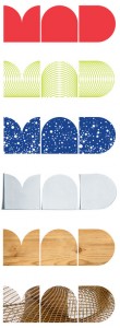
Museum of Arts and Design Logo

In 2008, the Museum of Arts and Design (MAD) relocated into a brand new building and got a new graphic identity. Prior to 2002, the museum was called the American Craft Museum which was felt to be outdated and didn’t fully represent what the museum encompassed. Designers worked to create new graphics that embody the museum’s mission of showcasing innovative methods used by artists. They created their own typography that could easily be manipulated depending on the use. The acronym MAD is easily distinguishable from the MAD we know from the magazine.

MAD_Logos_Sm

The designers used the shape of the museum’s new building as inspiration. I think it creates a unified message. The museum and their simple logo composed of geometric shapes expresses a contemporary feel and because of the proximity of the type can be read as one circulinear shape until the viewers eyes follow the curves to the spaces in between and discover each individual letter’s form.

26design.1902


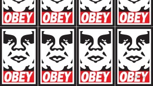
Obey Logo

original

In 1989, Obey the Giant iconography was created by street artist and design student, Shepard Fairey, while he was teaching his friend how to stencil. Since then, it has grown into prolific street art, fine art and the clothing brand, Obey. Since the outcropping of the Obey Giant image in the 90’s, I was fascinated by it and the evolution of the artist’s work. I knew there was something he was trying to convey. This logo reminded me of vintage propaganda posters yet it was distinctly speaking the language of pop culture.

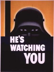
World War II Poster

HesWatchingYou-WW2-Propaganda-Poster


When the viewer sees Shepard’s image of Andre the Giant, there is an instant association with war propaganda posters. Like the propaganda posters, he uses simple, bold graphics and typography. Because of this association, the viewer knows there is a “message in the medium”. The design is effective because there is a perfect balance in design elements: contrast, alignment, repetition, and proximity. The eye loves contrast and is immediately drawn to the deep-set eyes of giant, as the small white shape of the iris contrasts the larger black shapes that make up the eye. The viewer is drawn in further to the shapes of the forehead, nose and mouth and directed to the word OBEY. The use of the color red elicits a feeling of caution and the use of italics has a slightly menacing affect, like a subliminal whisper. In addition, I believe the use of the word “obey” is a play on the punk rock mantra “Question Authority” of the 80’s and 90’s and a clever way the artist is using reverse psychologically and challenging the viewer to think .


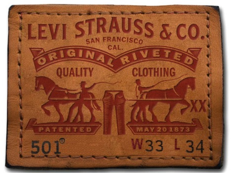
Levi Strauss & Co. Logo

The Levi Strauss logo has changed in the last 100 years but has maintained the some of the same elements such as lines and color. Today, the logo has been stripped of many of its symbols of authenticity and durability and has taken shape as a simple form.

1887


1890


1899


1910


1902


main-raw-two-horse

The logo has been distilled down to the same shape as the design on the back pocket of the jeans which has been the brand’s signature since the beginning. The batwing shape and color red have proven to be powerful symbols that have infiltrated the minds of generations and survived rebranding in 2011.