Archives for Inspirations

Admiration and Inspiration

Paving the Way
A Profile of a Practitioner by Mary Anne Funk


Robin Morgan, New York City, 2014

I have long admired Robin Morgan. I am inspired by her ongoing commitment to provide a place for the voice of women.  Robin is a co-founder of the Women’s Media Center for which she hosts a weekly podcast, WMC Live

Robin uses her online platform to make it possible for generations of women to receive the training and mentorship services she provides through the Women’s Media Center. Robin also helped start a special program called She Source which helps connect  women who are experts in a variety of fields and topics with publishers, journalists and talk show hosts who are seeking qualified women with whom they can share their expertise in interviews.


In the following video interview with Pressroom VIP, Robin talks about why she co-founded the Women’s Media Center and the importance of having a media that is diverse.

“The talking heads on the Sunday morning political programs, on all of the interview programs, are 63 percent white and male. That does not reflect reality or the diversity of this country and the strength of this country and the reality felt by most people.”(1:43)

Robin, along with other women, is still standing up against sexism. She is demanding equal pay, equal opportunities and respect for women in the workforce. She is also continuing to pave the way for women to have a voice and presence in our media both in the foreground and behind the scenes.

“Women are the majority of the human species. For us not to be included in all forms of media and in fact a majority voice, is bad for media, it’s bad for journalism, and ultimately it’s bad for democracy” (4:07)

1945, Robin Morgan in The Little Robin Morgan Show

I reached out to Robin’s publicist for an interview with Robin, however, Robin is currently writing a new book and not taking any interviews at this time. I respect her time and while it isn’t able to happen yet, I look forward to the day when I am able to meet and interview her.

I appreciate all that she has done with others to provide a space and place for the voices of girls and women, and the years of work she has put into making my work in this field possible.


Personal Inspiration: Into the Empty Quarter


Into the Empty Quarter 20 minute festival cut.

In this blog post, my comments and time stamps refer to the 20 minute festival cut.

Get Into the Empty Quarter feature length film here.

Into the Empty Quarter is an award winning 2013 documentary by filmmakers Alastair Humphreys and Leon McCarron.

Inspired by Wilfred Thesiger, who made a series of expeditions to the region nearly 60 years earlier, Humphreys and McCarron set off for the Empty Quarter desert on the Arabian Peninsula in November 2012. They traveled on foot, towing all supplies, food and water behind them on a homemade cart. Their route spanned 1,000 miles, starting in southern Oman and ending in Dubai.

A historic photo of Wilfred Thesiger and his camel, late 1940s. (1:49)

Humphreys and McCarron use present tense storytelling to bring us along on their expedition. By being both the creators and the stars of the film, they are utilizing a reflexive technique. The two use both scripted and unscripted editorializing and often turn the cameras onto themselves, vlog style. Despite the high stakes of the expedition, the characters come across as relatable and playful, which helps the viewer emotionally connect to the subjects during more trying portions of the trip.

The log-line, or the unanswered question that accompanies us throughout the film is, simply, “Will the expedition be successful?”

From the beginning, the filmmakers hint at this question by including comments about their qualms about the trip overall, design and mechanical issues with their cart, oppressive desert heat, and some waves of despair that come over them after pushing themselves physically and mentally in the middle of nowhere. In the end, they wrap up the unanswered question with a cinematic arrival in Dubai, and some thoughtful commentary about adventure inspiration and the idea of adventure heroes.

At 3:27, the film uses motion graphics laid over a map in order to portray their intended route.

The film’s map graphic, mid animation. The expedition had to skirt the Saudi Arabian border due to visa issues. (3:26)

Due to the central role the the journey or quest story arc tends to play in this genre, a map graphic, or at least the use of maps of some kind is essential. Not only does it spatially contextualize the expedition, but it gives the viewer a scope of just how grand their route was. In a film like Into the Empty Quarter, a map is a necessity, and Humphreys and McCarron take their maps to the next level with animation.

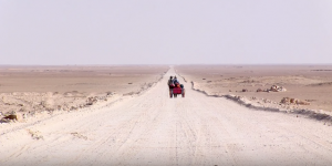
Because the two people on the expedition were also creating the film, they had to film themselves. This meant setting up a camera on a tripod, and walking past it, toward it, or away from it before returning to collect the equipment. Despite the grueling route, extreme heat and sun, and limited time and supplies, the Humphreys and McCarron do not skimp on collecting these wide, panoramic shots that depict them moving across the landscape. This film, and others like it, give new meaning to the expression “shoot and move”. They were also smart to include some ‘enter frame/ exit frame’ scenarios to aid in the editing process. Wide and ultra wide shots that feature the subject(s) are crucial elements of adventure filmmaking, because they contextualize the subjects and place them in the environment they’re passing through. As such, these establishing shots are a signature element of Humphrey’s and McCarron’s shooting aesthetic in this film. This story could not be told without these wide, locked down shots that feature the subjects. They show motion and progress across the landscape, which propels the subjects along and moves the story toward the resolution of the unanswered question. They display the beauty of the Empty Quarter’s desert landscape, which is a natural wonder that deserves to be showcased. The filmmakers stand out as a bright dot against the desolation and starkness of the desert, and these symmetrically balanced shots give us a sense of their isolation and remoteness. Again, they put the subjects in the context of their environment– two guys from the UK, pulling a weird cart in the middle of a vast, sandy plain with no buildings, water, or other people in sight. That alone is a compelling story, and it simply couldn’t be told without ultra wide shots. See below.

Humphreys and McCarron (and their cart) walking on an improved road near the start of their journey. (7:43)

In addition to using a compelling story arc, demonstrating clear proficiency with their cameras (Canon 5D and Canon XF100) and solid, tight editing, Humphreys and McCarron take the the time to stage and compose a number of visually interesting scenes that help carry the story along and make the film more visually diverse.

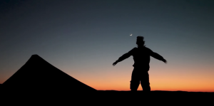
The silhouetting in the two shots below is used in a way that communicates the harshness of the Empty Quarter and, as such, adds to the story. As the sun goes down, Humphreys and McCarron are seen basking in the cool evening air, enjoying their nightly respite from the brutal daytime heat. The filmmakers decide to show this with these wide/ medium shots as opposed to simply saying it to the viewer with voiceover or first person narration. At 11:47, the pair dance around their campsite as the sun disappears behind the horizon. At 11:50, Humphreys can be seen swinging his arms, dancing again against the sunset. This communicates the joy of the relief brought with nightfall, and provides some nice character development. They show that despite being in a tough spot physically, these guys are friends and are enjoying their time together.

(11:47)

(11:50)

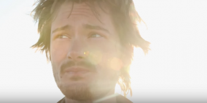
8:01 features nice closeup of McCarron as he talks about the state of expedition. In this scene, McCarron talks about how the ruggedness of the desert is dictating their route in ways that aren’t exactly as they had planned. He is clearly hot, tired and beaten down. Set up with his back to the sun, McCarron’s face is constantly shrouded with lens flare, and the background is washed out. This gives viewers the sense that the sun is unavoidable, inescapable, and a big consideration for McCarron and Humphreys.

(8:01)

This shot is from a sequence wherein McCarron and Humphreys are reconfiguring their cart before the start of their walk. After trying to pull it in the sand for the first time fully loaded, they realized they would have to make some slight changes to its design, and their trip is delayed while the cart sits at a fabrication shop. At 5:13, Humphreys is seen sitting, discouraged, on a couch in the street. The symmetry in the shot (the buildings in the background, the couch’s position relative to the buildings and the frame, and Alastair’s position on the couch) and the stark cleanliness of the street give us a lonesome, sterile feeling that adds to the feeling of helplessness conveyed by the accompanying voiceover. The shot lingers for 8 seconds, which aids in creating the feeling of being stuck. The following clips and voiceover, however, add that sometimes unexpected dilemmas on the road can lead to new developments, encounters and friendships that are great in their own way. This shot is a good bridge between those two ideas. Sometimes, when it feels like your fate is out of your hands, the best thing to do is just let go and go with the flow.

(5:13)

I have long been a fan of Alastair Humphreys, and I have learned a lot from this film and his other work. Into the Empty Quarter, along with other pieces of Humphrey’s and McCarron’s work, inspired a two person expedition I was a part of several years ago and has served as encouragement for my own personal travel and exploration.

One of my long term goals is to combine my expedition and backcountry experience with the filmmaking and storytelling skills learned in this program, and in so doing create a film like Into the Empty Quarter.

Websites:

Alastair Humphreys

Leon McCarron

Photos from Into the Empty Quarter expedition

Inspiration: Rocket Wars

Rocket Wars is a short film by the New York City based production company, Variable. The film falls categorically into what is best described as a cinematic-documentary hybrid, a style particularly innovated and championed by the team at Variable.

Rocket Wars, set in the Greek village of Vrontados on the island of Chios, tells the story of a more than centuries tradition wherein the the parishioners of two Greek orthodox churches exchange volleys of rockets aimed at each other. This annual holiday is known as Holy Saturday.

From beginning to climax the film is a clinic, from a narrative perspective, in the art of stage-setting and tension-building. What I aim to do in this blog post is point out instances where shot selection and juxtaposition in the editing process created that tension in the first and second acts and helped to craft a meaningful story. 

For more background and a technical breakdown of the production, click here.

Act I

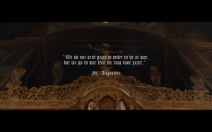
The very first shot of the film is a gorgeous low-angle dolly out of a gilded apse in a Greek orthodox church, this is overlaid by an ominous quote by St. Augustine. This first shot immediately introduces us to stakes to consider for the rest of the film, war and peace, or chaos and order.


The order and security represented by images of the church is juxtaposed by the chaos and violence of the ocean waves. This juxtaposition is further pushed by the presence of a less stable camera in the ocean scenes.

As we begin to see shots of the village, it is apparent by the absence of and life forms in the streets or on balconies, that there is this sense of impending doom or violence amongst the community.

It is important to note that it is the dialogue between these shots of the church, ocean, and village allows the editor to forgo sequencing back-to-back shots within a scene in favor of an interwoven, metaphorical sequence.

Act II


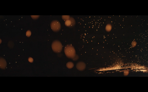
As we are introduced to the main characters of the film, the content shifts but the metaphor continues to build. As we see a man reflect in serene anticipation on what is to come, these shots are interrupted by poetic images of a firey chaos. This cut acts as a window into the mind of this character.


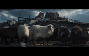
In the exterior shots we experience heavy winds and more shaky camera. A group of unnerved sheep amidst the winds invokes an obvious religious reference, and these sheep almost act as a stand in for the community members who are otherwise absent.

Without this beautiful interplay of poetic imagery building to the rocket-filled climax, the film, while still being visually stunning I am sure, would have fallen flat as a narrative. Here the filmmakers succeed in a textbook example of showing us what doesn’t need to be told and telling us what doesn’t need to be shown.


Inspiration: Watchtower of Turkey

I don’t necessarily recognize a great work of art the moment I experience it. If you and I were to see a movie together, you will likely find me at a loss for words during the credit roll as to what my true opinion of the film is. Usually, I need a certain absorption period to truly reflect on the impact a work has had on me, and the length of that absorption period is usually proportional to how much I end up enjoying the piece.

A good piece of art will bring me momentary enjoyment, a great piece I will revisit and recommend to others, but there are some works that fall into a category that I can only describe as ‘haunting’.  They are haunting because they embed themselves in a way that demands your acknowledgement, they speak to an archetype that either inspires or unnerves us, and they reveal something new to you in each interaction.

Works, across a variety of mediums, that I continuously revisit include: Stephen King’s IT, “Build Voice” by Dan Deacon, Dan Carlin’s Blueprint for Armageddon, Théodore Géricault’s Raft of the Medusa, Fallout (1997) by Interplay Productions, and Paul Thomas Anderson’s There Will Be Blood.

Continuing down that list we arrive at the subject of this blog, “Watchtower of Turkey” by Leonardo Dalessandri, a short travel film that I deem archetypal in the realm of online video. That I am highlighting this film is not original by any means. I am merely hoping to add my voice to the extensive coverage and universal praise of the work.

Watchtower of Turkey from Leonardo Dalessandri on Vimeo.

Named Vimeo.com’s top pick of 2014, “Watchtower of Turkey” is a tour de force of audiovisual immersion. Utilizing a seamless blend of matching action, visual matching, hyperlapse, slow motion, sound design, and pacing, Dalessandri takes us on a whirlwind tour through the country of Turkey. Although this piece is highly exceptional in a technical regard, films with this level of virtuosity are not all that uncommon in the saturated world of online video. What sets this film far and above any other of its type is the attention paid by the director to its storytelling structure in what would otherwise be a supercut of travel footage captured on the fly.

Dalessandri didn’t have a clear vision of how he was going to ultimately use this footage at the time he was shooting it. However, much of what made it possible for this film to take the form that it did was a certain degree of intentionality at the point of capture. I am going to finish up this post by highlighting three specific points in the film that show intentionality, and ultimately led to the creation of a successful film in the editing room.

“Do you hear me?”

In the opening act of the film we are reeled into this Turkish dream world with a soft poetic narration calling all of our senses to attention for the experience to come. This narration also serves to establish Turkey and its people as the character in this journey.

It is important to note that the decision to make this film happened spontaneously while Dalessandri was in Turkey for a music video shoot. The decision to record this narration shows that Dalessandri knew that merely showing the viewer would not be enough. It’s almost as if he is setting us up with a challenge at the beginning of the film, asking us to engage rather than react.

“Do you feel me?”

At 02:33 in the film, we see a sequence of whirling dervishes, in the second shot we see that the camera is panning back in forth in response to the dervish spinning in frame. This camera movement almost perfectly mirrors the angular momentum created by the spinning of the dervish. This technique gives us a visceral, felt experience in addition to the visual beauty of the shot.

“Can you see me?

Matched action and matched camera motion is central to the overall style of this piece, but an excellent example of how these matched cuts were able to be made in post production can be found at 00:57 in the film. Here Dalessandri cuts on a whip pan between two shots of street musicians. This seamless cut was made possible by the decision to film these separate musicians with the camera in a rocking motion as opposed to remaining static and reactionary.

Overall, this film is an example of what can be accomplished by a director and cinematographer who is actively engaged in the creative process through all phases of production. For me, it is a haunting (in a good way) reminder of how I should be approaching my own work with sincerity and intention.

“Funny Games” is the Horror Film We Need

The 2007 film Funny Games, directed by Michael Haneke, might just be the cure to the modern horror movie we didn’t know we needed. It features extremely inventive storytelling techniques, not just for a horror film, but for any film. From breaking the fourth wall, to sparse use of music, and use of off-screen action to evoke tension, this creepy home-invader thriller sets a tone for how to make a suspenseful film without undermining the intelligence of its audience.

The film is about a family–the protagonist played by Naomi Watts and her husband played by Tim Roth, and their child–that goes on a weekend get-away to their lake house. Things go awry when two strangers, apparently dressed as golf caddies, arrive and ask to borrow some eggs for the folks next door. But the strangers are not who they seem and soon the family is held captive as hostages for the intruders to psychologically toy with and harm.

Atmosphere and mood are set through seemingly benign scenes that build into increasingly dreadful ones as the story progresses. The use of music, or lack thereof, to sustain that tension is something to be admired in the movie’s design.

Instead of using loud music cues to evoke jump scares, or even creepy synthesizers or strings to set a tone, the movie relies entirely on diegetic sound and, except for the opening title, the music that appears in the film is only music that takes place within the world of the film–a style most often found in direct cinema/cinema verite documentary.

Not only does that make the story more real, but it makes the intensity of the powerlessness of later scenes even more prominent.

When the uninvited guests make their first appearance, they appear in all white–white shirts, white shoes, and white gloves. They come to borrow eggs, also white. Cinematography in the film works to extend this motif by showing the first villain through a screen door, that appears white from sun rays entering through it, in the first scene that he appears on our protagonist’s property.

Whiteness as a motif is represented in the cinematography, imagery, and set design of Funny Games
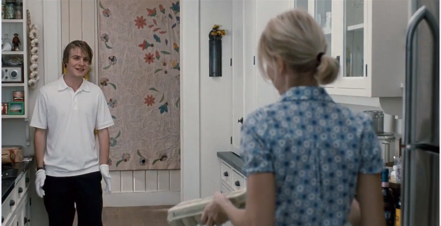
The villain’s outfit is white–an intentional motif of the filmmaker.
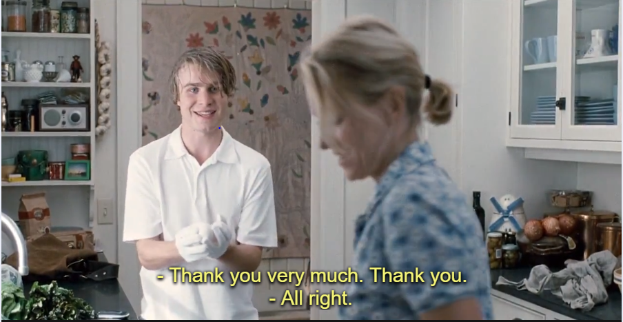
The villain comes to borrow eggs, another white motif associated with the villain.

Things turn ugly when the villain breaks the eggs, then receives more, then breaks those, then refuses to leave until he gets more. Then the second villain arrives, also dressed as a caddy, and kills their dog. The villains hold the family hostage and blames them for the situation for being rude to them about borrowing the eggs.

The motif is a reflection of their strange reasoning for their action and metaphorical presence in the movie. It’s a whiteness of hideous implications behind it’s supposed clean and pure surface. The dark intentions of the villains contrasts their facade of politeness throughout the film–they constantly say “please,” “thank you,” and “if you wouldn’t mind” as they play mind games and torture their victims. Their empty facade of politeness is what is symbolically represented by the repeated use of white in the film.

When it comes to the violence that inevitably takes place in the film, almost all of it occurs off screen. We only hear or see the after math of it, which intensifies the dread for the viewer.
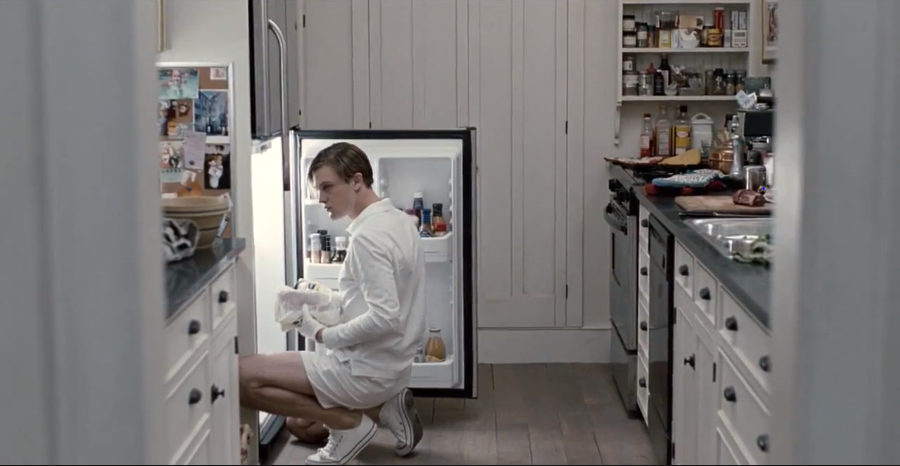
One of the villains makes a sandwich as violence occurs off screen.

In one scene, one of the main characters, the child, is shot and killed off screen. But the camera holds on one of the villains in the next room making a sandwich, instead of on the violence itself. The shot is heard off screen and then the scene lingers in the kitchen as the villain makes his sandwich.

Again, this is an extension of the same things set by the villains in the beginning: a seemingly banal facade of a scene–someone making a sandwich–with a sinister underbelly–someone getting shot off screen–that offsets it. This tonal discontinuity, and the lack of showing any violence that takes place, creates a gut wrenching sensation that intensifies for the viewer as the film progresses.

This technique also adds realism to the film because in real life violence and tragedy do happen co-currently among the banality of day-to-day life, it is just not always visible to all of us.

The film also makes great use of long holds on wide, single subject shots, which places a greater emphasis on the characters and their situation than on the distraction of cinematic techniques trying to cause us to jump out of our seats.

Naomi Watts struggles to free herself and her husband in Funny Games.

In the scene following the boy getting shot, the two villains briefly exit, and Naomi Watts attempts to break free from her bonds. We see a long held wide shot of her attempt, first on the floor, then getting up to stand, then falling over and trying all over again, all while she is tied up. Each agonizing little moment of this struggle is meditated upon and magnified through very minimal, but intentional, film techniques.

The light of the room is upturned, creating stark shadows evocative of dread, the boy’s blood is spattered on the wall, and his body is on the floor, partially obscured by the couch. The slow-burn reality of this scene, and all the environmental touches from when we last saw that room, work so much better than overly pretentious quick edits, blurs, double exposures, dissolves, quick pans, dutch angles, or tilts–the kind of techniques that so often accompany a violent death in a conventional horror film. It’s the character, her struggle, and this horrific but subtly composed environment we watch her in, that becomes the focus of the scene instead.

We’re not subjected to “shaky cam,” “pov cam,” “found footage,” or any other cliched techniques so often found in horror movies today to try and beat the scare into us with the blunt end of a stick.

Instead, the audience is left to simmer on the scenes, fester in these uncomfortable, almost nauseating moments. But even though there is no violence on screen, the film has a far deeper and longer lasting impact of dread and terror than most other modern horror films.

To top it all off, the film even plays with the ontology of the film by having the villains break the fourth wall repeatedly.
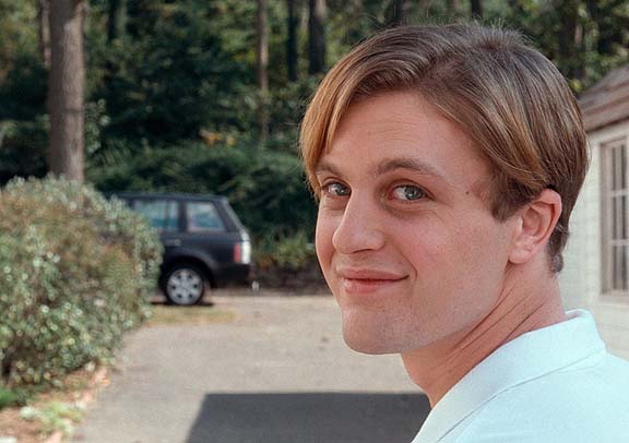
The villains in Funny Games stare directly into the camera at certain scenes.

The effect of this can be quite unsettling. From time to time, the villains in the film will stare directly into the camera, and occasionally address the audience directly with snide comments about where story of the film is going.

There is even a moment when the protagonist, Naomi Watts, shoots one the villains and appears to be getting the upper hand. But the other villain breaks the fourth wall again by finding a TV remote and “rewinding” the movie to before his intruder partner was shot, and then takes the gun away from her.

The effect is chilling because when the villains break the fourth wall it feels as if their, very realistic and plausible, reality is seeping into ours. It reminds us that though we may use movies to escape, our banal experience of day-to-day life happens co-currently with horrors happening in somebody’s else’s life. Right now, as I’m typing this, someone’s home could be invaded, someone’s life could be in danger, someone could have just been hit by a car, but does that make me move out of my seat? Not for a second. A movie like this, though, makes me think twice about keeping still.

It’s these deeper thoughts and sense of existential dread that this film evokes through it’s inventive storytelling techniques that cuts so sharply with me to this day. Though the setup to each scene may seem to lack ornamentation, the film remains more vivid in my memory by it’s subtlety while other, more conventional, horror films fade into the background.

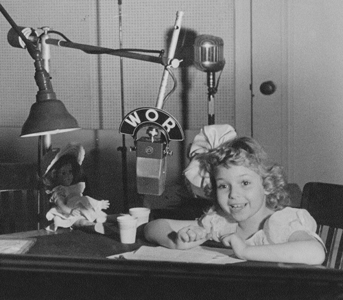
 

Russell Brownley: The Craftsman Project

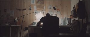
Russell Brownley is one of my biggest inspirations when it comes to a career path in storytelling and his is a model that I hope to one day follow. After graduating from film school Russell started his career as a surf filmer, traveling the world making surf videos for companies such as Reef. He was tired of action based filmmaking in the surf world so when he got the chance to direct his first film, De Passage, he focused more on the art direction, cinematography and a narrative driven story more than surfing sequences. From there he transitioned into directing ads and branded content for brands such as Nike and Patron, as a way to pay the bills for his own passion projects. Some of these projects include long-form documentaries  and starting the “We’re All Going to Die” art and film festival. One of these passion projects is the Craftsman Project, an ongoing series of short documentaries which will give a glimpse into the lives of people who make a living working with their hands.

This is the second short of the series and profiles Kahana Kalama, an ex-professional surfer, who is the owner of Aloha Beach Club a surf supply store with locations in North Park, San Diego and Kailua, Oahu. This story follows Kahana between San Diego and Hawaii as he manages both his shops and designs his new clothing line that is not only inspired by his home island of Oahu, but also completely manufactured there. Overall the film does a great job blending aesthetically pleasing shots with a deeply personal story of not only what his shops and his designs mean to him, but also what he considers his responsibilities not only to the brand and his employees, but to his Hawaii’n culture.

The film opens with stunning drone shots of the Hawaii’n coast which helps to establish Kahana’s roots in Hawaii, which is then further reinforced via a voice over (00:41) explaining what his Hawaii’n roots means to him. I really enjoy Russell’s use of the voice over technique in this piece instead of bouncing back and forth between interview shots and shots of Kahana’s work as I believe it would have taken viewers out of the story a little bit too much or too often. By using voice overs in this piece it allows one to be fully invested in Kahana’s story and gives the accompanying  visual pieces even more emotional weight.

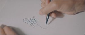
From there we are transported to Kahana’s shop in San Diego using a quick yet effective jump cut sequence and wide establishing shots accompanied by some simple on screen graphics to help the viewers with this quick transition. This is where the story truly begins to take shape as we start to see the physical process of Kahana’s art the same time that he is talking about what inspires his art and what design means to him personally . One of my favorite sequences in this short is the matched action sequence of Kahana sketching his designs (01:41-01:56). I especially the like the choice to start tight with a rack zoom, and move wider, instead of the more traditional, wide, medium, tight progression in most matched action sequences. This shot choice is made even more effective as Russell uses this sequence as a way to transition locations back to Hawaii and gives one the feeling that they are leaving the shop, instead of entering it.


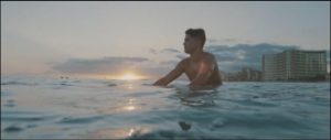
Once back in Hawaii, we are treated to another establishing drone shot, this time accompanied by the sounds of airplanes taking off to reinforce the idea that we have traveled from San Diego to Hawaii. These types of smooth transitions from scene to scene have become one of my favorite parts of Russell’s work and this piece is when he is at his best.  What struck me about this specific sequence in Hawaii was how well Russell was able to bring to life Kahana’s words about what it meant growing up in Hawaii. Kahana spoke to the fact that growing up Hawaii’n he was “Privy to life experiences and ways of thinking” that only someone who grew up in Hawaii could understand, such as the bond to the ocean, surfing, and deep familial and ancestral ties. The cinematography in this scene to me really shows how connected Kahana is to the ocean and to surfing. We get to see him in his element and can feel the deep bond that Kahana has to the ocean and Hawaii and can start to understand how these experiences inspire his work. The fact that most of this was filmed out in the water adds to this experience as you start to feel like you are in the water surfing with Kahana and can start to feel why he is so drawn to the ocean and surfing.  (02:30-02:57). We also get another great transition as Russell uses a wave crashing over the camera and its natural sound to shift the tone from Kahana’s inspiration to how he is now fulfilling his dream of bringing his brand back to Hawaii and why having his brand back in Hawaii is so important to him.

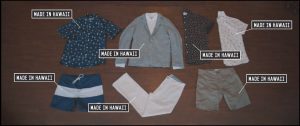
After this shift in tone we get to see some more great cinematography as we are shown the actual manufacturing of his brand “Aloha Shirts.  Russell uses effective jump cut sequences to move the process along at a pleasant pace, not too long where one could get bored, but not too fast to where a viewer might not think this is not an important part of the story. To help with the pacing Russell mixes in some short matched action sequences of screen printing and sewing to highlight the fact that all of the shirts are indeed handmade in Hawaii, by Hawaiians, a fact that Kahana is extremely proud of. (03:33-04:00)  The story of Kahana bringing his brand back to his home continues when his new brick and mortar shop in his home town is highlighted as a way to positively impact his hometown as well as inspire future generations.

Russell gives us one more great transition back from Hawaii to San Diego (05:07-05:15) as Kahana’s story of his culture, inspiration, and brand all get wrapped up and tied together into a nice little coda, and the film ends, where Kahana’s story begins…in the ocean.

Overall this piece is what I want my future work to look like. Not only do the visual aspects of the piece work to help tell Kahana’s story, the audio story itself is what really brings this piece together. The answers that Russell was able to pull out of Kahana in regards to why he has decided to bring his manufacturing back to Oahu, instead of outsourcing to China is really what made this piece one that can resonate with more than just surfers, and highlights Russell’s ability to create a comfortable and friendly rapport with his subjects, which is an incredibly difficult thing for filmmakers to do. Overall, The way Russell is able to tell a compelling human story while still maintaining an artistic edge in the way it is shot and edited is really what speaks to the filmmaker inside of me and something we can all learn from.

120 Days: Tarpon Season

Full disclosure: I’m a sucker for fishing stories.

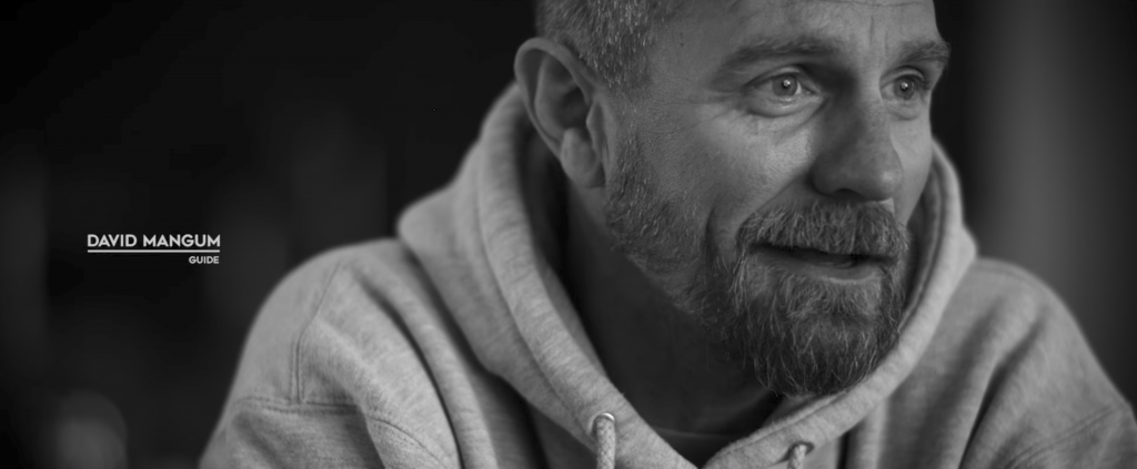
Highlighting unique characters and their most colorful sound bites is key to Felt Soul Media’s short film 120 Days: Tarpon Season. Yeti Coolers sponsors this film about David Mangum, a fly-fishing guide obsessed with tarpon fishing in the coastal Florida Everglades. In less than 8 minutes, this film offers a solid example of branded content that doesn’t feel anything like an advertisement. It blends visual eye candy with characterization and storytelling. 

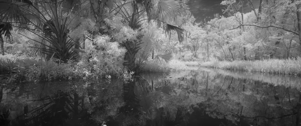
The film opens with the positive action using a mounting move as the camera (I assume mounted on a boat) moves down a channel in an Everglades swamp, inviting the viewer into a story with a beautiful and intriguing setting. Giant palm fronds place the viewer somewhere in the South. The filmmakers fade in the natural sound of a chorus of insects simultaneously with the picture to hook the viewer.

I love that the film is shot in black and white to accentuate the light and shadow of both the outdoor shoots and interviews. At 0:33, Mangum says in his interview that tarpon fishing has “grayed out everything else, more so than anything else in my life,” which builds on the significance of the choice to forego the vibrant colors of the environment.

I’m intrigued by the composition of the primary interview with Mangum. At 0:35, the filmmakers first show the interview with him in the right third of the frame looking to the right of the camera, leaving little talk space. They’re also punched in tight on his face, with picture cropping off his head just above his eyebrows. At 4:00 however, we see more of Mangum. He’s sitting upright and animated, he’s positioned in the left third of the frame and his eyes are aligned with the upper third. It could be construed that the more we get to know this somewhat surly character, the more his face and his personality are revealed.

To convey that Mangum’s approach to guiding for tarpon is obsessive, the string score builds up a sense of frenetic energy, and quick cuts showing various scenes playing in reverse effectively generate tension. It’s pretty brilliant how Mangum’s swirling hand motions around his head act like a recorder winding tape back to set the video in reverse (1:23).

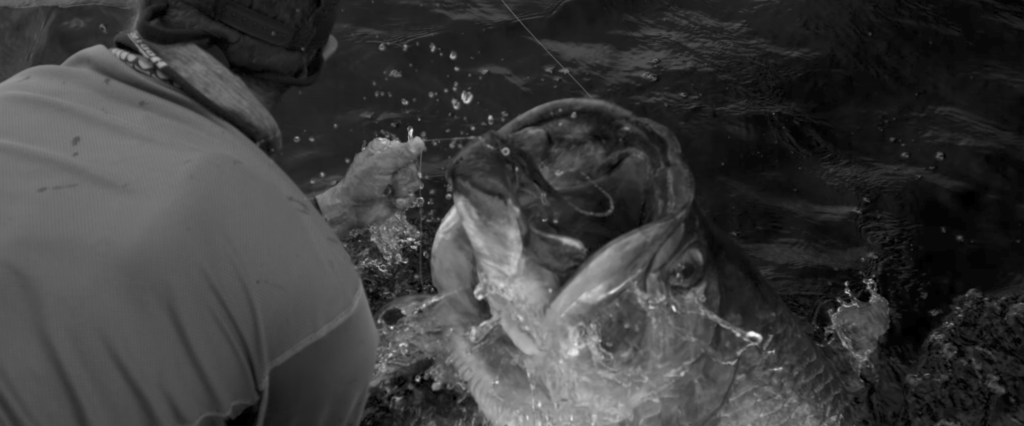
The tone of the video shifts at 4:33 as we segue from describing Mangum’s obsessive preparation and the pursuit of tarpon, to describing the payoff; the thrill of having a tarpon on the line. We start to see longer clips and the pace of both the footage and the cuts slow down. The artful cinematography of birds flying and a tarpon jumping (4:34-4:50) are captured at a frame rate of 1,000 frames per second with a Phantom Flex4K camera.

Despite the pacing of the action slowing way down, the three interviews are cut together in quick succession. Each individual contributes to the description of the sheer exhilaration that comes with the sight and feeling of having a tarpon on your fly line. That shared experience speaks to the bonds felt in fishing culture. The piano score of “Where is my Mind” not only adds a layer of elegance to the cinematography, but it counterbalances the manic nature of the earlier part of the film. This gets to lure of all fishing. Fish are elusive, and the time and energy it takes to present a fly to a fish can be all-consuming, even maddening, but the rush of having a fish on the line makes it all worthwhile.

At 5:32, we see a close-up shot that would never have happened it the videographer wasn’t comfortable getting as tight as possible over the subject’s shoulder. I recently learned that the filmmakers, Travis and Ben, shot for two weeks and saw only one tarpon. If they weren’t ready for this shot, they might not have been able to pull the video off.

I was most struck by the way the video is buoyed and balanced by the humor offered by a secondary character, Brett Martina, a shit-talking guide with a thick South-Florida draw, who provides light moments in a story about a man who is pretty rough around the edges. I think that without this interview, the story would have been too somber. The black and white footage and montages set to piano music may have come off as an overly dramatic for a fishing video. Brett lends some needed levity. I appreciate that the filmmakers break the fourth wall frequently during Brett’s interview because his personality comes through best as he interacts with them.

No matter how impressive the shots are, and many of these are truly great, any fishing video gets boring fast unless we get to connect with the people in the story. While we begin the film thinking we’re about to get to know David Mangum, the film concludes with the viewer feeling a little closer to Brett, who even provides the concluding statement on David’s story.

Inspiration post: Find your greatness – Nike

Nike “Find your greatness” campaign appears on social media and digital channels on July 25 of 2012, supported by a YouTube homepage promotion the day after.

It’s a powerful inspirational message that goes beyond sport. It seeks to inspire people who strive to excel on their own terms, to realize personal goals and achieve their moment of greatness.

“Find Your Greatness The film” shows people from around the world training, playing and competing, with the common thread that the locations featured are all called London. We go from a scene at “London Gym” where a man pumps out crunches during a workout to a rugby match in East London, South Africa, where a boy breaks the line handing off a larger opponent.

In Little London, Jamaica, a female boxer works the pads with precision. In London, Ohio, we see a focused young baseball player catch the ball and throw it to first base in one seamless action. Athletes are special and working for their own goal, however they are all connected by a unifying sense of what greatness could be to them.

The voiceover emphasizes that greatness is not simply reserved for the superstar athlete, but is something everyone can achieve. Whether that means finishing a first marathon in London, Canada, or a female Muslim team sharing a celebratory huddle on a soccer pitch at London School, Qatar.

Watching the video campaign we are reminded of the power in everyday moments from a young girl performing flips in her garden to a young boy deliberating a first jump from a high diving board into a pool. A final leap into his own moment of greatness.

I find this campaign emotionally meaningful and technically challenging. There’s the most effective use of timing in the juxtaposition within shots. In order to guide the viewers in emotional responses to the scene, the editor varies the pace from scene to scene. For instance, through the slower pacing used in minute 1.08 when a baseball player catches the ball, the editor wants to put dramatic emphasis in the scene. He wants the viewer to really focus on what’s happening. After we hear: “Some people are told they were born with greatness”, we hear only the sound of the ball reaching the baseball glove. Viewers are now immersed in the story, caught up with the character; they want to know what’s next. Only after the action, we hear the voice over again: “Some people tell themselves”.

To make people empathize more with every situation and feel it more realistic, the sound design is built on natural sounds. Whether it’s a documentary or narrative, watching a scene where you can clearly hear what’s going on in the environment helps bring the visuals to life and makes you feel like you’re inside the story with the characters.

Nike has always done a great job in its campaigns by putting meaningful content into powerful video pieces without even mention the product.

Here’s what I found effective:

  1. The voice over:  simple structure, short sentences, solid and effective words.
  2. Close up, medium and wide shots: sequences are rhythmically mixed up according to energy and actions of each story.
  3. Call to action: the campaign invites the audience to take action. Find your greatness.
  4. Eye contact: in almost every single scene, regardless how dynamic the situation is, we can see the protagonist in the eyes and find his struggle. We empathize with them.
  5. Wide shots are longer to give people the chance to explore and find the meaning of the visual.


Humans of New York: The Series (Episode 8: “Help”)

Brandon Stanton is most known for his Humans of New York (HONY) photography series, profiling random New Yorkers he meets on the street and the conversations he has with them. This summer, however, Stanton launched the first episode of Humans of New York: The Series, a video component to his popular photo blog. Working with cinematographer Michael Crommett, Stanton interviews subjects in America’s biggest city, with each episode consisting of multiple interviews that are connected around a central, universal theme.

The first video from the series that I came upon is called “Help,” and is the one we’ll examine here (it’s actually the eighth episode of the series). The 13-minute episode features a variety of views and anecdotes dealing with the concept of help and what it means to each person.

Originally, I watched this video because I love HONY, but as I got further into the episode, I realized that Crommett and Stanton employ a lot of the techniques we’ve discussed in our class, and figured it would make a good blog post.

Side note: I was not able to figure out how to embed a link to a timecode within Facebook video, and it appears there are no Vimeo or YouTube links to these videos. If you want to check out the specific scenes I mention, just advance the playhead to the listed timecode. 

Because interviews are always the prime focus for HONY, Crommett and Stanton rely heavily on cutaways to not only break up a single interview but also as a way to transition between subjects. They bookend their piece with scenic cutaways of the New York City (NYC) skyline (starting with a time-lapse at 45 seconds, ending scenes at 13:00). Typically, they will introduce their subjects by

Example of talking space and rule of thirds during one of the interviews of “Help.”

way of a J-cut and then move into a snippet of the interview. Most of the time, they are accounting for the rule of thirds, and providing talking space for the interview. Occasionally, they will shoot the subject straight-on for other reasons. For example, in the opening scene, Crommett and Stanton want to show all the people in the “rat race” behind their interview subject, so Crommett shoots the subject straight-on. I found it interesting how they also used cutaways of the person they’re interviewing as a way to break up the interview itself, as these are – from an editing standpoint – pretty long segments. Most of the time, they are shooting at eye level of their subjects – even the scene with the man and his dog, who is sitting on the sidewalk (10:55).

Speaking of which, that final segment is introduced with a great example of a conceptual matched action shot – the motion of the crane elevator thing going down, then cutting to the man lowering his dog into the wheelchair (10:35). I love that.

Other examples of techniques we should employ in our work:

Matched action sequence with the motion of the subway trains (3:37)

Use of a frame within a frame (6:08)

Dolly shot (8:22)

Cutting on the beat (during the aforementioned subway sequence)

Waiting for an object to exit the frame before a cut (2:45)

I highly encourage you check out the other HONY videos, not only for our class, but just for your own personal enjoyment.

Skip to toolbar