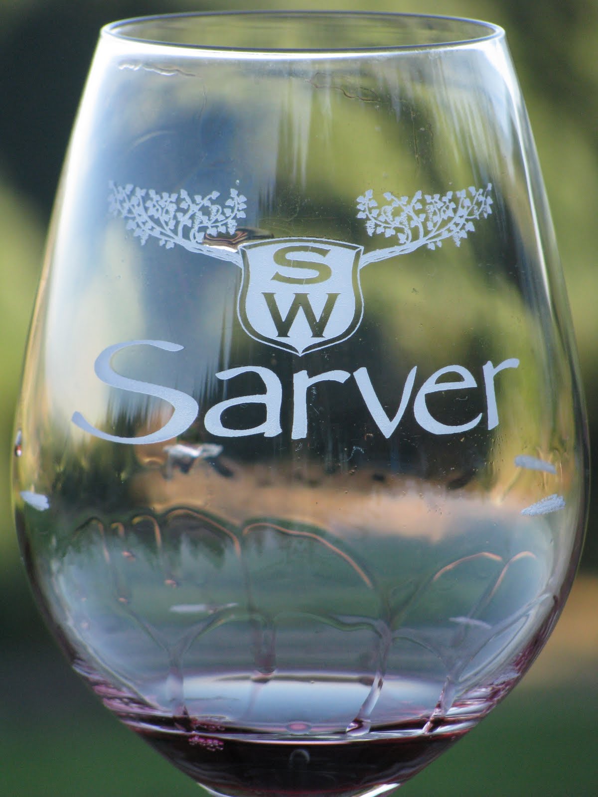
Sarver Winery, http://sarverwinery.com/
This is where I work. I really enjoy their logo because I’m a sucker for balance and it tells a story. I don’t have the heart to break it to the owners about the Papyrus and no wonder it’s one of the most hated fonts because it simply makes me cringe. The isolated logo design is intriguing in that the vines create an illusion of antlers behind the crest. It may be a too busy or odd shaped for logo display in digital contexts, but if you knew the Sarvers this would make perfect sense – their disinterested in merchandising and are adamant about not “doing what everyone else does”. The winery is a family owned business with three years under it’s belt and as it continues to evolve perhaps so will the logo. For now, I appreciate the simplicity of the letters/shield design and believe this creates a nice contrast with the intricacy of the grapevines. If I could rework the logo I would clean up the foliage elements and create more variety in line stroke.
http://www.logomoose.com/wp-content/uploads/2010/07/music-poet.jpg
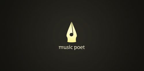
This logo was pulled from a post on music industry logo designs. I like the playful juxtaposition of a traditional calligraphy tool symbolized in a contemporary online platform. The all lowercase letters read clean and are comfortably spaced beneath the pen tip imagery. The word combo is provoking and the subtle note created by the offset line and negative space circle center is sharp and clever. The pyramid layout makes it so the title reads simultaneously with the logo and vice verse, the words and graphic working inseparably. The monochromatic color scheme is powerful here and would be easier to work with from a production stance.
![]() www.mtv.com
www.mtv.com
Love this old school logo for MTV! Nice use of the hard-edge trompe l’ oeil effect with the block font capital M. Identifies with a generation(s) of people. The active, humanist stylization of the tv creates a nice overlay of text. I appreciate the square format of the overall piece, how the logo enjoys a compact existence free from the constraints of say a logo designed with radial symmetry. The company has given this icon a sense of evolution by exploring gradients and patterns of color over the years. I don’t know if I speak for everyone when I say the M somehow evokes a television.