In terms of high fashion, Chanel is one of the world’s forerunning leaders in the fashion industry. This design is iconic for the world of fashion as its brand logo has the ability to transcend the ages. This design is comprised of two Cs, interlinking, one facing left while the other faces right. More often than not, the name CHANEL is written below the brand’s Cs. Chanel’s logo has some variance between its representations. Sometimes, the interlocking Cs are encased within a circle, while other times, the Cs stand alone without the use of the circle. Sometimes, the logo is represented by only the interlocking Cs, and sometimes is is represented by the name Chanel only. Although there are many variances within the designs that are used today, there has been little to no change to the components of the overall design since the beginning of the Chanel industry. The logo is almost always represented as black text on a white back ground, or vice versa. Its clean lines, and sans-serif typeface make this logo a timeless staple to the fashion industry. In my opinion, to alter this design, or rebrand this company would be a disservice to the enduring legacy of the House of Chanel. http://www.chanel.com/
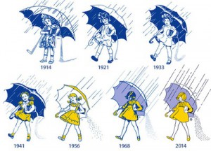
For most people in the United States, the Morton Salt Girl is easily identifiable, and recognizable. She is a familiar face to the vast majority of homes across America. Clearly, from the image above, it is easy to see that our Salt Girl has undergone many updates and changes throughout the design’s lifetime. In comparison to her earlier days, the Salt Girl has had minor updates to her wardrobe and hairstyles to stay up to date with the latest fashion trends, as well as the size and shape of her umbrella. She’s gained a sense of movement compared to her first appearance in 1914. The colors used in this logo have stuck with the cooler hues, mainly blue and purple, but has also gained the use of yellow around 1941. The effect that the yellow has creates quite the visual impact. The viewer’s eye is drawn first to the Salt Girl’s dress and hair, then travels throughout the rest of the picture, where we can see that her salt canister is carelessly leaking copious amounts of salt during her walk in the rain. Along with the Salt Girl herself, the Morton brand logo is accompanied by the name MORTON in a sans-serif font. The effect is in strikingly bold contrast to the playfulness of the imagery of the Salt Girl. As for rebranding, I’d like to see an even more updated version of the Salt Girl. Her overall outfit and personal sense of style have gone relatively unchanged (with the exception of refreshing the general design) since 1968. Maybe it’s time that the Salt Girl gets a whole new wardrobe, complete with rain boots and pants? http://www.mortonsalt.com/
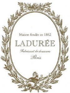
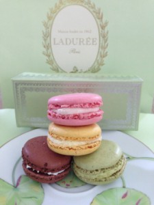
For the French, pastries are part of everyday life, and every good Parisian knows of the little shop of Ladurée. The original Ladurée sweet shop is located in the heart of Paris, but the company has expanded internationally on a limited basis. Their logo has a classic appeal in the sense that it has captured a facet of the timeless essence of French culture. The logo is an ovular shape, surrounded by wreaths of leafy branches. At the bottom of the oval, delicately sits a small cherub, as if this cherub himself descended from heaven to experience the delectable taste of the macarons from Ladurée. Inside the oval, the text (written in French, translated by me) reads “House founded in 1862/ Ladurée/ maker of sweets/ Paris”. The font is a serif style font, with varying font scripts, including a cursive style font and an all caps text of LADURÉE. Often the logo is represented on a pale pistachio green background (which is the same color of the original Ladurée shop), while the inside of the oval remains white. Sometimes, the green color is absent, but it is usually represented that way on napkins, letterheads and business cards. When the interior of the oval is left white, it allows the text to be easily read. Furthermore, by keeping the name in caps, your focus remains on the center of the logo. Although this label has been around for a considerable amount of time, I feel as though an updating of the text could be beneficial to the overall design. There are three types of text within the design. Although I do believe that the text used for the center focal point of LADURÉE should remain the same, I think it would give a more congruous look if the text on the top line were to match the bottom line. https://www.laduree.com/en_int/
