Tag Archives: AAD 610
Marketing, Media + Communication I: Logo Design
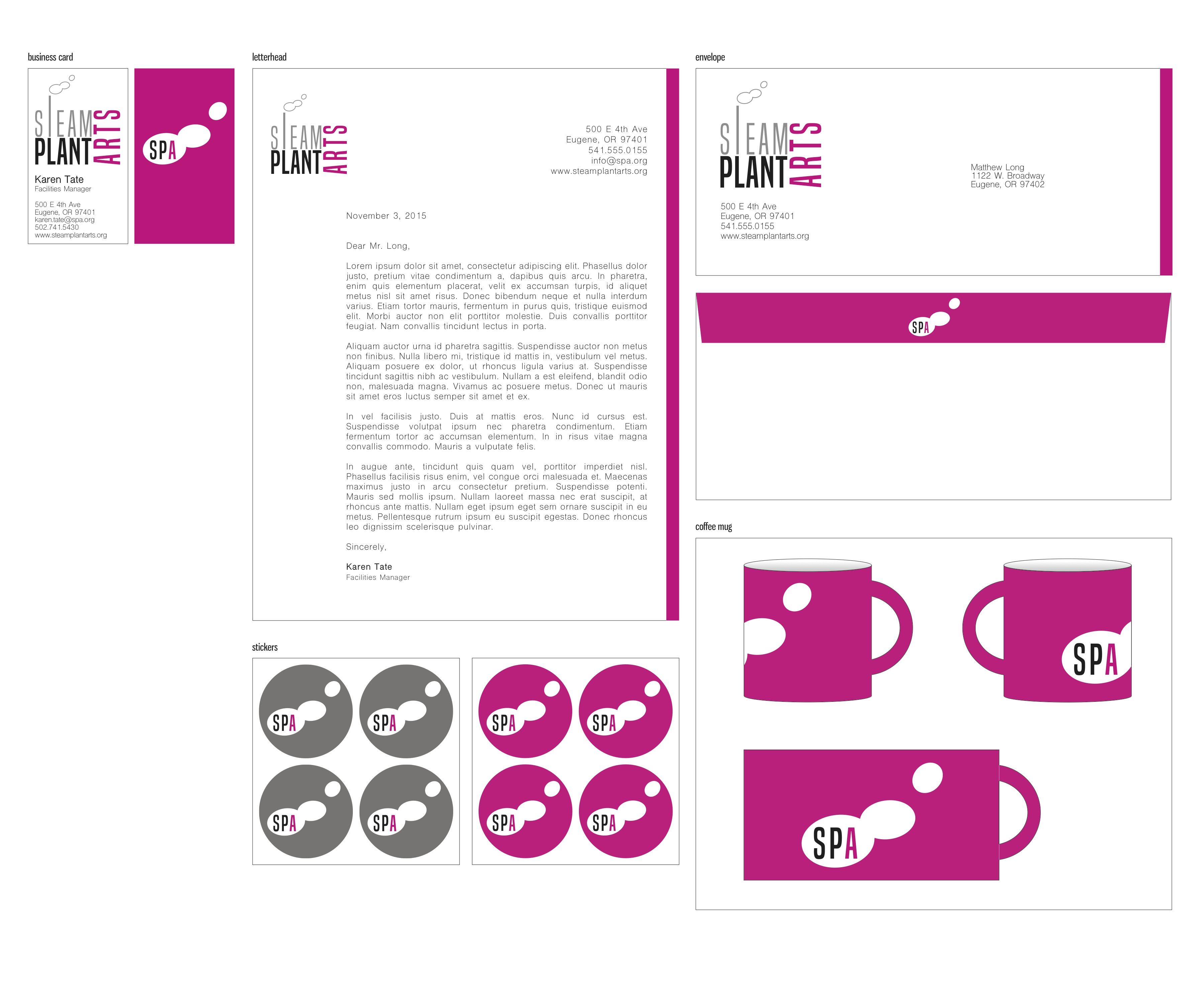
Standard Logo:
Stylized Logo:

Organizational Statement: The Beaux Arts Foundation
1. What is your organization or company? Give background history including who, when, and why it was founded.
The organization I am focusing on is the Beaux Arts Foundation in Lexington, Kentucky. It is an entirely student-run non-profit with rotating directors from the University of Kentucky. The foundation was inspired from the original Beaux Arts Balls that began during the classical Beaux-Arts era of architecture in the 19th century. The ball always incorporates a theme and offers opportunities for creativity from the ball-goers, usually in the form of an extravagant costume. It began in Lexington in 1969 by University of Kentucky architecture students who wished to transform the traditional event and turn a profit for local charities.
2. What do they do or make? Describe the products and services and what makes them unique.
The Beaux Arts Foundation hosts two annual fundraisers in which music, art, costumes, fashion, and community come together to raise money for charities that have been selected by the current directors. They are unique because while a Beaux Arts Ball exists at other architecture schools nationally and internationally, the University of Kentucky is famous for their over-the-top “party with purpose.” Every Halloween weekend, the foundation hosts a “Fall Ball” headlined by local musicians, and the proceeds from this event go towards the production of the major spring fundraiser: The Beaux Arts Ball. The Beaux Arts Ball brings in internationally known electronic artists, provides opportunities for design students to create installations and stage backdrops, pairs architecture and fine arts students with the Lexington Fashion Collaborative to produce and present a sustainable and innovative fashion show, and promotes local businesses by inviting food trucks to the event and acquiring sponsorships. They are unique because so many different types of art come together for this annual event and the majority of it is local. The arts are a highly collaborative field, and the Beaux Arts Foundation highlights the possibilities of success when so many artists are brought together for one beneficial outcome. In addition, a large portion of the Beaux Arts Ball depends upon the venue which is encouraged to change each year. The Ball has taken place in tobacco warehouses, parking garages, and conventional music halls.
3. Describe the culture of the organization or company. What is the work environment like, the atmosphere? What is the building like- interior/exterior, architecture, fittings and furniture? How do the employees work together? What are the jobs and roles of individuals? How are they treated by management?
The Beaux Arts Foundation is a fairly casual organization because it is student-run, but still maintains professionalism. The work environment is extremely collaborative, with each member frequently bringing new ideas to the table while also playing devil’s advocate. Over the years the amount of directors has grown, but currently about 10 students fill a director position. These roles include an Executive Director, a Public Relations Director, Music Director, Installation Director, Social Media Director, Historian, Fundraising Director, a Past Director, Venue Director, and a Fashion Liaison. These students are not technically “employees,” as they volunteer all of their time outside of class, work, and homework. Most everyone works very well together. Encouragement to become a part of the Beaux Arts Foundation is large, but the selection process for new directors is strenuous and thorough. Since all the directors are students and involvement is voluntary, not all arguments are calm and collected, but the energy is very passionate and that makes for a great product at the end of the year. The Beaux Arts Foundation aims to foster urgency, responsibility and autonomy, so traditional management is miniscule. They manage the events as a collection of people who are individually held responsible for completion of items. Tasks are delegated to an individual based on category, and decisions are made by majority. The Executive Director serves as “management” only in that they are the primary contact for the foundation and have served as a director for one year prior to filling the Executive Director position.
4. Who is the targeted audience? What are their demographics?
The target audience is young adults. Known for being a “party with purpose,” the ball-goers take the term party seriously. Therefore, most of the attendees are current college students or recent graduates. Both the Fall Ball and the Beaux Arts Ball actually have an age requirement of 18 to attend the event. The Beaux Arts Foundation advocates diversity and creativity, so this brings in a wide array of students from around the region. Majority of the audience is UK College of Design and Fine Arts students and their friends, but there are many people who have been attending the ball for 10 years.
5. What is the organization or company mission statement?
Mission: The Beaux Arts Foundation promotes diversity and originality across multiple art forms at a local and national level. We aim to attract supporters of all kinds who converge to form a heterogeneous crowd that mobilizes the collaborative arts, camaraderie, and optimism to connect with the arts through unique channels that give back to the community.
Marketing, Media + Communication I: Brand Awareness
National Maritime Museum:
![]()
This logo captivated me the first time I saw it. Initially my eyes focused on the wave graphic, unaware of the interruptions to form letters. The “flow” of the logo itself is very smooth and clever. The eye follows the line up and down in a wave, but is able to discern the n, m, and m hidden in such a simple design. I think if the stroke of the path was any thicker or thinner the letters would get lost within the graphic. I also like this logo design because of the white on a blue background, rather than a blue graphic existing in whitespace. With it this way, the graphic emulates the crest of a wave and provides a deeper oceanic connection as compared to the inverted option of blue on a white background. I also commend the designer for forming the breaks between each letter in a diagonal manner. If the division was vertical, I think the graphic would have literally lost it’s flow and subtlety. The only criticism of mine is that the written words “National Maritime Museum” are in an awkward spot. I find the alignment with the above path to be odd. If it were justified to one side or the other or even aligned underneath with the tracking and/or kerning adjusted, I think that would provide even more emphasis on the beautiful, curved line above.
Modern Container:
![]()
This particular logo pleases me for many reasons. At first it presents itself as a three-dimensional object, but upon closer inspection one notices the letters “M” and “C.” It reads very well because one sees the “M,” followed by the “C,” but the “C” leads the eye inside the object, making it very dynamic. The font is a very contemporary sans serif, and the narrowness of the lowercase letters provide contrast from the imposing, block letters on the “container.” Therefore, the logo seems balanced in modernity while clearly representing the product. I find the secondary stroke to be unnecessary in the design. I think it distracts from the cleanliness of the lines represented. In some ways the extra boundary reinforces the logo as an object surrounding the text and allows the depth to be more apparent as compared to having the gradient dissipate into the white space, but one single green line closing that edge might have sufficed and provided the same effect.
21C Museum Hotel:
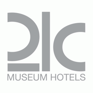
21C Museum Hotel began in Louisville, Kentucky as playful, eccentric hotel with various themed rooms equipped with odd design surprises all over the building. There is a gallery space in the lobby of the hotel, but quirky art in all forms is located everywhere. Because of the kookiness of the museum/hotel itself, I think their logo could’ve been slightly more playful. The “mascot” for a lack of a better term is a minimal penguin, represented in different colors based on the urban location of that 21C branch, and I think this could be translated into the logo design in some aspect. Overall, the logo is extremely contemporary and clean, but I think that doesn’t represent the chain in its entirety. So far, all 3 branches of 21C have occupied a historical downtown building in Louisville, Lexington, and Cincinnati. The logo emulates a very high-class, highly modern design aesthetic that are less apparent in the actual decoration and art within these buildings. The concept of 21C is modern and forward-thinking, but also extremely playful and I find the branding does not quite match the mood of a 21C museum hotel. Design balance and alignment of the logo itself I think is overall pleasing. I appreciate that the “C” is mirrored in the “2” and that the Museum Hotels text is justified evenly at the bottom. It is also graphic while being slightly abstract in the re-design of the number “2.” Overall my critique of this logo only comes from the adequate representation of this phenomenal arts space.
Marketing Media + Communication I: Learning Objectives
1. Further my understanding of graphic design from a marketing perspective
2. Experiment with three-dimensional design techniques that can be applied to a potential logo
3. Become completely comfortable with running and updating a WordPress site so that I can apply these skills to an outside project
4. Learn how to create marketing materials for a webpage using pixel-sized canvases
5. Explore and experiment with the best possible graphical means to apply a brand identity to an arts organization
New Student Survey Questions
1. Where did you move from to attend the UO? And, briefly describe how you landed on the UO AAD program. Any interesting, funny, anecdotal stories/details are welcome.
I moved here from Louisville, Kentucky just over 2 weeks ago. At first, my interest in UO came from researching graduate programs in the Architecture department. Once I decided to pursue arts management, I immediately checked the university for the program availability as a Master’s. I have always wanted to move to the Pacific Northwest, and I visited the university last November fell in love with both the university and the region. My boyfriend and I began our 38 hour trek out here in a 16′ moving truck and trailer, and everything went surprisingly well, including my desire to spot bears at Yellowstone.
2. Area of concentration in AAD?
Performing Arts Management
3. Describe your knowledge and use of technology systems.
I took a graphic design class in high school my sophomore year in which I was introduced to the Adobe Creative Suite. I then went on to join yearbook, and served as the Chief Editor my senior year. During those years I mostly worked with InDesign and Photoshop. During my architectural undergraduate career, graphic design was built into our studio curriculum. I became very knowledgable of Illustrator and InDesign through presentations, and furthered my proficiency of Photoshop through rendering and image editing. I am also able to use 3D modeling softwares including Rhino and AutoCAD, including VRAY rendering software.
4. What software do you commonly use? Briefly describe purpose/application for software on your list.
I most commonly use Illustrator and Photoshop. Illustrator has been used mostly to create flyers/posters and then transferred to InDesign when adding text or for a design portfolio. Photoshop is used to edit images and add affects to text if needed.
5. Do you have any graphic design or media production/management experience? Have you taken any graphic design or media production courses?
I have done some graphic design for a non-profit I worked with, mostly making flyers and posters here and there for upcoming events. I took graphic design in high school, and in college I only took one actual course that taught about the programs, but all my architectural studio courses heavily touched on design and design standards, but never in a marketing sense.
6. Know anything about typography?
I know some about typography but I am very eager to learn more.
7. Do you use Web (2.0) apps? Name those that you use or are familiar with.
I have worked with WordPress and Cargo Collective briefly.
8. Do you use Social Media (Facebook, Twitter, Instagram, Snapchat, Vine, Yelp, etc.)? Name those that you engage in.
Most commonly I use Facebook, Instagram, Tumblr, and Twitter.
9. Tell us something unique about yourself.
I thoroughly enjoy darkwave/industrial electronic music and cooking.
10. Anything else?
I am excited for this class because I’ve never learned much about graphic design from a marketing/branding angle. I look forward to having opportunities to experiment with ideas and tools I’ve never needed to use before.