Prince Pückler’s Media Inventory

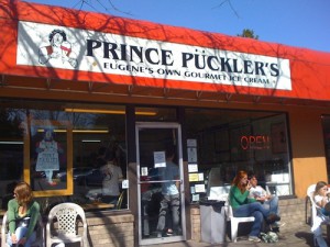
This post is going to be a bit short because I cannot find all that many media channels that Eugene’s favorite ice cream shop participates in.

1) The Website: http://princepucklers.com/
This site has most everything that one would want to know about the company: its hours, weekly specials, menu and prices, a few photos, locations where Prince Pückler’s ice cream is sold, and a few (out of date) news stories. Ice cream is a pretty simple product to sell, and their website really gives an adequate amount of information: nothing too frilly.

2) The Facebook page: https://www.facebook.com/princepucklersicecream?fref=ts
The facebook page is similar to the website, though it features less regular information such as the comings and goings of various specialty or seasonal flavors (egg nog is in, fresh strawberry is out). As well as some photos (many repeats from the website), general hours, contact info, site URL and other such information. Again, a simple product with a simple facebook page. It is nice that this does give pretty regular updates about the special flavors that one might be able to find at the shop.

3) The Twitter page: https://twitter.com/PrincePucklers
I was actually surprised at how lively the twitter page is. Like the Facebook page, it lists updates on seasonal flavors as well as pictures of nice-looking cakes and sundaes. The really nice thing about their twitter page is that all sorts of people post on it from UO Students all the way up to Senator Ron Wyden. It would seem that we all scream for ice cream.

4) T-shirts
Bx8YzFjIgAE6wO-


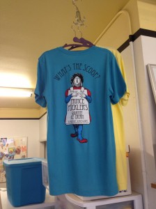
As it seems that Prince Pückler’s has little to no advertising presence, these t-shirts are probably doing the heavy lifting as far as printed collateral is concerned. The logo and tagline leave a bit to be desired, but the visibility that these provide is pretty great. Nothing like a bunch a walking billboards to advertise your ice cream!
First logo draft

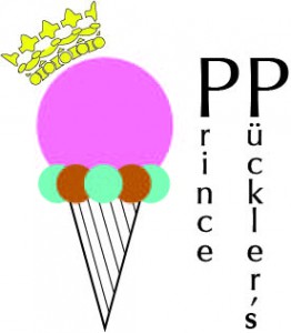
Here’s a first go at a logo. I like the graphic but the location of the text is still in question. I’m questioning where it’s going to end up on the collateral. The extreme different sizes of the words “prince” and “pückler’s” is very problematic. A design conundrum indeed…

For a good color version click here

Here’s the mysteriously neon colored one:

Logo v3

Art World Field Guide Proposal

The trajectory of the “togetherness” of the gaming community has fluctuated in the years that video games and card games have become popular. In the beginning, people would come together to play simple arcade-style games like Pong. As the games became more mainstream and arcades began popping up in more and more places, the social aspect of gaming blew up. Even as consoles continued to update, physically being in the same place as other gamers was an important aspect of playing games together, whether in an arcade or at home. As video gaming companies began to push for online connectivity, the landscape of social gaming radically changed. Where you used to only be able to play a certain game with a friend in your living room or against someone at an arcade, you could now go online and play with people across the world, even if you were thousands of miles apart. The “place” of video games changed from being very geographically dependant to depending more on who had the same game and a connection to play with you. This is a good example of the “convergence of place” (p.473) that Dueze mentions in his article about media life. This digital, social landscape of gaming continued to expand to the point where some multiplayer games these days don’t even have the option to access the multiplayer function unless it’s online.

imgres-2

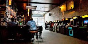
In the digitalization of social gaming, I have begun to notice that the original, old-school style of getting together to play games is starting to make a resurgence in an interesting way. Because some of the modern consoles are starting to phase out social gaming where the players are physically in the same place, gamers are trying to reclaim that experience. Arcades and arcades combined with bars, barcades, have been becoming more and more popular in older generations trying to relive the social gaming experience.

What I propose to do my field guide on is the landscape of public social gaming in Eugene. To me, the environment seems to be rather diverse with a good distribution of arcades and barcades that are growing in attendance. For people my age, going to one of these places doesn’t even seem like something for a niche market; engaging in social gaming in public is becoming mainstream again like it once was. What I plan to discuss about the arcades and barcades is what kind of games and atmosphere they have. With these sorts of institutions they could focus on any number of things: classic games, a modern feel, pinball machines, racing games etc. The answers to these questions will also inform what kind of people go there – age, gender, in groups or alone, and other demographic concerns.

images-2

Something else that I want to explore as part of this field guide is places where people get together to play other sorts of games, like card games or board games. Even as social video gaming has ebbed and fluctuated in popularity, there seems to have always been a strong, albeit small, population that has engaged in this form of gaming, which almost always requires the players to be in the same physical space. I want to document and analyze the spaces that this sort of gaming happens as well. I’m imagining that this is going to yield different results than the arcades because the video game institutions are stationary businesses, while these card and board game meetings are transient groups. The places that host these meetings have to subsist on other businesses as well.

Finally, the last aspect of this ecology that I am going to investigate is going to be used game stores and game exchanges in town. Although gaming doesn’t necessarily happen at these businesses, I think it is an important aspect of the overall social gaming environment. An open exchange of games between players is the part of this environment that helps to replicate and keep up an essential part of the socializing – not only do people exchange their playing skills, but they also can exchange their actual games. In so doing they enter into a sort of system somewhat removed from time where players can collaborate even if they’ve never met or will never meet. These game exchanges really exemplify the idea of a live cycle of participation in this art world. Some people don’t want to play games anymore and they give theirs away here for new or continual gamers to take them and make them their own. It also gives gamers access to older games and systems that they could not get at a modern game store.

imgres-3

 I have not totally figured out how this project will manifest in a transmedia context, but I do want to make a map of Eugene that highlights these places. Photos will be very important to document the differences in atmosphere and participants in these social gaming places. There might even be some way to incorporate actual gaming into this; we will have to see what develops.


Level Up Arcade: http://www.leveluparcade.com/

Blairally Vintage Arcade: http://www.yelp.com/biz/blairally-vintage-arcade-eugene-2

Shoryuken League: https://www.facebook.com/pages/Shoryuken-League/112145452263105

Parker Galactic LLC: https://www.facebook.com/parkergalactic

Putters: http://eugenesgamecentral.com/?page_id=6510

Addictive behaviors: http://www.yelp.com/biz/addictive-behaviors-eugene-2

CD and game exchange: http://cdgmexeug.com/

http://www.theverge.com/2013/1/16/3740422/the-life-and-death-of-the-american-arcade-for-amusement-only

Logos, logos, logos!

Here are my thoughts on some logos that have caught my eye throughout the years.

1. Moonstruck Chocolate

imgres-1

Moonstruck is a chocolate company based out of Portland. Their chocolates come in whimsical shapes based on the season and they have really top notch truffles and cakes (and hot chocolate!). Let’s go from the top down. The graphic is somewhat unusual, yet very effective. The thin crescent moon is very aesthetically pleasing while not taking up too much space. They could have left it at the moon, but adding the somewhat strangely-proportioned dancing man in the moon not only added the whimsy that is reflected in their products (and in chocolate itself), but it also gives it a more personal touch: this is a place for people. The font that they chose is also very effective with its lack of serifs and clean thin lines; it’s very easy on the eyes. The added interest of the ascenders in the “h”, “a”, and “e” is a nice subtle touch (especially because their angles match the angle of the moon). The line between “Moonstruck” and “Chocolate Co.” separates the name of the place a little bit from what the place is. To me it gives it an effect that says, “we don’t just make chocolate, we make experiences.” Finally, the gradient deep purple background with the white on top adds to the moon-ness of the whole logo and unifies the whimsical and almost mystical feel.

2. Kellogg’s

imgres

This logo often takes backstage to other cereal logos, so we don’t pay as much attention to it. Truth be told, that might be okay because I don’t think this logo is as successful as it could be. I think that cursive scripts can be risky because they can make things harder to read and, in this case, make things look like weird words. This particular cursive script is thick, which makes it harder to read and the small opening at the top of the “o” and the “g” make it almost look like it could be “Kelluyy’s”. Plus, this thick cursive doesn’t look all that modern (which is not necessarily a sin, but it does deserve to be pointed out). In the points won column, I think the capital “K” looks really good in this script (and Kellogg’s must have as well, because it’s the focus of the Special K cereal). Also the red grabs your attention, but as you’re walking down the cereal aisle at the store, you don’t want to read thick cursive. In the end, I think that the logo is okay, but could be improved with a more modern cursive script that’s easier to read so that “K” doesn’t have to do all of the heavy lifting.

3. The Mystery Machine

images

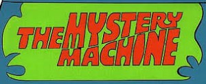
Ah, The Mystery Machine: making kids want hippie vans since the 70’s. For some reason, the Kellogg’s logo made me think of this one (which maybe points to them needing an update). Now this logo is working in a different way than many other logos in that it’s not really trying to sell us anything. The point of Scooby Doo was more the ragtag group of teens investigating insurance fraud all across America, and The Mystery Machine was just part of that…well, machine. That being said, the logo’s main job is to add to the feel of the show, and I think it achieves that. First of all, the blue and green background with the somewhat abstract, somewhat groovy shapes gives a good feel of haunting and mystery (and are a pretty 70’s color combo). The font of the letter is in all caps and some letters (“i”, “y”, “t”) are rounded and fat while others (“h”, “m”) are concave and flat, giving it a sort of funhouse mirror effect that also captures the spooky and fun feeling of the show. This is also reflected in how the word “mystery” starts off tall and then gets small and the word “machine” does the opposite, while still staying in a pretty perfect and subtle parallelogram. The words that this effect brings to mind are “groovy,” “spooky,” and “seventies,” which pretty perfectly captures what the show is all about. Many people in my generation grew up on this show, and for me at least, part of its charm came from how it was somewhat dated and I think this logo encompasses that pretty well. I don’t think they changed it for the modern movies, and the shouldn’t because an updated logo destroys the purpose and just looks wrong.

images-1
Like so.

Art in Society Learning Objectives

1. I have always been interested in the fluidity of art categorization (i.e. who/what counts as art/artist and why?). I know there are often no definitive answers, but I would like more tools to approach issues like this.

2. I would like to gain a greater understanding of what counts as an art world and how they form/who decides if it is an art world.

3. Another goal of mine is to get more context around how the current state of the arts in society formed and why.

4. Something else that I’m curious about after doing the readings thusfar is the idea of transmedia. Like many definitions in the art world, it is a fluid idea, but I still don’t feel like I totally grasp a deep understanding of it.

5. I want to learn more about the broader ideas of aesthetics and art participation and what the interplay is between the two of them.

Student Survey

1. Where did you move from to attend the UO? And, briefly describe how you landed on the UO AAD program. Any interesting, funny, anecdotal stories/details are welcome.

I moved down from Portland two years ago to start working in non-profit arts here in Eugene, though I originally hail from Boulder, CO. I chose Arts Management as I was finishing my undergrad up in Portland after having a conversation with an alumna of my alma mater who worked in arts management. I instantly knew that it was what I wanted to do. As for this specific program, my partner is pursuing a phd here and it just so happened that this program also aligns with what I was looking for in a grad program.

2. Area of concentration in AAD?

Performing Arts Management

3. Describe your knowledge and use of technology systems. Responses should include the following:

  • Computer platform you use (Mac, PC, Linux, other)
  • Smart phones, tablets, other hand held/smart devices
  • Digital Cameras, Video, Audio devices
  • Peripherals – printers, scanners, other necessary and/or cool gadgets

In my personal life I use Mac, though in all of my professional experiences, I’ve used PCs and I’m comfortable using either. I also have a smart phone and an ipad, though I’m not much of an app monster. Otherwise, I’m competent on things like printers and scanners. Being young, I ended up being the de facto IT person at a couple jobs for simpler issues.

4. What software do you commonly use? Briefly describe purpose/application for software on your list.

Most commonly I use the Microsoft Office Suite including word, excel, powerpoint, outlook and access. Every now and then I use adobe illustrator and I have a very peripheral understanding of indesign and photoshop (based off of a few online tutorials and a bit of poking around). For a few positions that I’ve held, I’ve had to do a bit of database upkeep, so I’m comfortable working in some databases, though usually not as sophisticated as running complex reports.

On the more unusual side, I use Reason for electronic music composition as well as Finale for making sheet music.

5. Do you have any graphic design or media production/management experience? Have you taken any graphic design or media production courses?

I worked for two years as the Marketing Director for the Eugene Concert Choir. Though I never actually designed or produced our collateral myself, I did create concepts and layouts. I haven’t taken any formal courses in design though.

6. Know anything about typography?

I have opinions about fonts, does that count? In seriousness, there was part of an undergrad class that I took on book arts that focused on various foundational aspects of typography. I know about serifs, ascenders, descenders and all of that though I wouldn’t say I know typography common sense (what aspects work well for what kinds of media etc).

7. Do you use Web 2.0 apps? Name those that you use or are familiar with.

I have experience with blogger, flickr, google stuff (gmail, maps, docs, calendar), dropbox, wordpress and such.

8. Do you use Social Media (Facebook, Twitter, Instagram, Snapchat, Vine, Yelp, etc.)? Name those that you engage in.

In my personal life I use Facebook, Twitter, Snapchat, linkedin and tumblr. In my professional life I’ve used those as well as twitter.

9. Tell me something unique about yourself.

I have clubbed thumbs, I love heaters, and though I’m not religious I one day dream of being a part of a nativity scene.

10. Anything else?

I’m really excited for this course! Onward and upward!