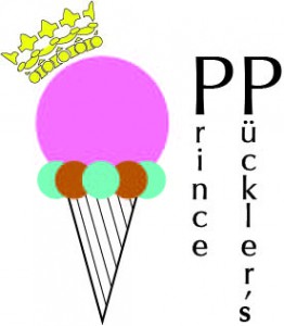
First logo draft
Here’s a first go at a logo. I like the graphic but the location of the text is still in question. I’m questioning where it’s going to end up on the collateral. The extreme different sizes of the words “prince” and “pückler’s” is very problematic. A design conundrum indeed…
For a good color version click here
Here’s the mysteriously neon colored one:
