Logos, logos, logos!
Here are my thoughts on some logos that have caught my eye throughout the years.
1. Moonstruck Chocolate

Moonstruck is a chocolate company based out of Portland. Their chocolates come in whimsical shapes based on the season and they have really top notch truffles and cakes (and hot chocolate!). Let’s go from the top down. The graphic is somewhat unusual, yet very effective. The thin crescent moon is very aesthetically pleasing while not taking up too much space. They could have left it at the moon, but adding the somewhat strangely-proportioned dancing man in the moon not only added the whimsy that is reflected in their products (and in chocolate itself), but it also gives it a more personal touch: this is a place for people. The font that they chose is also very effective with its lack of serifs and clean thin lines; it’s very easy on the eyes. The added interest of the ascenders in the “h”, “a”, and “e” is a nice subtle touch (especially because their angles match the angle of the moon). The line between “Moonstruck” and “Chocolate Co.” separates the name of the place a little bit from what the place is. To me it gives it an effect that says, “we don’t just make chocolate, we make experiences.” Finally, the gradient deep purple background with the white on top adds to the moon-ness of the whole logo and unifies the whimsical and almost mystical feel.
2. Kellogg’s
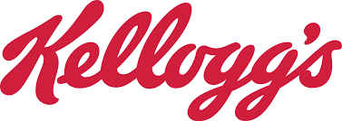
This logo often takes backstage to other cereal logos, so we don’t pay as much attention to it. Truth be told, that might be okay because I don’t think this logo is as successful as it could be. I think that cursive scripts can be risky because they can make things harder to read and, in this case, make things look like weird words. This particular cursive script is thick, which makes it harder to read and the small opening at the top of the “o” and the “g” make it almost look like it could be “Kelluyy’s”. Plus, this thick cursive doesn’t look all that modern (which is not necessarily a sin, but it does deserve to be pointed out). In the points won column, I think the capital “K” looks really good in this script (and Kellogg’s must have as well, because it’s the focus of the Special K cereal). Also the red grabs your attention, but as you’re walking down the cereal aisle at the store, you don’t want to read thick cursive. In the end, I think that the logo is okay, but could be improved with a more modern cursive script that’s easier to read so that “K” doesn’t have to do all of the heavy lifting.
3. The Mystery Machine

Ah, The Mystery Machine: making kids want hippie vans since the 70’s. For some reason, the Kellogg’s logo made me think of this one (which maybe points to them needing an update). Now this logo is working in a different way than many other logos in that it’s not really trying to sell us anything. The point of Scooby Doo was more the ragtag group of teens investigating insurance fraud all across America, and The Mystery Machine was just part of that…well, machine. That being said, the logo’s main job is to add to the feel of the show, and I think it achieves that. First of all, the blue and green background with the somewhat abstract, somewhat groovy shapes gives a good feel of haunting and mystery (and are a pretty 70’s color combo). The font of the letter is in all caps and some letters (“i”, “y”, “t”) are rounded and fat while others (“h”, “m”) are concave and flat, giving it a sort of funhouse mirror effect that also captures the spooky and fun feeling of the show. This is also reflected in how the word “mystery” starts off tall and then gets small and the word “machine” does the opposite, while still staying in a pretty perfect and subtle parallelogram. The words that this effect brings to mind are “groovy,” “spooky,” and “seventies,” which pretty perfectly captures what the show is all about. Many people in my generation grew up on this show, and for me at least, part of its charm came from how it was somewhat dated and I think this logo encompasses that pretty well. I don’t think they changed it for the modern movies, and the shouldn’t because an updated logo destroys the purpose and just looks wrong.
