I was tinkering around in R to see if I could plot better looking heatmaps, when I encountered an issue regarding how specific values are represented in plots with user-specified restricted ranges. When I’m plotting heatmaps, I usually want to restrict the range of the data being plotted in a specific way. In this case, I was plotting classifier accuracy across frequencies and time of Fourier-transformed EEG data, and I want to restrict the lowest value of the heatmap to be chance level (in this case, 50%).
I used the following code to generate a simple heatmap:
decoding <- readMat("/Users/Pablo/Desktop/testDecoding.mat")$plotData
plotDecoding <- melt(decoding)
quartz(width=5,height=4)
ggplot(plotDecoding, aes(x = Var2, y = Var1)) +
geom_tile(aes(fill = value)) +
scale_fill_viridis(name = "",limits = c(0.5,0.75))
And this is what I got:
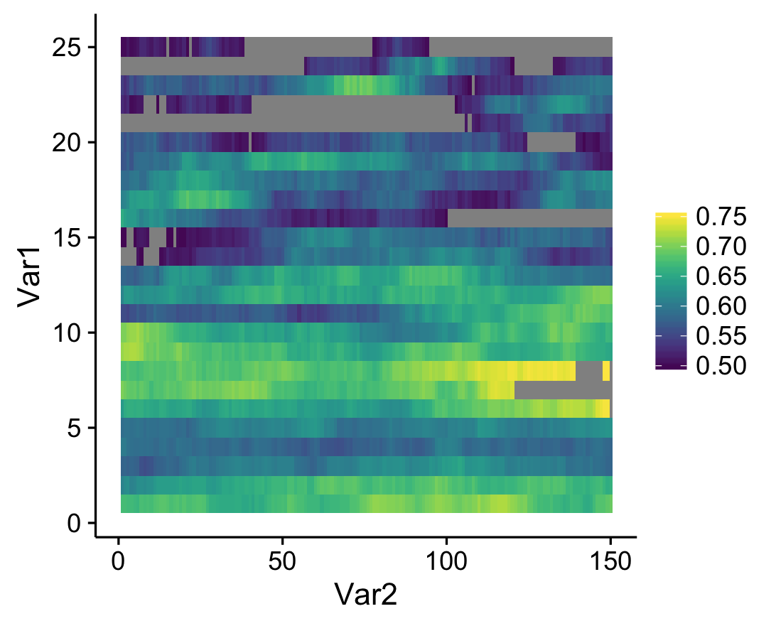
See the gray areas? What’s happening here is that any data points that fall outside of my specified data range (see the limits argument in scale_fill_viridis) are being converted to NAs. Apparently, NA values are plotted as gray by default. Obviously these values are not missing in the actual data; how can we actually ensure that they're plotted? The solution comes from the scales package that comes with ggplot. Whenever you create a plot with specified limits, include the argument oob = squish (oob = out of bounds) in the same line where you set the limits (make sure that the scales package is loaded). Ex:
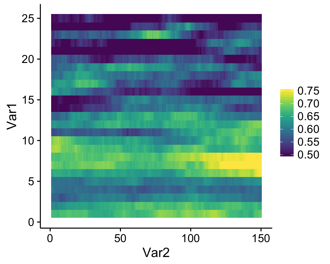
scale_fill_viridis(name = "",limits = c(0.5,0.75),oob=squish)
What this does is that values that fall below the specified range are represented as the minimum value (color, in this case), and values that fall above the range are represented as the maximum value (which seems to be what Matlab defaults to). The resulting heatmap looks like this:
A simple solution to an annoying little quirk in R!