Museum of Modern Art NYC
I chose the Museum of Modern Art’s logo because it is one of my favorite museums. Located in Midtown Manhattan, the museum houses an extensive collection of modern and contemporary art. The logo reflects MoMA’s modern sensibility with its simple, sleek design. The use of a bold sans-serif font creates a modern feel that can be easily re-sized to fit a variety of collateral material. The use of black-on-white font creates a feeling of weight and seriousness that is both sophisticated and glamorous. http://www.moma.org
Target
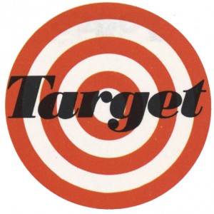
Target‘s iconic red bullseye logo represents a successful branding identity. The bright red color creates a striking visual impact that is associated with energy, strength, excitement and aggression. The logo has become so widely recognized by the American public that the name of the brand does not need to be represented in the logo. The image of a target takes the place of the word. The bold red concentric circles create a logo that is symmetrical and works well in any size. Over the years the logo has evolved from a more classic, vintage feel to the modern geometric logo we see today. The simplicity of the logo sends the message that Target is a ‘one stop shop’ that is trendy and convenient.
The Nature Conservancy
The Nature Conservancy is an organization dedicated to protecting ecologically important land around the world. The mission and vision are cleverly represented in the logo with the use of negative space and color. The white leaves cut of of the green circle suggest a globe and the calming green color relates to nature and peace. The words are a traditional black serif font with both upper and lowercase letters. The word ‘nature’ is slightly larger to create a hierarchy. The logo clearly demonstrates what the organization is focused on and the overall feel of the design is classic and timeless.


