
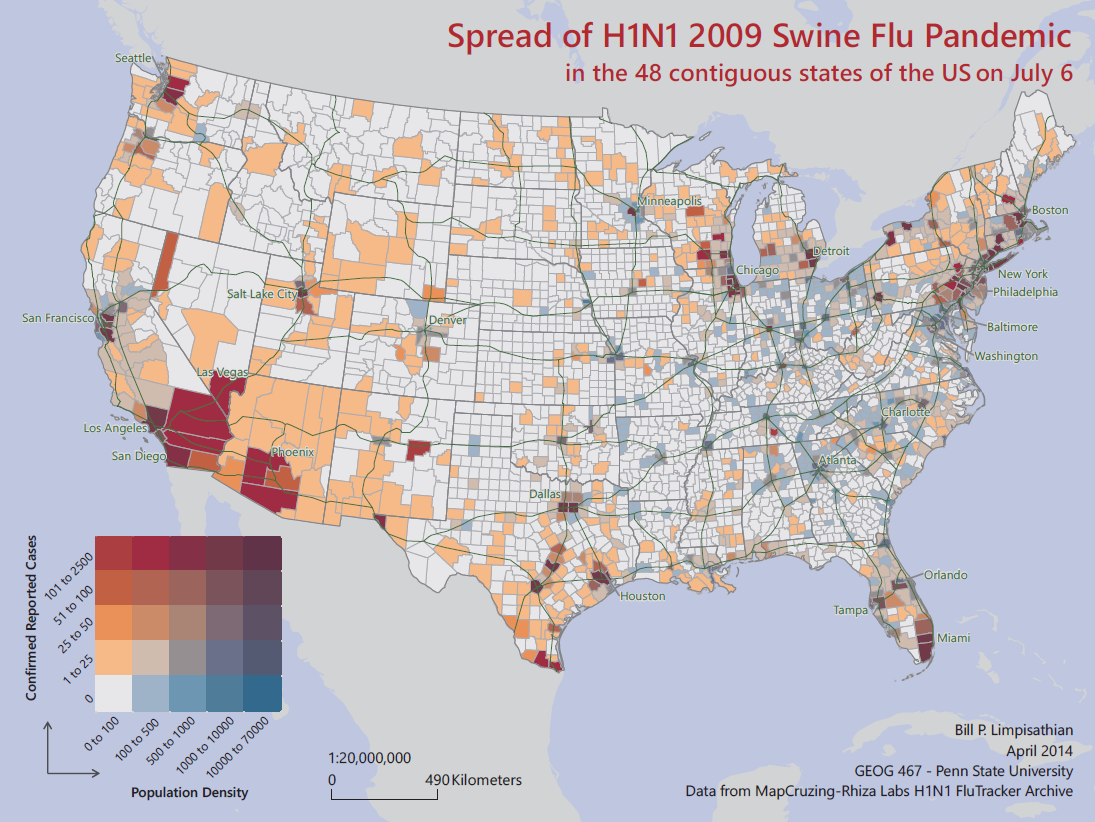
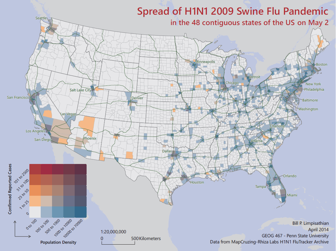
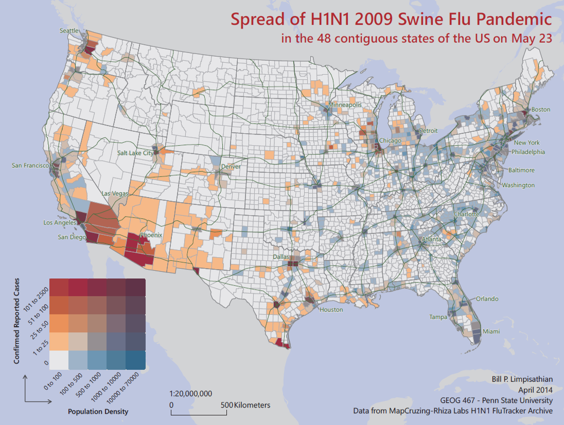
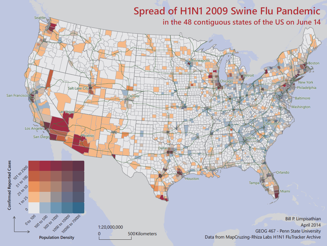
As part of an advanced-level applied cartography course with Dr. Brewer, I conducted a project to map the spread of the H1N1 2009 swine flu pandemic in the US by county. The project was challenging due to the lack of a centralized dataset, partly due to HHS policy on patient information protection. Thus, I relied on the use of crowd-sourced aggregation of case reports, which required significant processing. The map series, visually show the spread of the pandemic from the early introduction of the virus in the US to the peak of the pandemic at 4 periods. It uses custom 5*5 bivariate color scheme to show the spread in relations to the population density by county.
The task of designing a 5*5 bivariate color scheme that was able to show the spread of the virus in detailed was the most challenging aspect of this project.
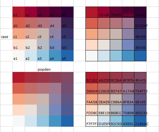
Variants of the bivariate color scheme during the devlopment process
Final Map Series
May 2nd
May 23
June 14
July 6
