

Summary
As part of a group project for an advanced GIS course in Fall 2015, I worked on the design and implementation of an web map that visualizes road accident incidents in Philadelphia. The project group included Marissa Defratti, Aaron Dennis, Bill Limpisathian, Maggie Norton, Tyler Regino, Kim Schmid, Derek Shaffer and Pat Stephens. I was in charged on the cartographic direction and interface design of the project, having developed the interface mockup, and cartographic palette and scheme used for the map.
Abstract
The Pennsylvania Department of Transportation records all reported vehicle collisions that occur within the city of Philadelphia. Each collision contains a spatial reference point and many attributes referring to the cause, type, severity, time, etc. of the collision. The Philly Crash Atlas turns these many data points into a useful visualization for those who commute out, to, or within the city of Philadelphia. The application also has potential to be used by infrastructure planners to find dangerous routes, assess the problems of that specific route, and allocate resources accordingly. In order to produce this application, a custom web map was designed to accentuate the data points along specific routes, user enabled filters were coded to easily sort data points, and a data-driven histogram for summarizing the data was made. This application has the potential to be used with collision data from other areas in the country as well as other data types that require similar visualization.
Interface Mockup and Design
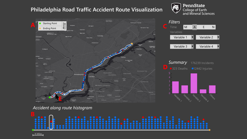
Version 1 (Initial Mockup)
Description of elements of the web map (write-up co-authored with Pat Stephen)
A. The user inputs an origin and a destination. The latitude and longitude values are sent to the Mapbox Driving Directions API and a GeoJSON data objects are returned. This returned data object includes total route distance, waypoint distances, waypoint names, alternate routes, and other variables currently not needed for this project.
B. All incident points within approximately 8 meters of the returned route are selected and returned. These points are then binned for every 1 mile along the returned route. Each vertical point column in the histogram reflects one of these bins. The user can easily view the sections of the route which have the most and least incidents.
C. The user can begin filtering the data based on time and a few important variables. The user can select incidents that occur in the Morning, Afternoon, Evening, and Night (M-A-E-N). Other variables like alcohol related, bicycle related, etc. can be selected to further filter the data.
D. The user can view a summary of incidents that occurred based on their specified route, selected times, and selected attributes.
E. The map will also be populated with the same filtered points. When hovering the cursor over these points, the same points will be highlighted in the histogram described in section B.
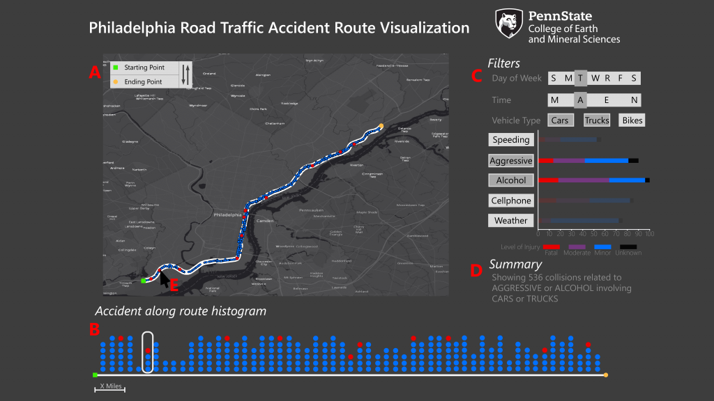
Version 2 (Refined Mockup)
Symbology
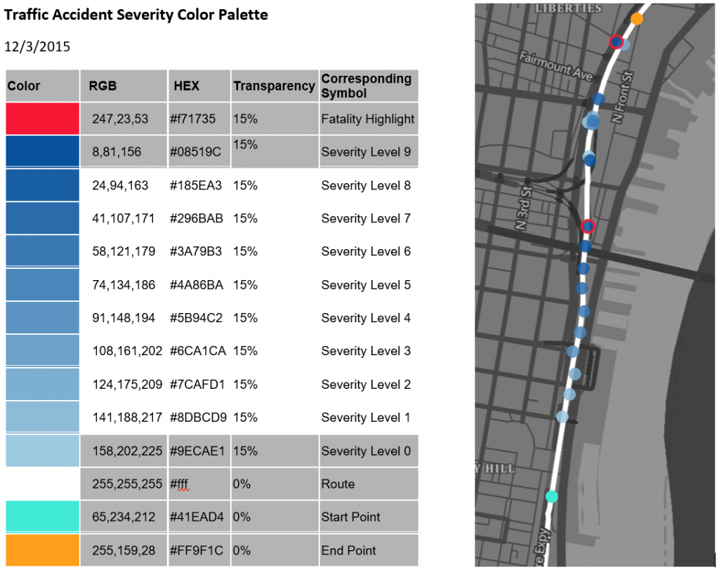
Our main symbology design intent for the project was to make the visualized data the centerpiece of the application while also keeping the application itself intuitive and uncluttered. Accordingly, it was agreed upon by the team that symbols and sign-vehicles would be highly abstract with a low level of iconicity. Thus, we chose to represent the visualized data using geometric circles, with significance being represented using logically-corresponding hues. This symbology choice additionally helps to ensure legibility and consistency of the data both on the map and in the associated histogram. Careful considerations were made to ensure that proper contrast and hierarchical-relations between map elements were maintain. Consequently, the application uses an extensively-customized dark grey basemap that provides sufficient contrast with the range of hues and saturations being used to represent the visualized data. Dynamic labeling symbolization was implement with zoom level-dependent city, neighborhood, and street labeling. Hue and saturation choices for the incident data were made with similar considerations, with each saturation level having adequate distinguishability from other levels, while also collectively maintaining the essential contrast with the background elements on the map. Consequently, a 10-class blue color-ramp was developed to represent the severity level of the accident with an additional red hue to represent fatalities. Furthermore, the use of a white route line helps to provide visual contrast and breakage between the foreground symbols and background elements. All incident symbols were assigned a 15 percent transparency value to maintain the visibility of stacked icons. Additional distinct hues were used to represent the start and end points and the implemented data brushing. Figure X. shows the original intended symbolization and color scheme of the map.
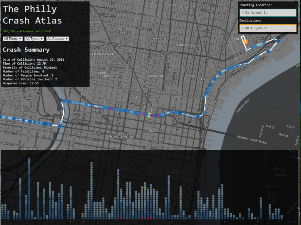
Implimented interface of version 1
Video Report
Project Report
 Loading...