Entry No. 15
17 February, 2014
Author: Josie Baldner
COLOUR INJECTOR LAMP
Taras Sgibnev
Colour Injector from Taras Sgibnev on Vimeo.
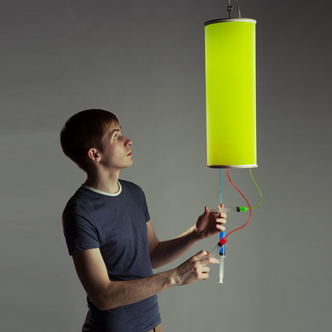
The Colour Injector Lamp was designed by Taras Sgibney to portray the way that three colors red, green, and blue (RGB) interact with each other in digital interfaces.

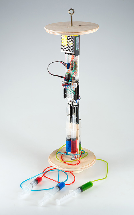
The lamp has three syringes with red, green, or blue inks inside them. As a user pushes and pulls the plungers of the syringes the colors emitted by the lamp change through a spectrum of hues like one would see on a computer screen. The interactive syringes hanging from the bottom of the lamp are connected to a series of syringes on the lamps interior. The plungers on the interior syringes are attached to switches that control a microprocessor that controls the color outputs of the lamps RGB LEDs.

http://www.dezeen.com/2013/11/19/colour-injector-lamp-by-taras-sgibnev/
Entry No. 14
4 February, 2014
Author: Veronika Jonsson
THE OLED: DEFINING A NEW FRONTIER IN LIGHTING DESIGN
Featuring In-Tenta | Sinato | Philips Lumiblade
OLEDs, also known as organic LEDs, work similarly to their LED namesake. When electrical current passes through the thin semiconducting materials that make up part of its construction, the OLED produces light. These semiconducting layers are uniquely organic, unlike those in an LED. The semi-conductive layers are sandwiched between one positively charged cathode layer and one negatively charged anode layer which manages the movement of electrons through the assembly to produce light. Depending on whether the OLED is transparent or not, the cathode layer can be either transparent or opaque. This sandwich construction then sits on an organic transparent material called a substrate.
The difference between LEDs and OLEDs
The semiconducting layers of LEDs are built in crystals of inorganic material while OLEDs are created using organic material. This means that OLEDs are more resistant to damage and can be made to be flexible or curved.
OLEDs also produce a dramatically different light quality than LEDs or any other electric light source. Unlike the typical point light source, OLEDs emit light evenly over a complete surface. This means that strategies for diffusing light, particularly important for the tiny point source lights characteristic of LEDs, are not necessary.
New Frontiers
ONA | In-Tenta
One of the winning designs in the LG International Design Competition, ONA responds to the competition’s call for designers to “change the way we see the Light.” Due to the fact that lighting continues to be evaluated by conventional standards such as light output and wattage, the unique qualities of OLEDs are generally overlooked. The call for entries asked that designers “bring justice to the quality of OLED light” in order to set a new precedent for light quality to support emotional and physical health. Dividing the competition into two categories – the first for designs using the standard OLED panel developed by LG and the second for designs using the special flexible panel design, ONA was the first place winner in the first category. Delivering a lighting product that could be mass-produced and that integrated itself within furniture design, the jury thought that it did well representing some of the possibilities for the OLED.
In-Tenta is among many renowned lighting design studios working to integrate OLEDs in their work. New designs take advantage of the flexibility OLEDs allow as well as their diffused quality of light, which lends them to be understood as a ‘lit surface.’ These attributes are being explored in new applications across the globe; from Samsung’s flexible Smartphone display prototypes to Audi’s ‘wallpaper’ car lighting.


[Photos courtesy of inhabitat]
Infuse| Chikara Ohno of Sinato
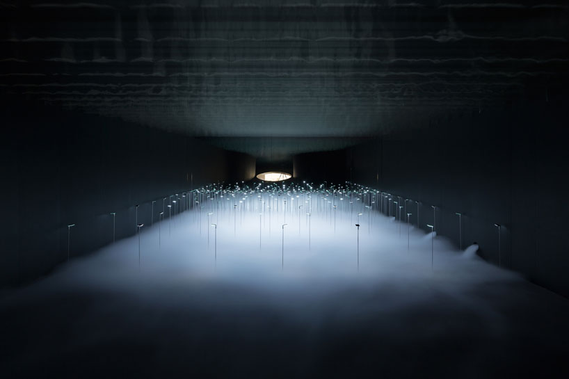
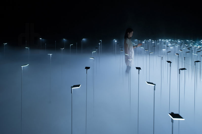
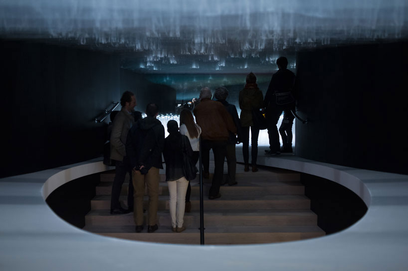
A particularly artful application of the OLED, the lighting installation at Superstudio Piu in Milan combines the effect of the OLED with that of fog to create an ethereal interior landscape. In this installation Ohno saw the potential for the OLED to be reconsidered in an experiential context. In the installation space many OLED panels are set up in a pattern so that visitors can meander through them and walk through the light infused fog moving at their feet. Because the OLED panels emit diffused light at each source there are no concentrations of light distinguishable in the fog. This even distribution throughout the mist produces an absolutely dream-like effect – as if one were walking through a blanket of light.


[Photos by Takumi Ota. Courtesy of DesignBoom]
To view more emerging OLED specific applications and designs check out the video below produced by Philips Lumiblade in association with Dezeen Magazine.
Entry No. 13
10 November, 2013
Author: Veronika Jonsson
PUBLIC ART: HELSINKI’S LIT LANDMARK
Lighting Design Collective | Silo 3468
Completed in the fall of 2012, Silo 468 is a lit urban art piece that engages its environment and provides a civic space for its community. Designed by the Lighting Design Collective based out of Madrid, the design won an international competition to convert a disused oil silo into a cultural landmark as part of Helsinki’s year as The World Design Capital.

[IMAGE: Design Bloom]
Located 2 kilometers across the water from central Helsinki, the artwork was inspired by the movement of light on the surface of the sea and the visualization of the prevailing winds and swarming birds which are both well-known phenomena to the residents of Helsinki.

[IMAGE: Design Bloom]
Throughout the day, the design effectively evokes the sparkling nature of water through the use of approximately 450 mirrors mounted behind nearly 1,250 perforations that let in direct sunlight and reflect it back out to be seen by onlookers. This effect on the exterior surface can be seen across the water most strongly during sunrise and sunset, but translates throughout the day in the interior where the perforations and mirrors work together to cast dappled shadows that move across the space in relation to the suns course.
[IMAGEs: Lighting Design Collective]
During the evening, however, the flickering display of white LED lights behind the perforations work in conjunction with software that monitors the movement of wind and triggers changing light patterns in real time. The software additionally is programmed to provide patterns that mimic the swarming of birds to reference the seaside location. Though the software works well in providing unique patterns that never repeat, the lit display does not necessarily communicate the designers’ intentions and lacks the interactive quality it promises.
SILO 468 URBAN LIGHT ART PIECE FOR CITY OF HELSINKI from Lighting Design Collective on Vimeo.
Entry No. 12
25 October, 2013
Author: Ben Bye
LOCAL LIGHT: HULT CENTER LOBBY LIGHTING
Rowell Brokaw Architects | Luma Lighting Design
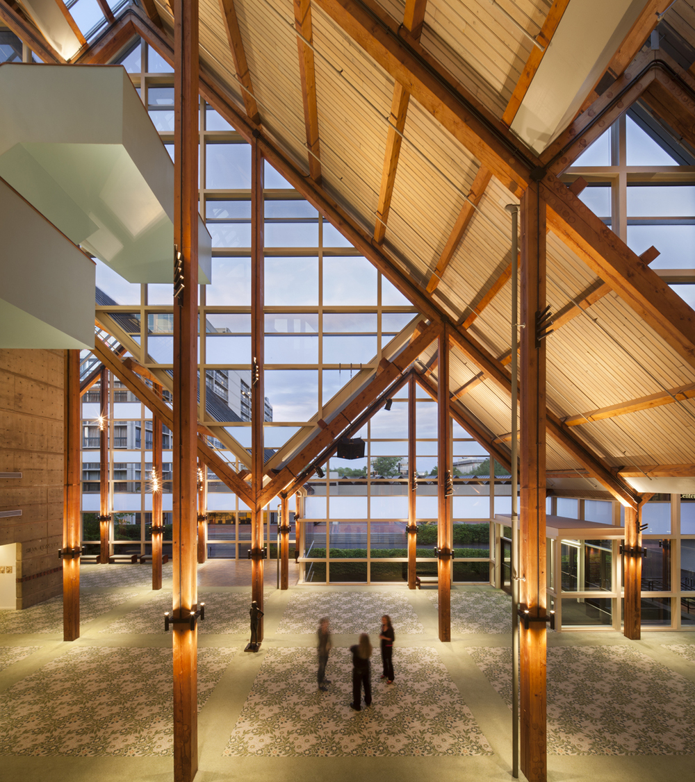
Eugene’s Hult Center for the performing arts recently underwent a lighting renovation in it’s lobby. The space was previously equipped with Fluorescent Light fixtures attached to the lobby ceiling, giving low lighting levels and Furthermore, the extreme height of the lobby required scaffolding in order to change out balasts. The cost of this task amounted to $30,000 per change, leading management to neglect burnt out lamps untill a large enough number where out. This led to highly diminished light levels in the lobby. Rowell Brokaw Architects took extreme care to design a lighting system that would not require the expense of scaffolding, instead relying on a mechanical lift that reaches up to 35 feet above the floor.

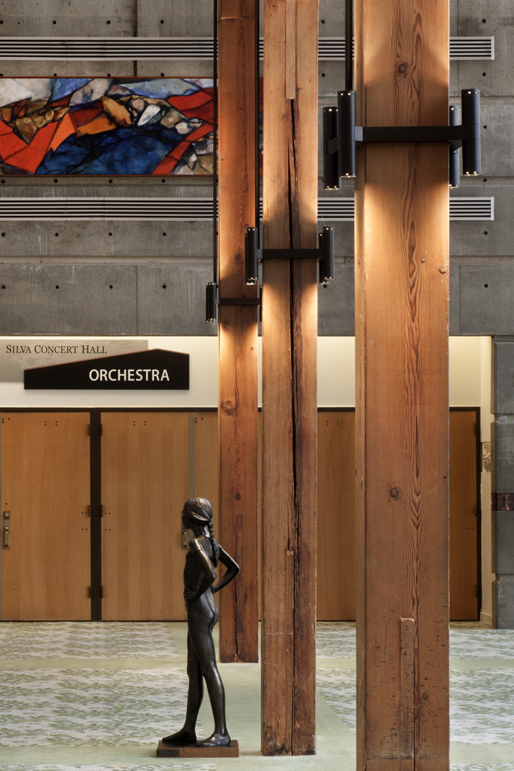
The new lighting scheme brings light closer to the lobby floor, creating a brighter more focused light. Light is focused both up and down the large timber columns, highlighting the distinctive structure showcased in the hult center lobby.


All Images From Rowell Brokaw Architects / Information from the Eugene Register Guard
Entry No. 11
15 October, 2013
Author: Josie Baldner
IMMATERIALS: LIGHT PAINTING WIFI
Timo Arnall | JØrn Knutsen | Einer Sneve Martinussen
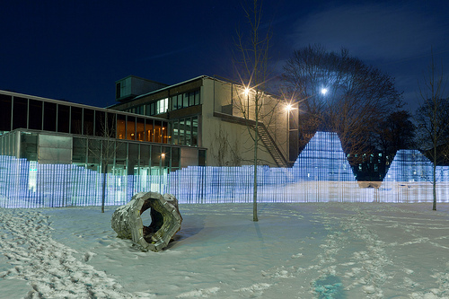
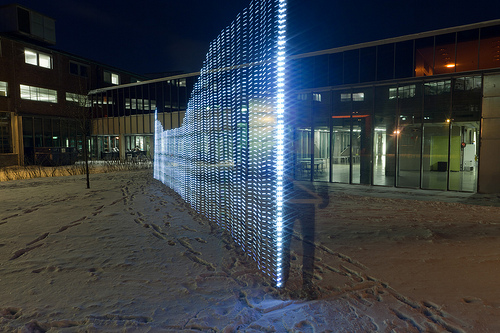
Immaterials was a photography project started in 2009. It explores the idea of capturing what wifi actually looks like in an urban setting. The project does this by setting up a long exposure wile someone holding a tall rod with LED lights that pick up on the strength of the wifi signal walks through the scene.
Immaterials: Light painting WiFi from Timo on Vimeo.
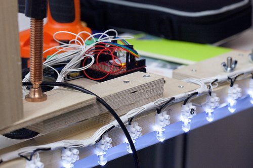
The lighting display was created using a four-meter tall wood support structure with 80 LED lights attached to it. The lights respond to Received Signal Strength (RSSI). When moving through a space with this device in combination with long-exposure photography the device creates what looks like a graph or section of the strength of a wifi signal forthat specific spot and time, and what becomes really fascinating is when this experiment is repeated in the same spot because the photographs show the almost rippling cloud like quality of wifi.
 
Photos from http://www.nearfield.org/2011/02/wifi-light-painting
Entry No. 10
09 May 2013
Author: Wes Thompson
Philips “EnduraLED” wins Department of Energy’s L Prize
The US Department of Energy held the first ever government-sponsored technology competition called the L Prize, where they sought entries in lighting innovation. The challenge was to find the lowest energy bulb while maintaining quality of light, color, and intensity equal to a standard 60W incandescent.
The proposal/prototype from Philips met the requirements with a bulb that used under 10W, making them the winner of the $10 million prize.

[IMAGE: National Geographic]
After the competition, the bulb underwent 18 months of rigorous testing to look at the viability of making it available to consumers. It was tested under extreme temperature and humidity conditions, vibration simulations, and changes in voltage. The Department of Energy estimates that if every bulb in the US converted standard 60W bulbs to Philips EnduraLEDs, 35 terawatt-hours could be saved in one year. That’s the energy equivalent of lighting almost 18 million households.

[IMAGE: Apartment Therapy]
At the end of the testing, the only down side is price. Each bulb cost roughly $18, as opposed to $3 for some inexpensive CFL bulbs. They estimate that the price will continue to go down, plus the added incentives of the quick payback in energy savings.

[IMAGE: Popular Mechanics]

[IMAGE: Inhabitat]
Entry NO. 9
23 April, 2013
Author: Ben Bye
Kunsthaus Graz
CRAB Studio | Cook Robotham Architectural Bureau
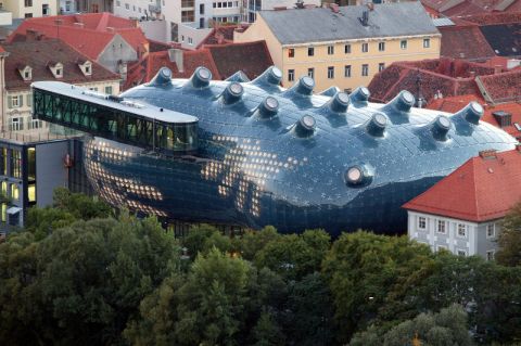
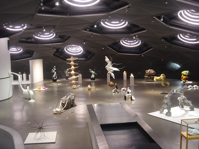
Last evening, Peter Cook of Archigram and CRAB Studio gave lectured at the University of Oregon. In his lecture, he highlighted his project for the Kunsthaus Graz. Built in 2003, the Kunsthaus Graz is a public art gallery for the city of Graz, Austria. The project is unique in its focus on both natural daylighting systems and high-tech facade illuminations.

Photo: 23musings.com
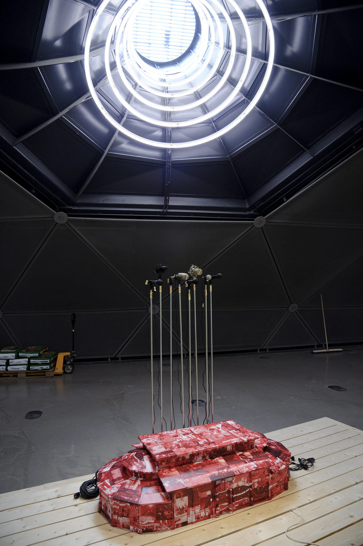
As an art gallery, the building is most interested in capturing natural north light. The roof above the second floor gallery space is punctured by a series of north facing light monitors. The monitors create both the desired lighting conditions as well as adding interesting punctuation to the facade. As sources of daylight during the day, the monitors are transformed into luminares by night with sculptural fixtures filling the void of the monitor.

Photo: escdotdot

Photo: UMJ / N. Lackner
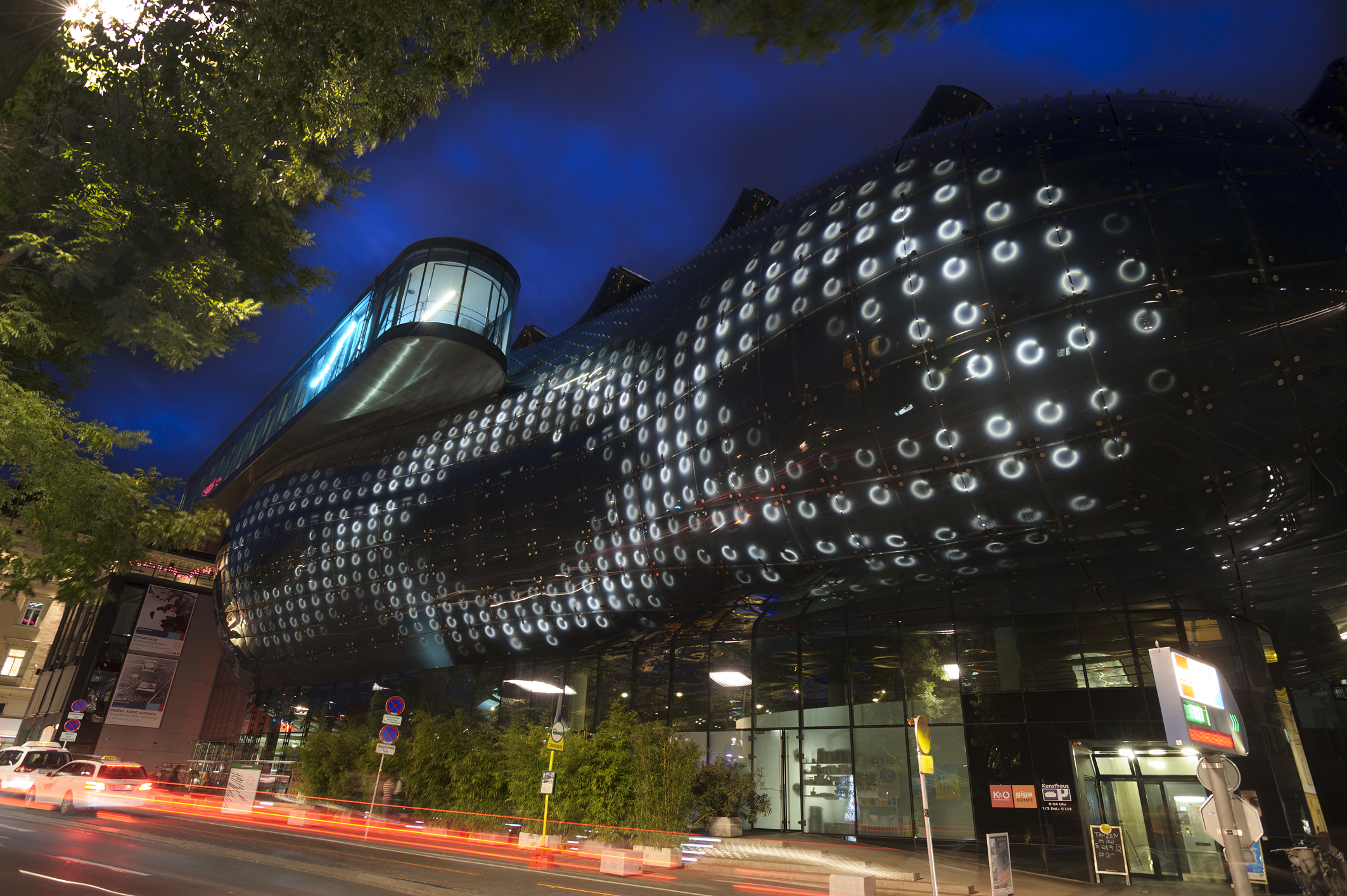
The gallery is also unique for it use of active facade illumination. Behind the glass cladding panels sit hundreds of computer controlled lights. Together in synchronization, the lights can form patterns, words, and images. Rather than utilizing high tech LEDs, the entire effect is achieved using standard purchase bathroom lights. The bathroom lights were utilized in part due to budget constraints but more importantly because of their high resistance to water infiltration and damage.

Photo: UMJ / N. Lackner
All Information from http://www.crab-studio.com/graz-kunsthaus/
and Peter Cook’s Lecture on April 22, 2013 at the University of Oregon, Creative Cynicism: The Cheerful Response
Entry NO. 8
04 March 2013
Author: Ben Bye
Nature Trail
Jason Bruges Studio
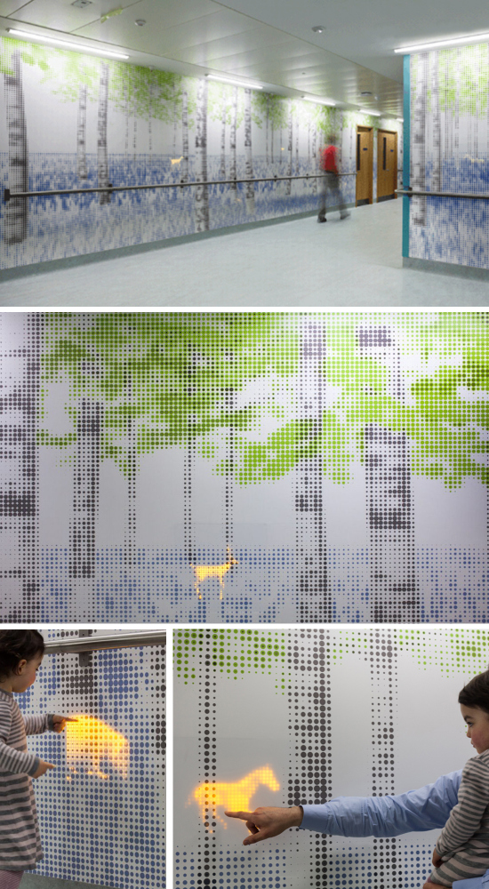
Nature Trail is an installation for Great Ormond Street Hospital in london. The designers created an interactive LED Wallpaper system to the children’s wing of the hospital. At different levels of a tree scape wallpaper, embedded LED screens have interactive animal animations. Children can touch the screens and make the animals move around. This project uses lighting design to impact emotions, with the goal of making children’s experience at the hospital a little bit easier.

Photo: http://xo-inmyroom.com/2013/02/06/jason-bruges/
All information: http://www.jasonbruges.com/projects/uk-projects/nature-trail
Entry NO. 7
01 March 2013
Author: Josie Baldner

Handmade School
Architects: Anna Heringer and Eike Roswag
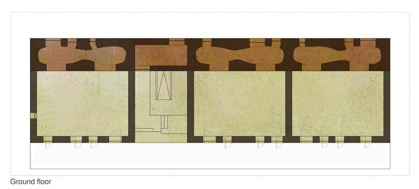
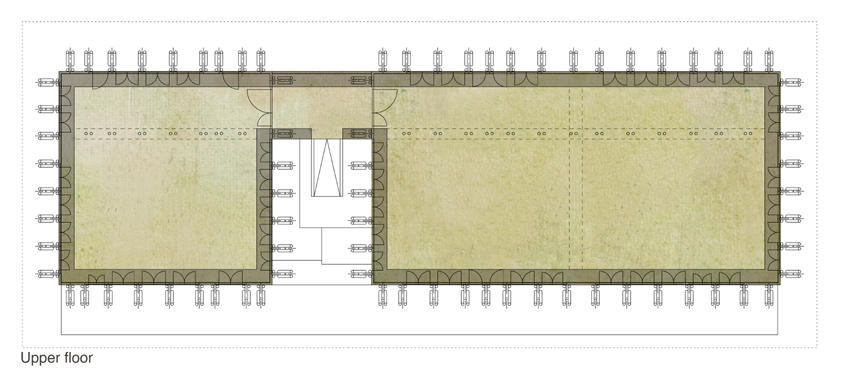
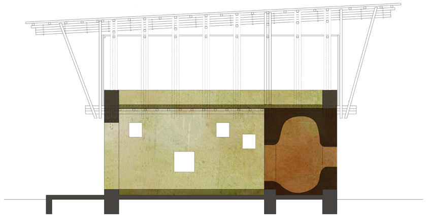
The Handmade School was desiged to engage the local communiy to develope their skills and knowledge, in particular with local resources through the building process. It is built with localy sourced handmade bricks for the foundation with cement plaster facing, loam and straw for the load bearing walls, bamboo and nylon lashing for the upper floor, and corrogated metal for the roof.
“Its innovation lies in the adaptation of traditional methods and materials of construction to create light-filled celebratory spaces as well as informal spaces for children.”
– Jury of The Aga Khan Award for Architecture 10th Circle

The building was designed to have three room types to promote different levels and speeds of learning. The three smaller cavelike spaces support an interactive and imaginative way of learning and provide childscale places of retreat. The deep oddly sized west facing windows add a playful nature to the secondary spaces wile providing enough lighting for reading.


Photos and Information from:
http://www.anna-heringer.com/index.php?id=31
http://www.archdaily.com/51664/handmade-school-anna-heringer-eike-roswag/
http://www.moma.org/interactives/exhibitions/2010/smallscalebigchange/projects/meti_handmade_school
Entry NO. 4
30 Jan 2013
Author: Chris Smith
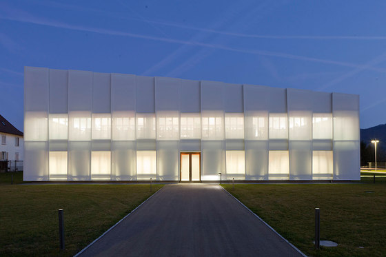
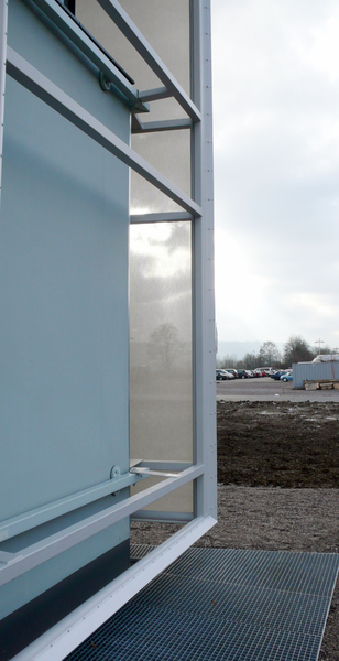
Sedus Stoll, a furniture manufacturer, has built itself a new building with a textile skin made of glass fiber fabric. Not surprisingly, the play on artificial and natural forms of light become really interesting. From Detail (issue 1+2/2013), “the facade is “suspended in front of the façade in two layers , the skin gives the building an appearance ranging from solid structure to just about to dissolve. Special adapter profiles made of aluminium were developed for attachment. The translucent membrane furthermore has a positive influence on the total energy balance of the building.”
Architects: ludloff + ludloff Architekten, Berlin
Location: Hauptstraße 4, D-79804 Dogern, Germany
Client: Sedus Stoll AG, Waldshut
Structural engineers: Sobek Ingenieure, Stuttgart
 
Photo: detail-online.com architonic.com
Taken from the same spot by architectural photographer Jan Bittner, we see a building become more exposed as daylight diminishes. It does seem these transparent facades are more popular these days as many architects are taking advantage of technological developments that keep both performance and aesthetic in mind. Such is the case with our variant here. <<Continuing From Detail>>The steel tube frames which are up to 12m (about 40′) high use custom adapter profiles made of aluminum. Springs in the holding profiles offset changes in length of the construction due to temperature fluctuation maintaining the tautness of the membrane. The translucent material provides protection from the sun and rain, is dirt repellent, and allows ideal rear ventilation. It also meets exacting aestheic requirements in that it’s suspended in front of the facçade in two layers, sun protection blinds are used to achieve varying degrees of transparency, giving the building – depending on lighting levels – an appearance ranging from solid structure to “just about to dissolve.”

A detail drawing in plan: ludloff + ludloff Architekten
 
Detail Photo: detail-online.com
Rahmen Stahlrohr = Steel tubing frame, Glasfasergewebe, silikonbeschichtet = Glass fibre fabric, silicone-coated, Adapter Aluminium = Aluminium adapter, Klemmprofil = Clamping profile
Considering the other available systems to implement: Bild 1 von 2 : Abluft = Waste air, Zuluft = Supply air, Kühldecke = Cooling ceiling, Umluftkühlgerät = Circulating air cooler, Flächenheizkörper = Radiator, Nach Entrauchung = After smoke extraction
|
|
