Part 2B2
SAMPLED DATA
1. Your analysis of the data and any observations you make regarding the environmental data having (or not having) on the bike counts as well as the relationship of the demand variable. Do you see the same correlations as you did several weeks ago in Assignment 2? Do you see similar patterns as you did in the previous section or different?
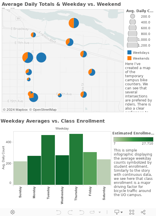
I took a bit of a different approach and really focused on the demand variable. In this data there are very similar patterns to the previous section regarding the bike counts and the class enrollment. The higher counts on the weekdays paralleled by higher class enrollment values. The map also supports this by by displaying greater weekday traffic at most of the counters.
2. A brief description of the sensor. Recalling our discussions and readings on sensor ontology and particularly bike counters –what kind of sensor is this? – What is actually being measured to produce a bike count?
These count were collected by pneumatic tubes. These are short-term, mobile, and cost-effective ways to gather bike count data. These work by sending a burst of air pressure as the bike drives over top. Each increase of air pressure is counted as a bike. There are algorithms that filter out other vehicles that pass over top of the tubes. The two tube allow you to analyse directionality of the bicyclists.
3. A brief description of the sensor network. Recalling our discussions and readings on sensor networks – how is the data getting from the sensors to you?
This data was collected by LCOG’s transportation sector. The tubes were laid out at the locations temporarily. As each bike passes overtop the tubes, the increased air pressure is sensed and counted as one bike. The data is stored on an on-site hard drive. After a few days of data collection, someone comes out, grabs the data off the hard drive and uploads it to LCOG’s data base.
4. A brief description of the visualization you chose. Why did you choose it? How did it suit your data and your purpose/story?
I created a dashboard to visualize the data. I got the map idea from LCOG’s website and I wanted to created one for the campus locations. This way there was spatial familiarity for each counter location. I found it to be very effective. The most popular entrances to campus can be easily differentiated for the less popular. I also used the pie graphs to convey weekday vs. weekend traffic. The graph is similar to the one one in the previous section and equally as effective. Demand is a major driver of bicycle counts.
July 21, 2023 at 6:00 am
Introducing the revolutionary JN0-104 Mock Exam, now absolutely FREE for a limited time! 🚀 Elevate your networking skills with the latest 2023 version. Seamlessly designed by experts, this cutting-edge simulation mirrors the real Juniper Networks Certified Internet Associate (JNCIA) exam, ensuring an unparalleled learning experience. Sharpen your knowledge, gain confidence, and conquer the https://www.dumpstool.com/JN0-104-exam.html certification effortlessly. Unleash your full potential with diverse practice questions and in-depth explanations, empowering you to succeed. Don’t miss this exclusive opportunity to excel in your career. Embrace success today and embark on a journey towards becoming a certified networking professional. Download now and embrace the future of networking!