Poster & Display Ad Collateral
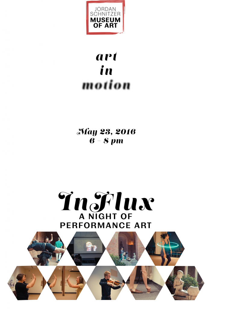
11 x 17″ poster. My effort with this poster was to stick to the more modern, minimalism effect I’ve been going for with re-branding the JSMA. I wanted to use white space for dramatic effect and play with a more scripty font as well as using Mortison Personal, the main re-branding font I settled on. I also wanted to play with layout in this poster; the eye is drawn to the heavier graphic presence at the bottom of the poster, but naturally we read from the top down, so the viewer will be forced to pause and take a moment to actually absorb everything that the poster days. I also didn’t want the poster to be so busy that it was difficult to gauge from a distance.
1/4 page ad, Eugene Weekly. I followed Eugene Daily Emerald’s specifications of a 1/4 page ad at 9.75″ x 3.25″. The display ad also uses white space liberally, taking the aesthetic cues from the event poster and compacting them. I made the logo a little more prominent, added a website, and changed the date format and font to something sleeker.


Leave a Reply