Sarah Wyer e/Portfolio

arts administration | museum studies | folklore

Author: Sarah Wyer (page 3 of 4)

Brand Awareness

Brand Awareness Assignment
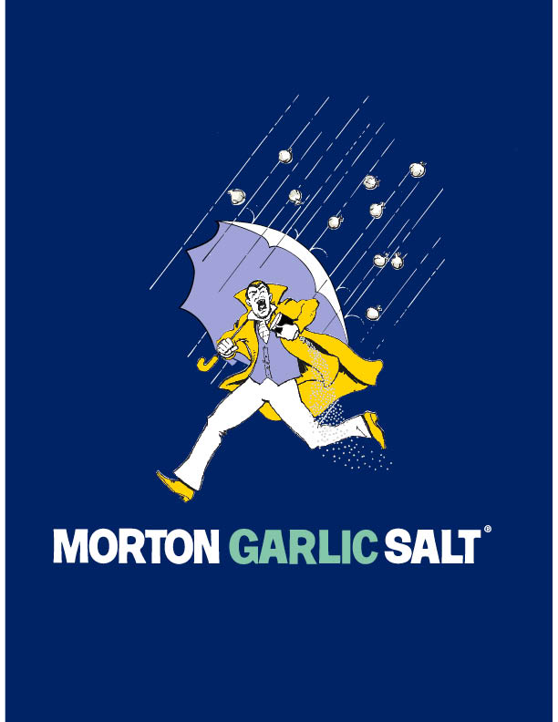
 1. Morton Salt

salt-girl

When I was looking around my house and trying to figure out which logos had an impact on me I noticed—seemingly for the first time—my salt. I usually buy Morton Salt, partially because the price difference in salt containers is minuscule and I grew up with Morton Salt, and partially because I actually really like the logo design. It was with this in mind that I began researching the Morton Salt Umbrella Girl. The design, presented to the Morton Salt Company in 1911, was striking because in one image, that of a young girl with an umbrella and the salt pouring out behind her, emphasized that even in the rain, Morton Salt would pour. The catchphrase “When It Rains It Pours®” is actually a rewording of the proverb “It never rains but it pours.” Oftentimes, Morton’s ad copy is confused for the proverb. The Morton Salt Girl is the brand personified. She has been updated throughout the ages, as the below graphic illustrates, and she is a popular illustration for salty science projects and a costume choice, and has even made appearances as a tattoo on several limbs. In 2014, Morton Salt, Inc. updated the Morton Salt Girl from their 1968 logo, adding a slightly more modern font. There is less contrast in the new logo and the colors are brighter. If yellow is an optimistic color then the Morton Salt Girl is simply delighted about being able to pour salt even as the rain hits her umbrella. The deep blueish purple background could be a reference to a brand you can trust, provide start contrast to the yellow of the girl’s outfit, and suggest an imaginative, story-esque twinge.

history-umbrella-girlMortoncomplete3JKrCl

4b9e4cc72a37f31fc8871f67cfe0fe29


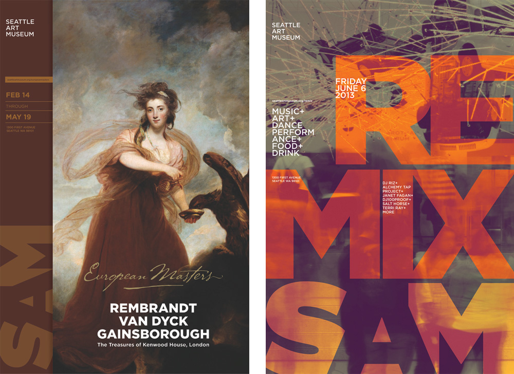
2. Seattle Art Museum

sam_logo_detail

I spent my summer interning with the Seattle Art Museum (SAM), so the SAM logo became an everyday sight. As mentioned in class, re-branding is an expensive process for large organizations. SAM is a museum with over 225 staff, three locations, and lots of materials to apply a new brand to. In 2013, Microsoft Corporate Citizenship awarded SAM a grant to re-brand. The museum went from its thin, ultra-contemporary sans serif lettering to ultra Gotham font. The thick letters are offset by the negative space of the “A” in the middle of “SAM”, and the warm gray coloring is an inch of two more towards corporate neutrality compared to the light “trustworthy” blue (also often affiliated with corporate-ness). The font is actually the same, utilizing SAM’s already-purchased Gotham package, just taken to the other extreme in weight. The previous re-brand was only 7 years old when SAM released its new look in 2014. The warm gray is a little too faded to capture my interest, but I do enjoy the color-flooding technique SAM has used to blend the brand logo into posters and other materials.

sam_poster_02


SAM_Logo_Sm


3. Herman Miller

 herman-miller-logo-design-20111herman-miller-logo-design-1999

Ah, furniture. The OG of modernist office furniture, Herman Miller’s brand has enjoyed consistent fame and recognition. Their logo, the pop-esque “M” surrounded by bright, glaring red, shares this recognition. Originally set with a wood-grain, the “French-curved” “M” has endured as a moniker. The logo is minimal in design, harkening to Herman Miller’s furniture style. Also, the logo was designed to be clear and effective no matter how simplistic the color scheme of printed materials was (the first ad was printed in 1946 when a two-tone printing process was used). Always preferentiating red, the “M” of Herman Miller stands out as bold and exciting.

herman-miller-logo-design-1946


4. Starbucks

starbucks logo

The famous Starbucks coffee mermaid was a research project for the original Starbucks founders in 1971. The company started in Seattle, a city with roots as a bustling port, so the Starbucks founders looked through old nautical and seafaring books trying to find something that resonated with their new brand. The two-tailed mermaid is a nautical nod to Seattle, and the symbol of the siren is an enticing suggestion. Originally the logo featured the buxom siren in all her seductive glory with a background of brown to match the coffee bean color. The Starbucks logo we all know and hate (or love I guess) has is green, white, and black. Although green suggests health, environmentalism, and peace, it is hard to take the logo in its true colors when the symbol of the siren is one of addiction, enticement, and doom. Her eyes are a little crazy too. Nevertheless, the Starbucks logo is one of the most widely recognized in the world. The logo incorporates bold sans serif font, the easily manageable shape of a circle, and the siren has been updated to be family-friendly.

old-starbucks-logo-01-2014


Sources:

Armin. “New Logo and Identity for SAM by Hornall Anderson.” Brand New. UnderConsideration, 25 June 2014. Web. 06 Oct. 2015.
Bravo, Amber. “Irving Harper: The Mediums Beyond the Message.” Herman Miller. Herman Miller, n.d. Web. 06 Oct. 2015.
Clara, Robert. “How a Topless Mermaid Made the Starbucks Cup an Icon.” AdWeek. AdWeek, 29 Sept. 2014. Web. 06 Oct. 2015.
Honigman, Brian. “The Psychology of Color in Logo Design (INFOGRAPHIC).” The Huffington Post. TheHuffingtonPost.com, 24 Jan. 2013. Web. 06 Oct. 2015.
M., Steve. “So, Who Is the Siren?” Starbucks Coffee Company. Starbucks Coffee Company, 5 Jan. 2011. Web. 06 Oct. 2015.
“Morton Salt Girl Could Make Advertising Industry History.” Food Manufacturing. Morton Salt, Inc., 10 Sept. 2014. Web. 06 Oct. 2015.
“New Work: Seattle Art Museum.” New at Pentagram. Pentagram, 4 May 2007. Web. 06 Oct. 2015.
Smith, Graham. “Evolution of the Herman Miller Logo 1905-2011.” The Logo Smith. The Logo Smith, 14 Nov. 2011. Web. 06 Oct. 2015.

AAD 610 Learning Goals

  1. I would like to learn more about typography and choosing the right fonts for projects/designs/papers.
  2. I would like to be comfortable with Adobe Illustrator, InDesign, and Photoshop.
  3. Have a large collection of resources to help me overcome hurdles in design and marketing.
  4. Be proud of the re-branding assignment I complete and submit. I don’t like turning in shoddy work and hope to produce something I can be proud of despite my limited experience with design and marketing.
  5. Feel like I have grown as a designer and have more confidence in my skills.

Typography of Stephen Fry

Talking about typography in class today reminded me of a wonderful video someone made on the YouTubes. A dude was inspired to make a visual typographic representation of a speech by Stephen Fry, renowned British Smart Man. 😉


AAD 610 // New Student Survey Questions

New Student Survey Questions

1. Where did you move from to attend the UO? And, briefly describe how you landed on the UO AAD program. Any interesting, funny, anecdotal stories/details are welcome.

I originally moved to Eugene from San Diego, CA to finish my undergraduate degree at the University of Oregon. I liked it so much that I stayed for my Masters’. I chose AAD because I felt like I did not have the necessary practical skills for the types of positions and jobs that I wanted.

2. Area of concentration in AAD?

Museums Studies with a twinge of Community Arts.

3. Describe your knowledge and use of technology systems.

I am familiar with both Mac and PC operating systems. I can use a camera. I am pretty super with my iPhone.

4. What software do you commonly use? Briefly describe purpose/application for software on your list.

hahahahahahahahahahaha.

Sorry. I have used PhotoShop briefly to created a poster for research display, and during my summer internship at the Seattle Art Museum I created a map for a public art bike tour with the city of Seattle. I am much less familiar with other Adobe suites, although I’m currently rocking Acrobat.

Commonly, I use Microsoft suite (Word, Excel, PowerPoint), email systems, website browsers, etc.

5. Do you have any graphic design or media production/management experience? Have you taken any graphic design or media production courses?

Very little. I have never taken a course on design or any of the things you asked about.

6. Know anything about typography?

I sure do! I have a whole list I wrote up of typography tips when I realized that I was going to be doing a little design work at my summer internship and had no idea what I was doing.

7. Do you use Web (2.0) apps? Name those that you use or are familiar with.

…I don’t think so?

8. Do you use Social Media (Facebook, Twitter, Instagram, Snapchat, Vine, Yelp, etc.)? Name those that you engage in.

Am I a millennial? I sure do. Facebook & Instagram are my main platforms. I love Yelp but do not contribute to it at all.

9. Tell us something unique about yourself.

When I was a child of three years my mother and I lived in Rome with her at-the-time boyfriend, “John with the Beard.” He left for a long trip for work and my mother and I were robbed on a city bus and did not have any food or money. For a little while she sent me into small bakeries and sweet shops and I earned free samples and free pastries with my general child-cuteness. I would then walk outside and share the treats with my mother, and that was how we ate for a couple of weeks.

10. Anything else?

I’m a second year, but catching up with Marketing classes.

AAD 522 Synthetic Essay #2

Wyer AAD 521 Essay 2

Link for the essay #2 PDF above!

AAD 521: Cultural Programming Essay #1

AAD521 Synthetic Essay 1 <- link to the PDF of my Essay #1 assignment for Cultural Programming.

AAD 630: Research Methods Final Project Proposal

Here is the link to the PDF of my final project proposal!

AAD 630 Research Methods Final Project Proposal

AAD 630: Literature Review on a Research Topic

Here is a PDF of my AAD 630 Literature Review on a Research Topic assignment.

Wyer_AAD630LitReview

AAD 630 Research Methods: Research Technique Assignment

A .pdf of my Research Technique Assignment, where I explore a potential lead on emerging research interests.

AAD630 Research Technique Assignment

AAD 630: Analysis of two Master’s theses/projects/capstones

Below is a link to a PDF of my assignment.

PDF of Analysis Assignment

Older posts Newer posts
Skip to toolbar