Brand Awareness Assignment
1. Morton Salt
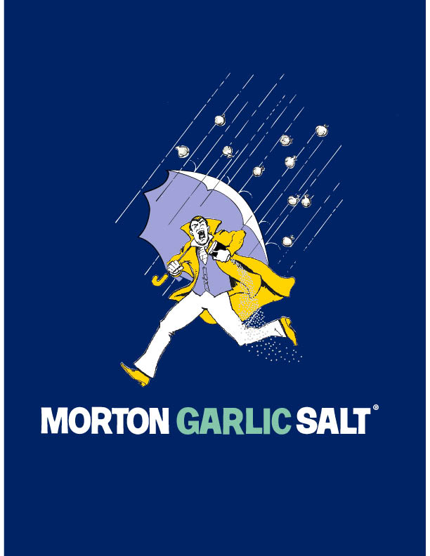
When I was looking around my house and trying to figure out which logos had an impact on me I noticed—seemingly for the first time—my salt. I usually buy Morton Salt, partially because the price difference in salt containers is minuscule and I grew up with Morton Salt, and partially because I actually really like the logo design. It was with this in mind that I began researching the Morton Salt Umbrella Girl. The design, presented to the Morton Salt Company in 1911, was striking because in one image, that of a young girl with an umbrella and the salt pouring out behind her, emphasized that even in the rain, Morton Salt would pour. The catchphrase “When It Rains It Pours®” is actually a rewording of the proverb “It never rains but it pours.” Oftentimes, Morton’s ad copy is confused for the proverb. The Morton Salt Girl is the brand personified. She has been updated throughout the ages, as the below graphic illustrates, and she is a popular illustration for salty science projects and a costume choice, and has even made appearances as a tattoo on several limbs. In 2014, Morton Salt, Inc. updated the Morton Salt Girl from their 1968 logo, adding a slightly more modern font. There is less contrast in the new logo and the colors are brighter. If yellow is an optimistic color then the Morton Salt Girl is simply delighted about being able to pour salt even as the rain hits her umbrella. The deep blueish purple background could be a reference to a brand you can trust, provide start contrast to the yellow of the girl’s outfit, and suggest an imaginative, story-esque twinge.
2. Seattle Art Museum
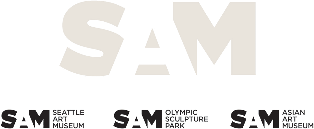
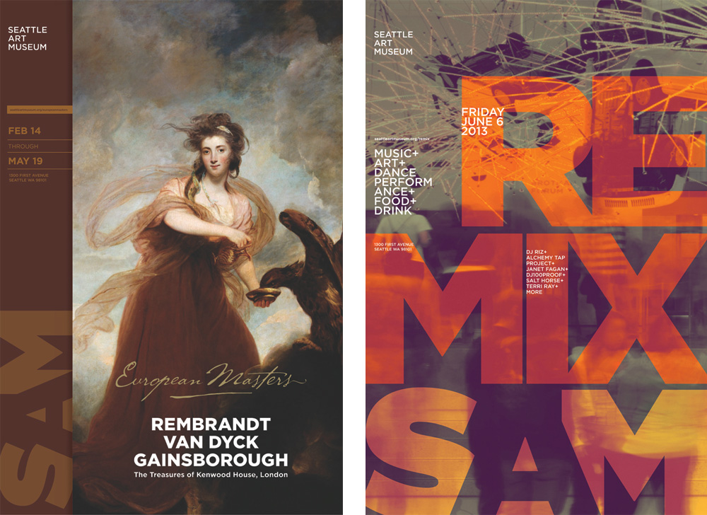
I spent my summer interning with the Seattle Art Museum (SAM), so the SAM logo became an everyday sight. As mentioned in class, re-branding is an expensive process for large organizations. SAM is a museum with over 225 staff, three locations, and lots of materials to apply a new brand to. In 2013, Microsoft Corporate Citizenship awarded SAM a grant to re-brand. The museum went from its thin, ultra-contemporary sans serif lettering to ultra Gotham font. The thick letters are offset by the negative space of the “A” in the middle of “SAM”, and the warm gray coloring is an inch of two more towards corporate neutrality compared to the light “trustworthy” blue (also often affiliated with corporate-ness). The font is actually the same, utilizing SAM’s already-purchased Gotham package, just taken to the other extreme in weight. The previous re-brand was only 7 years old when SAM released its new look in 2014. The warm gray is a little too faded to capture my interest, but I do enjoy the color-flooding technique SAM has used to blend the brand logo into posters and other materials.
3. Herman Miller
Ah, furniture. The OG of modernist office furniture, Herman Miller’s brand has enjoyed consistent fame and recognition. Their logo, the pop-esque “M” surrounded by bright, glaring red, shares this recognition. Originally set with a wood-grain, the “French-curved” “M” has endured as a moniker. The logo is minimal in design, harkening to Herman Miller’s furniture style. Also, the logo was designed to be clear and effective no matter how simplistic the color scheme of printed materials was (the first ad was printed in 1946 when a two-tone printing process was used). Always preferentiating red, the “M” of Herman Miller stands out as bold and exciting.
4. Starbucks
The famous Starbucks coffee mermaid was a research project for the original Starbucks founders in 1971. The company started in Seattle, a city with roots as a bustling port, so the Starbucks founders looked through old nautical and seafaring books trying to find something that resonated with their new brand. The two-tailed mermaid is a nautical nod to Seattle, and the symbol of the siren is an enticing suggestion. Originally the logo featured the buxom siren in all her seductive glory with a background of brown to match the coffee bean color. The Starbucks logo we all know and hate (or love I guess) has is green, white, and black. Although green suggests health, environmentalism, and peace, it is hard to take the logo in its true colors when the symbol of the siren is one of addiction, enticement, and doom. Her eyes are a little crazy too. Nevertheless, the Starbucks logo is one of the most widely recognized in the world. The logo incorporates bold sans serif font, the easily manageable shape of a circle, and the siren has been updated to be family-friendly.
Sources:







Leave a Reply