Fancy definition: the style, arrangement or appearance of typeset matter
Common definition: what language looks like
- In design, words are graphic elements as important as art work or form.
- What words look like is just as important than what those words say. And sometimes it’s more important.
Font definition: a complete set of characters comprising one specific size, style and weight of typeface (ex. Arial, Times New Roman, Bauhaus)
Fonts have personality. Accurate font selection is key to the success of any visual communication piece. Check out this fun video: https://www.youtube.com/watch?v=i3k5oY9AHHM
And here’s a good TED Talk on typography: https://www.youtube.com/watch?v=OXc-VZ4Vwbo
Serif Type – tiny strokes, or serifs, at the tip of each letter (Times family)
- Works best for large areas of text in print
Sans Serif Type – without serifs (Arial)
- Works best for large areas of text in digital
TYPE Categories:
- Oldstyle (slanted serifs; moderate think/thin transitions)
- Modern (thin, horizontal serifs; radical thick/thin transitions)
- San serif (no serifs; no thick/thin transitions)
- Script (like cursive)
- Decorative (fun novelty fonts)
Typography terms
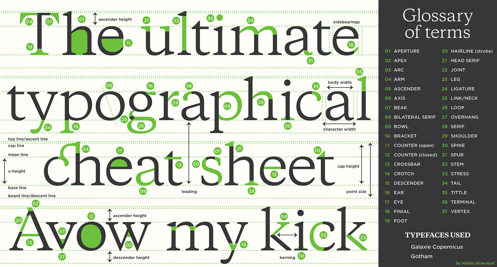
Image credit to: http://martinsilvertant.deviantart.com/art/Typography-Series-01-Anatomy-of-typography-329617642
10 rules of typography

Image credit to: http://www.designmantic.com/blog/infographics/ten-commandments-of-typography/
