File types

AI: Adobe Illustrator
AI files are vector files used by designers and commercial printers to generate files of different file formats and sizes. AI files can only be opened using Adobe Illustrator and may be created in layers. An AI file is one of the most preferred formats by printers, promotional product companies, silk screeners, banner and sign companies, and other third party creatives.

INDD: Adobe InDesign
Vector based source files created in the layout program.

EPS: Encapsulated Postscript
EPS files are most commonly used by designers to transfer an image or artwork, generally a vector file into another application. Vector-based EPS files are scalable to any size. EPS files can be opened using Adobe Illustrator, Freehand, or Adobe Photoshop. A vector EPS file is one of the most preferred formats by printers, promotional product companies, silk screeners, banner and sign companies, and other third party creatives.

PDF: Portable Document Format
A PDF is a universal file format that preserves/embeds the fonts, images, layout and graphics of any source document, regardless of the application used to create it. PDF files can be shared, viewed and printed by anyone with the free Adobe Reader software. Some PDF files can be used for commercial, digital, and/or desktop printing.

PSD: Photoshop Document
The PSD file format, usually a raster format, contains graphics and photos created in Adobe Photoshop image editing software. Most commonly used by designer and printers. PSD files can only be opened using Photoshop and may be created in layers.

JPG: Joint Photographic Experts Group
A JPG file is a compressed image file that does not support a transparent background. The level of compression in JPG files can vary in resolution with high quality for desktop printing, medium quality for web viewing and low quality for email. When compressed repeatedly the overall quality of a JPG image is reduced.

GIF: Graphics Interchange Format
GIF files are low resolution files most commonly used for web and email purposes. Almost all browsers can support the use of GIF files, which use a compression scheme to keep the file size small. GIF files can be created with a transparent background.

TIF: Tagged Image File Format
The TIF/TIFF file format is most commonly used for storing images, photography, or art. TIF files are most commonly used in professional environments and commercial printing. The TIF format is the most widely supported format across all platforms. It is the standard format for high quality images. Though large in size, TIF formats are considered to be the most reliable format for high quality images.

PNG: Portable Network Graphics
The PNG file format is most commonly used for use online and on websites due to their low resolution. PNG files are bitmap images that employ lossless data compression, and like GIF files, PNG files can be created with a transparent background.

BMP: Bitmap
BMP is a standard image format on DOS and Windowscompatible computers. BMP format supports RGB, Indexed Color, Grayscale, and Bitmap color modes. You can specify either Windows or Mac format and a bit depth for the image. For 4bit and 8bit images using Windows format, you can also specify RLE compression.


Information adapted from: http://www.bourncreative.com/common-graphic-design-file-formats-explained/
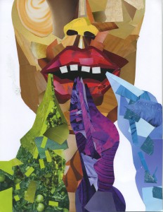
Color collage examples

Scan
Image credit to Matthew Sorensen


Scan 4
Image credit to Dallas Carnahan


Scan 1
Image credit to Erin Hampton


Scan 2

Image credit to Hannah Giardina


Scan 6

Image credit to Madelyn Engel


Scan 3

Image credit to Alex Lianopoulos

Color 101

COLOR

  • Color provides information
  • Color creates identity
  • Color creates contrast
  • Color helps organize
  • Color attracts and adds visual interest

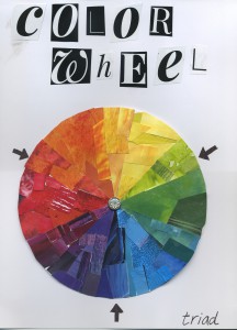
Color schemes (mixing colors)

Contrasting color schemes:

  • Complementary (two opposite colors)
  • Triad (three colors equidistant from each other)

Related color schemes:

  • Monochromatic (single hue with tints and shades)
  • Analogous (adjacent hues)

Color models

RGB (additive):

  • Light
  • Digital media
  • Percent of color between 0 to 255

CMYK (subtractive):

  • Pigment
  • Full color/process printing
  • Percent of color between 0 to 100

News design

Today’s news design. Visit newseum.com for a gallery of newspaper front pages.

  • Color
  • Lots of visuals (photos, infographics)
  • Modular layout (stories packaged into rectangular shapes)

Headlines

  • All stories get them (except for news briefs)
  • Indicate prominence
  • Fit width of story
  • Anchor stories / help organize page
  • Usually between 18 to 60 pt; sans serif font
  • Follow capitalization rules
  • Avoid hyphenation
  • Always touch start of text
  • Don’t run headlines into each other

Body copy

  • Serif font
  • 10 – 11 points (left aligned; often justified)
  • Paragraph indents; no line spaces between paragraphs
  • Column format
  • Text “legs” should be at least 4 to 5 lines
  • Avoid widows and orphans
  • Story shapes: think rectangles

Art work

  • Photos always have a frame (generally .5 pt)
  • Always make one photo dominant
  • Balance photo sizes and placement on page
  • Avoid: photos below text, placement that separates headline from body copy,  placement that interrupts text

Captions

  • Every photo gets one
  • Generally fit width of photo
  • Different style than body copy (usually a serif font that is smaller than body copy; often bold)
  • Consistent style throughout

**Adapted from The Newspaper Designer’s Handbook by Tim Harrower

Typography 101

Fancy definition: the style, arrangement or appearance of typeset matter

Common definition: what language looks like

  • In design, words are graphic elements as important as art work or form.
  • What words look like is just as important than what those words say. And sometimes it’s more important.

Font definition: a complete set of characters comprising one specific size, style and weight of typeface (ex. Arial, Times New Roman, Bauhaus)

Fonts have personality. Accurate font selection is key to the success of any visual communication piece. Check out this fun video: https://www.youtube.com/watch?v=i3k5oY9AHHM

And here’s a good TED Talk on typography: https://www.youtube.com/watch?v=OXc-VZ4Vwbo

Serif Type – tiny strokes, or serifs, at the tip of each letter (Times family)

  • Works best for large areas of text in print

Sans Serif Type – without serifs (Arial)

  • Works best for large areas of text in digital

TYPE Categories:

  • Oldstyle (slanted serifs; moderate think/thin transitions)
  • Modern (thin, horizontal serifs; radical thick/thin transitions)
  • San serif (no serifs; no thick/thin transitions)
  • Script (like cursive)
  • Decorative (fun novelty fonts)


Typography terms

anatomy_of_typography
Image credit to: http://martinsilvertant.deviantart.com/art/Typography-Series-01-Anatomy-of-typography-329617642


10 rules of typography

Typography-10RULES
Image credit to: http://www.designmantic.com/blog/infographics/ten-commandments-of-typography/


Points and picas

Designers don’t uses inches. They use points and picas. Here’s what you need to know:

A point is smaller than a pica.

1 inch = 72 points
1 inch = 6 picas

Adobe InDesign displays units like this:

pica → 0p0 ← point

8p6  (that means 8 pica, 6 points)

0p11 (that means 0 pica, 11 points)

>> the next bigger increment would be: 1p0 (that means 1 pica, 0 points)

PointsPicas

Design principles

Learning how to communicate visually through design is based on a series of principles. Let’s say you have 20 pieces of content. As the designer, your job is to figure out what that content should look like. Principles of design make that job easier. It’s a lot like learning the rules of grammar. First, you need to learn how to apply the rules. Then, you can learn how (and when) to break them.

Principles of design have been conceptualized through many different approaches. My approach considers four principles of design for successful visual communication: proportion, placement, unity and the “big picture.”

Proportion. We don’t want everything to be the same size. That’s boring. But more important, it doesn’t give your audience any relevant information. Every piece of communication needs a dominant focal point. Proportion helps to organize your content and to guide your audience through your content.

  • Proportion helps us determine how big (or small) items should be
  • Element size determined by relative importance & surrounding elements
  • Every page needs dominant focal point; don’t be scared of negative space
  • Maintain proper portion of elements (don’t skew the X/Y dimensions of artwork)

Position. Position helps us determine where to put items on the page. When considering position, you should have a definitive reason for the position of each item on the page. Consider the relative location of items to each other and the relative location of items on the page.

  • Position helps us determine where to put items on the page
  • How close together (or far apart) are items?
  • If items are related, it is likely that they will be positioned relatively close to one another; if they aren’t inherently related, they might be best positioned far away from each other
  • And what relative position do they take to each other? And to the page? (think alignment)
  • If items are related, it is likely that they would fall along the same visual line
  • When considering position, have a definitive reason for the relative position of each item on the page

Unity. Unity helps us achieve consistency in design and it gives design identity. But unity can be tricky; we don’t want everything to look the exact same. That would be boring. And, more important, it wouldn’t help to achieve our communication objective. An effective use of repetition of design elements (balanced with contrast of design elements) helps achieve unity.

  • Unity helps us achieve consistency in our design and it gives our design identity
  • How do we make it all go together?
  • Should everything look the exact same (repetition)? Should everything look different (contrast)?
  • Related items should have the same look
  • If two items are not exactly the same, they should look different

BIG Picture. The “big picture” isn’t a traditional principle of design. But we are approaching design from a communication perspective and not just an aesthetic perspective. All of your design decisions must be made within the context of your communication objective. When embarking on a new design, our goal is always the same: the design should enhance the communication function of the item. Design decisions should be based on three considerations of the communication objective: message, audience and medium. There are two final, yet critical, considerations of the big picture: law and ethics. When designing in the mass media, you must know, understand and apply relevant laws. Consider photographs. It is not legally OK to take any photo you can find on the Internet and use it for your own purposes. There are legal considerations, such as copyright and trademark law. Equally important is ethics. As I often say, just because you can do something, it doesn’t mean you should. Sure, in Photoshop it’s relatively easy to digitally alter an image. But that doesn’t mean it is ethically (or legally) OK.

  • COMMUNICATION: Message, Audience, Medium
  • Aesthetically pleasing (Attractive design)
  • Ethics, Law, Diversity


**Adapted from The Non-Designer’s Design Book by Robin Williams.