What these videos succeed in doing is informing their audiences of the candidates who have formally announced that they’re running for the democratic nomination of President of the United States in the 2020 election. Each video is around two minutes in length and they briefly inform their viewers of the candidates, answering any question: who are these candidates?
Who Is Kamala Harris? | 2020 Presidential Candidate | NYT News 0:11-0:16
The first thing that is consistent within the series is the animation style. We see multiple layers of stills and archived news footage stylized with a color palette complimentary to the democratic party’s color. The consistency between the videos bring a sense of unity, one of the many things these candidates say is a theme and priority in their campaigns. The approach to the series is traditionally journalistic, using archived clips that give the viewer a synopsis of the candidate throughout the years—highlighting their strengths and the challenges they face against the other announced candidates. The videos also include what the current president thinks of the candidate, with video clips of him criticizing them and their positions on certain issues.
Bernie Sanders Is Running Again. Could He Win? | NYT News 1:04-1:09 Here, three main strengths that the candidate brings to the democratic field are featured. This is done on all featured candidates in the series.
One thing that I do think The New York Times needs to do is feature more democratic candidates who have formally announced a 2020 bid. So far, they only have five videos, featuring Bernie Sanders, Kamala Harris, Kirsten Gillibrand, Cory Booker, and Amy Klobuchar. According to CNN, as of February 28th, 2019, a total of 13 candidates have announced so far.
Vice News is one of the many properties under the Vice Media umbrella. The Vice News platform regularly releases video content exclusively for their YouTube channel and implement a reflexive approach to journalism. For their One Star Reviews series, reporter Taji Ameen visits business and services listed on Yelp.com with a low one-star review rating average to see if they really are as bad as people have reviewed it or if the businesses and services are just misunderstood (the unanswered question).
0:32-0:52
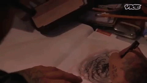
In this reflexive narrative, Ameen willingly lends himself as a protagonist to the story. Ameen is in search of getting his first tattoo and begins researching online for one-star reviewed tattoo parlors. Here, we see a composition method, or tool commonly used in online video which is implementing the use of computer screen capturing (or screen recording). What this does is allows the viewer to not only see what the on-camera character is looking at on their computer screen, but to also drive the narrative along as the character is searching for a possible route to take the story. Ameen scrolls through his options and comes across Fat Kat Tattoo and the artist mentioned on multiple reviews named Nate.
3:20-3:26
Next, there’s a sequence in this video that gives the illusion of a montage. As Ameen is asking Nate questions, the audio is layered over as the shots are faded in and out on top of each other to give the illusion of time passing and making Ameen seem more annoying throughout Nate’s creative process of drafting the tattoo. Question after question, shot after shot the tattoo is finally drafted and Ameen sits down on the chair ready to interview Nate and get his one-star tattoo.
The journalistic approach to the one-starred reviewed tattoo parlor shop begins to shift at the moment Ameen is being tattooed. He goes from a reflexive approach and combines interview. “I noticed some kind of, like, negative reviews on the internet in regards to working with you.” Nate then open up to the reporter and talks about struggling to be professional in his line of work, struggling to balance his personal life and his business. I believe what Ameen did to lead into the interview built the trust between himself and the “supporting character” of his narrative.
6:41-6:56
The story ends with Ameen writing a positive five-star review of Nate and Fat Kat Tattoo Parlor with a voiceover. This final voiceover wraps up the narrative nicely, teaching the viewer that we must not always judge a book by it’s cover it’s Yelp review.
Vox is a news and opinion website owned by Vox Media and was founded in 2014 by journalist Ezra Klein. “We live in a world of too much information and too little context,” explains the news organization. What Vox aims to accomplish is to provide context and insight to stories involving politics, policy, business, pop culture, food science, and “everything else that matters.” The outlet primarily accomplishes this through the use of visual aids, motion graphics, and narration. Vox is well known for their explanatory stories, going into detail and describing complex topics, issues, and processes. In the Vox video titled “NAFTA, explained with a toy car” they use their commonly used motion-graphics methods to explain the North American Free Trade Agreement (NAFTA) and answers the question: Why would the price from the 1993 and 2018 models of the same car be the same while the cost of almost everything else in the country is going up?
0:00-0:17
The video begins some multiple layers of motion graphics, including an animated and texturedwhite background with a subtle “old film” effect. A simple effect of around 3 to 5 looped solid images. Next, we see a 1993 and 2018 Chevy Suburban key-framedinto focus, increasing in scale—alongside a layer of a blue circlebehind the car that the narrator is talking about. The narrator explains that even after inflation, the 1993 model is still about the same amount of the 2018 model, even with modern technologies are equipped like rearview cameras, airbags, and a remote engine start feature. We are left asking why that is and informed on why and how NAFTA does it.
Because this project is a journalistic report on NAFTA, the sources are cited directly on screen when referencing data visually or are referenced orally by the narrator.
0:30-0:42
We are then shown another graphic, an animated line graphwith the prices of cars throughout the years of NAFTA demonstrating how prices have been steady while the price of other items has gone up. The layers and keyframe effects layered here include the lines that reference measurement, the units of measurements, and the title of the graph have an “accordion” effect from the bottom of the screen to the top. The line of data referencing the prices of cars compared to other goods in the US swipefrom the left to the right side of the screen. All that data is then given some kind of a camera blur or transparencyeffect so that a layer that includes the abbreviation NAFTA to swipe upover a solid yellow layershaped like a rectangle. These effects engage the viewer with visual cues on what to focus on and emphasize important facts and details.
0:48-0:56
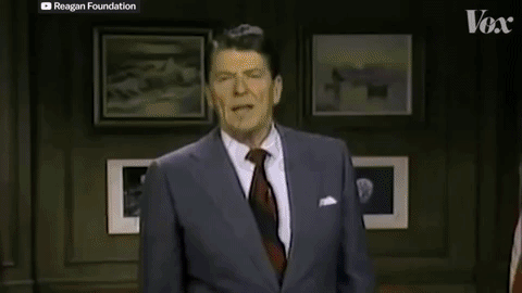
The following segment actually uses match on actionthrough the use of narration. Three clips of three different Presidents of the United States: Ronald Reagan, George H.W. Bush, and Bill Clinton complete a sentence while giving the viewer the impression that they are all reading off the same sentence, “The nations of North America are ready, strengthen by the explosion of growth and trade to recognize that there is no turning back from the world of today and tomorrow.” Really, the three Presidents are all referencing NAFTA, but are not saying the same thing. Essentially, what this does is create a uniform narrative between US Presidents who are addressing the same issues without referencing all of them individually, saving time and keeping the narrative from straying off or running too long. Also, the video clips are being cited with a credit to the original source on the top left corner of the video.
1:05-1:14
NAFTA is briefly being summarized in this animation and the countries involved are outlined out of a solid layerbeside text over a solid layer, key-framedtogether. The outline of the US is maskedand layeredover footage of President Clinton signing a bill into law as the top layered mask’s transparencyis lowered to show the archived footage of NAFTA being signed.
1:56-2:03
The story here uses a credible and knowledgeable voiceon tariffs and cars. Rebecca Lindland is an Executive analyst with Kelley Blue Book. Her interview, which looks like was recorded during a Skype call is minimized to an appropriate size and layered over some thematic motion graphics to keep the viewer engaged.
2:10-3:00
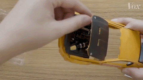
The video now cuts to a shot of a model 2014 Ford Mustang. We are seeing this model being built from an overhead view. It appears as if the camera was mounted along a horizontal tripod overlooking the top of a table with enough room for a set of hands to build the model car. The narrator builds the toy car by explaining where most of the parts were likely built and assembled on the full-sized model. This POV sequencemakes it feel like the viewer is the one building the model car.
3:12-3:33
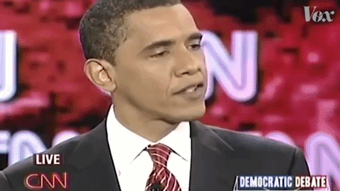
The narrative now features an opposing voiceon why NAFTA isn’t entirely a good idea for keeping jobs within the US and North America. We hear clips of voices from President Barack Obama and Senator Bernie Sanders explaining why it isn’t an entirely well-crafted policy. The remainder of the video then implements the same techniques used previously to carry on the narrative through the end, explaining where North America is heading right now with the current USMCA (United States Mexico Canada Agreement), the replacement to NAFTA.
In summary, the reason why stories told by Vox are so inspirational to me is because they almost entirely use a combination of creative stylized shots, motion graphic techniques, and multiple media sources to really engage and educate a viewer. They source information, voices for, and voices against the topic at hand to give a balanced and informed narrative. They take elements from single-use media mundane and create a multimedia masterpiece.