“There’s no reason that political advertising needs to be particularly boring.”

The 2018 midterm elections were more than just a referendum on President Donald Trump’s leadership. The election cycle will also go down as a new age of visual storytelling about the wave of women seeking office. With unprecedented numbers of women on the ballot, filmmakers used novel storytelling approaches to introduce voters to the candidates. The commercials are all notable for their storytelling prowess, their distinct visual choices, and for how the stories of women confronting the status quo were front and center.

As visual storytellers, we can learn from and imitate the sophisticated persuasive work on display to tell our own compelling stories. As journalists, understanding the successful visual language at use here helps us tell smarter stories about how candidates are connecting with voters.    

Here’s a look at several campaign videos about women, two of which went viral this election cycle.

Alexandria Ocasio-Cortez

The Courage to Change

“Women like me aren’t supposed to run for office. I was born in a place where your zip code determines your destiny.”

That’s the start of Alexandria Ocasio-Cortez’s get-to-know-me campaign video. This came out before the 29-year-old congresswoman from New York was a national star, and before she won a primary victory over a long-time Democrat. It’s a film that paints Ocasio-Cortez as a relatable, hard-working protagonist taking on forces larger than her, including people in her own party. There’s no doubt that this intimate origin story paved the way for her success, and introduced a new form of storytelling that is being widely copied by other women, including all the women now running for president.

It was made by Detroit filmmaker Naomi Burton, who admits she borrowed from storytelling techniques she honed while creating advertising campaigns for companies like General Motors. After the 2016 elections, Burton decided to quit her job in advertising and focus on making what she described in an interview as “leftist propaganda.”

“I was creating propaganda for all of these corporations,” Burton told New York Magazine’s podcast, The Cut on Tuesday. “What we’re trying to do is take all that we learned from that private-sector world about creating, you know, really high-end, high-quality content, and just bringing that over to the left. Create Super Bowl-level ads for leftist candidates and for this leftist movement.”

The video features Ocasio-Cortez in a traditional narrative voiceover structure. But there’s also something that hasn’t been seen much in campaign videos about a previous generation of women running for office: the ordinariness of a woman getting ready for her day and then how she spends it, from sunup to sundown. This has become Ocasio-Cortez’s trademark: an unprecedented glimpse into her personal life using social media. This film marks the debut of this sort of storytelling.

I’ll break down two specific sequences to understand why the visuals were so effective with this narrative technique:

The film begins with seven quick clips in 10 seconds of Ocasio-Cortez in her own bathroom getting ready for the day by doing her hair and putting on mascara. There’s a softness to the focus, suggesting a wide-open aperture and the use of the natural light, and it is all conveyed with handheld camera work and medium- to tight shots. (With one exterior, establishing shot of her apartment building, also shot handheld and with some artful solar flare on the lens.) These are deliberate choices that, within the first 10 seconds, convey a sense of authenticity we don’t get with older female candidates.

There’s another interesting visual choice, shot with the same hand-held, wide-open aperture. From :49 to 1:02, we see 13 quick clips of children and families. These children are holding hands with adults, playing, eating with their moms at home, and walking across the streets with their fathers in the diverse district Ocasio-Cortez was running to represent. (Again, with one solar-flared exterior in the mix, clearly a favorite technique of the filmmaker! and one that gives us that sensation of being there, in that place, as the story is told.) The final medium shot, handheld, is a video portrtait of a young girl, someone who looks like Ocasio-Cortez might have when she were 7 or 8. And then we cut to her as an adult, speaking to a group at a church. It’s time to fight for a New York that working families can afford, we hear her say.

Burton says these scenes from a woman’s life may may seem novel now only because there have been fewer women involved in creating video. More women in video means more stories get told about women, she said. “If more women were just involved in that, you’d see scenes in women’s lives,” Burton said.  

If imitation is the sincerest form of flattery, there’s a lot of filmmakers and campaign managers out there trying to recreate Burton’s magic. Since the video came out, and since Ocasio-Cortez’s election, we’ve seen other candidates letting people into their homes.(Kamala Harris in her kitchen, for example.) It often seems staged, and that’s because it is. You can’t imitate Ocasio-Cortez’s millennial comfort with cameras and social media. Other candidates who want to create narratives that invite voters and viewers into unguarded moments will have to find their own authentic visual language to show us scenes from their lives.  

Mary Jennings “MJ” Hegar

Doors

Like the Ocasio-Cortez film, with Mary Jennings Hegar we get the origin story of a candidate who is new to politics and needs an introduction to voters. Hegar, though, is no ordinary woman. She’s a heroic former Air Force helicopter pilot who fought to lift the ban on women serving in on-the-ground combat roles. The Texan broke down a lot of doors – and that’s the storytelling metaphor that drives the film that introduces her to voters. She needs to be made relatable, and that’s done through storytelling that portrays her as an ordinary woman in extraordinary circumstances doing whatever it takes to physically and metaphorically bust through barriers.

One of Hegar’s first memories is of a door, she tells viewers: the glass one that her father threw her mother out of when she was a child, which is depicted as a re-enactment in the early scenes of the film. Throughout her life Hegar faced barriers, and that meant “opening, using and sometimes kicking through every door that was in my way,” she says in the video.

Let’s look at how the use of a steady cam, along with visually and conceptually matched cuts, are an important part of the storytelling approach:

She tells us right away in the opening seconds of the film that it is a story about doors, and we see Hegar’s modern-day front door in Texas. It’s open, and it’s though we as viewers are invited in. In one, fluid 20-second steady cam shot, we get to walk in her front door, through her hallway and into her dining room, where her husband is delivering food to her and their two children and another adult. (We even see the tattoos on Hegar’s right upper arm, something few previous women running for Congress have dared show.) In that same long shot, the camera comes up to the door on display in her dining room, as Hegar explains how it is the door to the helicopter she was in when she was shot down in Afghanistan.

We go directly to a conceptually matched cut of an actual door on an actual helicopter, in a re-enactment of a combat scene. From here, we see scene after scene of Hegar walking through doors. (Note at 1:06 the Air Force poster on the wall of her re-created childhood bedroom, and how it cuts to the same poster outside of a re-enactment of her entering the Air Force recruitment office years later.)    

These conceptual match cuts occur throughout the piece, contributing to the narrative flow of the story, that one thing led to another in her career, and that the door she’s trying to break down now is an inevitable progression of that.

The idea for the get-to-know-MJ ad came from producer Cayce McCabe, an experienced writer and director at the political consulting firm Putnam Partners. He told Adweek that he shot on a steady cam to make the Hegar campaign video feel “very fluid” and “as though the whole spot is connected.” He also told Adweek that filmmakers can make political ads that are as cinematic and as “well-shot, well-produced, well-written, clever” and even “attention-grabbing” as those made by big corporations.

“There’s no reason that political advertising needs to be particularly boring, or particularly straightforward, or what people have been used to seeing in political ads for decades,” he said. (What a relief!)

Hamilton creator Lin-Manuel Miranda even tweeted about it. “MJ, you made the best political ad anyone’s ever seen. I should be asking YOU for help!”

Hegar was in a tough district for Democrats, even for Democrats who were awarded the Distinguished Flying Cross. But 3 million people watched Hegar’s video on YouTube. It’s sure to open yet another door for her.

Heidi Heitkamp

Arm Wrestling

I include this campaign commercial because it has a striking visual technique, but it was used in a way that was likely unhelpful to the candidate. It also illustrates what might be a generational/fashion shift in  storytelling. Heidi Heitkamp of North Dakota was well known to her constituents – a 2012 profile of her first campaign for U.S. Senate described her hugging her way across the room because she knew so many people wherever she campaigned. Even though everyone already knew her, as a Democrat in a state where 63 percent of voters chose Trump in 2016, she faced an uphill battle against a sitting congressman with as much name recognition as her.

So it’s worth looking at the eye-catching campaign commercial she released at the end of the midterm cycle. It’s a 30-second commercial more in the vein of a traditional television spot aired at the end of a campaign. Heitkamp sits at a table, armwrestling a muscle-bound man at a table – and winning. (We never see the arm-wrestler’s face, just his meaty back and shaved head.) We hear music that’s a little reminiscent of a WWF promo video, and the lighting has that garish look of a night-time sporting event – pro basketball comes to mind. And most strikingly, the 30-second spot is shot in one take with no cuts, using a controlled dolly shot to swoop in over the arm-wrestler’s shoulder toward Heitkamp’s face in a positive action shot. “I’m Heidi Heitkamp and maybe this is how we should decide elections because it couldn’t get much more ridiculous,” she says, in a nod to the role of fake news in modern politics.

This one-shot controlled dolly shot is fun to see – it’s what caught my eye in my Facebook feed. But imagine how much more effective it could have been had it been used with the  narrative aplomb the other two women deployed? Something that demonstrated, visually, Heitkamp’s place in her state, using the landscape and her connection to it to her advantage? Something that evoked feeling for her love and familiarity with the place she hoped to continue representing in the U.S. Senate.

Heitkamp directly names her opponent, something both Hegar and Ocasio-Cortex also do in their ads. From a storytelling perspective, it gives the women adversaries to vanquish, and as viewers we are invested in the outcome. But unlike Hegar and Ocasio-Cortez, Heitkamp doesn’t give us an intimate glimpse at her womanhood. She is one of the boys, in a masculine-leaning commercial with unflattering light.

The campaign ad got little attention, and Heitkamp lost the election. I reached out to the campaign but didn’t get a response about who made the spot. It came at the same time as Heitkamp’s vote against Supreme Court nominee Brett Kavanaugh, and she released a separate ad explaining that vote, which likely stole the thunder from her ad. Given Heitkamp’s reputation as a down-to-earth and relatable politician, the commercial was a surprising pick.

I’m hopeful that in future elections, women won’t need to show they’re one of the boys to get elected.

-Erika Bolstad

Mass graves of Tulsa

I’m a huge fan of Vox’s ambitious, explanatory video journalism utilizing a variety of camera, editing, motion graphics and storytelling approaches in producing compelling stories. Vox crew members are master tour guides in leading audience members through the journey of a person, place or thing.

A great example of this is The mass graves of Tulsa. It’s a gripping, horrific and necessary story about the 1921 massacre that took place in Tulsa, Oklahoma’s “Black Wall Street” – a once thriving community of black-owned businesses in a neighborhood called the Greenwood District. White supremacists burned more than 1,200 Greenwood buildings and killed approximately 300 people there following accusations of an African-American teenager assaulting a white teenager. Tulsa Mayor G.T. Bynum recently launched a search to find the mass graves where the murdered victims were buried and bring closure to their families.

In the opening starts with a voiceover from the video producer and drone footage with three different bird’s-eye view shots, coupled with some creepy music and the narrator/reporter saying, “Something terrible happened here…” – which gave me a sense of morbid curiosity, foreboding and definitely wanting to know What Happens Next? The drone shots make effective use of contrast by going from what looks like Small Town USA to a cemetery – bolstering the What Happens Next? tension and drawing the viewer in even more.

:01 Bird’s Eye View Drone Shot #1
:05 Bird’s Eye View Drone Shot #2
:08 Bird’s Eye View Drone Shot #3

Introducing the Interview Style, there’s a J Cut at :09 where we here audio of an interviewee as a lead-in to the visual cut of her. It’s a seamless transition as the video producer guides us from the drone shots into the room where we meet the first interview subject and gain context.

:11

At :14 Vox gives us an effectively abrupt and eye-catching Symmetrical Composition with the next interviewee. The composition creates a demanding, in-your-face and straight effect for a story and resolution that demands the same.

At :18 and then :21 we see a medium cut, then close up, of an MOS interviewee that makes use of Shallow Depth of Field to tone down a background that may have been distracting. However, we can see the blurred image of a police car with flashing lights in that background. It’s appropriate for the criminal nature of the subject matter at hand providing continuity. In addition, we see a cut form medium shot to a tight shot to emphasize the importance of what the interviewee is saying, “It was an absolute massacre.”

:18
:21 “It was an absolute massacre.”

Vox also uses the Re-enactment Style in telling us what happened nearly 100 years ago with old footage, photos, newspaper articles and records documenting the racial violence. These powerful elements are peppered throughout giving us historical prospective and authenticity.

:24
1:26
1:41

In addition, Vox employs motion graphics layered over and alongside old photos and newspaper stories to enhance the explanatory portions of the piece. It adds an interesting aesthetic element to static b-roll (still photos, records, newspaper stories, rock shots) and guides the viewer to a deeper understanding by visually connecting the dots for us as to what went down. It draws our attention to what we need to see and says LOOK AT THIS now. Below are just a couple of examples.

1:57

Sound effects conveying an antiquated/historical feel are used as well. When showing the viewer images of archived newspaper stories, we often hear the tap of an old -fashioned typewriter – bringing us back to a time when the stories were published. These segments are also edited to the beat of that sound effect creating greater impact – like audio exclamation points.

3:55

Overall, Vox’s polished, professional and highly-produced Mass graves of Tulsa leaves us with an urgent sense of call to action to provide closure to the families of the massacre’s innocent victims.

How to Make the Girl

As I work to weave a poem into one of my own visual projects, I went in search of inspiration from short films that are deliberate in their use of poetry. I came across Motion Poems, a Minneapolis-based nonprofit that matches poets with filmmakers to produce work that interprets poetry.

Be forewarned: The motion poems are addictive and inspiring. Each one I watched led to another. And I wanted to know more about the poets and the filmmakers who created the work. How did the filmmakers chose the imagery, and what else had they produced? How much did they collaborate with the poets? Even without words, many of the films could be considered visual poetry. But with skillful use of sound and music and words, they transcend both film and poetry to become something new.

Some of the motion poems were explicitly linear, using reenactment to tell the narrative of the poem. Others were much less overt, and I was surprised by how much I was drawn to the nonlinear visual storytelling. With these types of motion poems, images are as carefully chosen as words to evoke emotion. There is much we can take from this approach, even when we are putting together journalism-based work: images have emotional power that we can use to convey a tone and even the intent of our pieces. 

In “How to Make the Girl” by filmmaker and musician Ann Prim, we see the power of a nonlinear interpretation of a poem by a fellow multi-hyphenate: musician and artist Dessa Wander. Prim often has a nonlinear approach to her work, which is deliberately designed to provoke feelings, she said in an interview with Minnesota Public Television about one of her other films, Filmetto – Porta 241.

“I really like the person viewing it to create their own narrative,” Prim said. “The human mind always wants to make a narrative. It wants to make sense of our surroundings.”

Of her films, Prim says she is drawn to telling stories of women’s lives, “especially stories that reveal the strength needed to survive and thrive.” A common thread running through her work is a focus on characters who tend to dwell outside social norms. They also often exist in what Prim describes as “the space between and in the process of becoming.”

That’s exactly what we have in “How to Make the Girl.” The four-minute film opens with the title appearing word by word over an abstract image (and sound) of a lathe. The words disappear one by one, as though they are being deleted on a keyboard from the end of a sentence. It’s an act of visual wordplay that suggests the girl can be unmade by external forces (or creators) as easily as she can be made. Viewers may create their own narrative, but they are given a visual clue at the film’s beginning that this film is about the forces that shape women’s lives.

From the start, music and sound are powerful forces in this film, as is befitting in a piece of art made by a filmmaker and poet with musical backgrounds. The film opens with a curtain drawing from left to right and music that evokes the rhythmic sound of industrial clicking. It was only on second viewing that I realized there was a hand – unknown who it was attached to! – pulling the curtain. A bare lightbulb swings in the opposite direction, creating an artful juxtaposition of imagery.

In the background are a girl’s dress behind plastic, dirty shears, blue rubber gloves and a hose. The hypnotic lightbulb continues to swing back and forth as the camera pulls away in an unmotivated negative action shot. We are 30 seconds in, and visually, we know that a stage has been set. The emotion evoked here is that of unease, that something natural is awry.

Next, we see shadows on the floor that represent the moving light bulb. We see a sequence of the items on the wall: the dress, the shears, the hose. The camera moves closer to pan over these items. Unlike the crisp medium opening shot, these are fuzzier, their focus deliberately muddy. The light from the shining bulb continues to swing across the items. And then, at 45 seconds, Prim focuses on the moving bulb, in an extreme close up that crescendos with the sound of the sizzle and crackle of the filaments within. It is so close we see the dust on the bulb.

This shot is followed by a conceptual match cut to the smooth legs of a girl, also swinging from side to side from some fixed point above. Her pale legs are the only bright spot in this otherwise ominous room. They being to spin, and we hear once again the sound of something turning. The next shot (at 1:12) is of an analog counter.

It is here that the poem begins, with words that correspond to the counter: “One hundred turns on the lathe…”

Fear is evoked next. A raw rib scuttles from left to right across the screen, using stop motion to animate its movement. “We don’t use the rib in this new method.” Feed it to the dog, the voice of the creator says, as a growling maw lunges at the rib at 1:40.

Again, the hand of an unseen creator is at work, turning the figure of the girl wrapped in a opaque plastic tarp. Still unseen, the creator tosses the body into the trunk of an old green Buick. It contributes to the feeling that we are watching a horror film, a Frankenstein under construction. And the treatment of the girl’s body, tossed in a trunk, suggests her disposability. The garage door begins to close. In a matched action shot that takes us in a close-up to the door, it slams shut, with a powerful bang. This shot is so carefully constructed, with such an eye for detail, that we see spiders scuttling at the bottom of the frame, disturbed by the slam and the noise. (1:57) This is imagery used to evoke disgust and unease, accompanied by the sound of scuttling insects, as though a collection of cockroaches scattered, off-screen, somewhere behind us.  

The camera as the car drives away is focused midway between the foreground and the background, so the taillights and the shape of it are out of focus until the car arrives at the point of focus. This is a beautiful, 20-second shot worth replicating. It is accompanied by emphatic techo music with a strong beat, and the muscular sound of a gas-guzzling sedan accelerating away. (From about 2 to 2:25.) This is a masculine, old-fashioned car, another clue that this film is about how women have mostly lived in a world created by men.

The screen fades to black, and then there is an abrupt shift of tone and color palate and music at 2:27. “La Camparsita” by the Brazilian guitar duo Los Indios Tabajaras, kicks in. (There are no other musical credits for this film, which suggests that Prim composed most of it. It’d be interesting to know whether she and Wander collaborated on the music.)

This next shot is also a lengthy one, lasting from 2:28 to 2:48. Once again, it begins with the girl’s feet, a callback to our first glimpse at the creature under construction. Prim uses a slider to pan slowly from the girl’s feet to her head. The girl is on a lawn chair in a pool, in a pink one-piece bathing suit, “baking” to her finish.

Next, we get an extreme closeup of the girl’s face, as it turns toward the camera and she removes tanning goggles. The next shot is so tight that we can see the veins in her eyelids and the wisps of blond, baby hair at her temples. The emotion evoked here is one of marvel: something real and youthful, yet artificially constructed, is awakening. The poem, which has been absent for more than one minute, does not start up again until we get closer to the girl’s face: “A day on the drying rack and the pupils should contract.”

I do not want to spoil the final minute for anyone who wants to watch the rest of this film, so I’ll end my discussion of film techniques here, other than to say that we return to the same shot we saw at the start.

The poem, except for its last few lines, is read by a separate voiceover actor, Mikel Clifford, suggesting once again, the hand of the unseen creator. Dessa Wander reads the final lines, though, leaving us with an existential mystery, but one certainty: It is the poet who created this world.  

– Erika Bolstad


The Sound Of Drowning

The Sound Of Drowning, is a poem performed by singer, poet and activist Amyra León, and is accompanied by beautifully strung together shots and cinematography in Harlem, New York. It’s a unique style of visual poem that is also met with reenactment, as Amyra is describing her upbringing in a very powerful and musical way.

From the start we are transported to winter in Harlem, New York. Beautiful shots with light snow falling that transition perfectly with the beat of a somewhat melancholy, quiet but powerful music track. When we meet Amyra she’s seen in two different shots that the producers use — the one where she’s down in the streets and another where she’s on a roof above the city. I think the two different versions and shots the producers use it brilliant and creative and gives the audience a sense into who she is, and where she comes from. Since it’s such a short video with limited amount of time, the two different shots showing her character are necessary.

Most of the video is narrated by Amyra, in a poem, that is met with a young girl reenacting as she goes along. Cameras follow the young Amyra and take us to the tough childhood and lifestyle she endured. Where her parents were unreliable and unavailable. Shots like this one below, to highlight disorder and a chaotic childhood:

Another beautiful and clever technique the filmmakers used was water reflection, at 0:37 Amyra begins to tell us that she has “tried 13 times to belong in homes that weren’t mine,” and there’s one initial shot of red brick buildings, that is followed up by a great shot of the building in the reflection of water, using very limited and slow pan up.

The video goes on with Amyra continuing to describe her upbringing through her musical spoken word, and the filmmakers capture an incredible shot that is framed by an arch as seen below at 0:49 – 1:02

At 1:09 to 1:15, the filmmakers transition into the latter part of the poem, which strikes with power and is hard-hitting. To start it off, the filmmakers use a sort of matched action between young Amyra, and grown Amyra, with a spin or dance move. It’s almost as if it’s a wind up for what’s to come in the following second half of the video.

Followed up is a sequence of the poem that begins each sentence with Amyra saying “my kind of poetry ain’t literary,” and that becomes the theme and pulling force for the next minute. Each time she drops “my kind of”, the scenes transition on queue, between close up, zoom-in shots of Amyra, mixed in with the reenactment shots.

At 1:17, “My kind of adoption ain’t real”

At 1:24, “My kind of body ain’t beauty”

At 1:33, “My kind of joy ain’t worth seeking”

At 1:46, “My kind of life ain’t worth saving”

The tone changes with the filmmakers focusing on Amyra raising her hands up, with her eyes closed at 1:56 to 2:02. Matched action abound here as she is “becoming, becoming, becoming” something new and intuitive. This transitions to a shot of where she is now today, on the stage, as a performer, activist, singer and poet, as pictured below:

The filmmakers end the video on a perfect, panning shot accompanied by her “dancing in the moonlight, and learning the sound of drowning,” and in the backdrop, they make sure to include what appears to be a mural depicting minorities that I am assuming is in Harlem or somewhere in New York (if any knows what this art is, please comment and let me know! I googled but couldn’t find it). Her hand motion is also matching the hand positioning seen in the mural, which was a nice touch if intentional.

Overall, for the limited amount of time the video is, Amyra and the filmmakers worked together brilliantly to pack this visual poem with a powerful punch. Using focused and matched reenactment shots, beautiful colors of the city, architecture and visuals of Amyra herself, and impressive transition techniques that flowed perfectly with Amyra’s impactful words. An inspiring and strong piece.

— Joe Ciolino

Period. End of Sentence.

“Period. End of Sentence.” is a 2018 documentary short (which just won an Oscar, by the way) about a group of Indian women who receive a machine that enables them to make sanitary napkins, and therefore start to address some of the issues that menstruation had caused for them. The film is shot in the reflexive style, with the film makers asking the subjects questions as the cameras roll and leaving those conversations in the final cut.

Once the women in the film learn how to use the machine and begin making their own pads, they come up with an idea to start selling them door to door, since there’s such a stigma in their culture and women often don’t want to buy pads in front of men. This introduces the unanswered question of this film, which is “will these women be successful in their business endeavor?” There’s a second part to this conflict as well, that may not be as clear but is still present. That second conflict lies in whether or not these women, or all women in India, can start to rise up out of the patriarchal society and create new roles for themselves. This is alluded to when the young girls are talking about dropping out of school when they get their periods and also when one older woman is talking about her friend who’s a police officer and people know her for what she does, not her who her father is. She says in that interview that the female police officer has the best life because of this.

Apparently, you can’t take screenshots in Netflix. This is especially unfortunate because I did it the entire way through the film and only realized once I went to upload them that they were all black, so I’ll do the best I can without.

The film looks very cinematic in terms of the color, but there is an element of shakiness to the footage that makes it feel authentic as well. In the darker spaces inside homes, the shadows are deep. Outside, the light is not warm but very light as if it were a bright and cloudy much of the time. The shots of people are use a lot of unique angles that I enjoyed, but I can’t help but wonder if they’re the type of thing a film professor might critique. The angles were were often a bit lower or a lot more off to the side during interviews than we’re generally taught to do. It’s consistent enough throughout the piece that it appears to be a style and not a mistake, though, and I really thought they added a fresh take to an old format.

At 12:40 the videographer does an excellent job of getting ahead of the action. The camera is set up inside of a dark room before the women open up a door from the outside and walk across the frame as the space fills with daylight. The only thing my eye was craving here that I didn’t get to see was after they walked across the space they were opening another door, and I would have very much liked to see them all exit the frame as well.

The cameraperson gets very up close and personal to the women in this film, which is shocking considering how shy they all are about the subject matter, but it’s also what I admire and think we could learn the most from. So often when I’m shooting I feel like I need to catch everything that’s happening within the entire frame or it won’t make sense, but here the rely mostly on tight and medium shots to tell the story. Around the 18 minute mark, when the woman speaking says “Now tell me, who wants to change things?” the music comes in and we see hands exchanging pads for money, it feels so much more exciting than it would if it were just composed as a wide shot.

“Period. End of Sentence.” is streaming now on Netflix.

–Amanda Rhoades

Surfer Dan

“Surfer Dan” is a short film created by Camp4 Collective, for the outdoor clothing company Merrell. Camp4 Collective is a group of photographers and videographers who produce “everything from 60 second product videos to half hour documentaries,” according to their LinkedIn page. Their work is often produced with the sponsorship of outdoor companies, like this one, but they’ve also had clients from like Apple. I found their short video “Surfer Dan” interesting because it follows an unlikely adventurer, which is something I aspire to do in my own work as become more comfortable producing video.

The film opens with a bird’s eye view of the ice-filled Lake Superior on the coast of Michigan, and then it cuts to Dan, our main character, scraping the ice off of his from a shot filmed from the inside of the van. The next shot is him loading it with his dogs and surfboards. These jump cuts appear to be intentional, like they could be showing process of getting ready to go find some waves. Before the title even appears, we see him carrying a surfboard across the snow and even diving into the water between chunks of ice.

The coloring has almost a blue-tint to it, conveying a cold feeling for the viewer. This kind of scene-setting and letting the viewer know what this guy goes right up-front works for this piece because it hooks us in. Surfing in ice is not all that common, and even the guys doing it in National Geographic aren’t thought of as the kinds of people you’d expect to see surfing in the dead of winter in Michigan. So, who is the kind of person who would do something so crazy? That’s why the viewer wants to keep watching—to find out who this guy is and what he’s doing out there. The unanswered question could be “who is this person?” or “will he catch a wave?” But it could also be “will he survive the brutal conditions?”

The filmmakers then use a few cutaways in and around Dan’s home to begin to introduce him. While showing these shots, they’re also transitioning into a sort of slice-of-life for Dan, who we see boiling water in his kitchen in the morning and getting dressed for surfing and playing with his dogs. In one shot, his dog stands on top of a propped up surf board while Dan walks around the room while talking about what he wears when he does out in the icy water.

The image stuck with me because even though the light coming from the window may be over exposed, and even though the room is a mess and we’re not even seeing Dan’s face in this, it feels like an environmental portrait almost because shows so much information about who he is. The filmmakers then use a few cutaways in and around Dan’s home to give viewers a better idea of the main and only character in this story. We see close ups of photos of him surfers in his home, medium shots of him interacting with his dog, and boiling water in his kitchen, and a shot of his vehicle license plate that says “UPSURFR” on his old beat-up van. All of this just conveys that this guy, in Michigan, of all places, lives for surfing. Shooting this license plate while Dan loads a surfboard into his van is the very definition of what my professor means when he says “don’t shoot the donut, shoot the donut hole.” These are the kinds of details that make the story.

Moving beyond the visuals, this film contains both an internal and external conflict. Externally, we’re following Dan on his quest to find some good waves in icy Lake Superior and there’s an unanswered question of whether or not Surfer Dan will get to surf. The way its shot feels like we’re with him on one day and we want to know if he’s going to find good waves. But there’s another conflict he touches on during the stand-up interview during all of this when he says, “surfing saved my life.” We don’t know Dan’s entire story while watching this film, but it’s at this point where he says the sport saved his life that we realize his motivations are much deeper than they appear on the surface. 

When he talks about how he used to drink and then quit and started surfing, or how someone can be having a hard time until he takes them surfing, and we realize this is how Dan copes with the challenges he’s faced in life. He also mentions wanted to bring people out surfing with him, so he can share this happiness he’s found. As the film concludes we see Dan happily jumping off this snow-covered pier into these crashing waves and then it transitions to him paddling out into the ice-filled water.

— Amanda Rhoades

Common Ground

http://www.commongroundthebook.com/video.php

This project is the result of 14 years of observing and documenting a plot of land in Illinois, as it evolved from a family owned farm to a suburban housing sprawl. Scott Strazzante, a photojournalist, met Jean and Harlow Cagwin as they went through the steps to sell their farm. He shot them taking care of their land and animals, and the day they watched their house being torn down. After the land was sold it became a housing development and he met the Grabenhofer family and shot with them as they raised their family in a new home just a few feet away from where the Cagwins cornfields used to grow. Common Ground explores loss, love, family and what home means. 

It exemplifies long term storytelling, not just in its emotional power but in its lovely construction. The building blocks of this story are the juxtaposition of images when the land was a farm to when it was a neighborhood, and the lives of the two different families. These shots are all seem to be captured using the natural, soft, light of the environments.

The pacing of these shots throughout this piece is extremely important. You are asking the audience to take in two scenes, from different time periods, and to compare and contrast them. If you don’t leave them on the screen long enough the beautiful nuances that the photographer captured will be lost. This first set of images pretty quickly makes sense. Although the compositions are quite different you get that it is people loving on their animals.


But the second image set you really need to look at and think about. The posture of the hands. The quiet reflective nature of the moment. So these shots are paced out, and on the screen, for a much longer period of time.


Even though the vast majority of the story is told through still  images, they still managed to get some movement in there. At 01:43 there are about seven seconds of super fast cuts that put the sequence of photos into motion when the dad is teaching his kid how to ride a bike. They use this technique again, but slower and with fewer frames, at 02:37. They also included short clips of video interviews throughout the piece. At 00:43 we see the Cagwins for an interview clip. It is a pretty tight shot but includes both people. The location choice seemed like a pretty smart way of problem solving. The couple is much younger in the farm days pictures, and by the time the interviews were conducted  they clearly no longer lived on that land. So it looks like they did the interview in a garden shed or garage. It was a nice environmental portrait feel and reinstated that these are the farmers, with garden tools in the background. The tightness of the shot helped show the emotion in their face as they talked about the house being torn down. 

They used a quick transition slide, at 01:04 with text to explain the jump in time to when the Grabenhofers bought their home. This was a nice smooth transition and the start of the juxtaposition of the images of the two families that leads you through the rest of the story.

The most important piece of video plays through the last minute, starting at 06:22. It cuts between tighter shot on the husband, and a wide shot of them both, while driving through the neighborhood that used to be their farm. The camera motion in these shots all plays into the homey feel of the piece. The handheld look keeps you in the moment, it’s a bit grainy and shaky, which fits the still photo style of the piece. This movement tells the viewer that they are seeing something real, and as it happens. No high production or set up shots, just following the moment. You can see through the windshield what the neighborhood looks like, as they lightheartedly argue about where they are. We end up on a wide shot of the couple standing in the driveway of the Grabenhofers home, which pushes closer as introductions begin. After shooting with both families for 14 years we see Scott bring them together for the first time. Again this shot throws you straight into the moment, as if you are right there with them. 

Personal Inspiration: Vox (NAFTA, explained with a toy car)

Written by Omar Rivera
Link to Video: NAFTA, explained with a toy car 

Vox is a news and opinion website owned by Vox Media and was founded in 2014 by journalist Ezra Klein. “We live in a world of too much information and too little context,” explains the news organization. What Vox aims to accomplish is to provide context and insight to stories involving politics, policy, business, pop culture, food science, and “everything else that matters.” The outlet primarily accomplishes this through the use of visual aids, motion graphics, and narration. Vox is well known for their explanatory stories, going into detail and describing complex topics, issues, and processes. In the Vox video titled “NAFTA, explained with a toy car” they use their commonly used motion-graphics methods to explain the North American Free Trade Agreement (NAFTA) and answers the question: Why would the price from the 1993 and 2018 models of the same car be the same while the cost of almost everything else in the country is going up?

0:00-0:17

The video begins some multiple layers of motion graphics, including an animated and textured white background with a subtle “old film” effect. A simple effect of around 3 to 5 looped solid images. Next, we see a 1993 and 2018 Chevy Suburban key-framed into focus, increasing in scale—alongside a layer of a blue circle behind the car that the narrator is talking about. The narrator explains that even after inflation, the 1993 model is still about the same amount of the 2018 model, even with modern technologies are equipped like rearview cameras, airbags, and a remote engine start feature. We are left asking why that is and informed on why and how NAFTA does it.

Because this project is a journalistic report on NAFTA, the sources are cited directly on screen when referencing data visually or are referenced orally by the narrator.

0:30-0:42

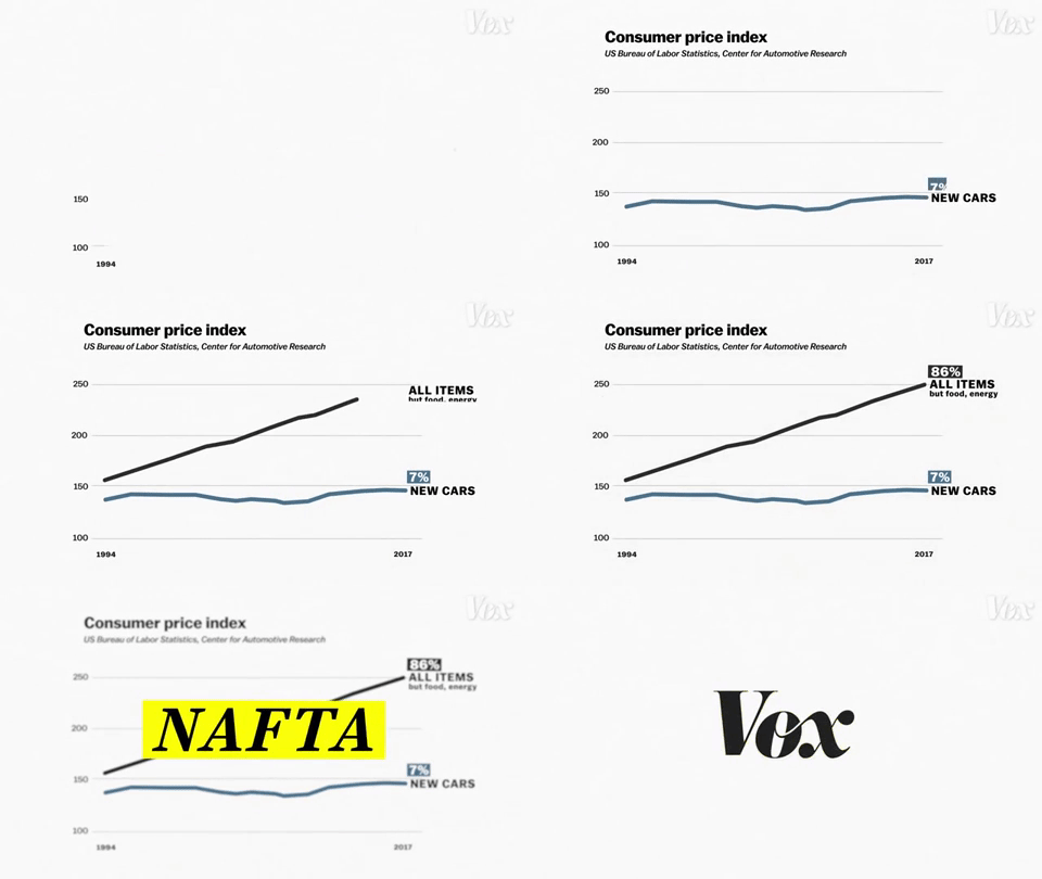
We are then shown another graphic, an animated line graph with the prices of cars throughout the years of NAFTA demonstrating how prices have been steady while the price of other items has gone up. The layers and keyframe effects layered here include the lines that reference measurement, the units of measurements, and the title of the graph have an “accordion” effect from the bottom of the screen to the top. The line of data referencing the prices of cars compared to other goods in the US swipe from the left to the right side of the screen. All that data is then given some kind of a camera blur or transparency effect so that a layer that includes the abbreviation NAFTA to swipe up over a solid yellow layer shaped like a rectangle. These effects engage the viewer with visual cues on what to focus on and emphasize important facts and details.

0:48-0:56

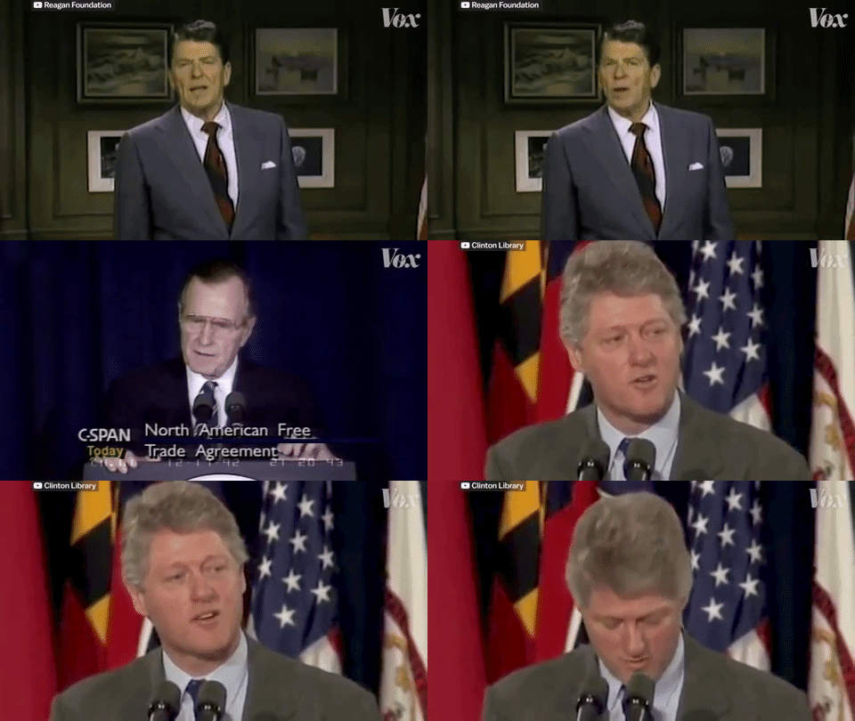
The following segment actually uses match on action through the use of narration. Three clips of three different Presidents of the United States: Ronald Reagan, George H.W. Bush, and Bill Clinton complete a sentence while giving the viewer the impression that they are all reading off the same sentence, “The nations of North America are ready, strengthen by the explosion of growth and trade to recognize that there is no turning back from the world of today and tomorrow.” Really, the three Presidents are all referencing NAFTA, but are not saying the same thing. Essentially, what this does is create a uniform narrative between US Presidents who are addressing the same issues without referencing all of them individually, saving time and keeping the narrative from straying off or running too long. Also, the video clips are being cited with a credit to the original source on the top left corner of the video.

1:05-1:14

NAFTA is briefly being summarized in this animation and the countries involved are outlined out of a solid layer beside text over a solid layer, key-framed together. The outline of the US is masked and layered over footage of President Clinton signing a bill into law as the top layered mask’s transparency is lowered to show the archived footage of NAFTA being signed.

1:56-2:03

The story here uses a credible and knowledgeable voice on tariffs and cars. Rebecca Lindland is an Executive analyst with Kelley Blue Book. Her interview, which looks like was recorded during a Skype call is minimized to an appropriate size and layered over some thematic motion graphics to keep the viewer engaged.

2:10-3:00

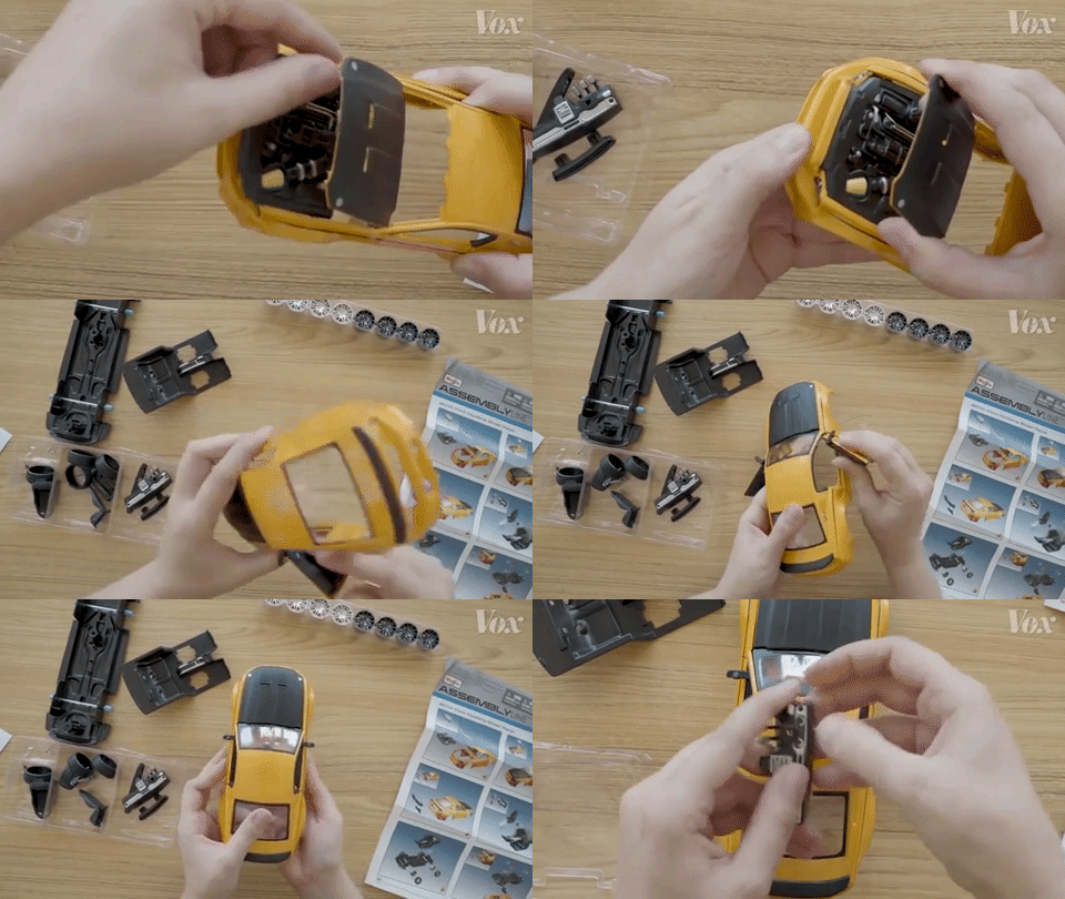
The video now cuts to a shot of a model 2014 Ford Mustang. We are seeing this model being built from an overhead view. It appears as if the camera was mounted along a horizontal tripod overlooking the top of a table with enough room for a set of hands to build the model car. The narrator builds the toy car by explaining where most of the parts were likely built and assembled on the full-sized model. This POV sequence makes it feel like the viewer is the one building the model car.

3:12-3:33

The narrative now features an opposing voice on why NAFTA isn’t entirely a good idea for keeping jobs within the US and North America. We hear clips of voices from President Barack Obama and Senator Bernie Sanders explaining why it isn’t an entirely well-crafted policy. The remainder of the video then implements the same techniques used previously to carry on the narrative through the end, explaining where North America is heading right now with the current USMCA (United States Mexico Canada Agreement), the replacement to NAFTA.

In summary, the reason why stories told by Vox are so inspirational to me is because they almost entirely use a combination of creative stylized shots, motion graphic techniques, and multiple media sources to really engage and educate a viewer. They source information, voices for, and voices against the topic at hand to give a balanced and informed narrative. They take elements from single-use media mundane and create a multimedia masterpiece.

Knives Down, Bikes Up

Knives Down, Bikes Up is a short, interview-style documentary, produced by Masses Collective, focusing on the youth in London, and how knife violence has been taking the region by storm and has been a grow problem for the past few years. Teens as young as 16 have been victim to knife violence and influenced by violent acts involving knives. Riders created the movement to create a sense of a new community, that swings the focus away from this violent lifestyle.

The text to begin the video coupled with the black and white shooting choice provides for a theme that could be felt as troublesome, or eerie, or as if being stuck somewhere that can be fearful. Almost as if the character(s) are trying to break out or move past that black and white lifestyle, or the potential for that violent lifestyle, and breaking into a world filled with color, and a more meaningful and fulfilling life that is founded by a small community of youth. It is used to transport the audience to this troubled community that is surrounded by the fear of being threatened with a knife, or worse yet being physically hurt. In this community, kids walking home from school are at risk and exposed to this potential violence.

The quote “I think knives is just an easy way to scare people, you know you’re going to do a damage with a knife, it’s easy to get a knife,” flows well with the black and white theme the producers used for the video and the underlying and eerie tones of the music track used.

Portraits are used throughout the video to give us a glimpse into those affected by this type of violence and humanizing the issue more for us by placing the faces right in the middle of the camera, in an attempt to put us, the audience, face to face with these kids. Furthermore, the producers use zoom-in to try and enhance this by bringing us from further out, to up close and personal.

The producers beautifully crafted together a portrait shot of an individual (at 1:18), being circled by another performing a “bikes up” wheelie, providing an artistic way to describe the movement without even having to say anything. The circling around breathes protection, community and youth coming together for one another.

The producers create a powerful sequence at 2:09-1:40, capturing the youth riding together as a community, with voice over quote “If you’re giving kids the opportunity to do what they want as long as it’s positive, then you’re keeping them away from what they could be getting drawn into.”

Slow motion of bicyclists poppin’ wheelies and super close-up shots of bicycle spokes turning seem to mesh well with the music in the background, but the producers keep it humble by not overwhelming us with too much of it.

A technique I really admired was that the producers didn’t use any talking head video footage of the interviewee. There’s one shot of (who I believe is the one speaking) seen below:

(cont.) and this is the only instance where we see him. He does start the video off by giving us a brief account of a particularly frightening experience he had, bringing us with him into the severity of the issue in London. However, it’s brilliant because the character isn’t just one person but rather this community of youth banding together. He doesn’t take over the video and the message. A talking head would have taken away from the beautiful style and character.

The use of zoom-in, the voice flowing with the tones and music, portraits, close-up and slow-motion shots are beautifully crafted together to make a short, but very moving and enjoyable piece to deliver an important message.

– Joe Ciolino


Fastest Mochi Maker In Japan: Repost

A short, fun piece about pounding Mochi with the fastest Mochi Maker in Japan

“Pounding Mochi With The Fastest Mochi Maker in Japan”

Produced by: Great Big Story

The producers took an interview approach to let Mitsuo Nakatani tell his story and explain the intricacies of Mochi making.

Techniques and tools that proved to be key:

Interview

I appreciate how the producers set up interview shot(s) with Nakatani. I personally like the standing shot introduction because it feels more artistic, interesting and natural in my opinion (this is, however, not true in every situation). I think it particularly works for Nakatani because the work requires him to be on his feet constantly. It’s physically demanding and requires constant moving around, standing for long periods of time, tossing Mochi and swinging a mallet repeatedly. Thus, the initial standing shot and standing interview makes sense.

Close-ups

When Nakatani is describing what Mochi is, he teaches us about sticky rice, or “mochigome”. While he is describing it, the filmmakers cut to a scene of a close-up shot of the mochigome itself, with a hand going across it to show the viewers how sticky it really is. We can see the rice stick to the hand because the shot is so close.

A good amount of slow-motion is used in the video, particularly with the tossing of the Mochi and then the subsequent pounding of it. It makes for an interesting shot for the viewer and shows how the process works. By using slow-motion, we can see how the Mochi is manipulated and changed by the mallets and how it works its way towards its final form.

There are some shots of this in real time, which is necessary for part of the narrative. This includes Nakatani telling us that their style of Mochi making is a high-speed process.

Matched-action. At :50 in the video, a man is tossing the mochi into the barrel, and then there’s a great over the shoulder view of the pounders immediately beginning the process by pounding away at it, and it cuts to a close up shot of the mallets and the mochi, matching the action from the shot before. They could have kept the initial scene in there, but by showing us a closer shot of the Mochi gives us a better/more interesting view of the process of Mochi pounding.

Again, at 1:24, there is more matched action with Nakatani putting on his chef hat. There’s a great wide portrait shot of his face. I appreciate this shot as a viewer because it’s an intimate shot. Centered, extremely close, and we can see how serious he is about his work. It makes the audience feel like we’re right there with the producers really getting to know Nakatani. This is proceeded by a side shot of his face, to a close up of the back side, then back to the front of his face, showing him finishing the perfect placement of his hat above his brow. I think this sequence is important because it’s showing how serious he takes his work, and the hat placement is just one element that he takes seriously.

There are some amazing close-up shots of hands as well. Hands grasping the handle of the mallets while Nakatani is explaining that Mochi making is all about timing and trusting the person next to you. The close-up of the hands firmly grasping the mallet brings us into the process and shows us that this is not an easy technique and requires strength and precision.

Action and reaction. The Mochi making process: the shots of the Mochi makers pounding, we can see the expression on their faces as they yell and pound away at the Mochi. At 1:50, Nakatani is describing how it is “like a battle”, and the filmmakers matched that quote with the shot of the faces, showing their determination and vigor, and how it causes them to react in a way that would be similar to swinging a sword or staff in a battle. It’s actually quite beautiful and poetic.

Again, at the 1:59 mark, the shot of the faces, we can see how it is a rigorous activity, and the subsequent reaction is the public showing their appreciation and excitement for it.

Which is a great transition into Nakatani talking about how people react differently to eating the Mochi. It goes from a wide shot of the crowd watching the the process, to close up shots of the Mochi, and faces, and reactions of the people taking bites. Nakatani tells us that he lives to see those faces. The filmmakers decided to couple this quote with close-up, slow-motion shots of the faces the people are making as they bite into the Mochi.

Pacing

“Quick Hands, High Stakes”: The pacing starts off quick in the beginning, to match the title of the video, showing the danger that goes into this sort of work. It makes us think “how do their hands not get smashed?”

The pace slows down with slow motion a few more times, particularly at the 1:45 mark, as mentioned before, when Nakatani is talking about how they use their shouting to coordinate and create a rhythm. The slow pace of the shot brings us into that process as if we’re there next to them experiencing the intensity of the process, but at the same time we can see the sheer determination and concentration that goes into it.

Detail

Again more close-up detail shots of Nakatani dawning his hat, showing his seriousness and that this is what he lives for, to see those happy faces of people eating Mochi. The detail, close up shots of the customers biting into the Mochi, using slow motion to show us the Mochi tearing apart, matching how we saw it it the barrel being pounded to form — to being torn apart by the customers which lead to those detailed shots of happy faces. Then again, more detailed, close up shots of the Mochi makers working together, pounding away with mallets and their hands, and giving us insight into how intense and difficult this work really is.

– Joe Ciolino