Crossing the Axis with “Two Fish And An Elephant”

https://www.youtube.com/watch?v=zBbfVHh3OUg

On the topic of the visual language (and stories without words), I thought this artistic music video from Khruangbin would be an excellent illustration of the 180° rule, or “crossing the axis,” and motivated camera movement.

The first scene the POV is from the outside of the car looking in at the protagonist’s right side. The camera begins to move closer and around her, almost as if to complete a 180° so that the POV becomes from her left. But before that action can be completed, boom, we’re slightly disoriented, because the camera cut to the other side instead. We’re now looking on at her from her left side.

Thinking about motivated movement, at 00:15 the protagonist notes the string tied to her wedding band. A few seconds later at 00:22 the camera subtly begins to move away from her, motivating the audience to follow it, to follow the string, which is gently tugging her from some unknown place outside of the frame.

Until about 2:20, the string is the object that is motivating us to move with the camera through about three different scenes. The scene where the protagonist, and the man at the end of the string begin to dance, also offers illustrations of the axis being crossed, but maybe it works here because the scene is very magical, and they’re dancing. I don’t mind it, but what about you?

Splitscreen: A Love Story


With the development of science and technology, in today’s world, we can use our iPhone to shoot 4k video clips and cut into a beautiful low-budget cinematic film. However, the quality of the film characters’ on the image resolution, the subjects and themes determine the value of the film. “Splitscreen: A Love Story” was shot entirely on a Nokia N8 Mobile phone in 2011.nokia-n8-official-1This two minutes and twenty-five seconds’ film directed by James W Griffiths and produced by Kurban Kassam. Five years ago, the cell phone’s camera lens did not have the 4k quality or f 1.4 apertures, what they do have is the idea and the editing skills for this unusual love story.

It starts with an L-Cut.  We can hear the alarm sound before we see the title “Splitscreen: A Love Story.” The graphic title uses the effect of the alarm clock screen which matches perfectly with the alarm sound. It is smart and neat.screen-shot-2016-10-25-at-12-27-24-pmAt 0:07, the story starts with two evenly split screens, the female character is on the left, and the male character is on the rightscreen-shot-2016-10-25-at-12-34-23-pm

In the following thirteen seconds, the videographer shot four different close-up shots of showerhead, egg, coffee and newspaper.Two split screens were edited perfectly to illustrate the character’s morning routine. screen-shot-2016-10-25-at-12-34-50-pmscreen-shot-2016-10-25-at-12-37-26-pmscreen-shot-2016-10-25-at-12-37-32-pmscreen-shot-2016-10-25-at-12-37-55-pmAt 0:23, the camera as the character’s point of view shows what they see while they are walking to the subway station. screen-shot-2016-10-25-at-12-41-49-pmThere are two color tones in this video separated by the screen; the left side is warmer and right side is colder. At 0:28, we realized the female charter is in Paris (Tolbiac Station), and the male character is in New York City (168 Street).screen-shot-2016-10-25-at-12-44-10-pm At 0:29, the train arrived at the subway station; two different trains was edited perfectly as one matched shot.At 0:32, we can see the differences between the color on the left and right. More importantly, the picture is edited entirely as one neat screen. Every scene matched evenly and delicately, from graffiti to bridge to the subway station to taxi, etc. screen-shot-2016-10-25-at-12-47-24-pm screen-shot-2016-10-25-at-12-52-10-pm screen-shot-2016-10-25-at-12-52-18-pm screen-shot-2016-10-25-at-12-52-26-pmAt 1:00, the most iconic cut/edit: a male from the right screen walks into the left screen, male with hat transited to the male with glasses.  screen-shot-2016-10-25-at-12-52-41-pm

The camera continued to be the point of view presented two characters who were doing the exactly same thing in two different cities. At 1:22, we realized two characters of this love story is a plane. At 1:31, double-decker bus arrived on the same frame and edited evenly for the two split screens.In the next series of jump cuts, we realized two characters might meet up in London.screen-shot-2016-10-25-at-1-04-11-pm screen-shot-2016-10-25-at-1-05-19-pm screen-shot-2016-10-25-at-1-05-28-pm screen-shot-2016-10-25-at-1-05-37-pm

At 1:48, they are both walking on the same bridge, from one side to another.screen-shot-2016-10-25-at-1-07-46-pm At 1:53, a vertical panning shot from maps to two character’s face, cameras continued to be the character’s point of view. Finally, this long-distance relationship couple met each other in London.The story ends with a medium shot of this couple smiled at each other on the bridge. At 1:59, film faded to black.screen-shot-2016-10-25-at-1-09-33-pm

“Their smiles were the garrets of a fairy palace where the real world would never come.” A beautiful love story shot by Nokia N8. The whole story does not use any words, dialogue or narrative. It used two separate screens to illustrate the love story of a long-distance relationship couple finally met each other in London. It is simple and well executed.

Pentatonix: Hallelujah

The music video for Pentatonix’s version of the song “Hallelujah” is a beautiful example of visual techniques and sound mirroring one another, and working seamlessly together to convey a feeling. I noticed the repeated use of several cinematic techniques to support the smooth, sinewy movements of the song, particularly crossfades, graphic match cuts, motivated and unmotivated tracking shots, and the use of positive and negative action.

Before moving on to the camera techniques, however, I want to point out the use of muted, natural light. This white, almost dusty light provides a soft, heavenly aesthetic that sets the tone for the entire piece. The use of natural light to signal the end of the song, as we watch the sun set toward the last half (2:45), is a nice visual and conceptual conclusion, as well.

This piece opens with a motivated tracking shot of the first singer walking through the desert (:07), and we gradually meet the other singers through a series of graphic match cuts (:14, :17, :18, :24). However, the match cuts aren’t clean — they’re done using a crossfade technique that makes them less severe. This could run the risk of looking cheesy or amateur in many cases, but for this piece it works beautifully; it supports the fluidity of the music and we see this practice throughout the piece (1:32, 3:22, 4:08).

Motivated tracking shots are used frequently in the first two minutes, as the camera follows the walking movements of the singers. But at about the two-minute mark, the singers stop walking and the camera movements largely become unmotivated mounting moves (2:19, 2:27, 2:35). I particularly love the jump from subtle, medium-angle mounting moves to the faster, wide-angle move when the music crescendos (3:33). The camera movement at this point provides visual interest and, as is the theme throughout this piece, visually matches the sound of the music.

There are also several other points toward the end of the piece where this tactic is used effectively, and which also introduce negative and positive action to provide visual reinforcement for the intensification or softening of the music. For example, the unmotivated mounting move at 2:45 uses negative action as the music ascends, and positive action as the music mellows at 3:35. The same technique is seen at 3:35 and 4:20.

I love how the producers of this piece consciously use particular cinematic techniques over and over again to visually augment what the audience is hearing. The movements of the camera and the transition between scenes are almost as lyrical as the music, compounding with the song to create a strong, consistent and compelling piece.

Holocaust Survivor Band

Musicians Saul and Ruby are pretty irresistible in this interview style New York Times Op-Doc piece, by filmmaker Joshua Weinstein.  The piece opens with an establishing shot of two men seated side by side, facing the camera in what feels like an interview setup. Saul introduces himself and his instrument.  The camera cuts to a close-up of his face, then pans down to a tight shot of the drum as he plays (0:16). The camera returns to both men, and the sequence repeats as Reuben introduces himself (0:20), the the camera cuts to close-ups of his accordion and his face. We return to the two seated in the interview, as they announce their band name, the Holocaust Survivor Band.

Through big grins, lots of motion and emotion, and rich detail shots as they play their instruments and tell their story,  this quirky duo practically bursts off the screen in the first 30 seconds. They are vibrant, I feel like I am there with them, engrossed in their story already.

At 0:50 the camera moves back to a wide scene-setting shot where we see both men playing together on a pier, a small audience watching them perform, with the cityscape in the background. The video flows between interview and scenes of the men performing, employing lots of L-Cuts (picture leading sound & sound leading picture) as we hear them narrate their story. A few techniques noted:

  • Graphic matched cut at 1:00 from drumsticks going down to water crashing up below the pier.
  • Unmotivated move at 1:32, camera pans across couple sitting at table.
  • Fantastic close up at 1:47.
  • Great detail at 1:55, fingers on keyboard.
  • So much emotion, movement, joy throughout.
  • B Roll motif (pier, birds, streaming dreamy sunlight and soft focus).
  • Lots of tight shots & shallow depth of field.

At 2:32 the upbeat Klezmer music stops, the pacing slows, and the introduction of a quiet haunting soundtrack shifts to a more somber mood. The location also changes and we see medium and tight shots of Saul in a dark room (though we don’t see his face directly) as we hear him recollect his days in a concentration camp and of how music enhanced their days there. Light streams into the dark room with a dreamlike effect. At 3:14 an L-Cut (picture leads sound) shifts to similar scene of Reuben reflecting on the camps.

The closing scene begins at 3:58, as the two (using positive motion) walk toward us, on the pier, with their instruments, singing. The video ends with a joyful scene of the two playing music together.

The relationship between the two men, their joy for life and music, as well as their dark past, are very effectively woven into this visual story.


Food From Home: Christine Ha


I discovered Food From Home series on Vimeo this week. It is a two minutes and fourteen seconds short film about Christine Ha, a chef, an author and the winner of MasterChef Season 3. It documents a real story about to preserve on film, to share Ha’s touching story about her mother’s cooking and passion behind recreating her dishes.  This short film was produced by Andrew Gooi, a filmmaker, and creator of Food Talkies.

In each of the Food From Home series, it begins with a four-second long “FOOD | TALKIES” title, a white plate spinning on a white background. Then the film fades to black and started the story about Christine Ha. The color tone of this film is warm.screen-shot-2016-10-17-at-3-18-05-pm It highlights the family’s warmth and reflects the relationship between Ha and her mother. At 00:10, this film began with a soundtrack music and a blurry image of Ha cooking in the kitchen. screen-shot-2016-10-17-at-3-26-31-pmTwo seconds later, Ha as the main character starts talking about her mother’s cooking and her homemade Vietnamese food. Along with the audio, we can see different close-up shots of her hands cutting garlic, onions, and carrots.

screen-shot-2016-10-17-at-3-32-45-pmThere are three different audio layers in this film, Ha’s voice, soundtrack (starts at the beginning) and sound effects (cutting garlic, water boiling, deep-frying, etc.) At 00:20, film shifted from close-up to medium shot, we can see a clear, focused image of Ha in the kitchen making food. screen-shot-2016-10-17-at-3-56-39-pm

This story uses an A-Roll and B-roll technique to tell Ha’s story. A-roll is Christine as the chef making spring rolls in the kitchen.  B-roll as the supplemental footage intercut with the main shot, and it transitioned into the touching story of her mother’s cooking and her passion behind recreating her dishes. At 00:26, the film shows a face-to-face interview of Ha talking about how her parents came to the United States in 1975 as refugee right after the fall of Saigon, Vietnam. It uses parallel editing cuts between her interview to her process of making spring rolls. This film has a lot of close-up shots during Ha making the eggrolls, peeling, stuffing, dipping, etc.

screen-shot-2016-10-17-at-3-50-33-pm screen-shot-2016-10-17-at-3-51-29-pm screen-shot-2016-10-17-at-3-51-37-pm screen-shot-2016-10-17-at-3-51-52-pm

At 1:01, Ha started talking about her mother who passed away because of cancer. It transitions to the second phase of making food. It slowly tells the audience how Ha learned to cook and why she learned to cook. The loss of her mother inspired her to recreates her mother’s dishes and flavors.screen-shot-2016-10-17-at-3-52-04-pm

At 1:22, Ha explained what spring rolls mean to her, “guilty pleasure,” happy time with her family during her birthdays and Vietnamese’s New Year. Instead of building establish shots or wide shots, this film used tons and tons close-up shots to show the details of Ha making spring rolls.screen-shot-2016-10-17-at-4-02-26-pm screen-shot-2016-10-17-at-4-01-36-pm screen-shot-2016-10-17-at-3-56-20-pm

screen-shot-2016-11-22-at-1-01-26-pm

At 1:35, we can see the detail shot of the oil and a slow-mo shot of  Ha lifting the eggroll from the oil. The shallow depth of field, music and the motion combined together perfectly.

At 1:45, we see the final product of spring rolls and Ha’s story toward the end, “Food of my mom is showing she cares about us and see the joy of food she produced in the kitchen.”

At 1:53, it transitioned to a medium shot to illustrated the family value means to Ha, “in the way of creating food in the kitchen with her, in a spirit.”

screen-shot-2016-10-17-at-4-07-32-pmAt 2:01, a close-up detail shot of the freshly fried spring roll. Then it fades to black as the ending.screen-shot-2016-10-17-at-4-08-17-pm

Overall, Food From Home: Christine Ha is an intense and detail-oriented film. The director uses two minutes and fourteen seconds to illustrate a touching story behind Chef Christine Ha’s cooking and her passion behind recreating her dishes. Kakehashi: A Portrait of Chef Nobuo Fukuda is another fascinating piece made by Andrew Gooi.

If you are interested, you can find more :  https://vimeo.com/182023749


Born To Be Mild

Born to be Mild from Aeon Video on Vimeo.

Andy Oxley’s “Born to Be Mild” provides plenty of identifiable examples of visual language for a documentary newbie like me. The 15-minute film is fun to view, and also funny because of Oxley’s five characters, all men who are proudly dull, and anything but ordinary.

I viewed seven or eight different short documentaries for this assignment, but I knew from the get-go the first film would be my subject. Between the montages, shot compositions, interview techniques, voiceover narration, music, ambient sound and more, Oxley and crew made it difficult for me to choose what to explore and blog about.

One thing I found in common with all five characters: Oxley places them in shots symbolic to their hobbies during their indirect interview. The man (at 6:35) who collects thousands of milk bottles – but he doesn’t drink the baby nourishment – is placed in front of his collection site. Another man (at 9:09) who collects bricks. In the shot, he sits in his garden where he describes how his collection has frustrated his wife.

Peter Willis is a Dull Man of the Year nominee for the Dull Men’s Club, and my favorite character. He’s interviewed (at 4:31) while sitting on a chair in the lower left third a wide shot on a grassy lot by a street. A sharp red mailbox in the distant right upper third of the frame next to a tree.

Oxley introduces Willis (beginning at 3:45) first with tight shots of his sandals and socks before a montage of medium shots that show the dull man taking photographs of red British mail boxes. Meanwhile the viewer hears music reminiscent of what you may hear in an old-school elevator.

His mission in life: get a snapshot of every single unique letter box. But he acknowledges he’s taken only about 2,500 photographs of the roughly 115,000. However, he’s a proud, card carrying member of the Letter Box Study Group, and membership has its privileges.

To accentuate that membership, Oxley creates (at 5:00) a very tight shot of Willis’ hand holding his one-year membership card. The card awards him access to the club’s database of all mail box locations.

“With the help of my son,” Willis says, “I have been able to get those references into my GPS unit, and we set it so it would give me an alarm, a little ding-a-ling warning, when I approach a post box.”

Meanwhile the viewer sees a montage of shots, including tight shot of the side Willis head inside moving car while he hunts for his prey. Another close-up of his GPS unit in the console of his car confirms to the viewer of the device’s importance.

“I rarely leave home without it,” he says with his eyes closed in a tight shot of his head with a blurry red mailbox in the background.

The overall message Oxley delivers is that these men enjoy the very slow and non-complicated aspects of life. Forget cell phones, fancy cars, traveling to exotic places and overall busy lives, Dull Men’s Club members say.

“I like to take in as much of where I’m going or what’s in front of me as I can,” Willis said.

Is the Dull Men’s Club a movement?

“No,” said one of the characters. “It’s not a movement. We like to stay put.”

Tony Hernandez
MMJ Foundations

Anatomy of A Scene: The Revenant

His films are so visually stunning; I’m a big fan of director Alejandro Iñárritu. I wanted to share this narrated clip from one of his most recent productions, The Revenant, because this scene is so artfully and skillfully done, and it inspires me. When we talk about “the gap,” his films are up on the ceiling of my gap, where my tastes are, but for now I’m on the ground floor looking up aspirationally.

Take a look at this:

This clip is already narrated and broken down by Iñárritu, and it’s really exciting to listen to him put the scene into context and then watch the whole movie with an insightful mind and eye. This article featuring cinematographer Emmanuel Lubezki gives me goosebumps thinking about how integral the use of natural light was in visualizing the “constant transformation of nature” throughout the film, and how his choice in camera allowed for scenes at dawn and dusk to be captured cleanly or without grain. In this particular clip we can definitely see light similar to what we experience here in Portland, soft light, as a result of the cloudy atmosphere.

revenant-1

I can’t do a better job than these two professionals pointing out the intricate dialogue of the visual language going on here, but to further illustrate the vocabulary I’m learning I want to point out one of my favorite techniques used in the first take: We can see negative motion within the frame between 1:29 and 1:37, meaning that the subject, Hugh Glass (Leonardo DiCaprio) moves further away from the camera, becoming smaller and smaller in the shot as the river carries him away. The aerial shot is magnificent, but equally amazing is the way the sound of the river was captured and synched with the visual of the river “transporting” the hero away to safety. Continue reading Anatomy of A Scene: The Revenant

Three minutes with Shirley


https://www.youtube.com/watch?v=c8TjO2FGnao

In this mini-documentary by Humans of New York a one hundred year old granny shares a story about her love who passed away.

The video was shot at character’s home with a natural light. Colors in it are warm, soft and a little bit bleached; and there is no distinct black color. To my mind, color grading like this creates a dreamy look.  As I found out here, some colorists call it “wishy-washy look.” I would like to see raw footage before grading to compare, but unfortunately there are no behind the scenes videos or photos.

“Shirley and Moe” is mostly shot with a hand-held camera, but there are also few wide shots from a tripod. Hand-held shots (a technique widely used in horror movies, reality shows and documentaries) make this video livelier, and give a viewer effect of presence. At 0:05 there is an L-cut: the character starts talking before we can see her while we read the title of the video. It works here, however, only with the previous shot that introduces the character.

1I like the composition of a shot at 2:47 (it is a sad moment and an editor emphasizes it by giving us few seconds without any sound, using medium shot of the character placed turned back to us) and the way it cuts with the next one.
At 0:51 camera follows the granny into one of the rooms, as if inviting us, the viewers, to also come in and take a glance. Except for this shot and pans showing details such as old photographs, the camera almost never moves (if not to take into account its almost unnoticeable shaking).

I also like director’s decision to include moments when the character is being distracted (at 0:44 and 1:17), that makes her even more sympathetic. Additionally, there are many face closeups that show character’s emotions in this video.

2Detail plays an important role in this video. The cinematographer shows us lots of knick knacks all over the apartment that give us the sense of an atmosphere of the place (00:49, 00:55, 01:22, 01:55, 02:15). The other meaningful details are character’s old photos, her husband’s drawings and a wedding ring that is still on her left hand. 4

The other thing that is worth mentioning is background music. It begins at 0:04 and fades at 2:07 when the old lady talks about her husband’s death; then music slightly emerges again. It fades the second time at 2:07 when granny quotes her husband. It is the most emotional moment in this video, and the way its authors used music here helped to emphasize it. I think it was a powerful move.

The main character in this video is very charismatic. The way she tells her story is fascinating: she talks to her dog, gets distracted, sings, reads poems, jokes and even dances a little. All of it together with visual storytelling techniques – the use of light, wide and tight shots, music, colors and details make this video story very appealing.shirley shirley13

Finding Anxiety With Slow Cuts

photo_negatives

In order to tell a compelling story, filmmakers are charged with the task of compressing time to make an unrealistic chronology seem natural. Using visual match-cuts and crossfades, filmmakers and film editors use a visual code to guide the viewer from one moment in space and time to another, disjointed moment. But there are times when films need to feel as true-to-life and as real as possible; times when the audience must see the action exactly as it is happening. In spite of its occasional heavy-handedness, directors and editors opt for the long take or “slow cutting” to show things happening in real time.

Most film fans are familiar with long takes. They can be seen in hallway shots in the TV show “The West Wing”, in John Woo films, and in Alfred Hitchcock’s film “Rope”. Long takes are often used for action sequences (which is precisely why directors like Woo and Quentin Tarantino love them), or to give the viewer a much more in-depth sense of the space and geography of the film’s setting. They provide very little relief from the tedium of an action, the fear of a situation, or the emotion of a character. The 1992 documentary “My Brother’s Keeper”, which follows three reclusive brothers while one of them is on trial for the murder of a fourth brother, uses a long take to illustrate all three of these moments.
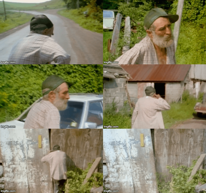
While interviewing Lyman Ward (one of the brothers in the film), the filmmakers ask why he seems nervous (near the 7:30 mark of the documentary). Ward responds that he is always nervous and has been that way since he was young. He starts to edge away from the film crew while continuing to answer questions. He gets increasingly anxious and begins walking toward the dilapidated home he shares with his brothers. The filmmakers do not cut the film.

All told, this scene lasts for around two minutes and seven seconds. It shows the lengths to which Ward will go to escape his nervousness. Because so much of this scene is spent following Ward wordlessly, his desperation to be alone is clear. The shot also gives the viewer a strong scene of setting. The tractors, old cars, weeds, and broken door—all grouped together in a single take—give the audience an unbroken taste of the squalor in which the Ward brothers were living.

Even though long takes are used for very different reasons in different kinds of films, they always insist that the viewer must be acutely aware of the action of the scene. Most long takes are tracking shots that give the viewer some clue about the character’s actions and his or her place in the larger setting. Stanley Kubrick’s 1971 film “A Clockwork Orange” has a famous long take scene wherein Alex is walking through the music store. There are two long takes in this scene, the first is a tracking shot that lasts for one minute and the second is a static shot that lasts for one minute and nine seconds in which Alex is framed by two women


Caution: NSFW

Quentin Tarantino also uses a long take in his 2003 film “Kill Bill: Volume 1” to show the interplay between all of the characters in a huge space.

Long shots are very easy to overuse. But they work wonderfully if there is a specific goal that they achieve. They force the viewer to stay in a moment and experience its lingering emotion. And when the director finally says, “cut”, the relief is palpable.

Yusra Mardini, Rio Summer Olympics 2016

One of my favorite things about the Olympics is learning the backstories of the athletes. They are the best in the world at their sport, and knowing their personal stories adds to the thrill of watching them compete.

This year, going into the Rio games, ‘Team Refugee’ athlete Yusra Mardini’s story captured my attention. In this video produced by the Olympic Channel, we get a poolside seat. I found the video inspirational.  Mardini comes across as a relatable human being, and as an unstoppable athlete who has overcome incredible obstacles to get where she is today.  After watching the piece, I am rooting for her and want to know how things will play out.

Leveraging natural available lighting at the pool(s) where Mardini trains in Berlin, the piece effectively combines interview and training footage, along with still photography (0:58, 1:12) to share her story and bring her infectiously optimistic personality to life.

The opening is powerful. Music and footage combine to quietly lead us into the story and set a hopeful, inspirational tone. Positive motion techniques are used as Mardini swims toward the camera (0:12). Use of detail is also effective as we see Mardini in a tight shot putting on her goggles (0:17). This moment draws us in, conveys a sense of commitment to the sport, and feels up close and personal.

I appreciate that the video is not gimmicky; and the choices to film at the pool, in the subject’s typical environment, where she’s wearing a swimsuit, cap, goggles, or in warm up gear with her hair pulled back. L Cuts (examples 0:19, 1:35, ) are used throughout the piece to move between poolside interviews of Mardini, her coach, and training footage.  At 0:40, the perspective shifts, moving the camera behind Mardini, shooting over her shoulder as she looks toward an Olympic facility, conveying symbolism of her hopes and dreams.

Medium shots in the interviews used classic rule of thirds composition (0:23), with both nose and headroom.  The environmental composition creates a strong sense of place by including the pool in the background. Motion and many different angles, lenses, and maybe a GoPro are used to create a beautiful cinematic effect as we see Mardini in the pool (0:02, 1:19, 1:23, 1:35, 1:40, 2:10, etc.).

The ending is strong.  The pacing increases as we see Mardini swimming her signature butterfly.  The video closes with a sense of future possibility; using negative motion as Mardini swims away from the camera, underwater (3:20).