Data visualization is an extremely powerful tool for presenting information, which can be tailored to appeal to a specific target audience. Some visualizations are aimed at practicality (appealing to a more “scientific” audience), while others are aimed at aesthetic appeal (geared towards a more “artistic” audience). Ultimately, some of the best types of data visualizations incorporate both of these aspects in order to reach a wider overall audience. Depending on the type of information and the purpose for displaying it, the narrative told by the data can be modified and fine-tuned to fit the desired target audience.
The exact same set of data points can be visually portrayed in an endless number of ways – the portrayals that most successfully catch the attention of a broad audience represent an interesting crossover of cultural values and understanding. It is these representations that have the ability to tell a cross-cultural and multi-perspective narrative.
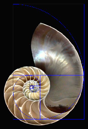
A significant aspect of my final creative display is my visual representation of a set of data – the Fibonacci sequence (a central theme in my project) is essentially a set of integers that display the phi ratio (1.816) between successive numbers in the sequence. There are several ways that these data points and their relationship (namely, the phi ratio) can be visualized. One of the most widely appealing visualizations of this data is the Fibonacci spiral. This visual is so successful at portraying the relationship between the data in the Fibonacci sequence because it is visually (aesthetically) appealing, and clearly displays a mathematical pattern (practically/mathematically appealing).
The dual appeal of this visual not only shows the overlap in values/ideas from separate audiences, but it also represents the visualization of this data that is commonly found in nature. The Fibonacci spiral isn’t difficult to find – it can be seen in examples ranging from the spiral of a nautilus shell, to the pattern of leaf growth on a herbaceous plant. This spiral is a means of data visualization that I will use in my display to show the interconnected nature of mathematics, science, and art, and to reach a very broad, inclusive audience.