The two resources exploring place that I have chosen to compare and contrast are Site Analysis by Edward T. White, and Finding Lost Space by Roger Trancik.
Finding Lost Space is focused more on the Urban design and plan of site. It analyzes existing spaces to understand why certain aspects of urban design do not work, and how to graphically boil those elements down to their purest form. This book is helpful in figuring out how to abstractly diagram very specific aspects of the site and its infrastructure. Three theories that were diagrammed out in the book (Figure Ground, Linkage, and Place) were very insightful for me while analyzing with South Waterfront. These diagrams, however, can be very confusing if not in close reference to the sight and context because of their more abstract nature.
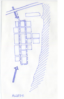
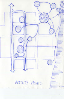
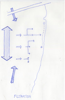
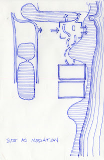
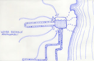
Site Analysis was much more centered around a wider variety of diagrammatic scales. The diagrams explored in the book cover hard vs. soft data, covering the very analytical facts of the site as well as the feeling and experiences evoked, site relationships, and the connections between building, users, and the context. The material expressed in the diagrams are generally connected with arrows and changes in texture or shape, which creates clear distinctions. They start out much more abstracted and become more clear the more defined the site and program become. This was the style that I chose to emulate in my diagrams. While the Finding Lost Spaces brought up good analytical diagrams, I felt that Site Analysis encompassed more of the potential of the site design.
Other sources I browsed through on mapping and place representation were:
Meta City Data Town, by MVRDV
Site Planning by Kevin Lynch
Site Analysis: Linking Program and Concept in Land Planning and Design by James A. LaGro

